Koto's playful identity for Foodvisor, a nutrition app that includes a guide called Guakka The Avocado
If those lockdown pounds are just not shifting, then perhaps a personal nutrition app might help. Not only does Foodvisor help you track your food habits, but it's also nice to look at, as it's just enjoyed a brand refresh courtesy of London studio Koto.
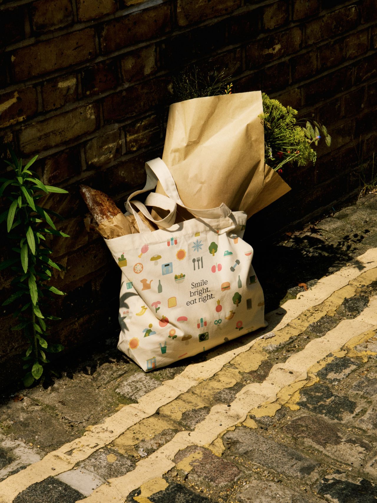
Koto's new identity for Foodvisor revolves around an eclectic set of illustrations that show living well in all its forms across exercise, nutrition and health. "We repositioned Foodvisor from a tech-driven calorie-tracking app to a personal nutrition guide with inspiration and advice for every motivation," explains Creative Director Arthur Foliard. "Foodvisor works with you, creating personalised plans that help you get the results you want. We created a brand strategy, visual identity, and tone of voice that builds on Foodvisor's supportive nature and elevates its role in helping people achieve their goals."
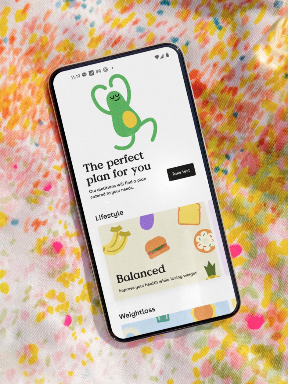
As a key part of the brand, Koto gave Foodvisor's mascot an overhaul, too. Called Guakka The Avocado, the studio switched it from a static element to a fun guide, moving with users through the product experience. "We embraced the idea of a guide through a motivational but realistic tone of voice, which recognises that although it won't always be easy, the most important thing is to keep going," says Arthur.
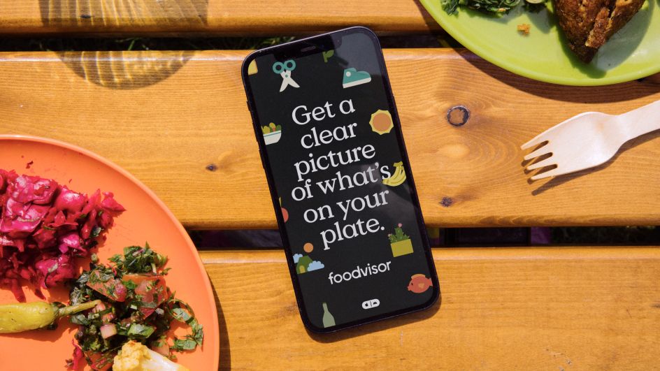
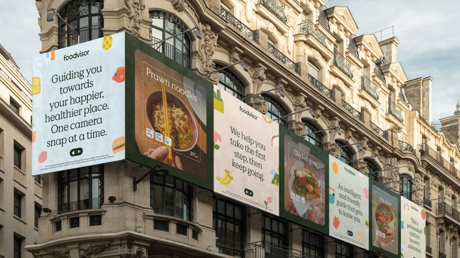
For typography, the choice of Value Serif was based on the company's personality and values, and its commitment to making a difference. "After using the app for so long as a team, we felt the personal benefits of working towards a happier and healthier lifestyle," explains Arthur. "There's something very emotional there. That's why we felt the need to move away from the techy or cold sans serifs other competitors used, and build equity in something softer and warmer."
Value Serif was then paired with Buenos Aires, not just because they work really well together, but because it's "more playful and friendly compared to a lot of body copy fonts," adds Arthur.
The typeface for the wordmark, meanwhile, was Common – something that's no longer available on the market. "There are two reasons behind this choice," says Arthur. "First of all, we wanted to build equity in the name, making the name the hero and the most recognisable element, as it exists in a space where all logos look the same. Second of all, we wanted to create a logo that felt in line with the rest of our language and the brand personality itself. Something softer, friendlier, and more pleasing to the eyes."
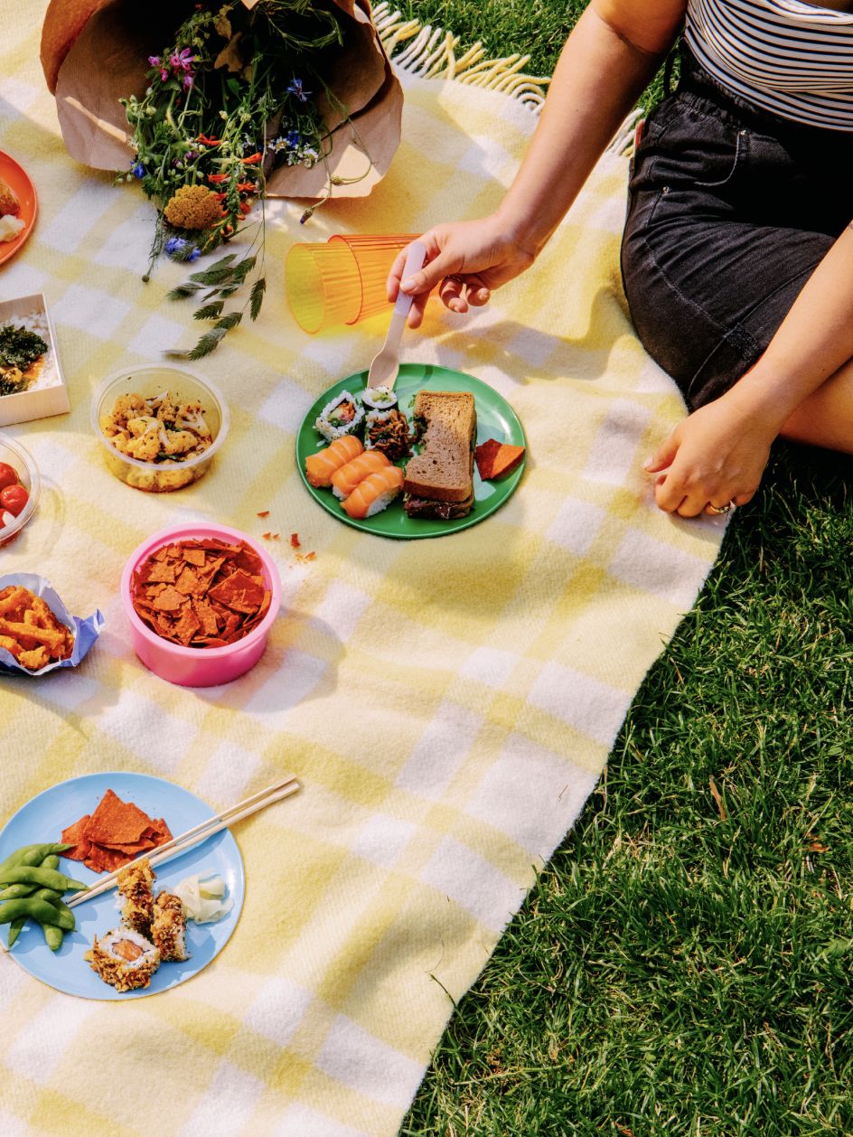

To add to the friendly tone, Koto used a colour palette that it describes as "calm and holistic" that feels optimistic, with colours that stand out against a black and white background. The palette also works well as the studio's illustrations (created exclusively in-house) are very simple in their forms, allowing colour to play a key part in identifying different types of food. "We couldn't deviate far away from their original colours or they start to become unrecognisable and unappetising," says Arthur.
"We utilised the tints of the palette to offer more flexibility to the illustration system that will grow exponentially over time. It may seem like a wide palette but really we worked hard to reduce it to its core. When illustrations work together as a collection, it's important to make them feel like a well-balanced set without any one of them taking centre stage. Creating harmony between the accent colours and softer tones was crucial."


 by Tüpokompanii](https://www.creativeboom.com/upload/articles/58/58684538770fb5b428dc1882f7a732f153500153_732.jpg)


 using <a href="https://www.ohnotype.co/fonts/obviously" target="_blank">Obviously</a> by Oh No Type Co., Art Director, Brand & Creative—Spotify](https://www.creativeboom.com/upload/articles/6e/6ed31eddc26fa563f213fc76d6993dab9231ffe4_732.jpg)


