Free The Birds has worked with Wilko sibling company, Kin, to reinvigorate its Skin Therapy range.
London-based design and branding agency Free the Birds has created a new brand identity and packaging identity for Skin Therapy, a range of everyday skincare products from Wilko sibling company, Kin.
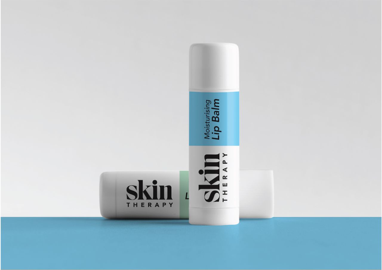
Free The Birds was tasked with ensuring continuity across all of Skin Therapy's sub-ranges—including Face, Baby, Kids, Vitamin C, Spa and Hygiene—while also giving each product range a sense of individuality and personality.
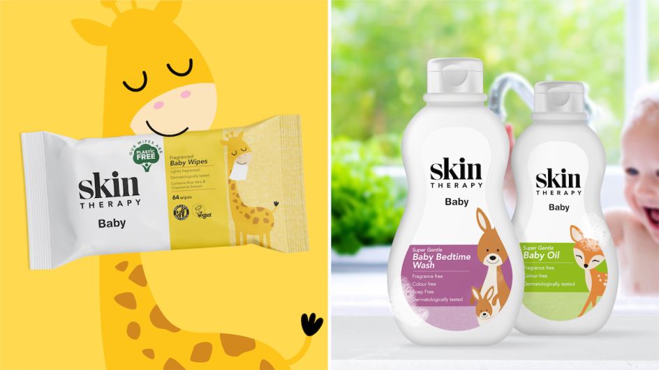
The new designs feature animal illustrations, "indulgent" patterns and a pastel-based colour scheme. The Baby range features illustrations of animals interacting with the product, aiming to make the products appear more fun and engaging. At the same time, the Spa collections have a soft, decorative illustrated swirl design "evoking relaxation and indulgence," according to Free the Birds.

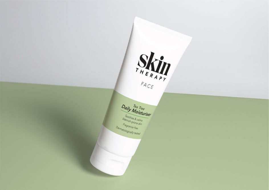
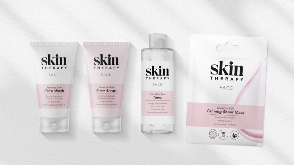
The rest of the skincare collections use a simple colour bar to highlight the product benefit in a gentle pastel colour for the Sensitive, Tea Tree and Moisturising products, set against a white background that remains consistent across the collections.
One of the most significant design changes was enhancing the Skin Therapy logotype to give greater visibility on store shelves and digital platforms while also creating a brand that can compete against rival mainstream beauty brands.

Nick Vaus, partner and creative director at Free the Birds, says that it was vital to make the brand "look affordable yet feel credible."
The new designs have been rolled out across the entire range, including face washes, scrubs, toners, moisturisers and lip balms. The range is sold to 800 retail and wholesale partners nationwide.



 by Tüpokompanii](https://www.creativeboom.com/upload/articles/58/58684538770fb5b428dc1882f7a732f153500153_732.jpg)

 using <a href="https://www.ohnotype.co/fonts/obviously" target="_blank">Obviously</a> by Oh No Type Co., Art Director, Brand & Creative—Spotify](https://www.creativeboom.com/upload/articles/6e/6ed31eddc26fa563f213fc76d6993dab9231ffe4_732.jpg)


