Transatlantika creates a new logo for the 'Fridays For Future' climate strike movement
US and German design studio Transatlantika has created fresh new designs for Greta Thunberg's global climate initiative to use.
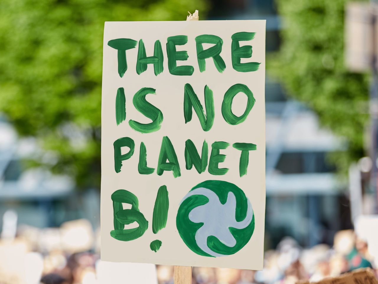
Fridays for Future is a climate strike initiative led and organised by youth across the world. Started by Greta Thunberg in 2018, it's best known for organising school-student strikes on behalf of the environment. The movement currently uses an intricate, hand-drawn illustration of planet Earth as its logo. Now design studio Transatlantika has created a new design proposal, which aims to let the movement be recognised more easily.
This proposal to redesign Fridays for Future's visuals was unsolicited, but the studio, which is based in Portland, Oregon, USA and Hannover, Germany, is donating its designs and providing the assets for free so that both the organisation and individual protesters can use the logo as they see fit.
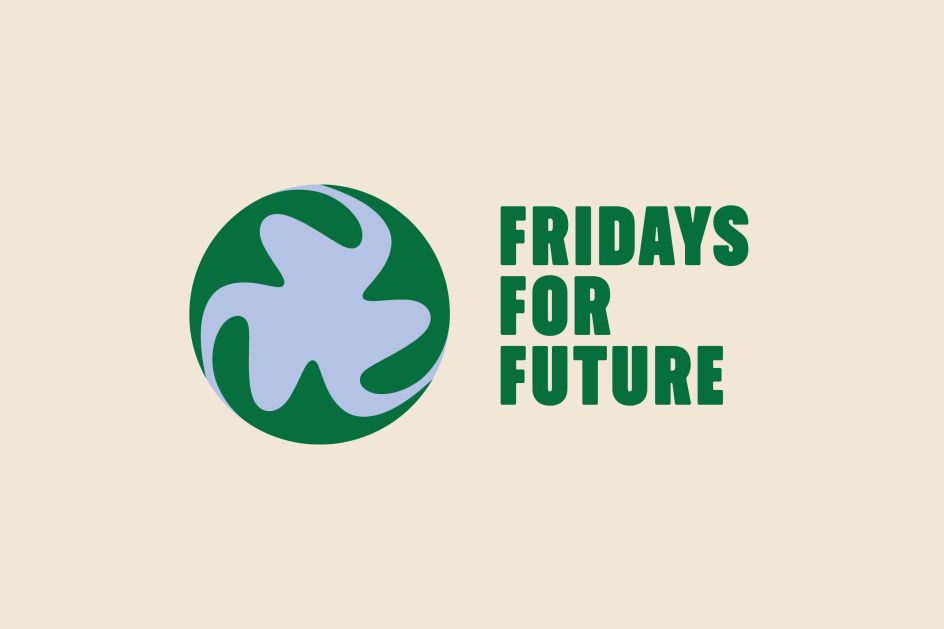
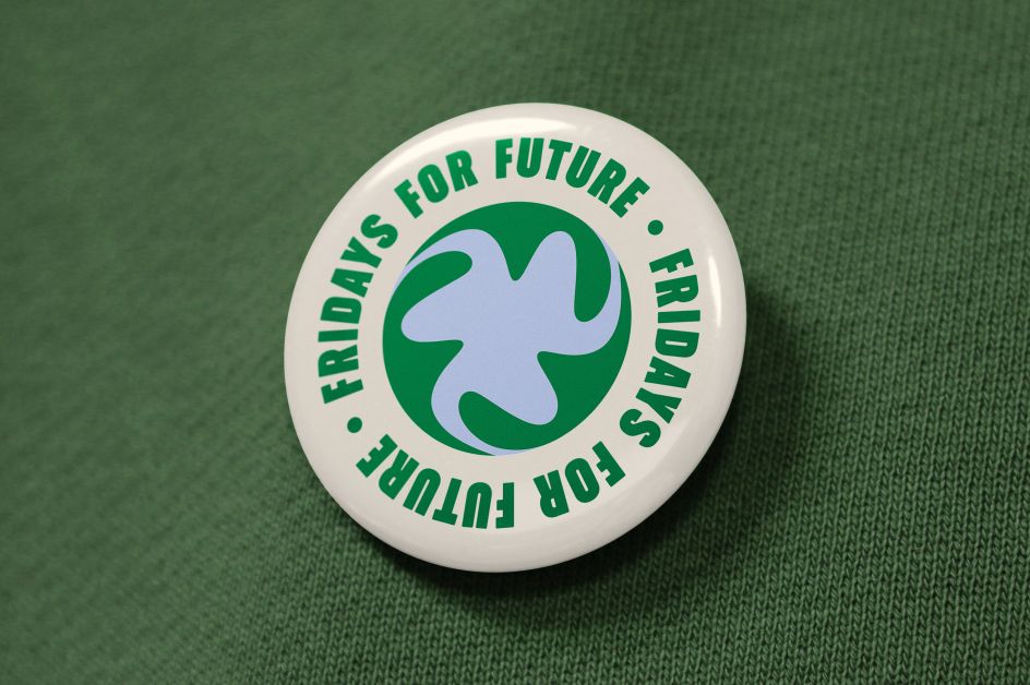
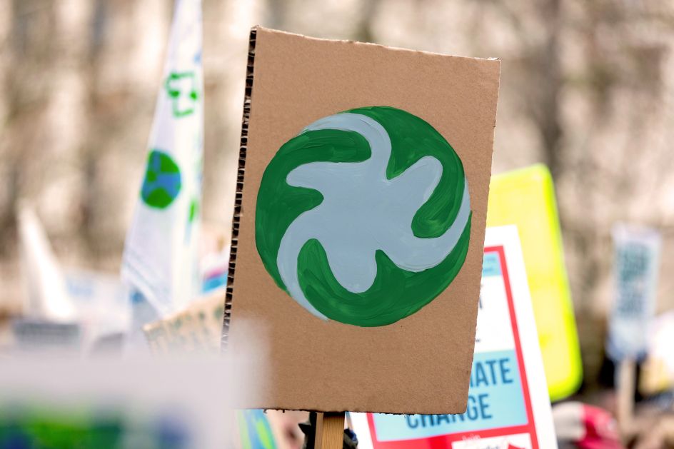
In designing a new logo for Fridays for Future, Transatlantika's main objective was to create a positive symbol that is unique, easy to read and carries a lot of meaning. The symbol can also be repainted by protesters relatively easily.
The design is an abstract depiction of planet Earth with three swirling "f" letters. Using the bold typeface Midnight Sans by Colophon, messages can be communicated with a sense of urgency. The colour palette features hues that are commonly utilised in an environmentally friendly context, while the background colour references the "no-dye" technique for garments, which avoids the use of ink and water.
Subtly evoking the kind of Earth iconography prevalent at every climate protest, it works as a characteristic identifier for Fridays for Future. The symbol goes together well with slogans and is a characteristic sign-off for the movement.
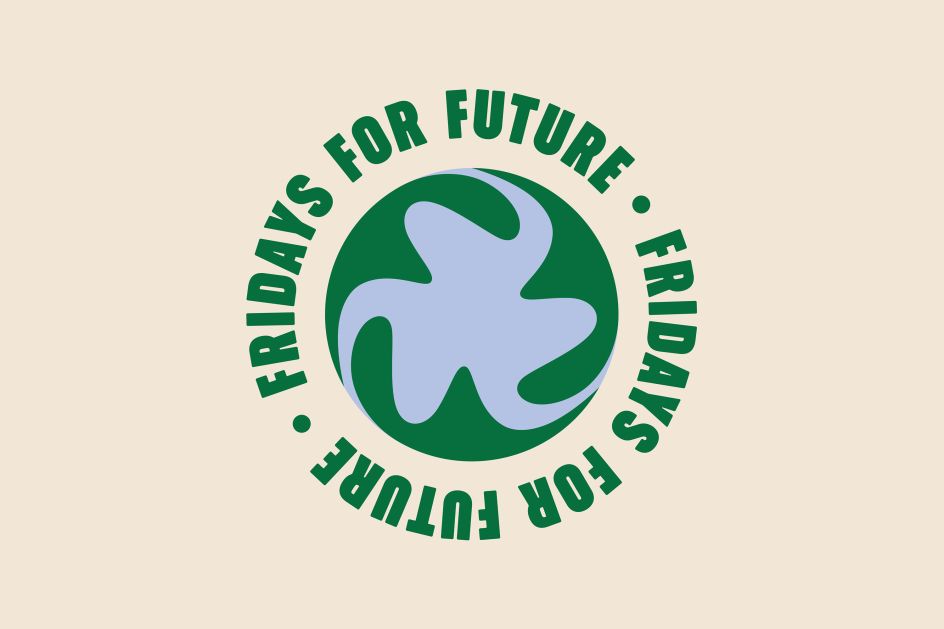
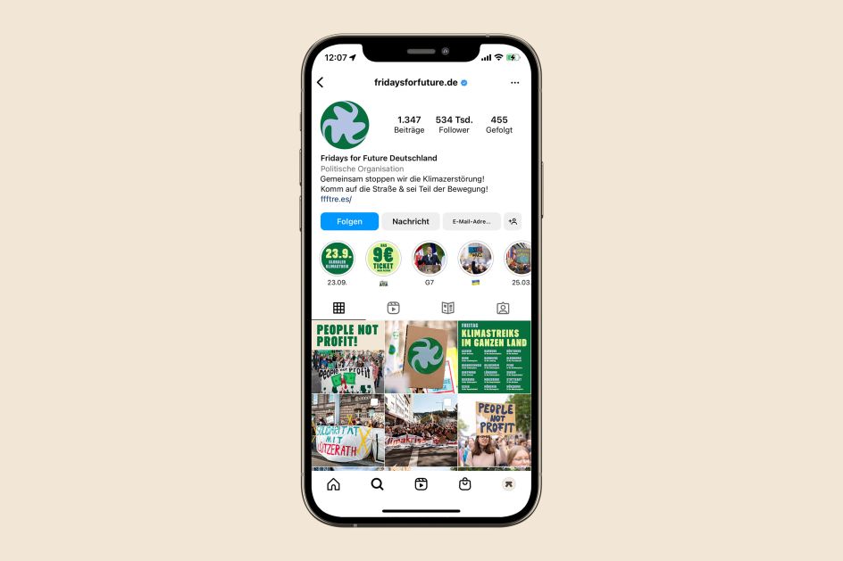
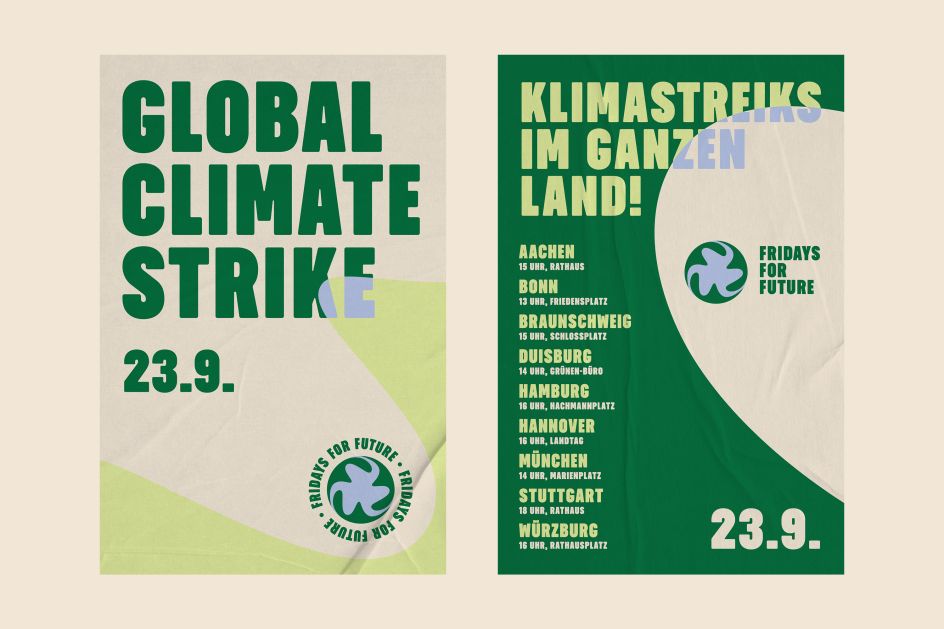
The shapes are also reminiscent of leaves, waves, helping hands and wind turbines and generally convey a sense of change. The idea is to make layouts more exciting while at the same time hinting at the flooding caused by climate change.
Transatlantika hopes the new designs will help Fridays for Future's social media channels appeal to more people with a stronger identity and help headlines make a bigger impact. They've created some poster design examples, which you can see on this page, to show how the new logo can work in practice.


 by Tüpokompanii](https://www.creativeboom.com/upload/articles/58/58684538770fb5b428dc1882f7a732f153500153_732.jpg)


 using <a href="https://www.ohnotype.co/fonts/obviously" target="_blank">Obviously</a> by Oh No Type Co., Art Director, Brand & Creative—Spotify](https://www.creativeboom.com/upload/articles/6e/6ed31eddc26fa563f213fc76d6993dab9231ffe4_732.jpg)


