Gali Erez on working in-house for Wix, her love of UX and how it feels to solve web design problems
Gali Erez is Head of Product for Editor X, a new website design tool created by Wix that hopes to ditch any need for CSS skills.
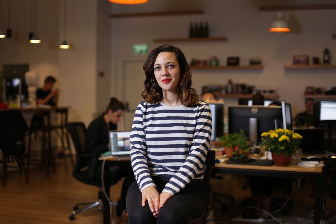
She joined Wix in 2015 as a senior UX designer before becoming the manager of all UX consumer experience groups at the platform. She was then later promoted to her current role.
Gali describes herself as a visual communicator and design lover and is super passionate about translating technology into a "human accessible and loveable product". After graduating from CalArts with a degree in graphic design she worked at Warner Bros., looking at future trends for media consumption. Gali has also worked on complex infrastructure apps for investment banks like Goldman Sachs, as well as ad-tech online platforms.
With plenty to chat about, we sat down with Gali, just after she launched Editor X to find out about her amazing career so far.
You've had quite the journey. Tell us more
It's incredible how a small decision we make in life can completely change its course. When I was 14, I skipped ballet and snuck into the drawing class next door. And that was it. I fell in love with art.
At 18, I started my BFA in Graphic Design at Calarts. My love for art and fascination with architecture and interior design made sense. Every space I walked into since childhood made me curious about the lifestyle of the people using or living in it. If it was organised well enough to serve that lifestyle - visual communication was precisely that - visual aesthetics, communication and function.
During my third year at school, I joined Warner Bros., who had just opened up a new department that was in charge of creating a digital landscape for the company, experiences to complement releases of movies and a platform that would include WB's vast library of content. It was my first serious job, and it was all new to me, but so was the industry, they didn't call it UX back then.
Everything was fresh and exciting for everyone. Our thought was that we should find ways to transfer the joy of entertainment from a physical to a digital world by learning users' preferences and patterns of media consumption, basically personalising the experience. Now I can't imagine our day-to-day life without that personalisation. It felt like we were breaking the rules and changing the industry.
Three years later, I moved back to Tel Aviv and started working in the digital ad world (Publicis and later on Meccan Erickson) which was still experimental. I love working on the merge of technology and experience with different mediums when they are still in their first stages.
I joined Wix in 2015, and it already had millions of users from all over the world. So many creative people, interesting projects, massive amounts of data, and so many user types – it was like being a child in a toy store. I learnt so many aspects of creating products, connecting with users and strategy. I moved at some point to manage UX teams each working on a different product at Wix.
My next challenge was going from managing UX to heading product. Leaving something you have spent years to learn and sharpen for something unknown is both exhilarating and terrifying, but ultimately being uncomfortable is how you evolve and grow. And then came Editor X – the most challenging yet fun product I have ever worked on. As design and UX have been a big part of me, leading a product that focuses on professional designers is a dream come true.
That's great to hear. What inspired you to become a UX designer?
So many things. Firstly, I moved between many cities and countries as a teen and quickly became aware of cultural differences and how they can be a struggle. Art and design became my culture. I love airports as they are an example of amazing design using global patterns of communications.
That was also present at Calarts. We had students from all over the world. I was so inspired by the many interpretations of visual communications using such a huge range of cultural and historical references and aesthetics. And somehow in complete contrast, we all found common ground for collaboration and creativity. That's the strength of visual communication over language.
Theory books like Design as Art by Bruno Munari and Thoughts on Design by Paul Rand also influenced how I see the world of creation. They both talk a lot about the relevance and worth of your work and how art is missing the mark on communication by ignoring such large communities. Today we talk about relevancy through user and market needs.
Our users at Wix also inspire me. My friend, who is a journalist, said that in a way we have very similar jobs, we investigate by "becoming" our subject and then we report. If you study and can report the problem you are trying to solve well, and then your solution is 100% aligned to it, you end up having the 'Simplify to Amplify' effect. It's a lifelong challenge always to have the right amount of function, aesthetic and humour. When it's successful, and it enables a user to fulfil a dream or just have their day become easier and fun, I am inspired.
My most recent inspiration has developed a new habit – for new brands, apps, games and mediums that come out and catch a lot of attention, I spend time on researching what was that sense of accomplishment or happiness they triggered in people.
What's it like to work for such a large company, it must be amazing being able to concentrate on one brand?
Wix is a large company, but it has a unique structure. It's divided into smaller companies, each with a lot of ownership focusing on a product or a set of products. Having been at Wix for five years, I can say that I've never had a boring hour or day. We reach many audiences and love testing new ideas quickly and consistently.
I was part of many teams and products and each time with a different challenge and timeline but with the same Wix spirit and vision, enabling people to create their dreams online. We are super close to our users, we love them, and we have a lot of respect for their creations. So I like concentrating on one big vision but also being able to break its meaning and bring it to life through many different products.
You mentioned you're behind Editor X, and it looks like a fantastic tool for designers, what aspects are you most excited about?
At Wix, we always sought after enabling people to create a site on their own, and the classic Wix editor and Wix ADI provided just that. However, creating a usable product for a huge range of people comes with a price. It means that if you make the platform too advanced, people who are not professional designers will lose that ability and enablement. We came to a place where we feel we have given powerful tools for our users, and now we can step forward and unleash a super sophisticated and professional designer platform. This time enabling designers to create without having to code.
It gives them the freedom that allows the full vision and creativity of the designer to be possible with nothing to stop them in the process. So with that said, one of those tools that was a great accomplishment was the combination of drag n' drop with responsive layouts. We wanted designers to design without having to bother with the structure of 'divs', without giving up on any capabilities. Same for flexbox layouts, CSS and many more.
When you are working on a site or web app, your process consists of different steps. Some might be code. I love writing code, but it shouldn't be a blocker for when I'm in the creative design stage of my process. Another exciting aspect is how you are working on a designer tool, and then you skip the step of having to move it to the developer. You just publish all the crazy layouts you did, and all these super decisions you made for every screen size, as a designer – that gives you so much power.
Aside from those you mention, what were the most satisfying problems to fix?
I'd say top feature requests, beyond layout design, from professional designers that already use Wix like a focal point for images and custom menus were so fun to solve. The issue was clear, and we knew it would make them very happy.
Another satisfying aspect was for the super complex layout features. We have a lot of professional designers on the team with expertise in different fields of design. What we did to build Editor X layout tools was while developing we kept doing daily cycles of packing the technology, letting the designers use the tools before they come to fruition. The designers pushed the boundaries to see if Editor X could handle what their creative vision is. Then we took this immediate feedback and refined it.
Working alongside designers on an hourly basis of learning and refining was extremely satisfying. When a new designer starts working now on Editor X, and they feel empowered by being able to layout per breakpoint so easily, it is a beautiful moment to reflect on the process we did.
As a UX designer, you must see things that niggle at you constantly. What are often the most common mistakes people make with website design?
Very true! I recently did a lecture in a meetup Wix does for the student community, and I talked about just that, with a focus on how to create a portfolio. We discussed a few things that can make a portfolio or site successful, like bringing their personality immediately and unapologetically into their website.
Spending enough time beforehand to be very clear on what they want visitors to know right away, it can be what job they are looking for, what their expertise is and same for any other site, what is the message, what is the product, is it clear right away? And many other tips.
But I think the most guilty pleasure designers have is searching for things that niggle them. Like, how come the part of usability testing when you get to enjoy that guilty pleasure is so often done very roughly and quickly? What I stressed to them was to test their portfolios on various people, devices and screen sizes. Even the best designers that create sites with perfect hierarchy, structure, content, UI and whatnot can fail in usability because of one small unlinked button, one unreadable text in mobile, or one unclear message. Respect your work by giving it a test drive.


 by Tüpokompanii](https://www.creativeboom.com/upload/articles/58/58684538770fb5b428dc1882f7a732f153500153_732.jpg)


 using <a href="https://www.ohnotype.co/fonts/obviously" target="_blank">Obviously</a> by Oh No Type Co., Art Director, Brand & Creative—Spotify](https://www.creativeboom.com/upload/articles/6e/6ed31eddc26fa563f213fc76d6993dab9231ffe4_732.jpg)


