Celebrating a unique studio culture and creativity through website design
Creative agency Greenspace has created the brand strategy and new website for architecture practice Apt; launching the designs to mark the company's refreshed visual identity, studio culture and its recent shift to becoming employee-owned; as well as its move to a new space in Clerkenwell, London.
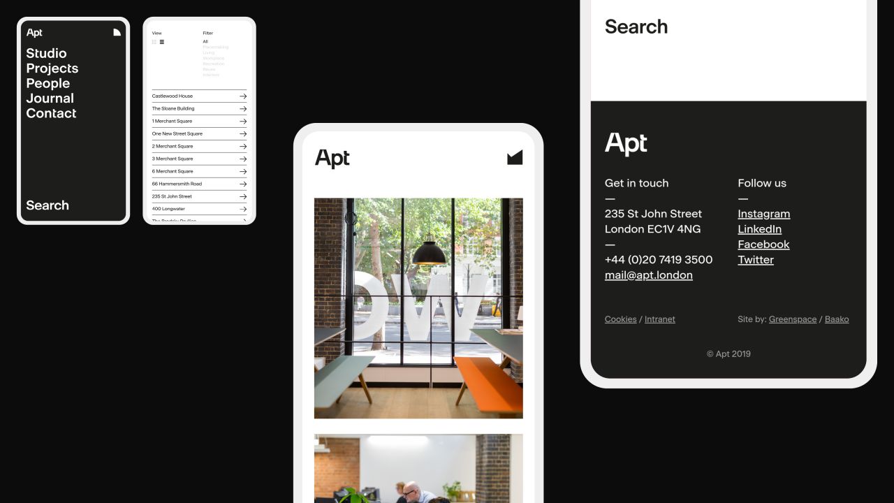
The design prioritises clarity, aiming to neatly showcase Apt's projects – which include the award-winning 1 New Street Square, the remodelled Grade II Listed Kings Library and The Treasury at the Bodleian – to potential new clients. This is achieved through the addition of a showreel that presents these projects "by combining grand scale with tiny detail" alongside footage of the new studio space and its team.
The broad aim of the site design, according to Greenspace, is to "translate the qualities of the brand purpose including great design, innovation and craftsmanship"; acting as a platform to showcase its refreshed visual identity, values and people.
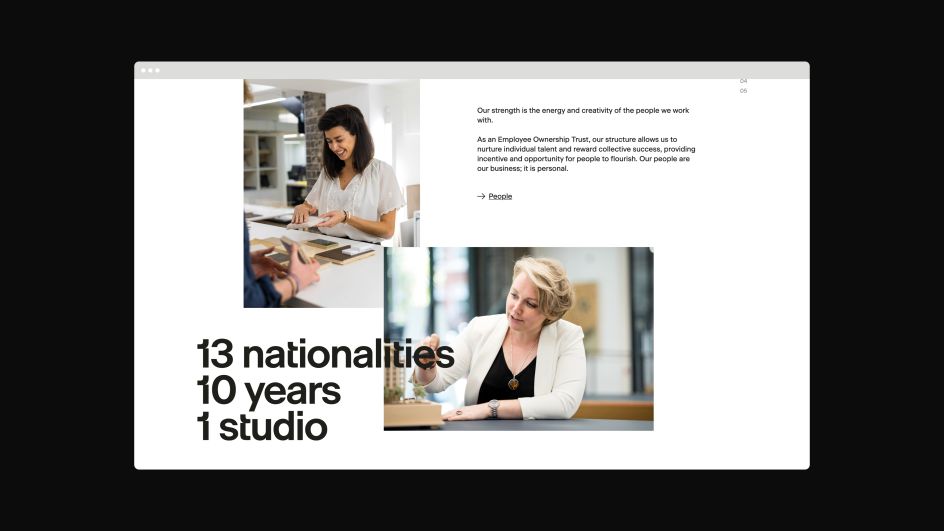
The new visual identity is shown on the site through the use of the practice's custom typeface Apt Sans and a flexible graphic language that becomes dynamic online through animated graphics. These are used alongside a new broader colour palette and set of project and internal studio photographs shot by Sam Bush.
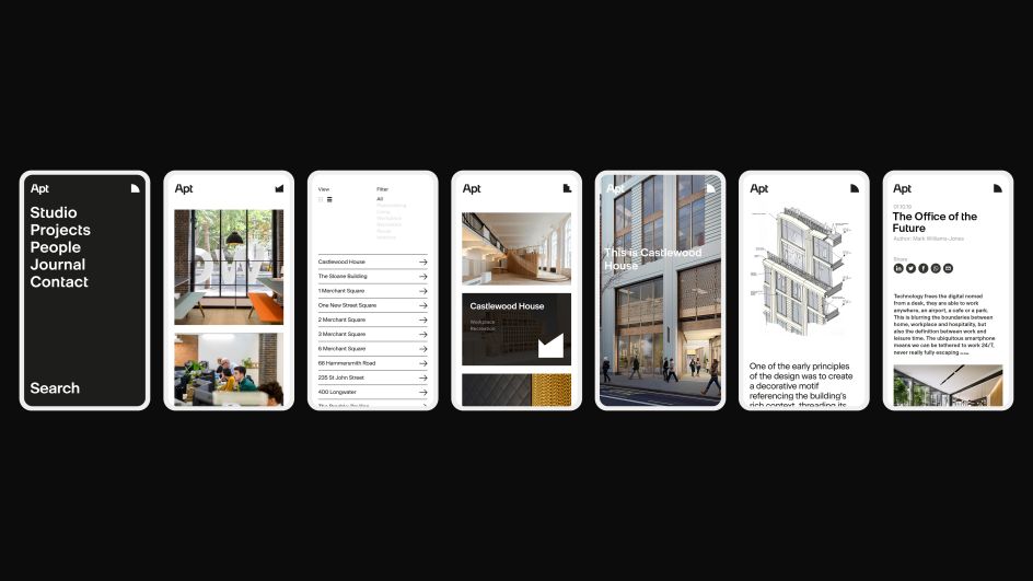
"A fundamental challenge was to simplify a potentially large and complex site into five clear and distinct sections," says Greenspace, which worked on the project with the Apt team and web developer Baako. The design of the homepage uses bold navigation tools and clear search functionality to aid fast, efficient navigation of the site.
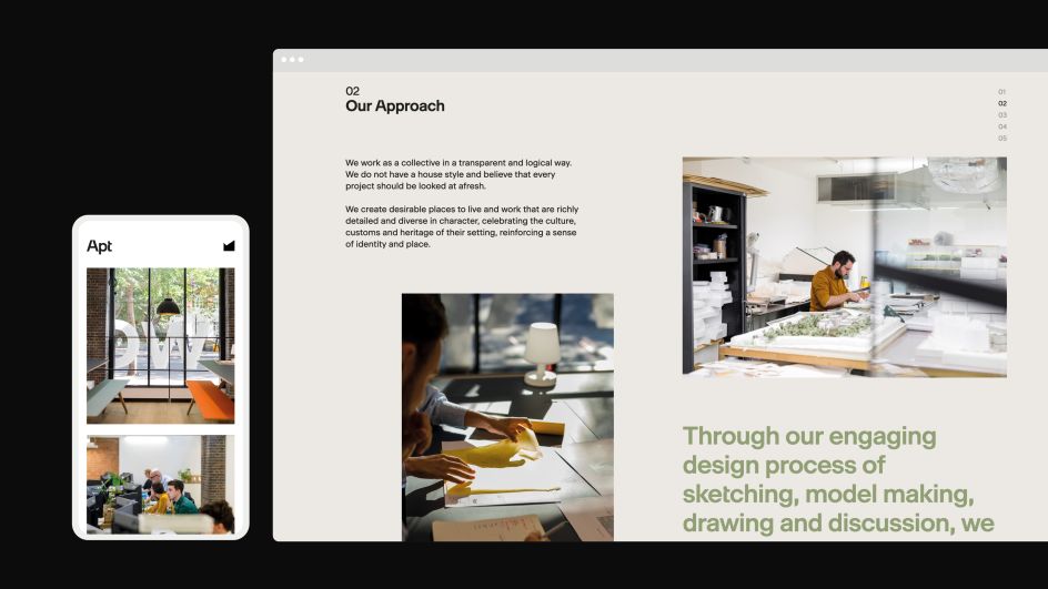

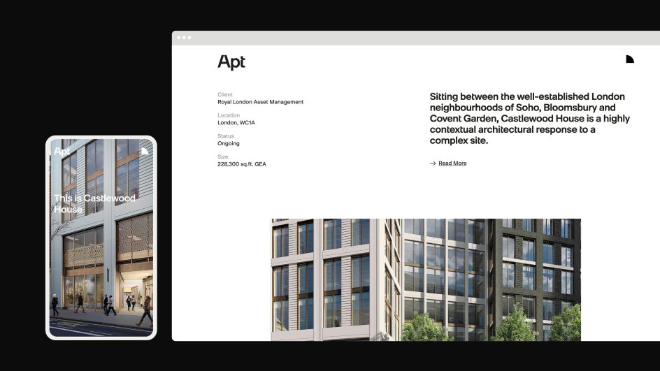
Luke Mcilveen, design director at Greenspace, says that overall, the site's main aim – and what the agency is most proud of in the result – is "capturing the spirit of the studio and bringing elements of the visual identity to life through movement and interaction."


 by Tüpokompanii](https://www.creativeboom.com/upload/articles/58/58684538770fb5b428dc1882f7a732f153500153_732.jpg)

 using <a href="https://www.ohnotype.co/fonts/obviously" target="_blank">Obviously</a> by Oh No Type Co., Art Director, Brand & Creative—Spotify](https://www.creativeboom.com/upload/articles/6e/6ed31eddc26fa563f213fc76d6993dab9231ffe4_732.jpg)


