Superunion's Scott Lambert celebrates the erratic nature of creativity in fun flipbook
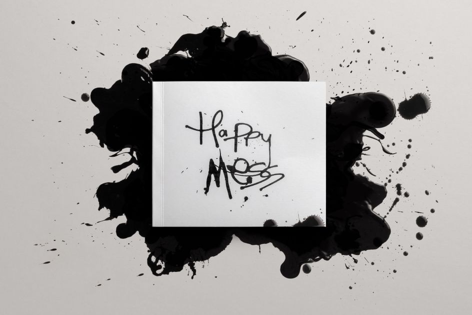
This side project by Superunion pays homage to those special moments that make creatives "irrationally happy". We find out more about HappyMess, the illustrated book of brilliant messiness.
When the first lockdown began, the pressure was on creativity to use the enforced time at home productively. But what many of us found was that creativity isn't something you can meticulously plan and schedule: it's far more random and serendipitous than that. And that's a concept that's embraced and celebrated in a new side project by Superunion's creative director Scott Lambert.
HappyMess is a playful, illustrated book capturing the brilliant messiness of creativity and the fleeting moments of joy we experience in our everyday lives. Created in partnership with speciality paper producer Fedrigoni, the dual-segmented flip-book features dynamic sketches of objects and moments from daily life in a joyous celebration of life's distractions.
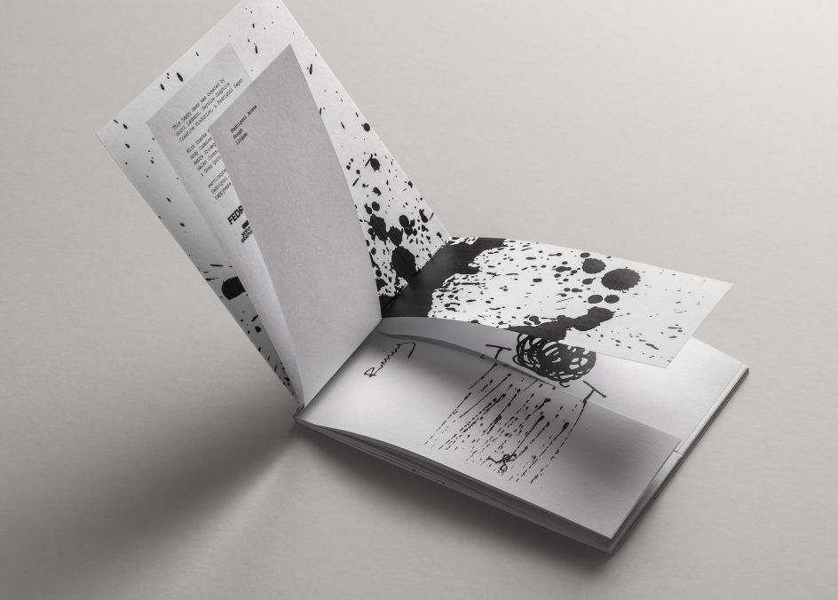
Drawing with Indian black ink on Fedrigoni's newly-named Arena Extra White range (previously known as Arcoprint), in various weights and the textures 'Smooth' and 'Rough', Scott reflected on the little moments of joy that daily life brings and celebrated the messy by-product of physical creation.
Printed and binded, the book features sketches of winning snapshots in sports, popular indoor plants, barbecues and animals amongst nature. Through these disparate subjects, it spotlights the precious few seconds of euphoria that comes from enjoying life's distractions.
The idea came about during a time when creatives faced inspirational obstacles because of multiple lockdowns, and Scott discovered how surprisingly cathartic the day-to-day could be.
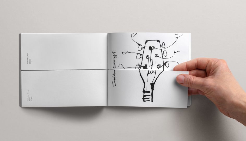
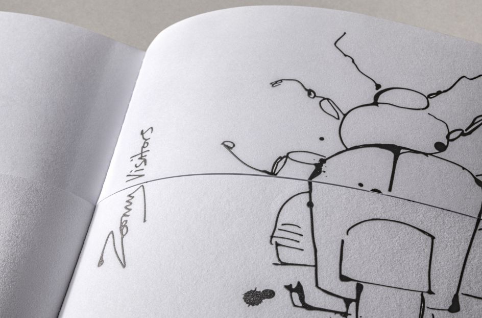
"I wanted to highlight that moment in a creator's process by taking characters and objects that typically make us irrationally happy – and what artists draw inspiration from – to make a book that mixes and matches them to showcase the erratic approach artists explore," he explains.
"Happiness is a messy thing, and I particularly enjoyed working with Fedrigoni's Arena Extra White Rough paper for its robust texture, reminding me of the wonders of tactility."
Fedrigoni suggested Arena Extra White for its intricate contours, making it similar to a canvas. "It personifies the art of tangibility, and our customers love it for its versatility," explains Ambra Fridegotto, marketing manager at Fedrigoni UK.
"Scott's line drawings all differ and share no running theme other than prompting artistic inspiration and moments of happiness, a concept mirrored in the deliberate choice of the same range and shade – Arena and Extra White – in two contrasting textures, Smooth and Rough," adds Ambra. "We're thrilled to have partnered with Superunion for its initiative and particularly enjoy Scott's sketches that epitomise the messy nature of a craftsperson."
You find out more about the project at www.superunion.com.


 by Tüpokompanii](https://www.creativeboom.com/upload/articles/58/58684538770fb5b428dc1882f7a732f153500153_732.jpg)


 using <a href="https://www.ohnotype.co/fonts/obviously" target="_blank">Obviously</a> by Oh No Type Co., Art Director, Brand & Creative—Spotify](https://www.creativeboom.com/upload/articles/6e/6ed31eddc26fa563f213fc76d6993dab9231ffe4_732.jpg)


