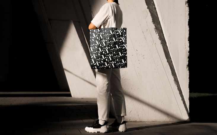
dn&co's new identity for Harwell, the UK's leading science and innovation campus
Nestled rather unassumingly in the Oxfordshire countryside, Harwell is a powerhouse of innovation. Set across 700 acres, it is home to an amazing community of over six thousand scientists, engineers and innovators working to accelerate change and solve some of the critical problems facing our planet. And it hired London creative studio dn&co to develop its brand identity.

With over £3 billion of national research facilities and 75 years' history of pioneering innovation, Harwell is renowned for pushing the boundaries of scientific discovery and understanding. The campus fosters collaboration to develop better, bolder solutions from space to life sciences and energy to quantum computing.
An ambitious masterplan will soon see Harwell evolve into an innovation capital for the world: an extended community, new state-of-the-art science facilities, labs and incubators, as well as homes, restaurants, shops, a gym and an apartment hotel. This is where dn&co stepped in, tasked with positioning Harwell as a platform that "celebrates science and its unique power to unlock universal progress".
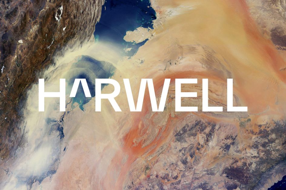
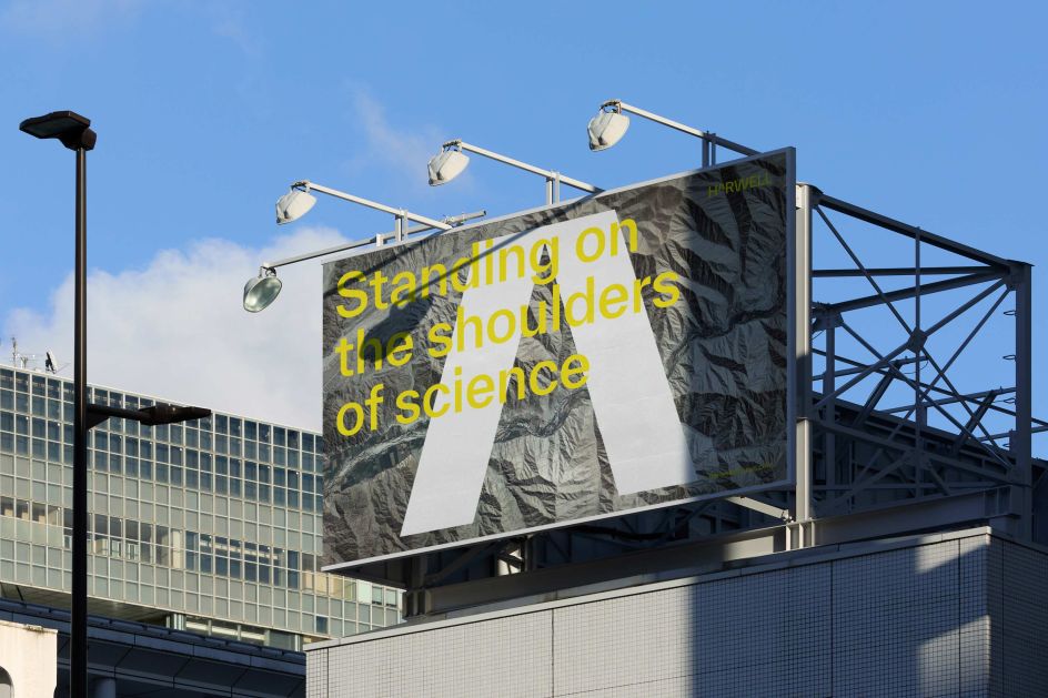
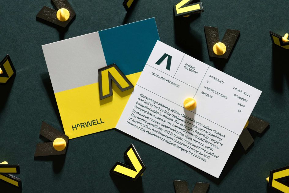
Taking inspiration from mathematics being the universal language of science, dn&co created a 'caret' as a symbol of exponential growth. Subtly referenced in the typeface, the caret becomes an ownable mark as part of a visual language with colour, photography and dynamic grids designed to strengthen the idea of growth and progress.
"Over the last 18 months, we have all come to understand the critical role of science in our lives, how it helps us survive and thrive," says Simon Yewdall from the London agency. "Now it's time to recognise the places where science happens and the communities who, behind the scenes, are working to answer the monumental challenges we face. From the pandemic to climate change, much of our future will depend on the discoveries and technological advances developed at Harwell Campus today. Yet, amongst the general public, Harwell is not well known and even less understood."
Simon continues: "With this brand, we wanted to put Harwell back where it deserves to be, as the leading science and innovation campus in the UK. It is not a science park but a remarkable community of the world's brightest minds tied together by an operational model that harnesses collaboration and helps people and businesses reach their full potential. Much like the powerful facilities at Harwell that look at the world with greater detail than ever before in human history – we felt we had discovered something new at Harwell. The brand turns that into a world-leading story to inspire us all."
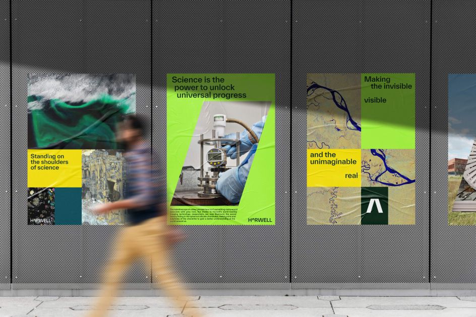

Creative Director Patrick Eley adds: "The Harwell brand is rooted in science, but it is decidedly human. We wanted to engage Harwell's diverse innovation community across different clusters of expertise, so we had to find a common language.
"If science is how we understand the world around us, then mathematics is the universal language of science — transcending discipline, age and time. Code, on the other hand, is the universal fabric that builds our modern world, and across both languages, the caret ('^') operates as a symbol of change and exponential growth. It means 'to the power of', but here the caret also stands for progress, reflecting Harwell's role in powering up the science and innovation community. Ultimately, it represents the value of collaboration and reminds us how we can solve bigger problems better together than we can alone."
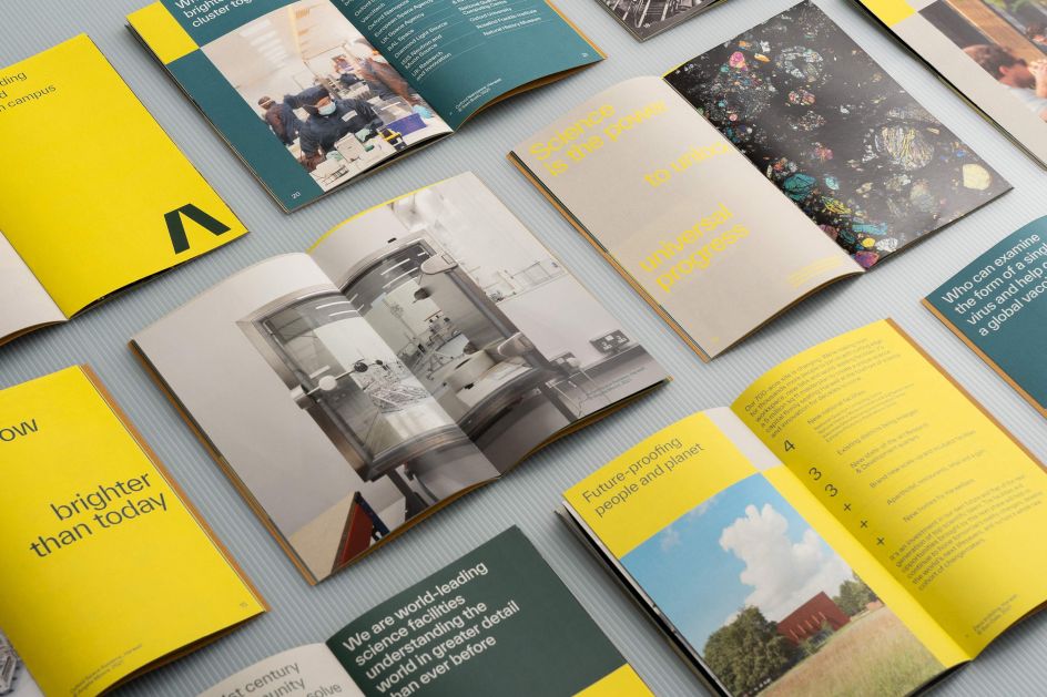

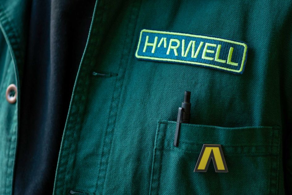
Patrick continues: "It's easy to say that graphic design isn't rocket science, but designing a brand that needs to resonate with rocket scientists can be unnerving. Gimmicks and clichés won't do. The visual trick of swapping the A of Harwell for the caret was neat and didn't overstep the mark. The Harwell brand language borrows from maths without stating the obvious, inviting us instead to decode a deeper meaning — the power of science and the progress it brings to the world."
dn&co created the brand strategy, brand identity and brand architecture. The new Harwell brand launches this month and will be rolled out across print, merchandise, signage, films, photography and online, with further on-campus applications planned for 2022.



 by Tüpokompanii](https://www.creativeboom.com/upload/articles/58/58684538770fb5b428dc1882f7a732f153500153_732.jpg)


 using <a href="https://www.ohnotype.co/fonts/obviously" target="_blank">Obviously</a> by Oh No Type Co., Art Director, Brand & Creative—Spotify](https://www.creativeboom.com/upload/articles/6e/6ed31eddc26fa563f213fc76d6993dab9231ffe4_732.jpg)


