How Lionel Taurus merges illustration and interaction design to create richer experiences
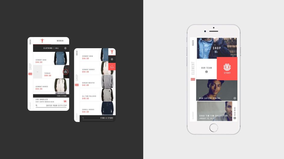
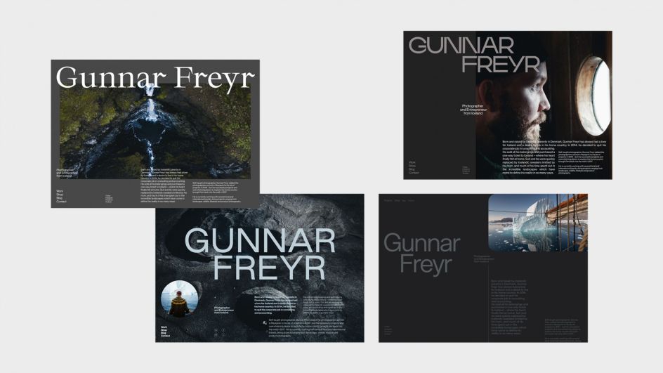
Squarespace product designer Lionel Taurus has created unique and singular works by bringing together the beauty of art with the practicality of design systems. He hopes that by combining the diverse disciplines, users and viewers will be more active when interacting with content.
As part of Squarespace's Concepts team, Lionel's job is to find innovative ways to showcase user content and envision the future of web design and technologies for the platform. Improved user experience is his ultimate goal, and he uses an approach to design thinking that can be traced back to his childhood.
He tells Creative Boom: "As a kid, I was very curious and attentive to design systems and how things were built. I remember breaking apart a lot of toys to understand how they worked from an engineering standpoint and trying to figure out the systems that made them function. My mom was drawn into painting, and one of my sisters was an aspiring Art Director. Needless to say that they both shaped who I am now."
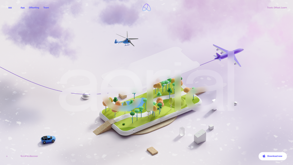
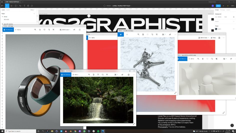
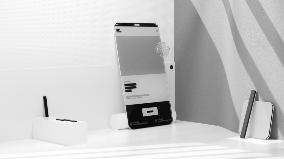
During his recent interaction design projects, Lionel has been adding a lot more illustrations and 3D graphics to his work. To make this merging of disciplines functional, he tries to keep the results as neutral and simple as possible. "It's easy to overuse 3D with graphic design or web design and corrupt the message you're trying to convey," he warns.
"I work a lot with primitive shapes and use natural materials unless the branding is very heavy on specific colours or textures. Even if the subject needs to be cheerful, I usually adopt a realistic approach so people can identify with what's happening."
According to Lionel, his projects use 3D as a lever to explain an idea more deeply. And the result is that the user has more control, plus more room for exploration and discovery. "It creates a more dimensional experience that can generate unique moments."
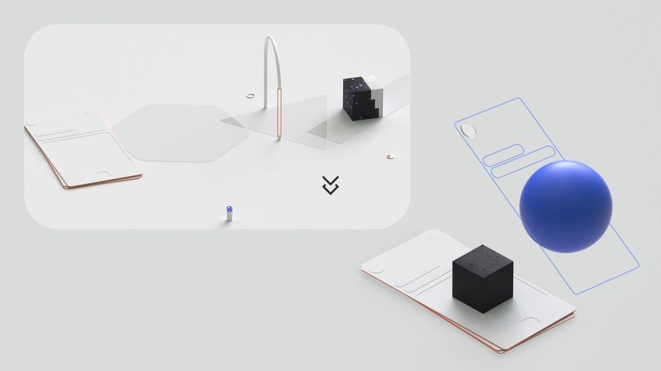
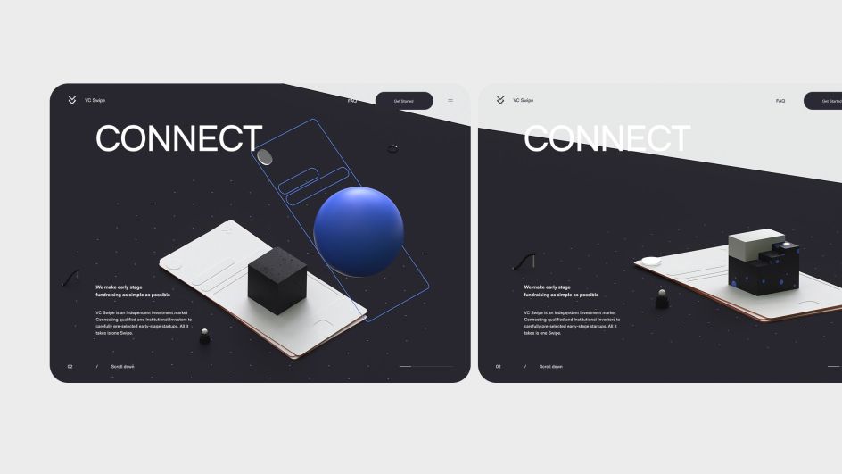
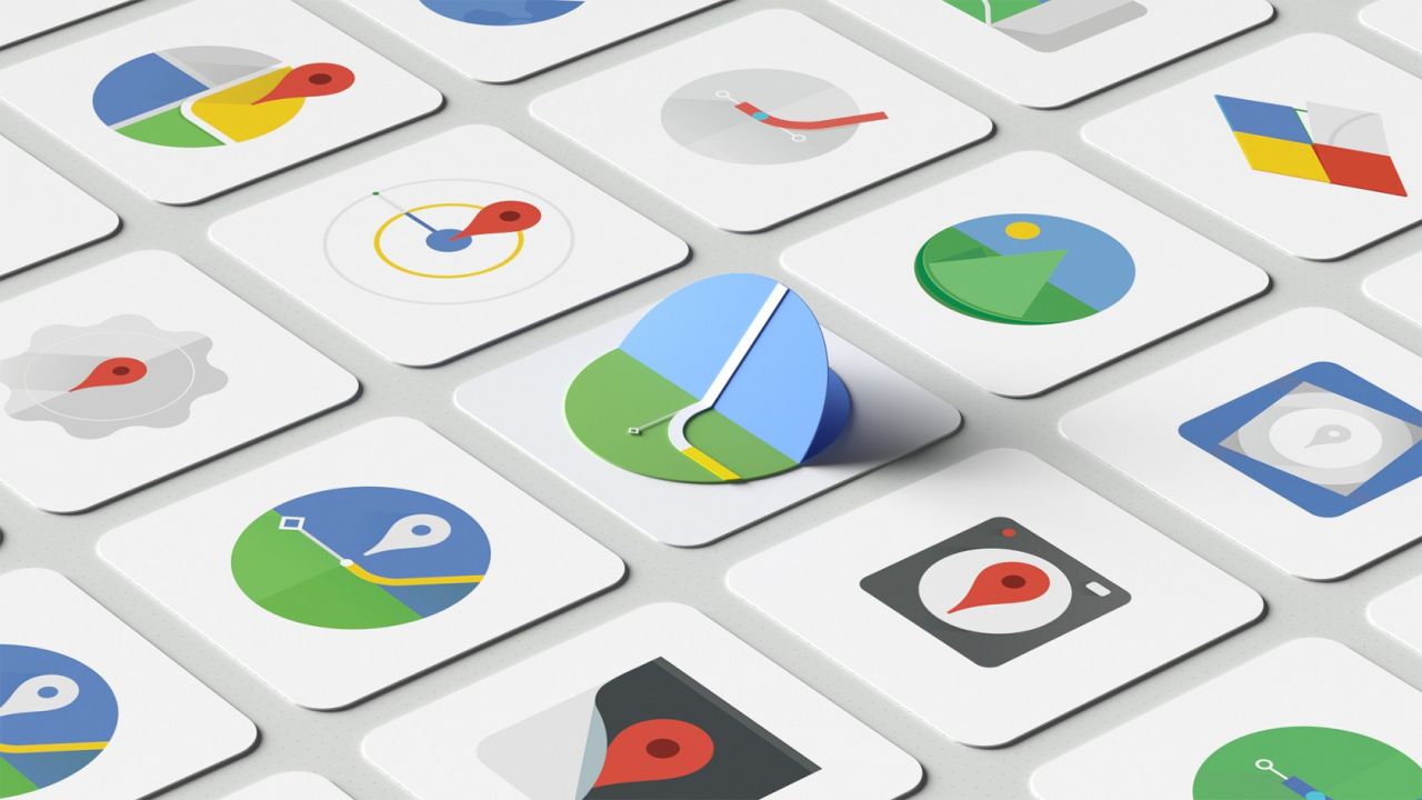
Another part of 3D's appeal was that it changed Lionel's perspective on thinking of space in terms of interfaces and web design. "Design elements don't need to be flat," he explains. "They don't need to move just from left right and up and down. You can simulate so many interactions close to the real world by integrating macro animations using 3D gimmicks. You can see it with the Google material design, for example, which used shadows and elevation to bring more depth to Google interfaces."
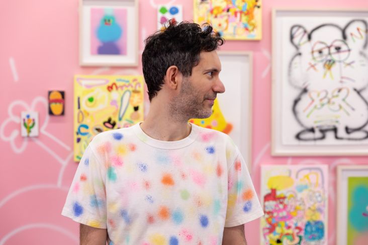
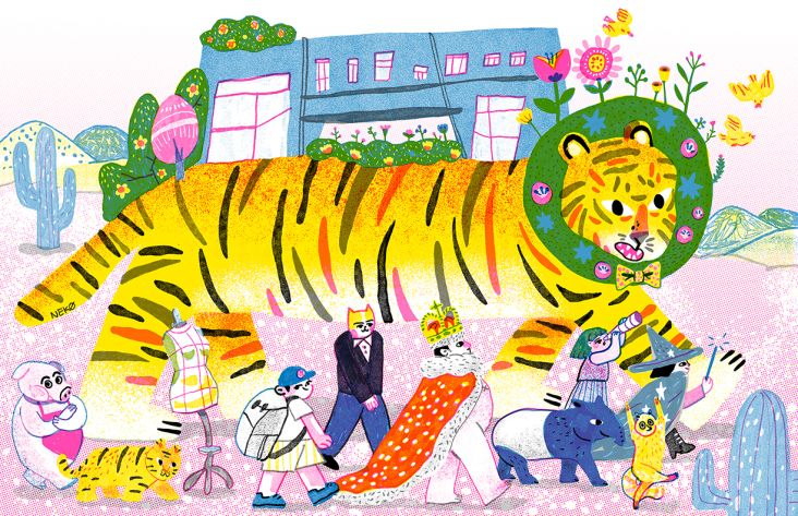
Outside of his professional work, Lionel also makes experimental illustrations. These help him to create his own references that can be used in other projects. "Experimenting in 2D and 3D is the best way to break apart from the design trends," he reveals. "It's the best place to make mistakes, learn, grow artistically and open doors to new ideas."


 by Tüpokompanii](https://www.creativeboom.com/upload/articles/58/58684538770fb5b428dc1882f7a732f153500153_732.jpg)

 using <a href="https://www.ohnotype.co/fonts/obviously" target="_blank">Obviously</a> by Oh No Type Co., Art Director, Brand & Creative—Spotify](https://www.creativeboom.com/upload/articles/6e/6ed31eddc26fa563f213fc76d6993dab9231ffe4_732.jpg)


](https://www.creativeboom.com/upload/articles/21/212b36fa1d576a9ea1aeb322ef0cffd6a5009e61_732.png)


