How Studio Herrström rebranded Elvis Presley for the 21st century
How do you make a 20th-century icon relevant to a modern, young audience? Studio Herrström's work for Sony Music is a model for designers to learn from.
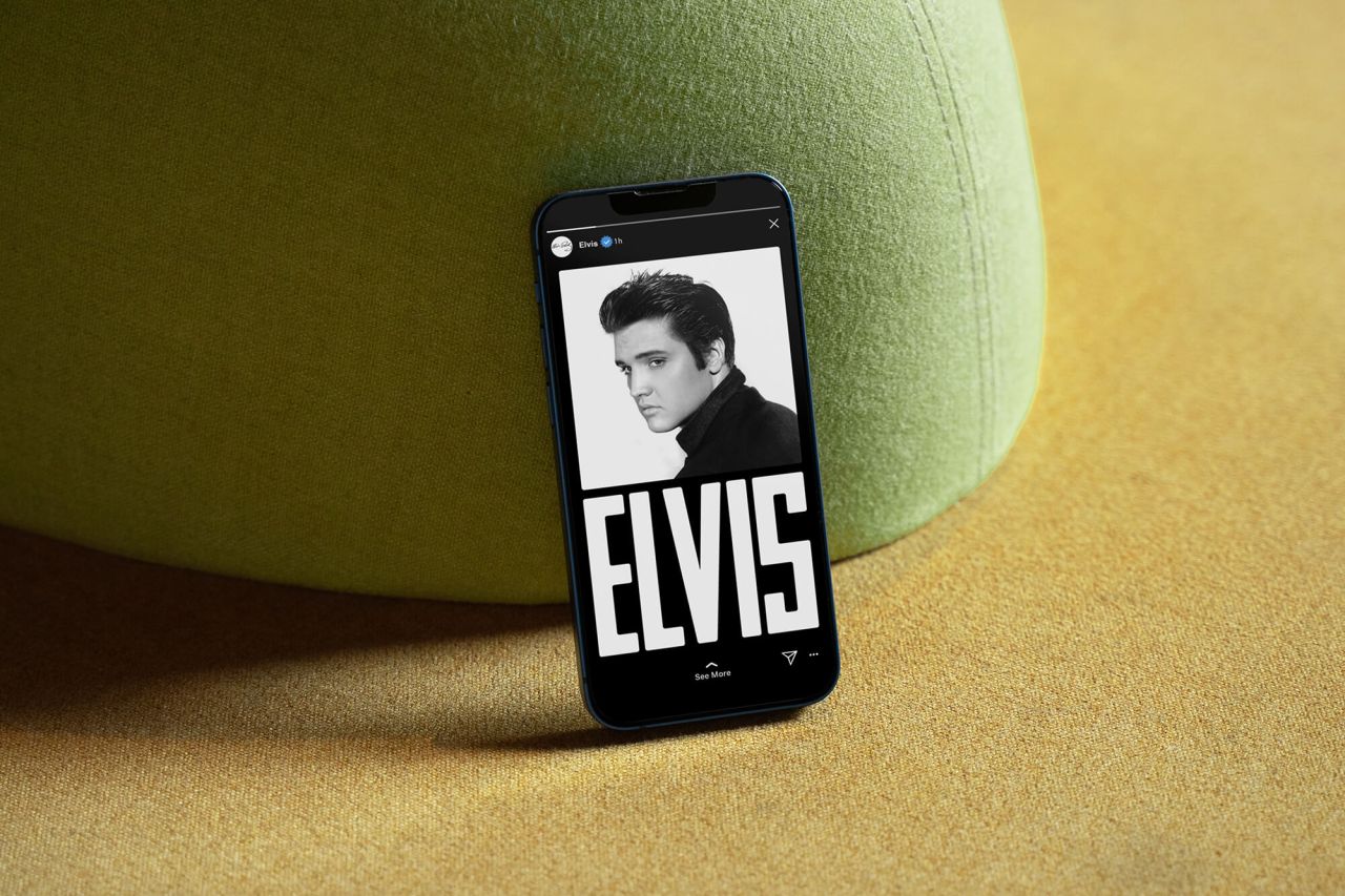
Anyone under the age of 46 wasn't even alive when rock and roll singer Elvis Presley died in 1977. And yet his legacy and iconic status continue to resonate today. Entire books could be written on why, but for our money, it comes down to one thing and one thing only: Elvis was the real deal.
The origins of rock and roll lie in America's black community, bringing together disparate musical forms such as jazz, rhythm and blues, boogie-woogie, gospel and jump blues into an energetic and generation-changing form of music. But for historical reasons, artists of that era remained largely unknown to white communities.
Several white artists bridged the gap, yet most of them were low-quality copies, watering down the raw energy of the original. However, Elvis Presley was the one artist who was never accused of that.
That's partly, of course, because of his enormous talent as a singer and performer. But it's also because he was authentic. Growing up in a poor, mostly black neighbourhood in Tupelo, Mississippi, Elvis had direct experience of poverty. He developed a deep love of gospel music by attending black churches in his youth. (Anyone who doubts any of that only has to listen to his 1969 song In the Ghetto, and all will become clear.)
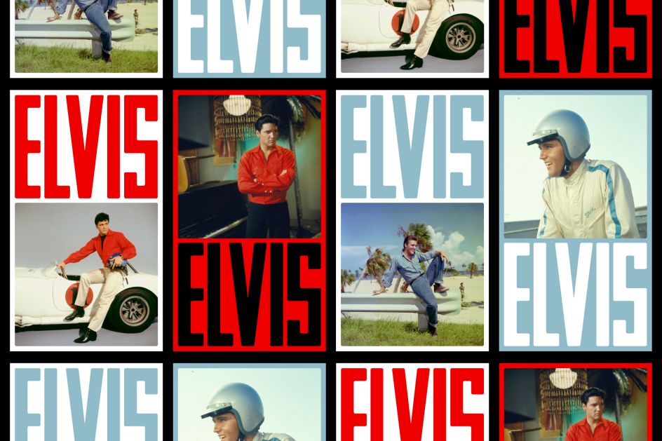
Life reignited
The singer's story was most recently reignited for a new generation in Elvis, a Baz Luhrmann film in which actor Austin Butler brought the singer hauntingly back to life, with Tom Hanks playing his Machiavellian manager, Colonel Tom Parker.
A year-long marketing campaign was built to support the anticipated influx of listeners, new and old, surrounding the film and beyond. Having rebranded Whitney Houston a year prior, Austrian creative agency Studio Herrström was invited by Sony Music to design a new, unified, visual identity for Elvis Presley.
By taking a holistic look at visual expressions in Elvis's discography, stage sets, appearances, jewellery and clothing, the studio – which has also worked with Spotify, Sony Music, Beats by Dre, Native Instruments and Sound.xyz – aimed to create an identity that would emphasise and embrace the characteristics of Elvis.
Unmistakably Elvis
While aiming to appeal to both new and old fans, the visual identity was designed to be unmistakably Elvis, but with opportunities to bring out unexpected expressions to catch the viewers' attention.
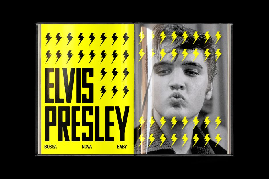
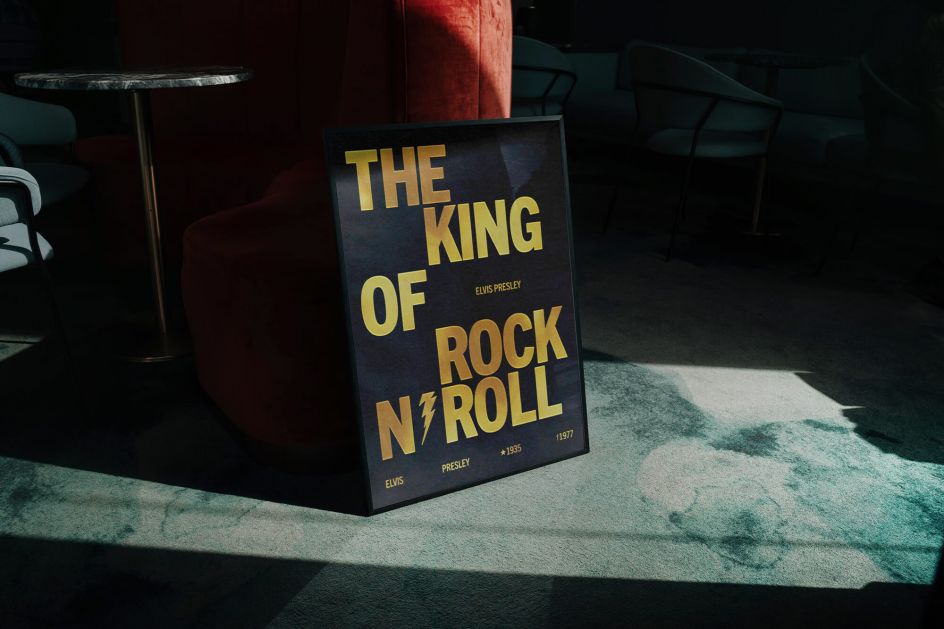
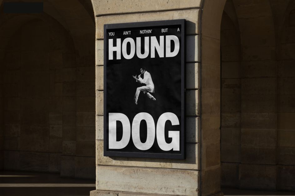
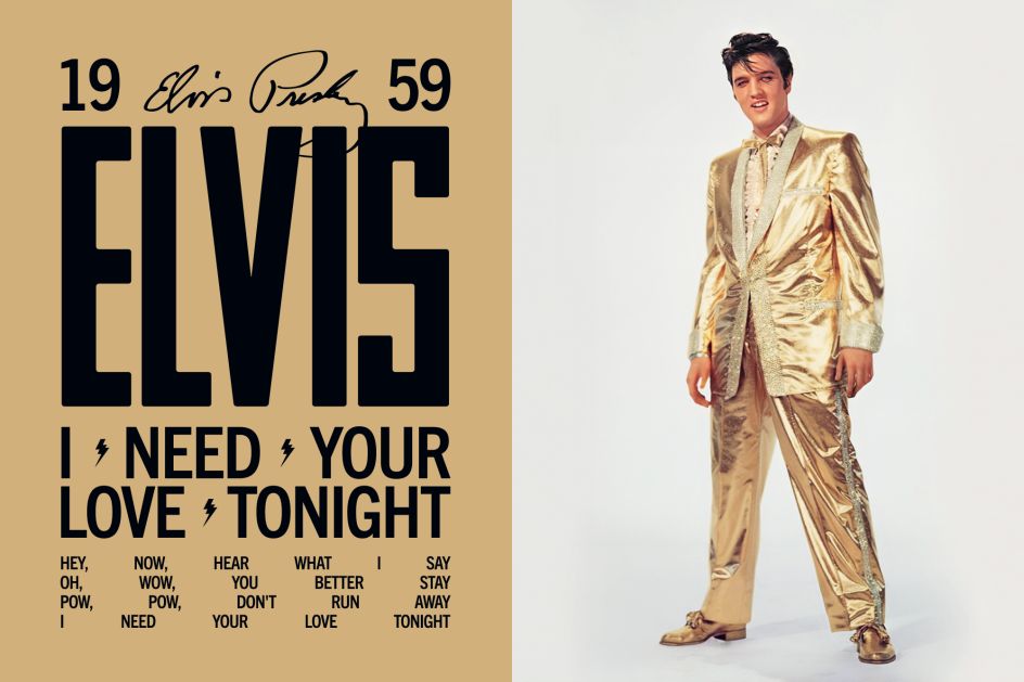
With its expressive yet simple typography, the logotype is inspired by the stage set from Elvis' Comeback Special in 1968. This design is then incorporated into expandable typographic lockups that can grow depending on the content.
The studio was keen to include defined spaces where typography is allowed to fill the room, using a custom headline hierarchy and justified text decorated gently with iconography that ties back to iconic shapes Elvis himself would use. This was inspired by tour posters, trading cards and tickets from the 1950s, '60s and '70s.
Across the channels
This visual identity and new brand guidelines inform the design language across Elvis' website, as well as his social media and streaming channels including YouTube, Spotify and Instagram. Other content ranges from animated videos about Elvis's life, tracks, and relevance today to playlist covers and campaigns. One of these videos, The Story Behind Elvis, was awarded at the Webby Awards as a People's Voice Winner.
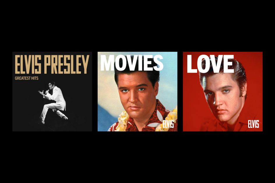
"Given the magnitude of Elvis as an artist, it was a unique and honourable project to play a part in," the team recalls. "We were asked to create an identity that would embrace the characteristics of Elvis and included everything in our research, from his stage appearance and dance moves to discography, jewellery, stage sets, and outfits.
"This led us to create a design system inspired by his era but works in the digital age, including expandable typography lockups, new iconography, and colour schemes that adapt to the imagery."


 by Tüpokompanii](https://www.creativeboom.com/upload/articles/58/58684538770fb5b428dc1882f7a732f153500153_732.jpg)


 using <a href="https://www.ohnotype.co/fonts/obviously" target="_blank">Obviously</a> by Oh No Type Co., Art Director, Brand & Creative—Spotify](https://www.creativeboom.com/upload/articles/6e/6ed31eddc26fa563f213fc76d6993dab9231ffe4_732.jpg)


