How The Unlimited Dream Company gave King Krule's 2023 tour a unique visual look
A one-of-a-kind artist demanded a visual look for his shows that was out of the ordinary. The Unlimited Dream Company explain how they delivered it.
All photography by Alex Brown and Reuben Bastienne Lewis
Here at Creative Boom, we try not to overuse the word 'unique'. It's a word thrown about in the creative industry with abandon but can rarely be justified as anything other than hyperbole. But early this month at the Eventim Apollo in Hammersmith, London, I went to a gig that really did look like nothing I've ever seen before.
I'd come to see King Krule, the nom-de-plume of cult singer-songwriter Archy Marshall, and if you're not familiar with his act, it takes a little explaining. The 29-year-old appears on stage with a conventional-looking band, but that's where any convention starts and ends.
His music is epic, melancholy, meandering, discordant, and often droney, and ranges in style from punk to jazz to ambient and beyond, often within a single track. Overall, there's a palpable sense of 'anything could happen'. For example, most bands tune up between songs; King Krule's been known to purposely de-tune. It's that kind of gig.
And it's not just music where King Krule applies this genre-defying, rule-breaking approach. The moment the gig starts, it's evident the look of the thing will be quite different to what you'd expect from a normal show.
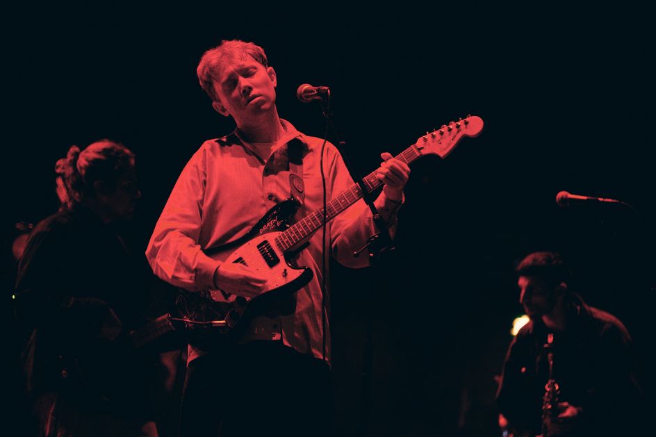


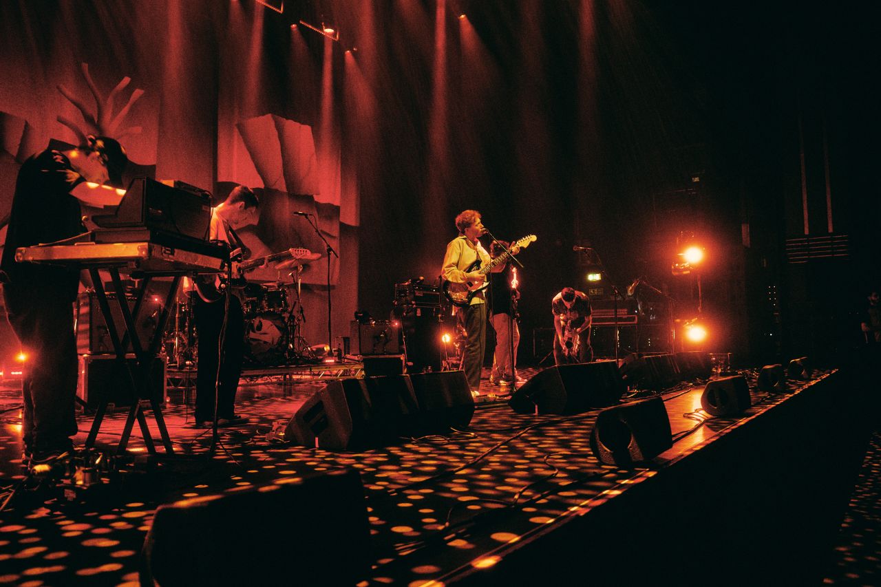
As you can see from the pictures here, the standard relationship between star and lighting has been turned on its head. Rather than putting a spotlight on King Krule, he and his band spend most of the time in murky darkness. And where swirls and flashes of colourful lights do spill up, it's more to obscure what's going on with the musicians than to illuminate them. The whole effect was more like being in a smoke-filled 1930s jazz club than a modern arena in 2023.
I was intrigued to learn the thinking behind this approach. So I chatted with George Thomson and Harrison Smith, the creative director duo behind The Unlimited Dream Company (UDC), about how they put the visual look of the show together.
Hip-hop to punk-jazz
"This was our first tour with King Krule, but we'd worked with his manager Theo [Lalic] before, for [the Nigerian artist] Obongjayar," recalls Harrison. "And then, through that, Theo asked him to take a look at King Krule. Since starting UDC in 2021, we've been working with many UK rappers, such as Loyle Carner, Slow Thai, Skepta and Pa Salieu, but we worried we'd get typecast. So, we were looking to partner with someone completely different. Plus, we generally only work with artists whose music resonates with us and the artist has a singular vision. So King Krule was perfect."
So what was the brief, and how did they approach it? "King Krule intentionally feels like his music is very intimate and personal," Harrison responds. "It's very much about the relationship between him and the audience. And in bigger spaces, that relationship might potentially not work as well. So our whole objective for the show was to create something intimate and moody."
He acknowledges that this flies in the face of gig convention. "Normally, the default is to light up the artist, so they stand out as this figurehead," he notes. "But for King Krule, he wants the music to stand front and centre; that's his main objective. So we needed to create an intimate space where he felt comfortable doing his performance, where he felt like his music would relate to the audience."
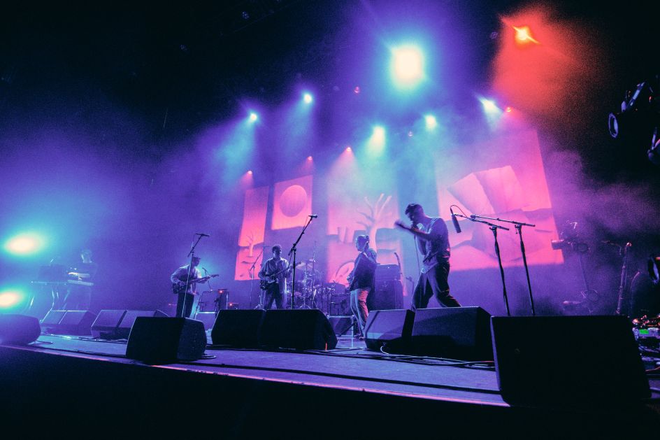

More specifically, King Krule wanted to represent the artwork for his album on stage, which was achieved with striking printed drapes. "Our idea was to break that apart into layers, like the layering within his music," says Harrison.
"But then also the album was loosely about the contemplation of spaces in between things," he adds. "King Krule wrote much of it on journeys between Liverpool and London. And with my architecture background, I've always been interested in the borders and boundaries where things meet and the gaps between things. The liminal spaces where exciting things happen and not being polarised on two edges. So it was trying to create that sense within a small stage space."
Dieter Ram influence
While bright lights were to be avoided, UDC realised they'd need some kind of lighting. (They did actually consider having a show in complete darkness, but ultimately figured that would make the illuminated fire exits the focus instead.) George takes up the story.
"We had these towered lights in the corners of the stage," he explains. "These allowed us to create a more intimate, isolated space for him to operate in while creating energy and dynamism down on the stage rather than everything being led from the roof." And these weren't just light sources but part of the staging in their own right. "A bugbear of ours is that many stage lights just aren't beautiful objects," he explains. They're quite clunky and ugly things. So we designed these to look like beautiful objects; more like a Dieter Ram-inflected, retrofuturistic Modernist lamp than a normal stage light."
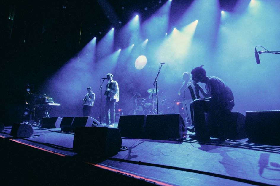


And there was one more layer to the staging, Harrison explains – namely, the area between the singer and the audience. "We always try, when we design, to include the audience as part of the set," he explains. "A lot of gigs these days feel like everyone is just looking at a giant TV screen. So we aim to create this intimate, medium ground, and then there's the background, and everything falls into darkness. That allows us to section things out, use lights to pick out elements within the set, and just play with the space in a way that works with the music."
Murky interest
As a result, this was the darkest, murkiest-looking gig I've ever been to. But while that might sound drab, depressing and monotonous, it was actually the opposite. By focusing the audience's eyes on darkness so much, the brief bursts of light, colour and movement became entrancing and kept the visual interest up throughout the performance.
Smoke effects were an important part of the overall effect. "There is a general level of haze to maintain that void," says Harrison. "It was important to us to create an atmosphere and a mood, rather than be like, 'Look at these lights that are doing these things'. Yes, you have to have some energy and lights to look at. But with this lyrical, spoken word story being told on stage, we were more interested in creating something hazy, moody, and bathed in light."
In short, the challenge was to find different and interesting ways to diffuse light. "It's something everyone does in film," George points out. "But with many stage lights, you just have a raw light source, which is the opposite of King Krule's world. So we used haze to diffuse the light, soften everything and create that atmosphere, rather than seeing the structure in the lighthead of the fixture.
"And then we looked at creating big washes of light, so King Krule becomes a silhouette amongst it all. You still get the activity and movement of his performance without necessarily seeing a clear image. So again, like in film, light becomes the most important storytelling device; shrinking down the stage and opening up and resetting tension."


 by Tüpokompanii](https://www.creativeboom.com/upload/articles/58/58684538770fb5b428dc1882f7a732f153500153_732.jpg)

 using <a href="https://www.ohnotype.co/fonts/obviously" target="_blank">Obviously</a> by Oh No Type Co., Art Director, Brand & Creative—Spotify](https://www.creativeboom.com/upload/articles/6e/6ed31eddc26fa563f213fc76d6993dab9231ffe4_732.jpg)


