She Was Only's new identity and website for Amalia Boier celebrates her 'poetic spirit'
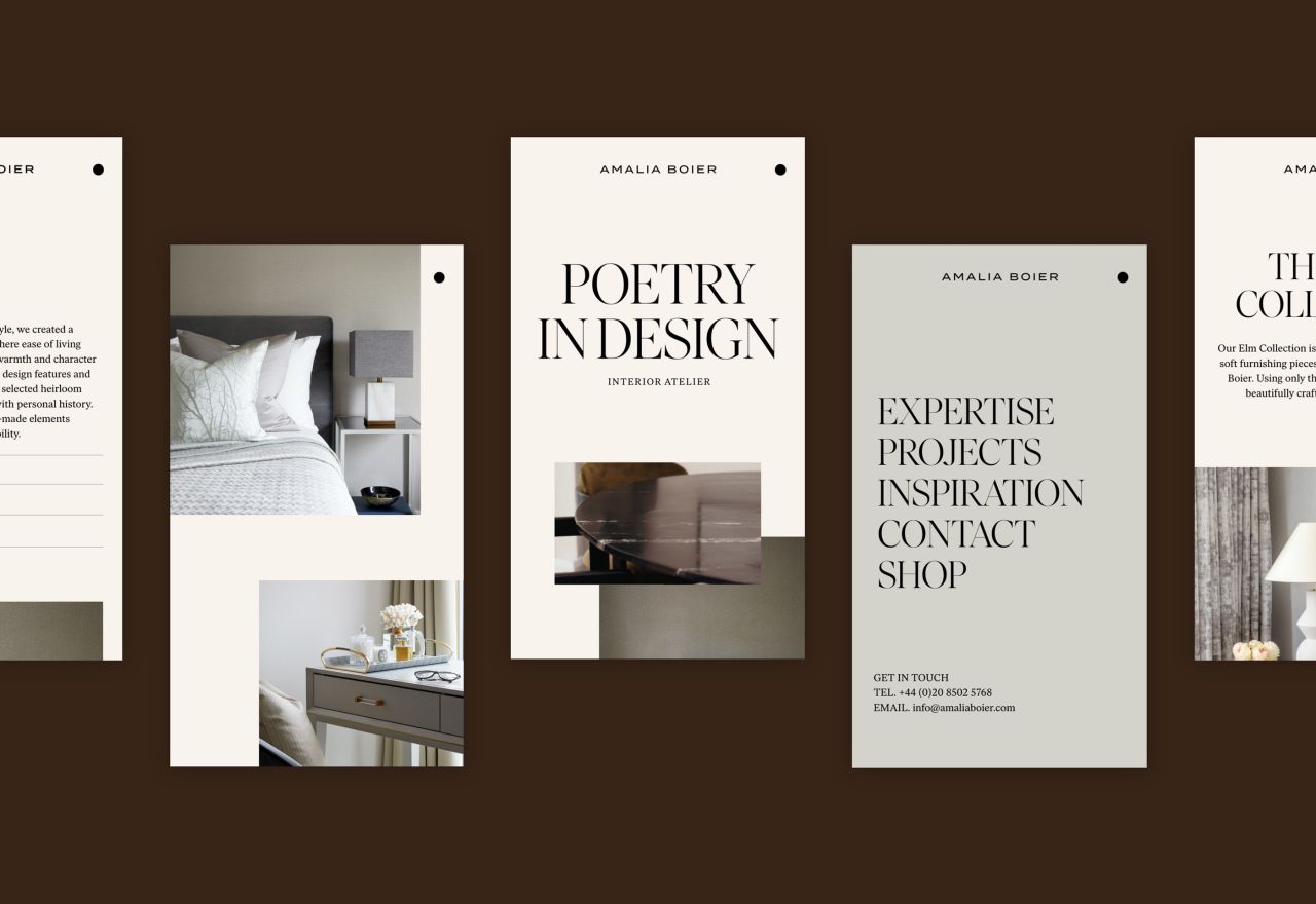
London studio She Was Only has unveiled its new identity and online presence for interior designer, Amalia Boier. The design focuses on her "poetic spirit", using earthy and calming tones and sophisticated typography, reflecting her distinctive timeless style.
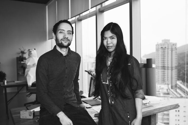
Amalia Boier approached Chris Vickers and Craig Scott earlier this year to overhaul her brand's identity and refresh her website. After working in the industry for many years and amassing a wealth of experience, she felt she needed something more reflective of where she now sits in the industry. "Our strategy emphasised Amalia's poetic spirit," explains Craig, "the compelling need to experience the world and then express it in unique and captivating ways. Her artistic approach allows her to tell stories through distinctive, exquisite interiors."
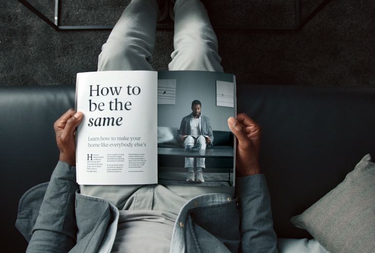
As such, the visual identity features classic and sophisticated book typography along with a gentle colour palette that complements Amalia's rich interiors. The chosen typeface was Ivar by Letters from Sweden. "It has that elegance we were looking for and comes in three optical sizes which allowed us to go large and impactful with the type whilst still working at small sizes," says Craig. While the colours were designed to be "as soft as possible".
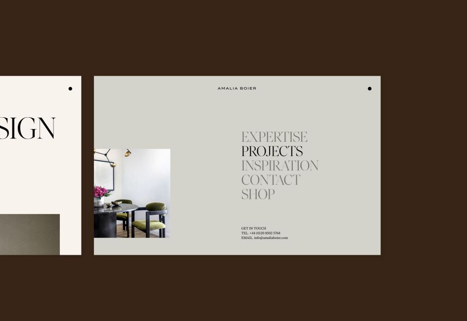
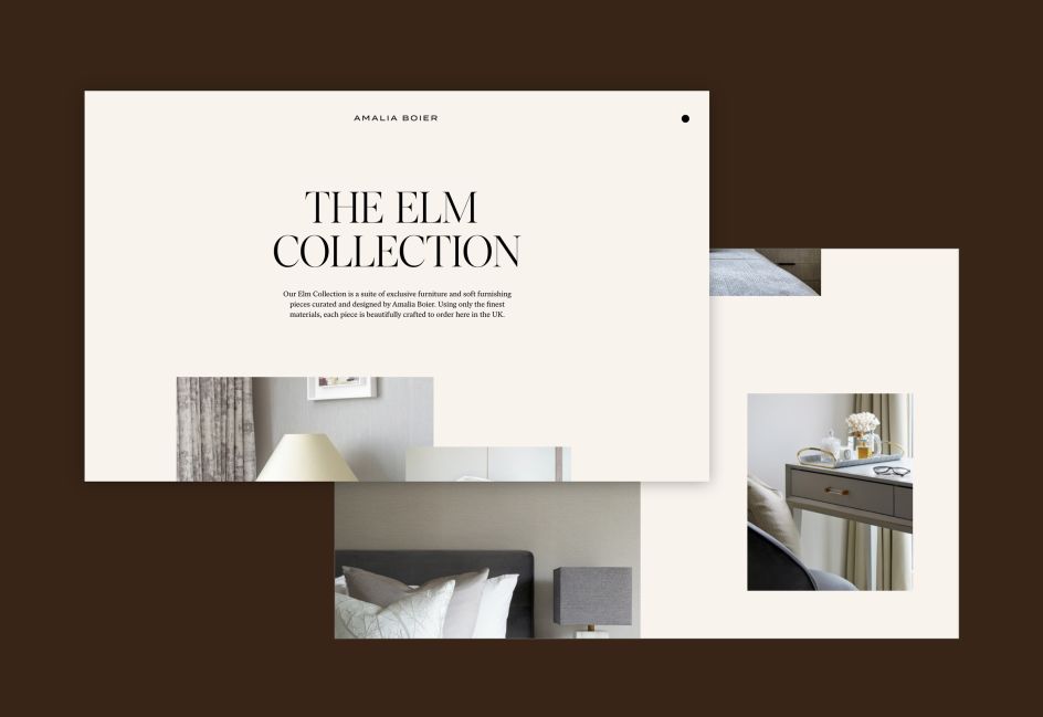
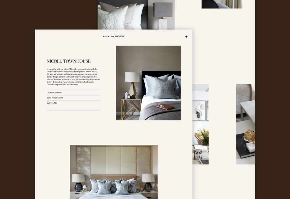
To bring the identity to life, She Was Only created an elegant, "free-flowing" website that showcases the interior designer's latest projects. Impactful imagery is offset with refined typography, hand-written scribbles and smooth transitions. The London firm also commissioned Pavillion Works to create a short film that explained Amalia's unique approach to interior design. Interior photography by Ben Sage and Anna Stathaki.


 by Tüpokompanii](https://www.creativeboom.com/upload/articles/58/58684538770fb5b428dc1882f7a732f153500153_732.jpg)

 using <a href="https://www.ohnotype.co/fonts/obviously" target="_blank">Obviously</a> by Oh No Type Co., Art Director, Brand & Creative—Spotify](https://www.creativeboom.com/upload/articles/6e/6ed31eddc26fa563f213fc76d6993dab9231ffe4_732.jpg)


