IKEA opens up to The Fönster, a new dynamic logo system created by 72andSunny
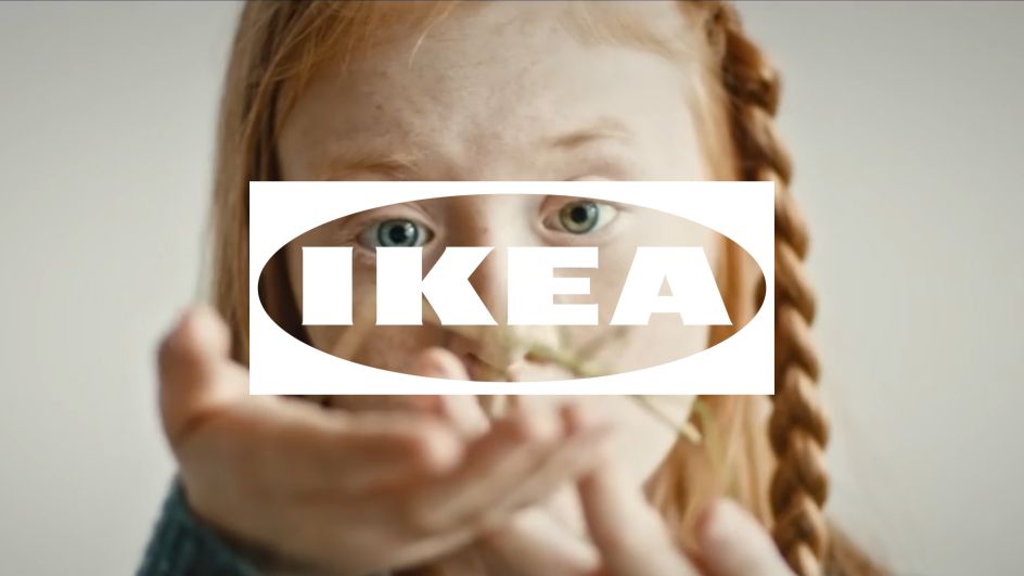
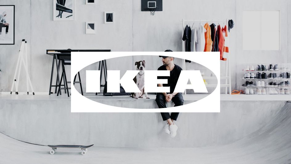
If you're wondering what 'The Fönster' might be, it's certainly not a new piece of furniture courtesy of IKEA. In actual fact, it's the name for the Swedish furniture brand's new dynamic logo system, designed by 72andSunny Amsterdam.
With a mission to "reinforce and integrate the brand into modern touchpoints", this is meant to be one flexible solution. Translating as "window", Fönster is designed to "reflect the point at which IKEA connects with the world, and the world connects back with IKEA."
The transparency aims to reflect core IKEA values of openness, curiosity and optimism that have been central to the brand as it strives to create a better everyday life for the many people.
"We have created a future proof version of the iconic IKEA logo," says Carlo Cavallone, executive creative director and partner at 72andSunny Amsterdam. "It has been optimised both in form and function, and is now more relevant and effective for the future touch points of the IKEA Brand because it will open up a deeper, and far more emotional connection, between IKEA and a wide audience of people."
The Fönster complements the existing and iconic IKEA blue and yellow logo (also optimised as part of the recent process). It will be used to tag and brand IKEA content that isn’t consumed in traditional channels by highlighting specific details, providing different perspectives and complementing work created with an increasing array of partners and collaborators.


 by Tüpokompanii](https://www.creativeboom.com/upload/articles/58/58684538770fb5b428dc1882f7a732f153500153_732.jpg)


 using <a href="https://www.ohnotype.co/fonts/obviously" target="_blank">Obviously</a> by Oh No Type Co., Art Director, Brand & Creative—Spotify](https://www.creativeboom.com/upload/articles/6e/6ed31eddc26fa563f213fc76d6993dab9231ffe4_732.jpg)


