Inspiring yet credible: Accept & Proceed's identity for groundbreaking AI exercise bike
The Carol Bike 2.0 aims to change exercise bikes forever. Accept & Proceed explain how they conveyed that message through the brand's new visual identity.

There are two problems with getting fit in today's world. First, there's never enough time. And second, everyone's body is different, so exercises that work for some can be less effective or even damaging to others.
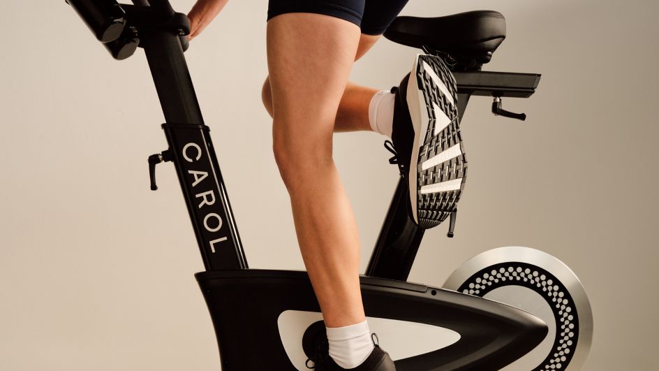
These are problems fitness startup Carol aims to address with the release of the CAROL Bike 2.0. Described as the world's first AI-powered exercise bike, it offers very short, intensive workouts that are tailor-made for you.
To create branding for the bike and the AI tech underlining it, the makers turned to Accept & Proceed, a design and strategy consultancy based in east London.

Accept & Proceed has previously worked on brands with similar science-driven values, including communications assets for intelligent bike safety features (Cannondale), data-led rider edition apparel (Rapha), graphic systems for advanced apparel engineering (Nike FIT ADV), and experimental visualisations based on athlete research (NXT).
The brief was to create an ever-optimising brand identity and system that would appeal to time-poor fitness enthusiasts and health-conscious athletes. Accept & Proceed developed the brand's strategy, tone of voice, visual identity, flexible infographic system and photography.
Accept & Proceed worked with the Carol team from strategy to brand roll-out, with the guiding principles that the new design would be rooted in scientific rigour, directness and the needs of riders.
At the centre of the identity lies the logo. Three circular nodes are arranged as an abstract 'C' and aligned to resemble a rider engaged in a full sprint. These are paired with a custom-drawn, sans-serif typeface containing two distinctly rounded characters that allude to wheels.
Together, the logo neatly combines the mechanical with the organic to give the brand a feeling of dynamism and innovation.
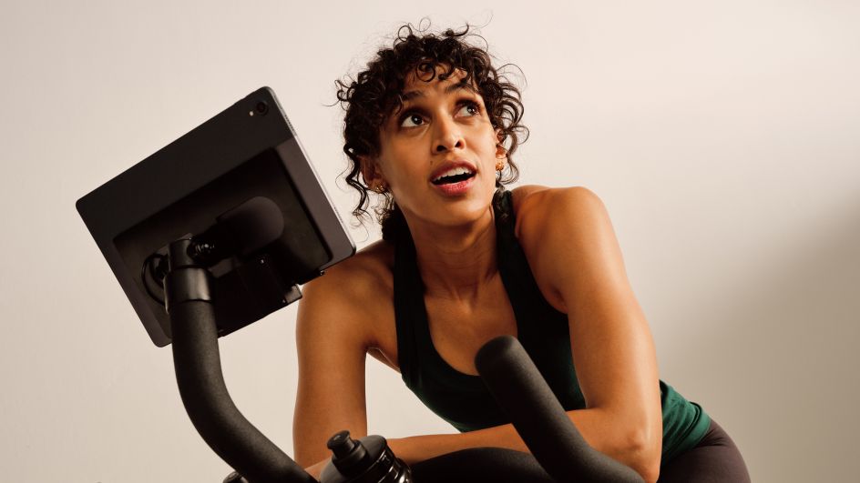
Carol's workouts use the science of REHIIT (reduced exertion high-intensity interval training) to give you the cardiovascular benefits of a 45-minute run in a workout lasting only eight minutes and 40 seconds. To demonstrate this, Accept & Proceed led the end-to-end art direction for the brand photoshoot, casting a diverse range of riders and capturing every movement and emotion in dynamic compositions, highlighting the bike's features in product-centric shots.
"On paper, the Carol workout seems like a too-good-to-be-true proposition," recalls Fred Ross, design director at Accept & Proceed. "However, working with the team, it quickly became clear that their product, passion and rigorous research were very real.
"Our identity, therefore, looked to balance scientific credibility with a straightforward approach. The unique workout also became a key source of inspiration, informing our motion behaviours, colour palette and the full range of emotion – and exhaustion – we captured in our art direction."
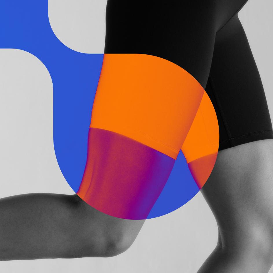
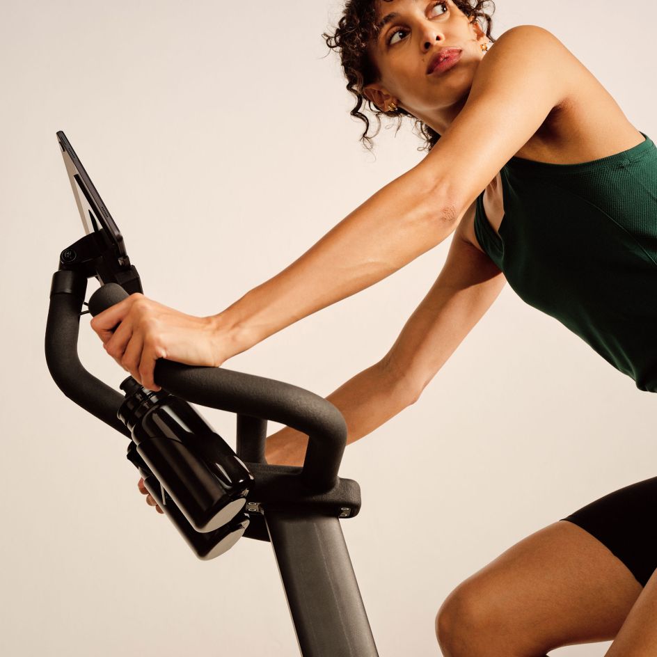
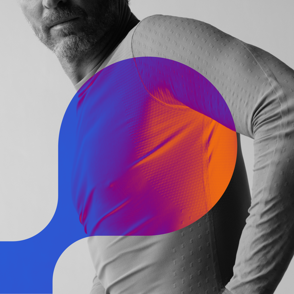
Accept & Proceed's rebrand, including the new typeface, photography and graphic devices, alongside a colour scheme inspired by the stages of a signature Carol workout, is currently being rolled out across Carol's website and other assets,
The hero colour is Sprint, which is used as a signifier on core applications, while the secondary palette follows the REHIIT workout: Warm-up, Recover, Cool Down and Rest.
Accept & Proceed's graphic elements are also transferable to AROL's social media, with flexible applications to suit product features, health benefits, key messaging, testimonials and more.
"Partnering with Accept & Proceed was the best decision we could have made," says Ulrich Dempfle, CEO and co-founder at Carol Bike. "We found a creative partner who believed in our mission and product—and wanted us to succeed. Their thoughtful approach, hard work and artful execution have paid off."


 by Tüpokompanii](https://www.creativeboom.com/upload/articles/58/58684538770fb5b428dc1882f7a732f153500153_732.jpg)

 using <a href="https://www.ohnotype.co/fonts/obviously" target="_blank">Obviously</a> by Oh No Type Co., Art Director, Brand & Creative—Spotify](https://www.creativeboom.com/upload/articles/6e/6ed31eddc26fa563f213fc76d6993dab9231ffe4_732.jpg)


