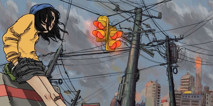
Julie Alex's slanted still-life illustrations are a love letter to her many passions
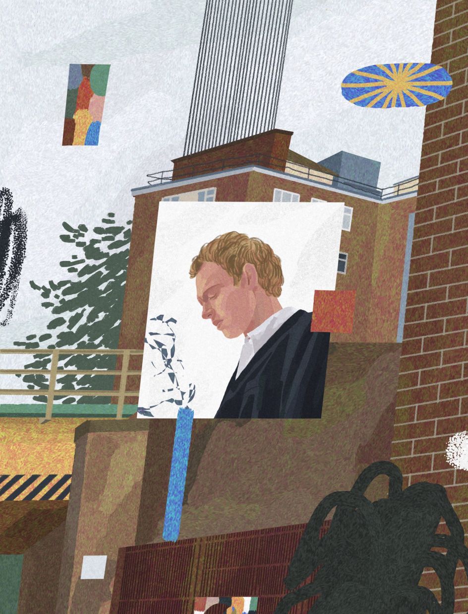
Illustrator Julie Alex creates unique portraits, still-life artworks and landscapes that are instantly recognisable thanks to her use of colour and one-of-a-kind slanted style. We caught up with her to learn more about her work.
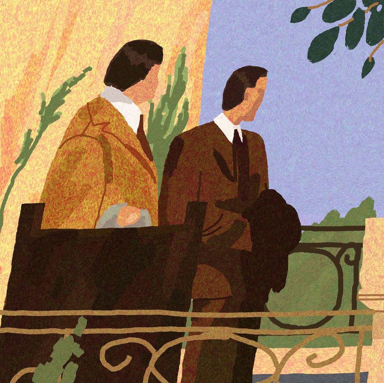
Drawing appears to be something of a family affair for Julie Alex. Like most artists, it's a craft she began practising in childhood when she would spend her time sketching alongside her sister. And it was her sibling's influence that helped her to embark on her own artistic journey.
"She's why I didn't quit it during my university years," says Julie, who only attended art school for a couple of weeks before going to university to study to become a history teacher. "She showed me it's possible to turn your hobby into a career.
"I became a freelance illustrator because this is what I've always wanted. It wasn't easy, though."
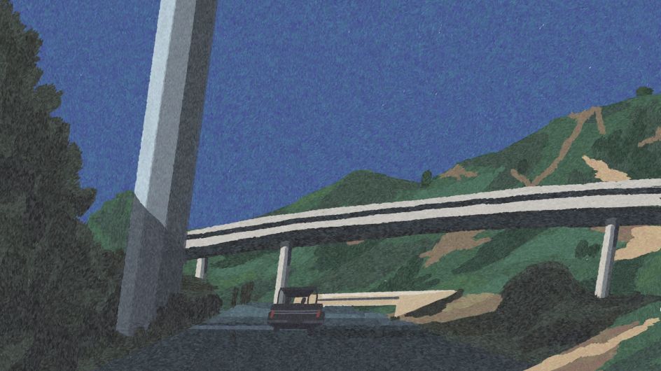
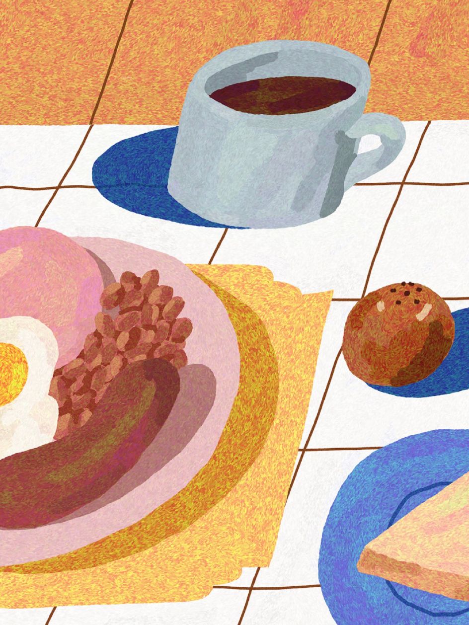
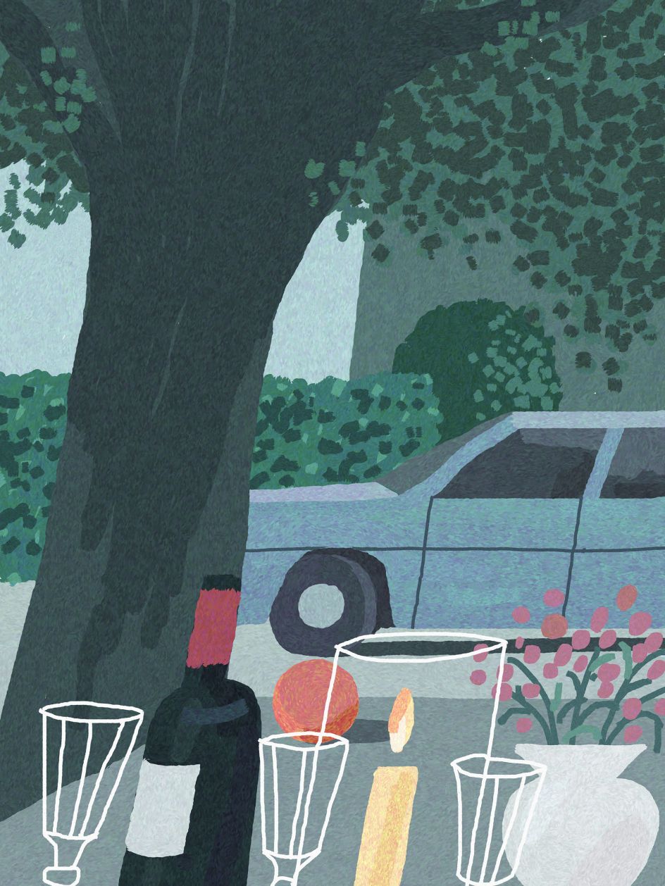
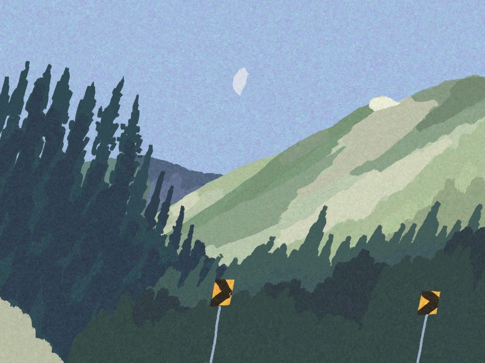
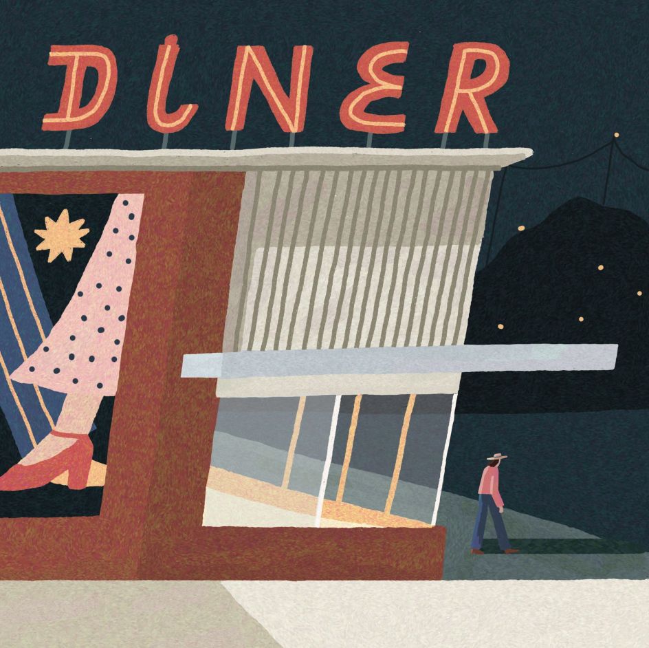
Nature in all its forms features prominently in Julie's work, whether that's flowers in a tabletop still life, the landscape looming around a motorway, or a starry sky framing a diner. This focus comes as something of a surprise to Julie, though, and she has David Hockney to thank for it. "I used to think nature was so boring to draw, but he proved me wrong."
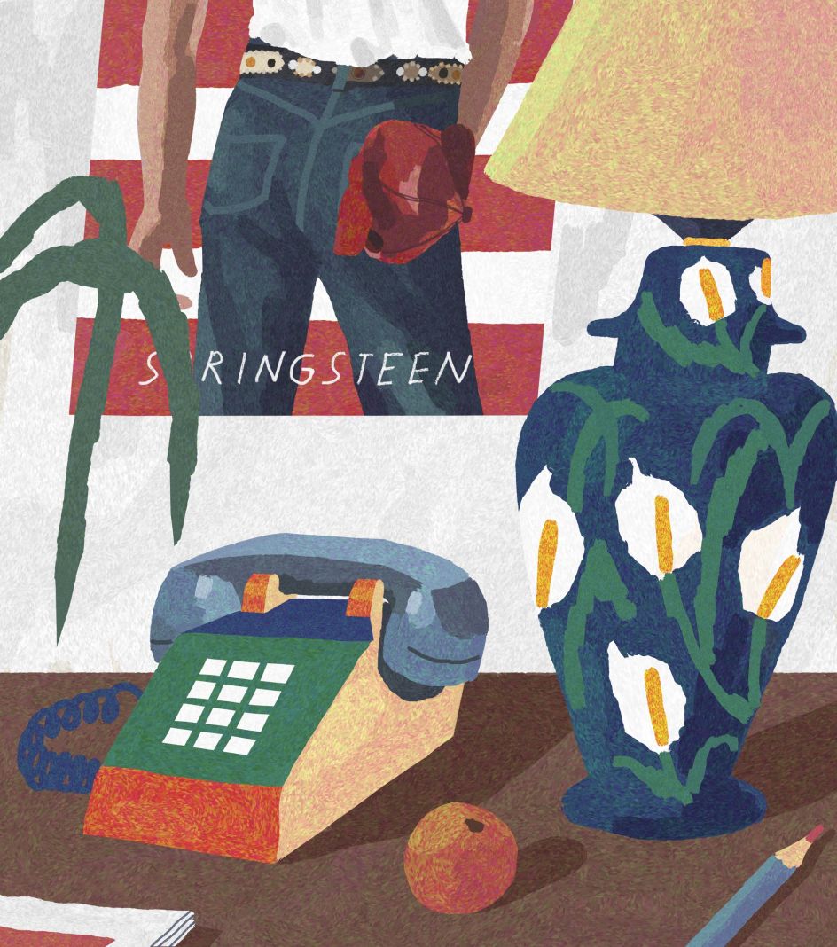
Elsewhere, Julie draws her inspiration from music. In particular, Gerard Way, the frontman of My Chemical Romance, who sidelines as an illustrator when he isn't singing. "I still have a folder with portraits of My Chemical Romance members," Julie reveals.
This passion for music led to Julie creating illustrations for alternative music and visual arts publication So Young Magazine, a personal highlight in her career so far as it was such a formative influence. "I like that there's something rough and honest about So Young illustrations and the music they write about," she adds.
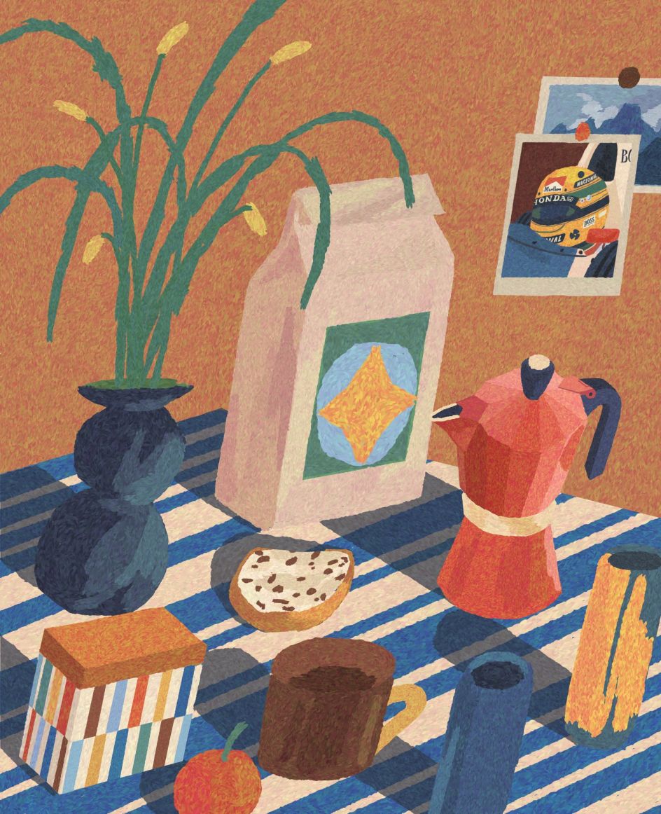
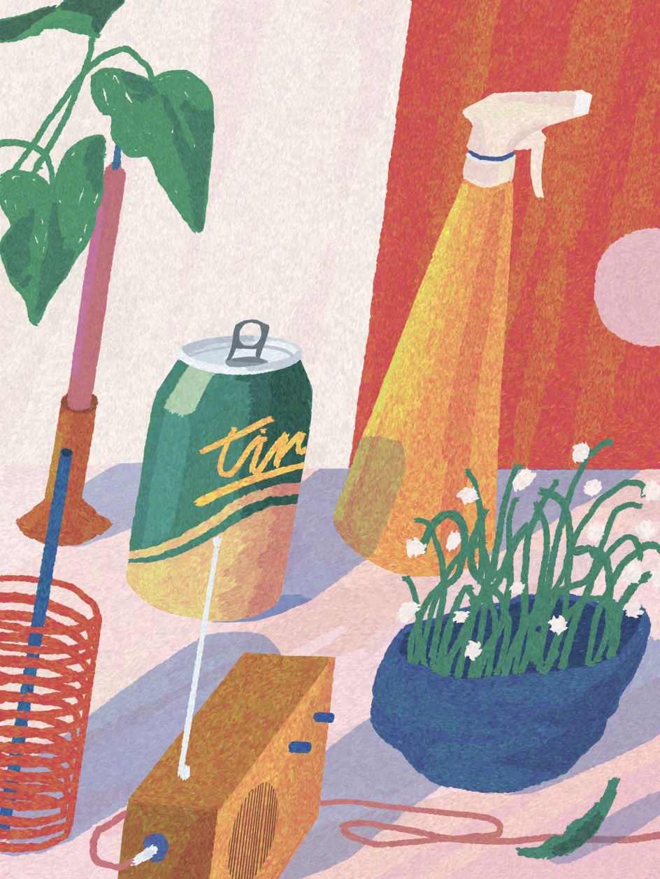
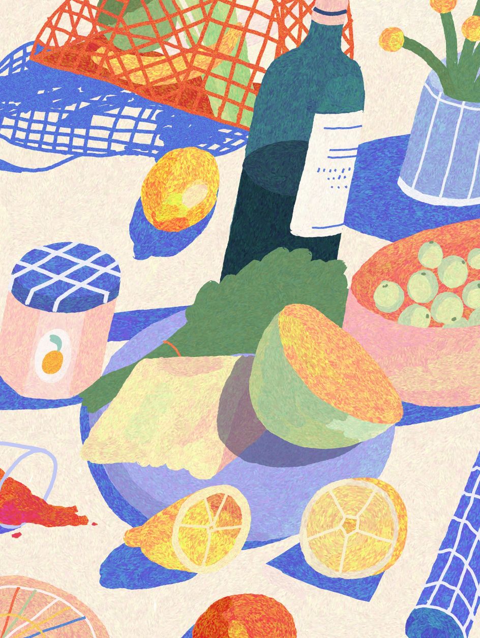
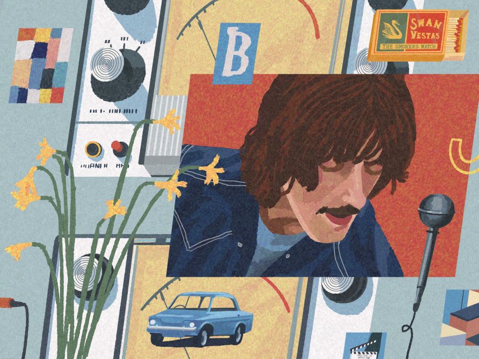
Perhaps the most instantly recognisable characteristic of Julie's work is how it appears to lean. Everything from the people to the buildings and the still-life studies has a particular slant to them, giving her pictures a sense of dynamism as they seem to slope off the page.
But what makes this quirk so endearing is how genuine it appears. There's no contrivance to this creative approach, and the technique does not overshadow or detract from what she's drawing. This is likely because it's based on practicality. "It's just what's comfortable to me," Julie reveals. "My handwriting is slanted to the right, so drawing the same way feels natural."
Reflecting on her art and how her style has evolved in this direction, Julie says that it's "more me now" than ever before. "One day, I found myself looking for inspiration in my old illustrations, which was a bit odd," she adds, although she isn't confined to the style she's developed for herself. "I think my art will always continue to change because I like trying new things."
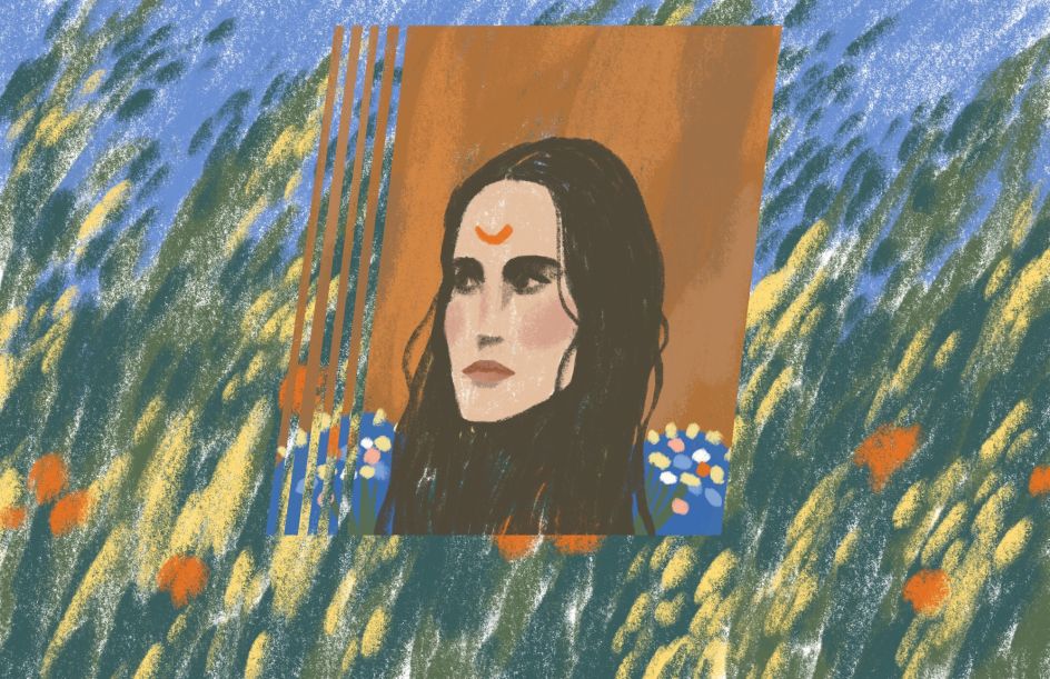
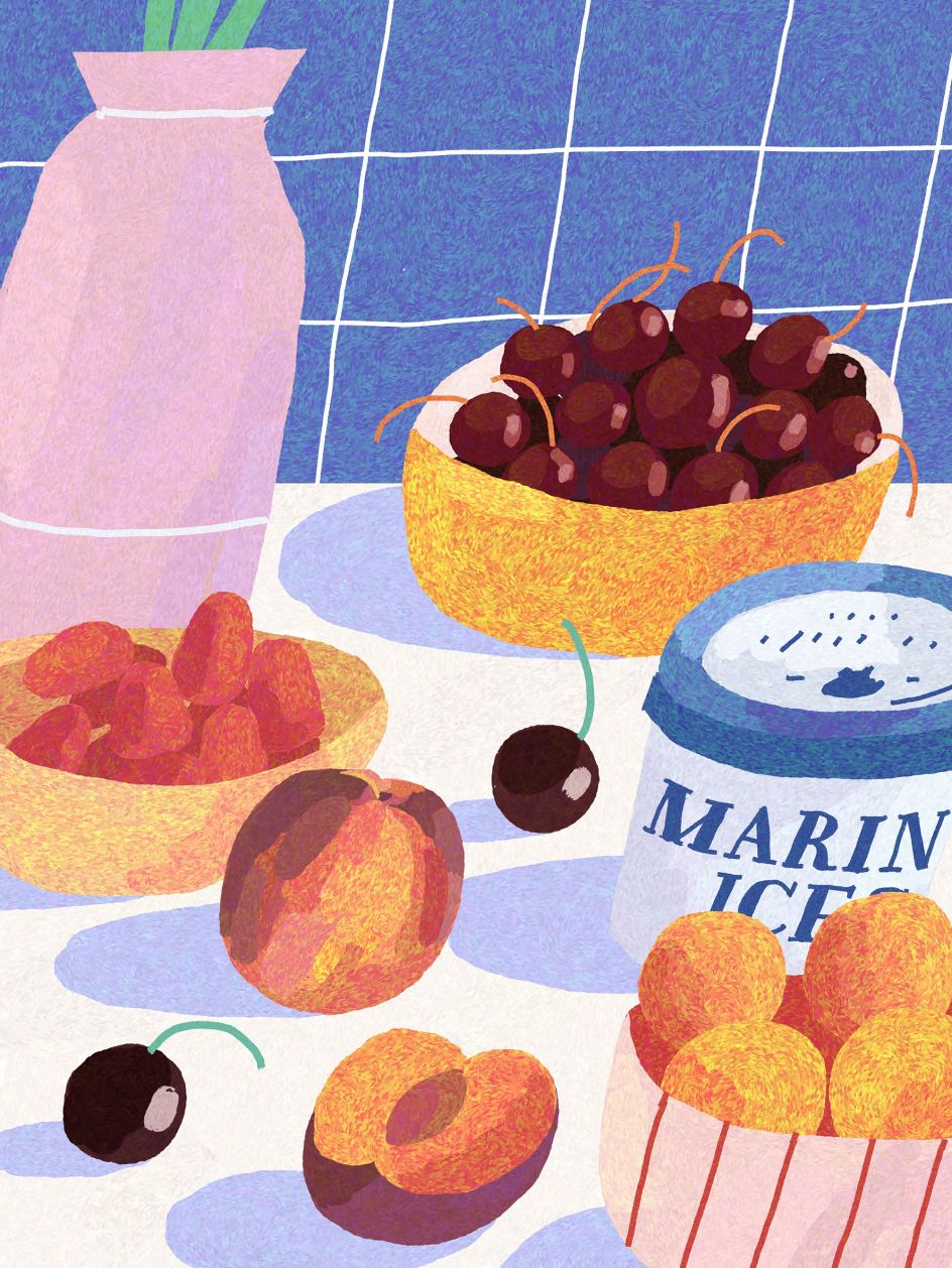
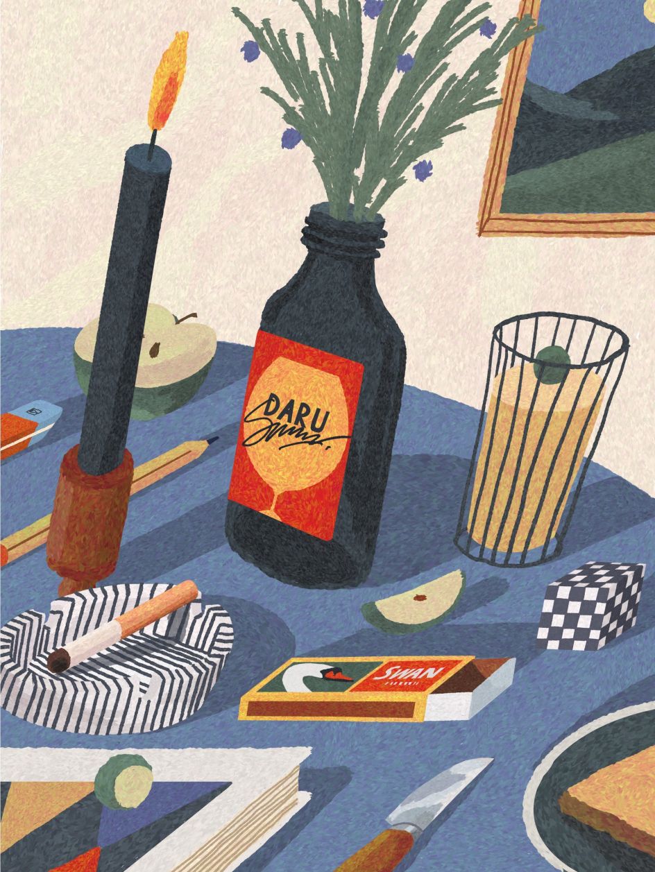
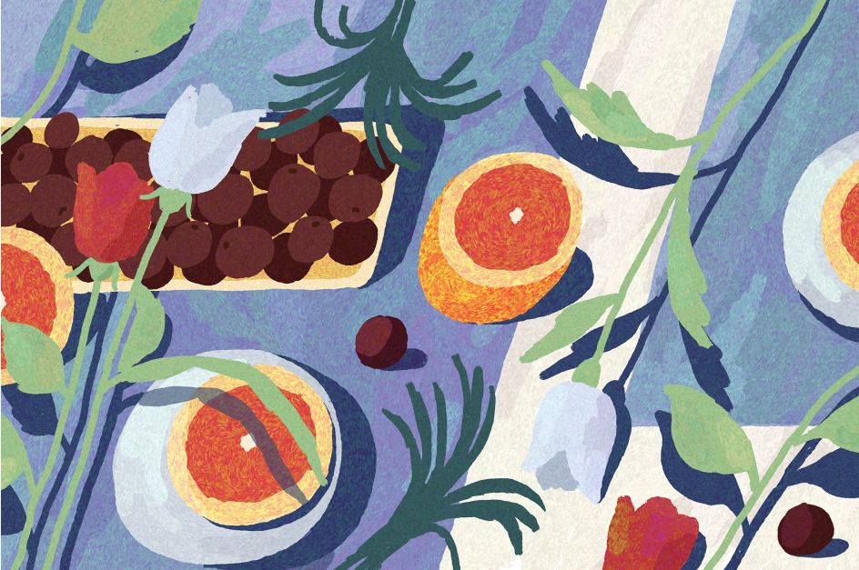
These days Julie has swapped out pencil and paper for digital tools, and her go-to method is to draw using Adobe Fresco or Procreate on her iPad and Photoshop on her computer. Despite this, her images still have a delightfully tactile feel, possibly due to how she uses her software.
"I use only one brush most of the time, and my approach is pretty traditional," she says. "Whether it's the iPad or the computer, I use them as a piece of paper. So it's just a brush and eraser for me."
It's an approach that perfectly lends itself to her style, particularly her still-life studies. Having first tried them out with the Still Here Still Life challenge, it wasn't long until Julie found herself addicted to them. "I would say my illustrations are love letters," she concludes. "I have a passion and strong connection for everything I draw for myself, whether that's nature, sports, or something from my favourite music and films."


 by Tüpokompanii](https://www.creativeboom.com/upload/articles/58/58684538770fb5b428dc1882f7a732f153500153_732.jpg)


 using <a href="https://www.ohnotype.co/fonts/obviously" target="_blank">Obviously</a> by Oh No Type Co., Art Director, Brand & Creative—Spotify](https://www.creativeboom.com/upload/articles/6e/6ed31eddc26fa563f213fc76d6993dab9231ffe4_732.jpg)


](https://www.creativeboom.com/upload/articles/a1/a1be57bc5ec32ca3cd9b95b8b6e12d299d66f35c_732.jpg)
