Illustrator Katie Louise Thomas on putting her personality into her art and making every piece feel magical
Midlands-based illustrator Katie Louise Thomas specialises in creating colourful, vector-design-based artwork across packaging, cartography and editorial. We met her to learn more about her journey and art style.
For many creatives growing up in remote rural communities, university is often seen as an opportunity to get away from home and experience the hustle and bustle of city life. Not so for Katie Louise Thomas. The Midlands-based illustrator headed in the opposite direction and studied at the renowned Falmouth University.
As we go on to hear, this was the logical progression of her artistic interests, rooted in her childhood sketching. And since then, she has gotten her career off to a flying start by working for the likes of Scientific American, Cornwall Wildlife Trust and the Financial Times, and landing representation from The Artworks Illustration Agency and Mendola Artists.
To learn more about her work, we sat down with Katie to discover why she likes vector design, how she tackles creative briefs, and what exciting project she's currently focused on.
Tell us about your background; did you always know you wanted to be an illustrator?
I think I've always been drawn to a creative path – growing up, I spent most of my time sketching and making a mess. Although there has been an expansive list of other interests, I never felt quite right unless I was sat with a sketchbook and pen.
The hardest part of choosing to pursue a career in the arts was convincing myself and others around me that it was an achievable goal. I found that when expressing a passion for most other subjects at school, students were welcomed with a list of job prospects. Despite the art lessons being well planned, enjoyable and a home for many talented students – they were never treated as something valuable like the subjects viewed as academic.
When I started to really take my passion for illustration seriously, I discovered an almost hidden world of opportunities that were just not shown to me beforehand. I think I always knew I wanted to be an illustrator; it just took me a while to identify that it was actually possible.
You're based in the Midlands, but you studied in Falmouth. What attracted you to the university?
After growing up in a city, I was excited to spend three years in an entirely new environment. Falmouth charmed me from the first visit, and studying and living next to the coast felt like a dream. Exploring the campus before I applied was not the anxious experience I imagined – I saw so many welcome opportunities and knew that this was the university for me.
I worked the hardest I had ever worked there because I was given constant support to drive forward and improve. I would have enjoyed any experience at any university, but I don't think I would have left finding a new home as I did at Falmouth.
Who are your biggest artistic influences, and why?
My biggest artistic influences always started at home; I was taught to draw by my dad. He sat patiently with me hour after hour, and he still does, giving welcome advice and comfort. His career in graphic design was an inspiration; I watched him turn true passion and skill into a successful career.
I also spent many hours admiring Quentin Blake's illustrations and started by reading almost every Roald Dahl book I could find. Blake's work always charms me and showcases how important depicting a personality is. His work is so energetic and detailed in a way I had not seen before.
As I progressed, the work of Charley Harper inspired me in a similar way to Blake. As a viewer, I understood what Harper was illustrating and could see it from his point of view. Every artistic influence has encouraged me to see the importance of expressing my personal voice.
How would you describe your art style?
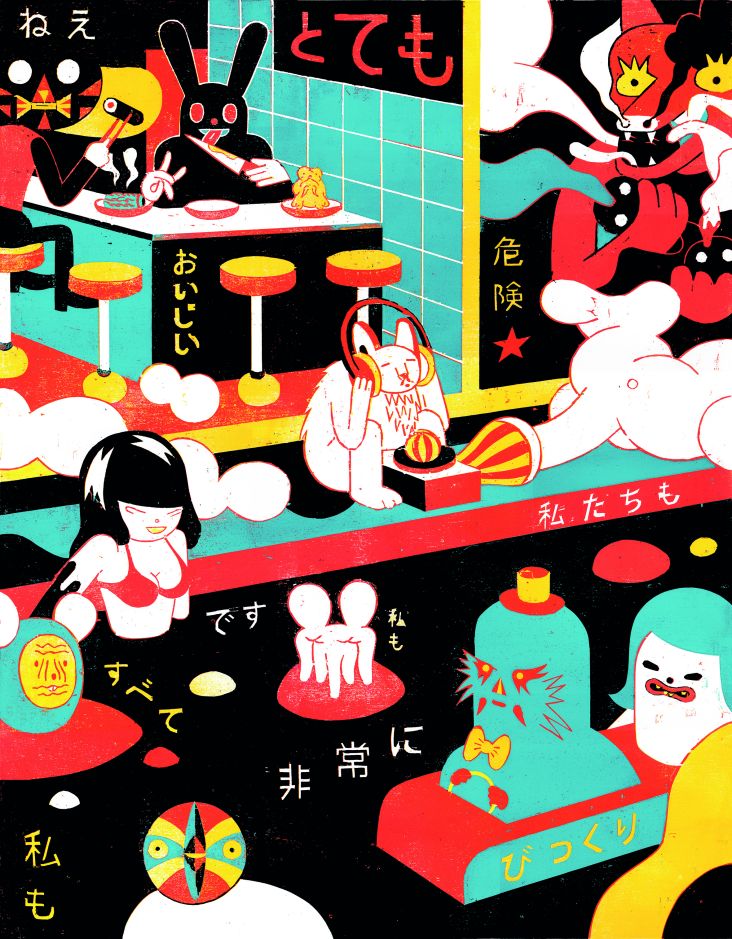
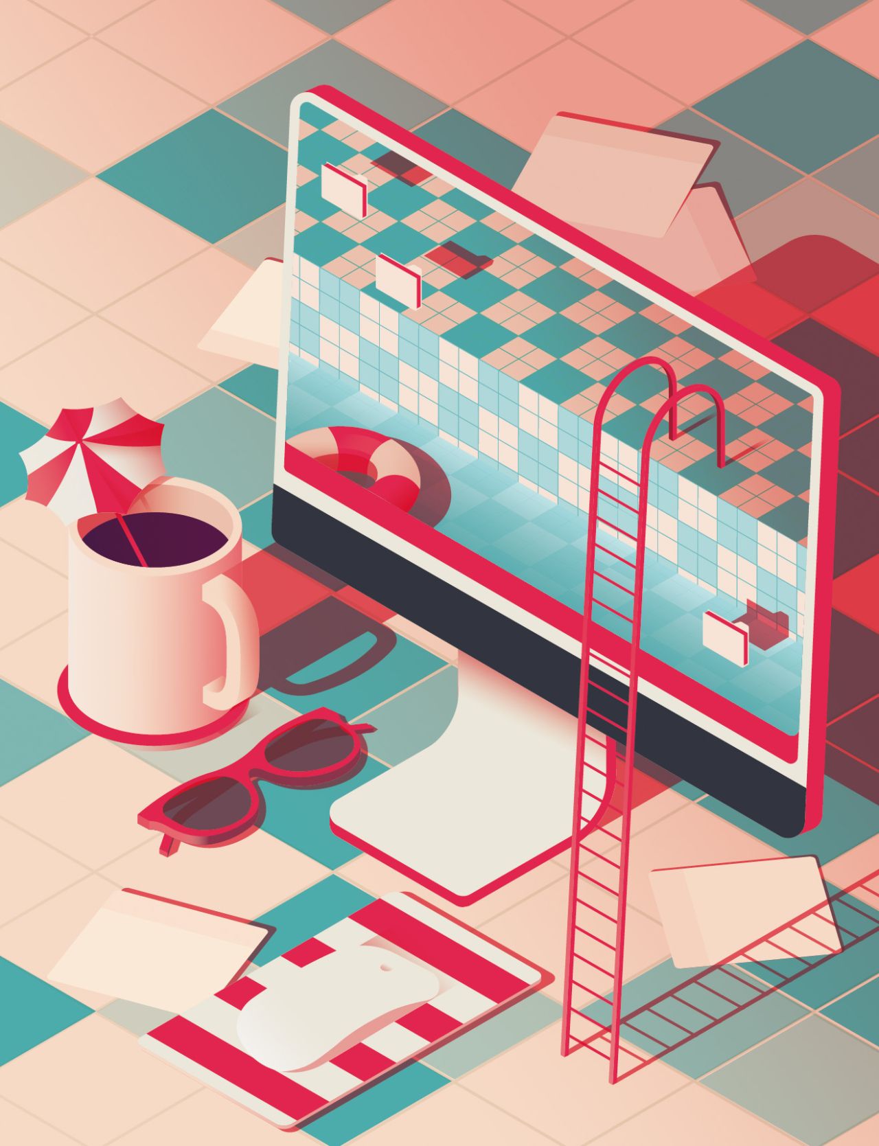
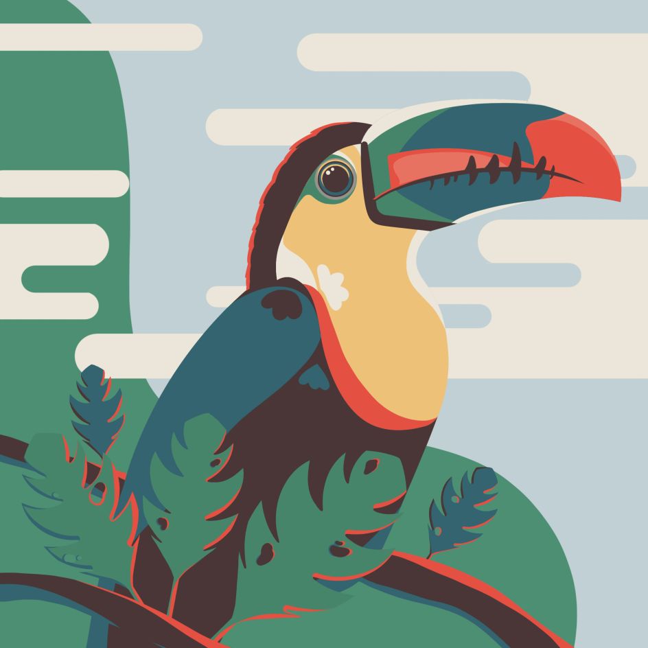
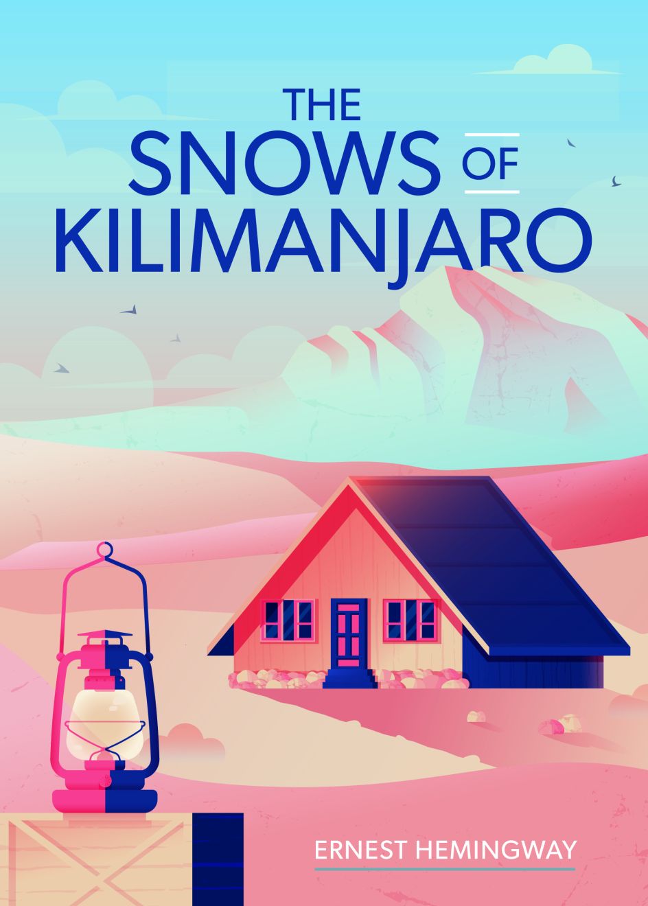
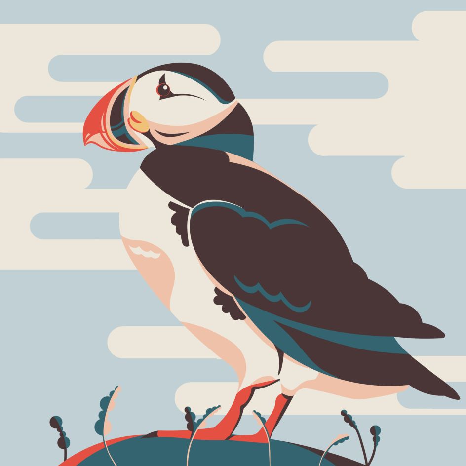
The main subject that connects all of my pieces is the bold use of colour. My process is similar for every illustration; bringing an image to life with colour will always be the most enjoyable part. I create work with a strong graphic style built around a concept.
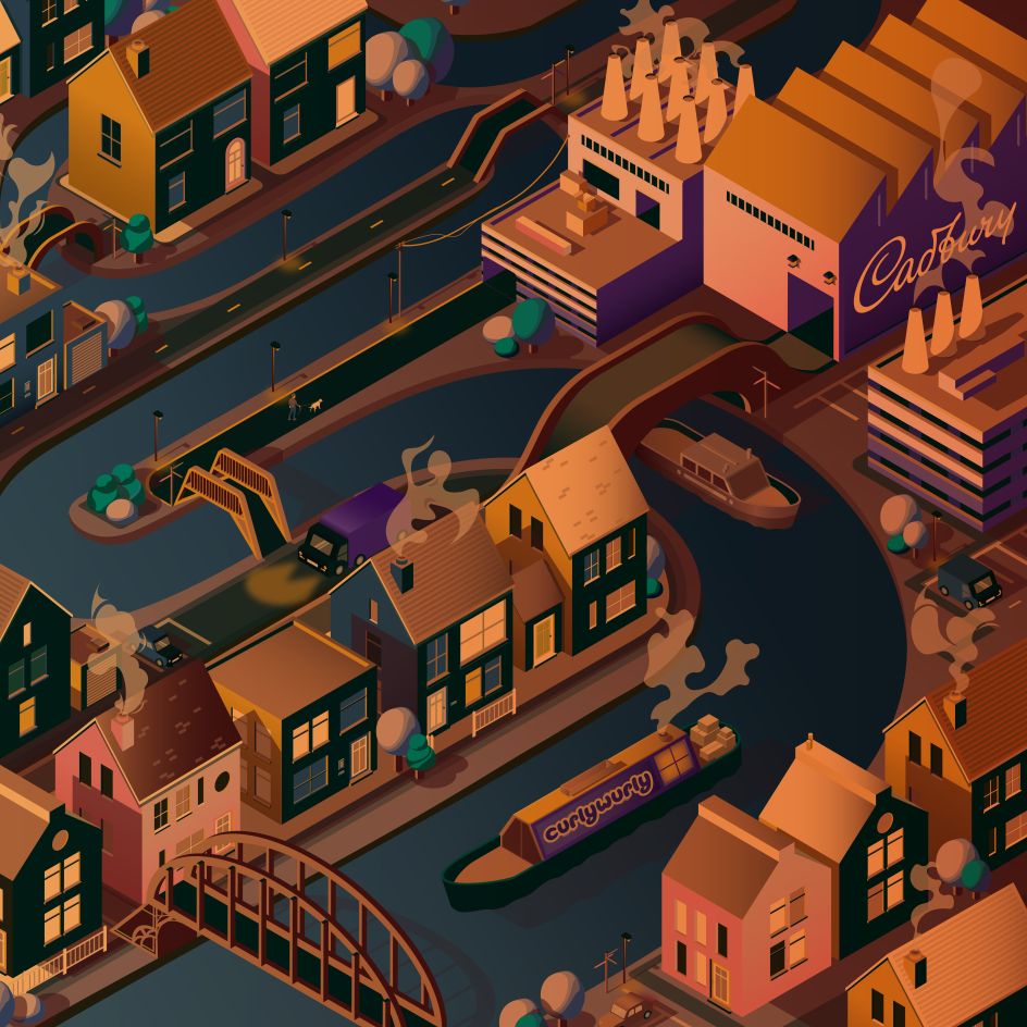
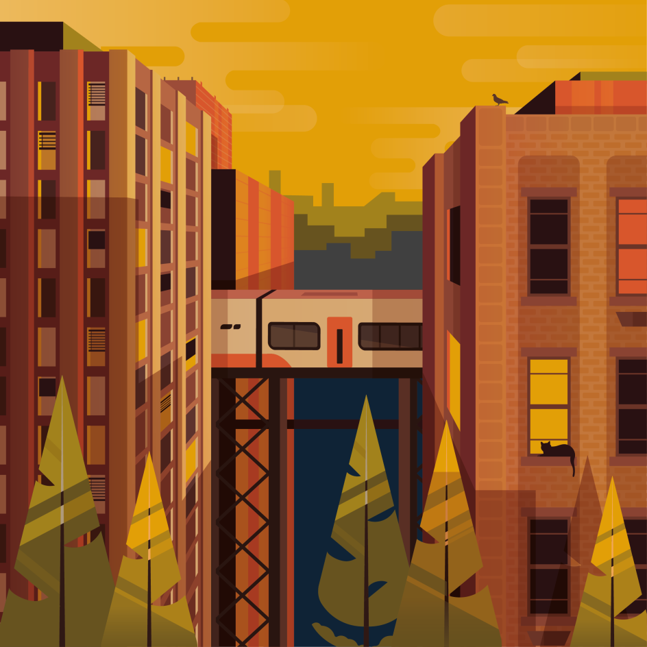
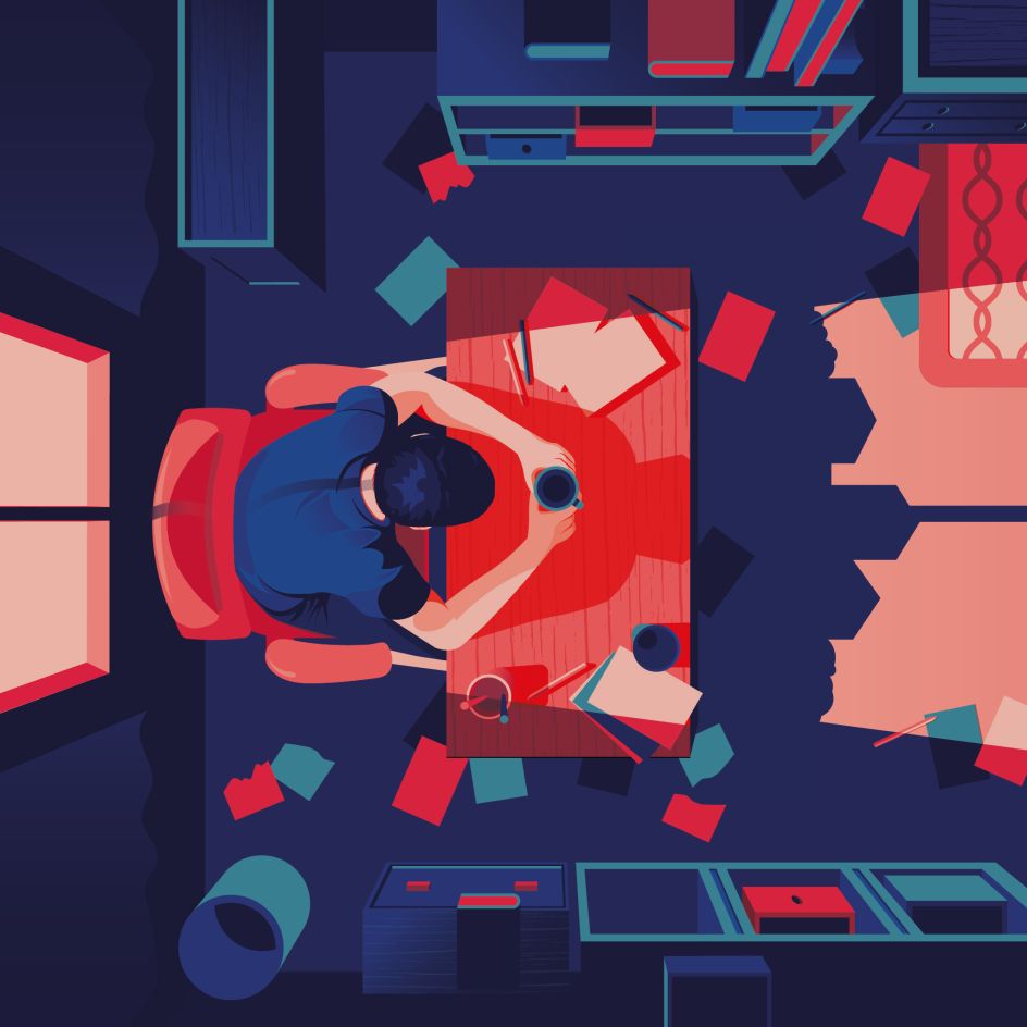
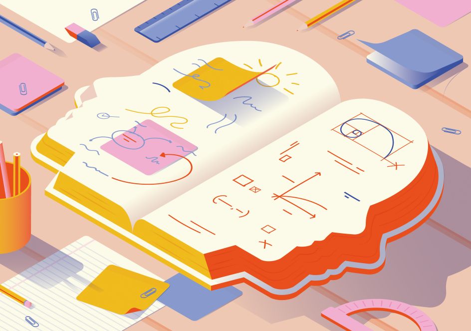
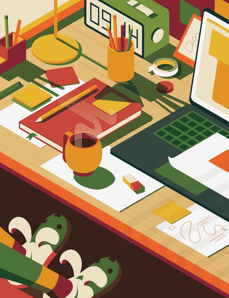
The number of layers in my illustrations would be fun to guess because a staple of my work process is the slow building of transparent colour. I want my images to hold a sense of reality, but I don't want them to be photographic. I want the viewer to know me, to see my personality. I find that every piece has an element to play with. Sometimes, I use angles to my advantage, and I have found that the isometric perspective is a distinctive part of many of my pieces.
Another aspect I experiment with is light. The shadow an object casts can be such an interesting but forgotten detail. I love how shadows can grow, soften and fall from surface to surface, and I hope to continue experimenting.
What appeals to you about working in vector design?
I fell in love with vector design accidentally during my second year of university. I was so open to learning every process, and I created a map of the Midlands using Adobe Illustrator. I wasn't sure why I chose this technique for this particular project; maybe it was my stubborn drive to try and master a programme lots of people have labelled as tricky.
Despite this project being a slow learning curve, I only had more momentum to explore and improve during every project afterwards. I find that working with vectors allows me to have the freedom to experiment whilst maintaining a professional medium.
Can you talk us through your process of interpreting a creative brief?
Before starting any visual part of a creative brief, I must fully understand it. A surprising amount of written work in my process takes place before an image is even sketched out. I connect words, grouping themes and concepts along the way. It is the easiest way to get all my initial ideas out in one place.
After dedicating time to truly learning my process of constructing a final image, I feel that I am now in a place where I can use that extra time to find the best idea to continue with in the beginning stages. Sometimes the idea is there all along. It just needs some polishing over.
What do you want viewers to feel when they see your work?
I want people to feel intrigued when they first see my work; I think there's an element of discovery in most illustrative work. I include small details that add some magic when revealed to the viewer. Each piece tells a different narrative, making every piece human, and this feeling may differ from viewer to viewer. The aspect that connects them all is that a small story has been told to them through my visuals.
Which project that you've worked on are you most proud of and why?
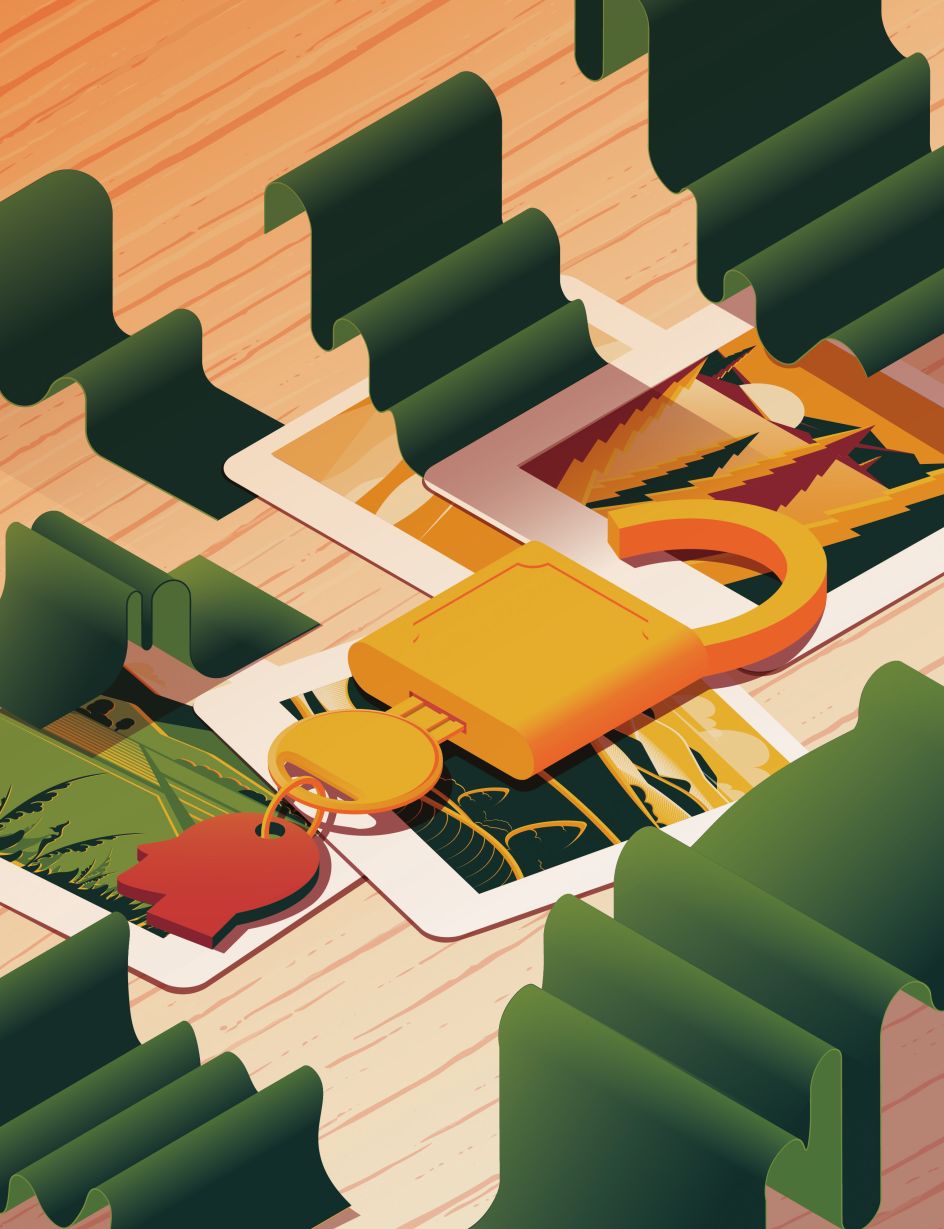
After graduating, one of the first commissions I received was a feature called 'Glimmers of Hope' for the 50th edition of Breathe Magazine. This piece combined everything I had learnt at university and felt like a great expression of my visual personality. It focuses on the complex theme of nostalgia and how we can use visual clues to unlock lost memories.
This feature not only allowed me to start an ongoing, regular working relationship with the magazine, but it has also received an iJungle Editorial Merit Award. Despite still being in the early stages of my career, I feel like this project marks a turning point in the leap from student to illustrator.

What are you working on at the moment?
I am concentrating on expanding my illustrative practice in collaboration with The Artworks Agency and their Startworks mentorship scheme. Together, we are working on expanding my skills to work within a wide range of illustrative areas. I am also continuing to broaden my work within the editorial field, illustrating subject areas ranging from science and politics to lifestyle and culture.
What's the best part about being an illustrator?
The best part about being an illustrator is the opportunity to take on an entirely different project each time. When asked about the field I wanted to focus on at university, my only answer was that I would be so happy to work in any area – design, editorial, book covers – I would take any of it on with a smile.
The truth is that being an illustrator makes me happy, and I can't imagine a project I wouldn't enjoy being a part of. I know that I may never work within some areas of the industry, but the best thing about illustration is that you are not just limited to one job/ one field. I am truly excited to see what will come with hard work and a whole lot of layers.


 by Tüpokompanii](https://www.creativeboom.com/upload/articles/58/58684538770fb5b428dc1882f7a732f153500153_732.jpg)


 using <a href="https://www.ohnotype.co/fonts/obviously" target="_blank">Obviously</a> by Oh No Type Co., Art Director, Brand & Creative—Spotify](https://www.creativeboom.com/upload/articles/6e/6ed31eddc26fa563f213fc76d6993dab9231ffe4_732.jpg)


