Studio zur Strassen gives fantasy football brand Kickbase a leg up
Kickbase, one of Europe's biggest fantasy football manager games, has some big ambitions and needed branding to match. Yannick zur Strassen explains how his studio developed a new visual identity and strategy.
After several years working in London for DesignStudio and Accept&Proceed, German brand designer and strategist Yannick zur Strassen recently returned to his home country and launched his own practice, Studio zur Strassen, in Munich.
The studio partners with visionaries, businesses and agencies to shape future brands. Creating relevance by finding the sweet spot between strategic thinking and gut feeling. Clients include Accenture, Arrival, Chelsea FC, Dickies, Kickbase, Napapijri, Nike, Nivea and Onefootball.
Recently, Kickbase, one of Europe's biggest fantasy football Manager games, invited Studio zur Strassen to work on a new brand identity for them. "Together with graphic designer Mark O'Neill, motion designer Paris Seawell and type designer Nolan Paparelli, we were presented with the opportunity to rethink how a football brand can look and behave for a new generation of football fans," Yannick explains. "And since we're quite proud of what we achieved with such a small team, we now want to spread the word."
The brief
With two million users, Kickbase is Germany's biggest fantasy football manager. Kickbase set a new standard in the fantasy manager world by introducing real-time experiences: actions on the pitch are directly translated into points for your virtual team.
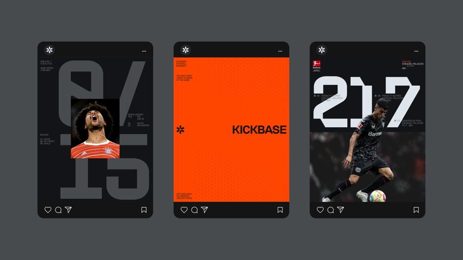
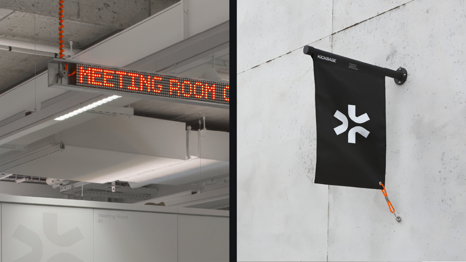
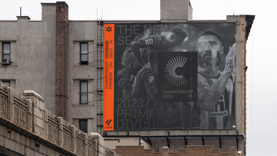
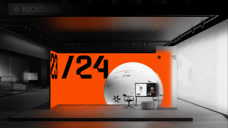
As Kickbase grew and evolved, so did their ambitions. They set a goal to expand into other leagues, such as Spain's La Liga, and envisioned building a whole ecosystem of content creation, events, and second-screen collaborations. With this in mind, it was time to revisit their identity to help craft a brand that reflects these ambitions.
Studio zur Strassen was invited to refine the vision and develop an identity that reflected where Kickbase came from, what it stood for, and what would help it grow into the football company it wanted to be.
Brand concept
The new identity is built around distilling the essence of football and understanding what makes the game so captivating. To win the game, you need tactics and metrics: the predictable. But you also need creativity and raw emotion: the unpredictable.
Kickbase realised that the world of football has changed over recent years and that the audience now enjoys talking about numbers and stats, expected goals and defensive coverage, as much as they love the experience of the game with all of its real emotions.
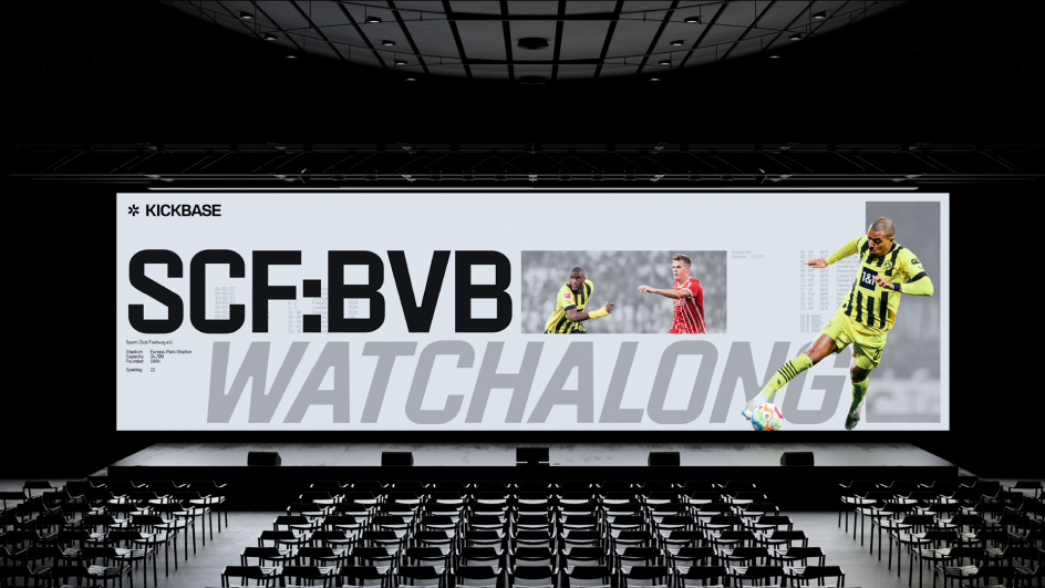
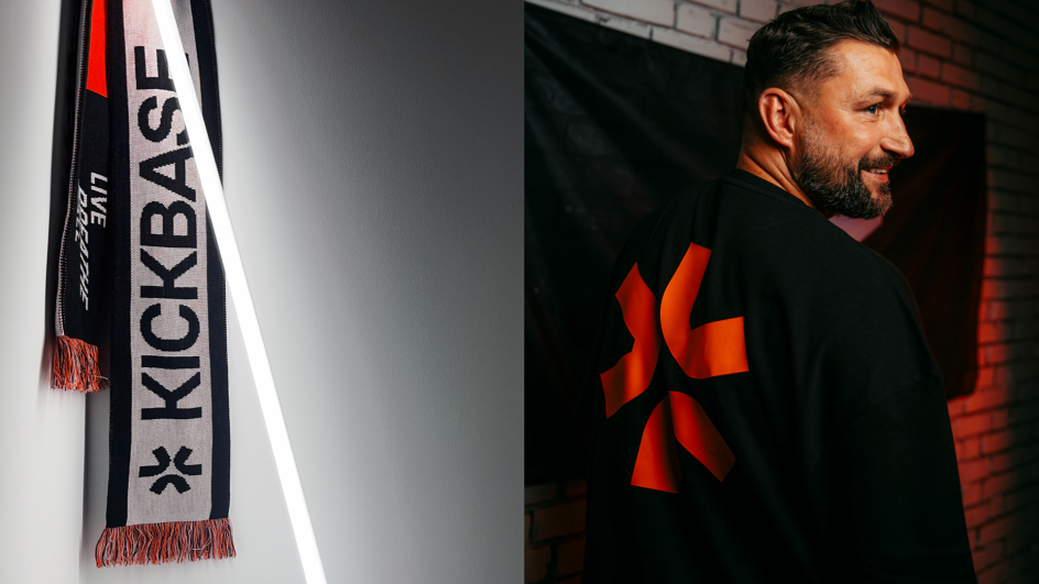
Answering the needs of a new era of football fans, Studio zur Strassen, together with designer Mark O'Neill, was presented with an opportunity to rethink how football should look and behave.
Design elements
The dotted grid underpins every part of the visual identity. It acts as a database of what happens on the pitch and shows the plays and movements on the field. This layer is data-driven and analytical and is underlined by the constructed typeface KB Volksans from Radmir Volk.
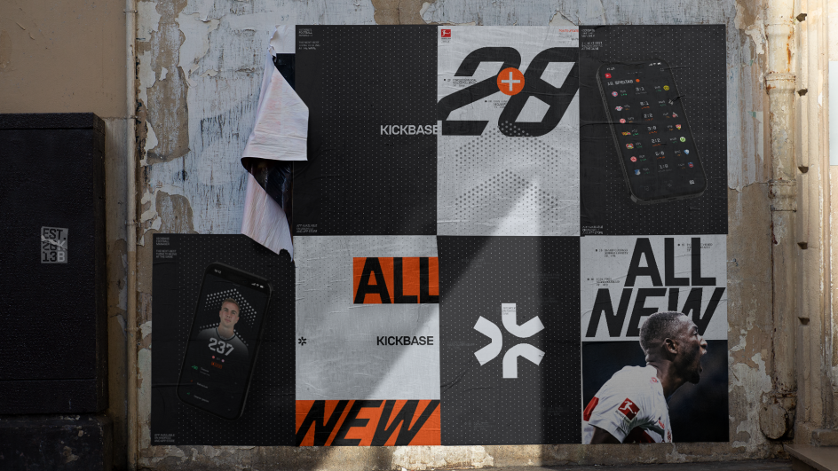
The rest of the identity is layered on top and is thereby heavily influenced by what happens on the pitch. Both the images and the variable typeface, KB Pitch – designed in partnership with Nolan Paparelli – stand in contrast to the information-based layouts and represent the emotional, wild, and often chaotic side of football.
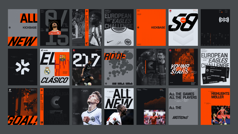
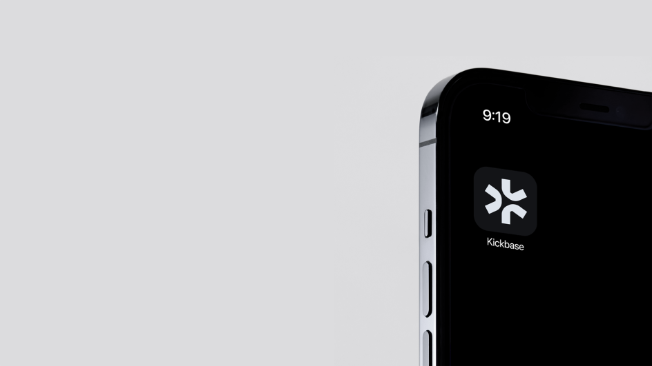
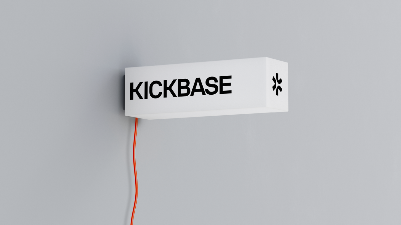
The new symbol is a modern interpretation of the old logo. The star is now more distinctive and loaded with meaning, inspired by the shapes of football. The centre forms a play button, with 'play' being a core value of the brand. Additionally, an arrow is pointing towards a stylised K, referencing Kickbase.
Motion, colour and copy
Motion is a core behaviour of the identity system, brought to life by animator Paris Seawell. The brand is constantly moving, information is updated, and patterns indicate the movements on the pitch. In this way, the brand itself feels like it's always 'on'.
The colour palette was built around 'Live Red' to underline the importance of 'No downtime' and 'Always on'. This hue was inspired by the ever-blinking red light of a recording camera.
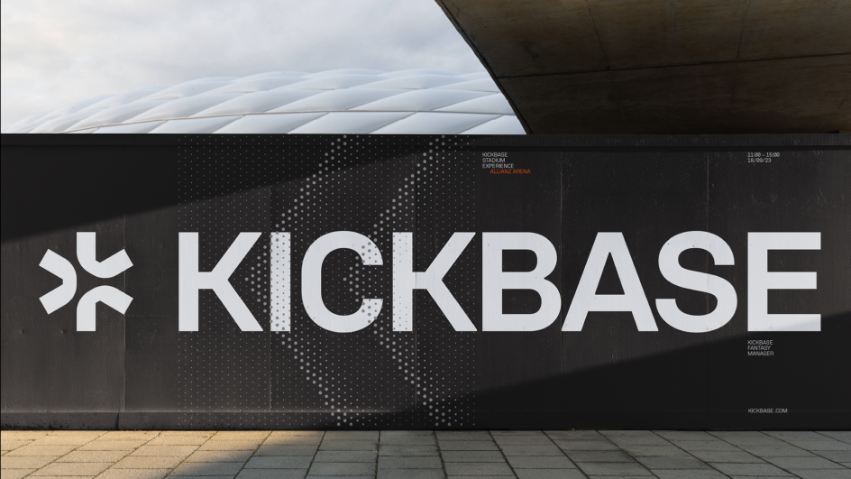
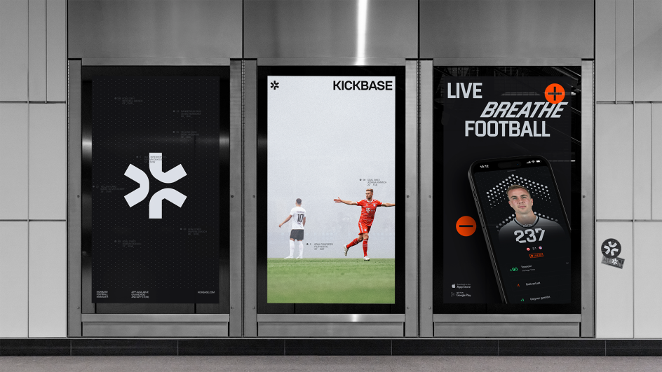
In copywriting, led by James Richardson, short, impactful messaging was created to reflect the ever-changing world in which we all exist. Messaging is light, nimble and flexible enough to keep up with this dynamic brand. The copy is human and real and speaks with (and for) the voice of the football fan.
Combined with these elements, the new brand allows it to live and exist in various spaces, from the app and social media to events and its broadcasting channel, Kickbase Studios (for which the new logo received special treatment).
Overall, the identity announces that Kickbase is not just a major player in the football market but is bringing an entirely new layer to the game. It sets Kickbase up as a future-facing company, one that's dedicated to the future of football.


 by Tüpokompanii](https://www.creativeboom.com/upload/articles/58/58684538770fb5b428dc1882f7a732f153500153_732.jpg)

 using <a href="https://www.ohnotype.co/fonts/obviously" target="_blank">Obviously</a> by Oh No Type Co., Art Director, Brand & Creative—Spotify](https://www.creativeboom.com/upload/articles/6e/6ed31eddc26fa563f213fc76d6993dab9231ffe4_732.jpg)


