Ragged Edge brings out AI's best side in characterful Kili rebrand
London-based branding agency Ragged Edge has cut through the noise surrounding AI to bring out the best that it has to offer. It's all part of a rebrand for labelling platform Kili, which uses artificial intelligence as part of its high-quality training data.
The possibilities offered by artificial intelligence continue to make headlines, with most people split into one of two clearly-defined camps: those who think AI will transform our lives for the better, and those who think it's out to get your job and spells doom for us all.
But where does the truth lie? As usual, somewhere between the extreme reactions, you'll see circulating online. In fact, according to Kili's latest rebrand, AI can be a force of good if it uses one very specific thing: good data.
Founded in 2018 by Edouard d'Archimbaud and François-Xavier Leduc, Kili represents the perfect synthesis of human expertise and trustworthy AI. By pairing subject matter experts with in-house teams and artificial intelligence, Kili empowers users to create high-quality, unbiased data sets. But with the current climate surrounding AI being as turbulent as it is, how could they sell this message?
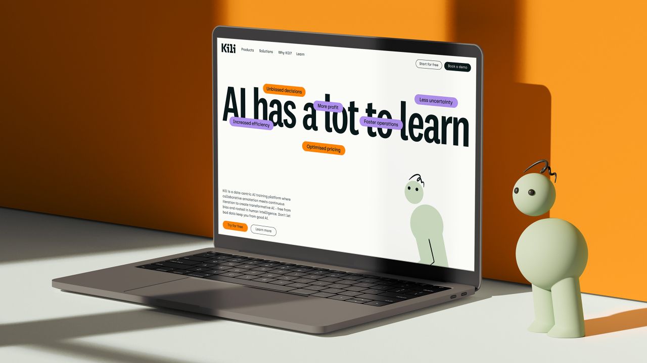
Enter Ragged Edge, the branding agency specialising in working with people "trying to achieve the improbable". Choosing to defy expectations and let the air out of the AI conversation, Ragged Edge went for a refreshingly stripped-back approach that goes back to basics. The result is a clean look free of pretension but one that also retains a sense of humanity via its playful animations.
"The rebrand recognises that we have a lot to gain from AI, but first, AI has a lot to learn from us," says Max Ottignon, Ragged Edge co-founder. "In an industry marked by its soulless hyperbole, we built the Kili brand around something more grounded: good data and human intelligence."
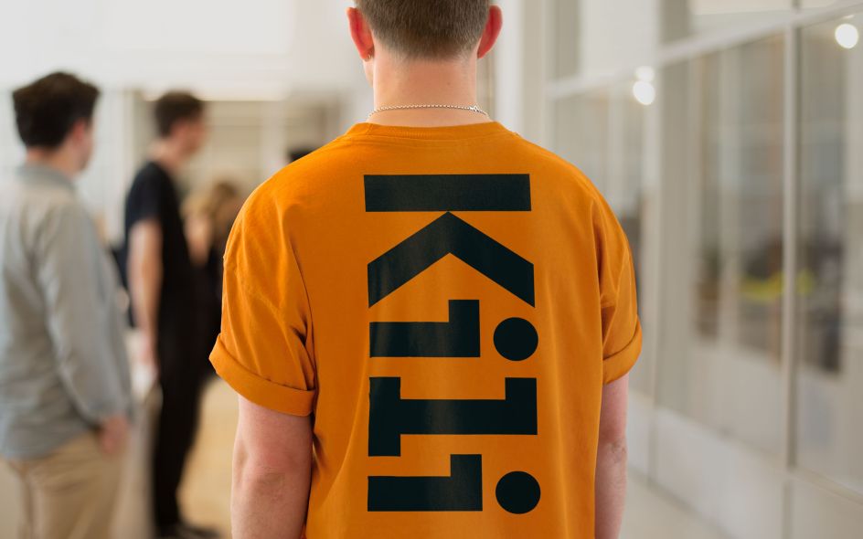
At the heart of this identity is something you don't see in many tech identities: a mascot. Taking the shape of a couple of stacked spheres adorned with a quizzical, almost anxious expression, the Kili mascot is the ideal summation of the identity: it's a personified expression of the possibilities of AI.
"The Kili character brings complex, technical points to life in ways that are easy to understand and emotionally engaging," Ragged Edge explains. In terms of design, this manifests itself via the mascot changing shape and interacting with the various interfaces. It's a rare, charming take on AI and one that cleverly bridges both sides of Kili's services.
The rest of the brand follows this lead. Kili's tone of voice balances pragmatic intelligence with empathy yet skilfully avoids the grandiose, hyperbolic statements that are so common in current AI discourse.
Supporting elements like the type, colour and UI design reflect this approach even further by imbuing the brand with unassuming humanity. An eye-catching yet not over-powering palette knits the whole brand together, and the full range of iconography, including infographics and product illustrations, adds a gravitas that complements the expressiveness of the Kili character.


 by Tüpokompanii](https://www.creativeboom.com/upload/articles/58/58684538770fb5b428dc1882f7a732f153500153_732.jpg)


 using <a href="https://www.ohnotype.co/fonts/obviously" target="_blank">Obviously</a> by Oh No Type Co., Art Director, Brand & Creative—Spotify](https://www.creativeboom.com/upload/articles/6e/6ed31eddc26fa563f213fc76d6993dab9231ffe4_732.jpg)


