Koto's identity for Brewbike features a charming coffee bean mascot
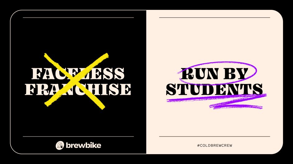
Hot on the heels of its identity for Meatable, Koto has just revealed a brand refresh for Brewbike, a cold brew coffee company that is "empowering" students to start and run their own on-campus micro-business and build invaluable skills for life after graduation.
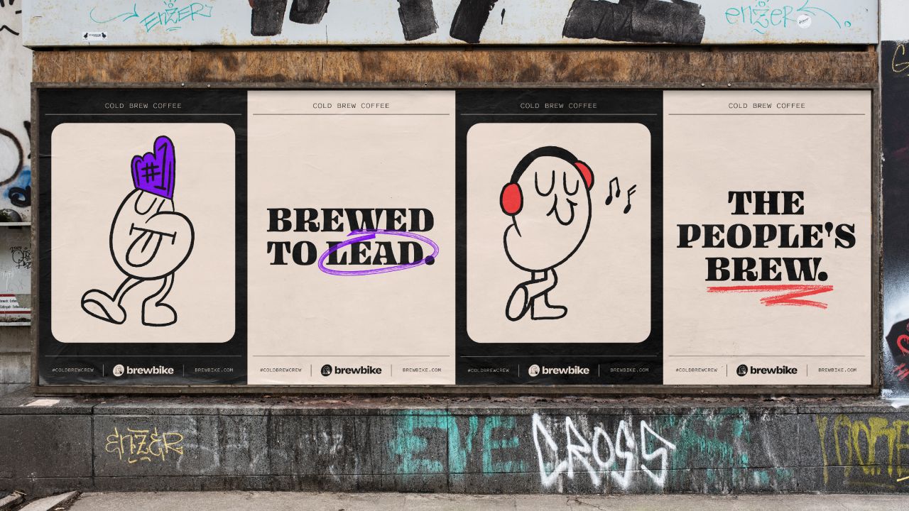
It approached Koto earlier this year with a brief to refresh the design for its growing venture, one that would reflect how it's maturing as a coffee company, combined with the "spirit and energy" of its university student employees. The entire project was carried out remotely.
"From the start, we knew Brewbike was onto something special," says Dave Raxworthy, design director at Koto's LA brach. "Instead of a top-down approach, it's handing the keys to students and preparing them for the real world. After immersing ourselves in their cold brew business, and being highly-caffeinated whilst doing so, our collaborative strategy process revealed their far-reaching vision: changing the future of business for the future of us all."
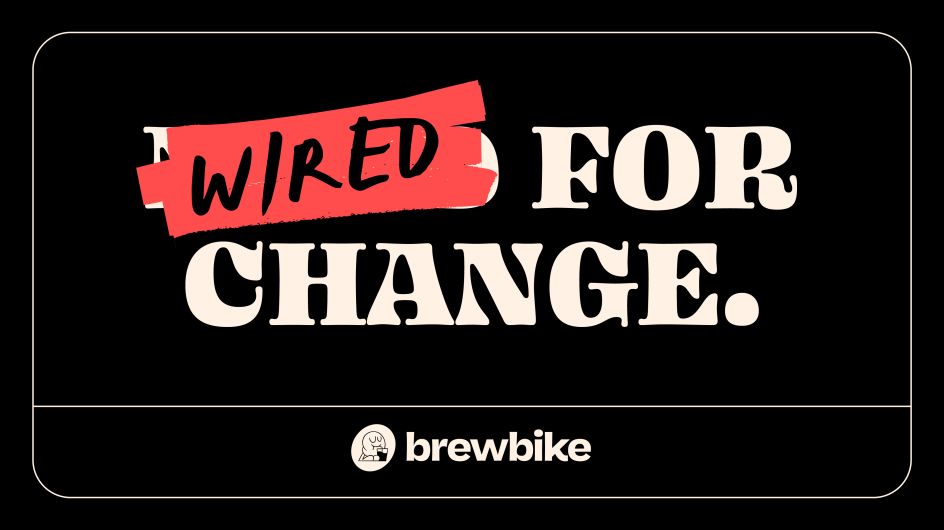
To realise this vision, Brewbike needed a company mission that rallies teammates and inspires customers. That mission became: "by turning students into leaders, we don't get young people ready for the real world, we get them ready to change it."
This strategy then became the springboard for Brewbike's new look: "Energetic, authentic, often cheeky personality with a touch of streetwear and a ton of heart," adds Dave.
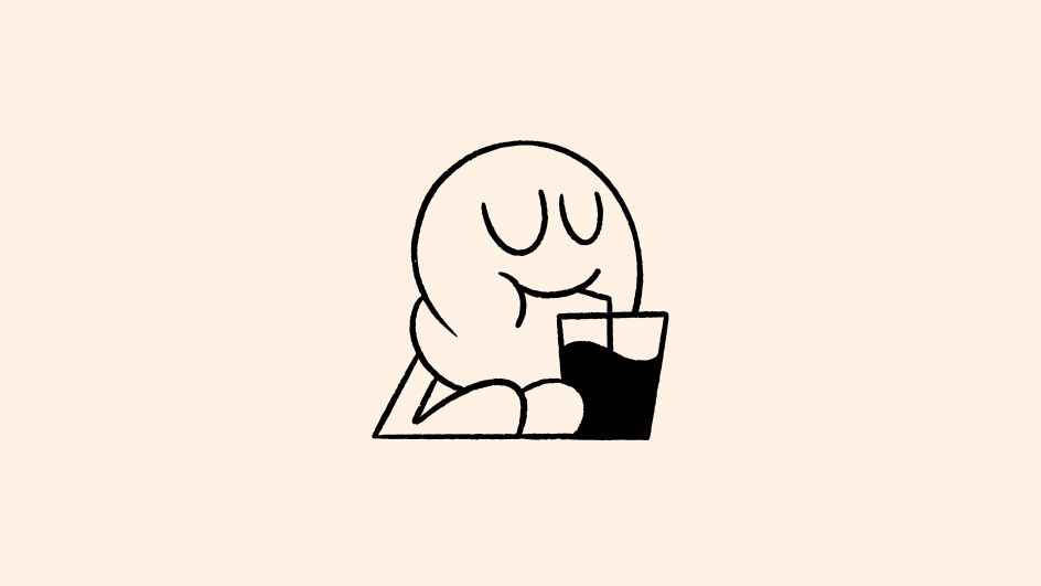
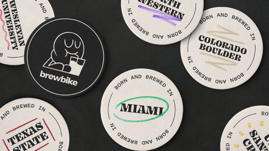
And because Brewbike was born on a college campus, Koto created a mascot. The Brew Bean is Brewbike's personal signature that embodies its employees. Whilst the colour palette tells the story of the company's marquee cold brew product, aptly named 'With Milk' and 'No Milk'. Bold college colours inspire the supporting highlighter palette.
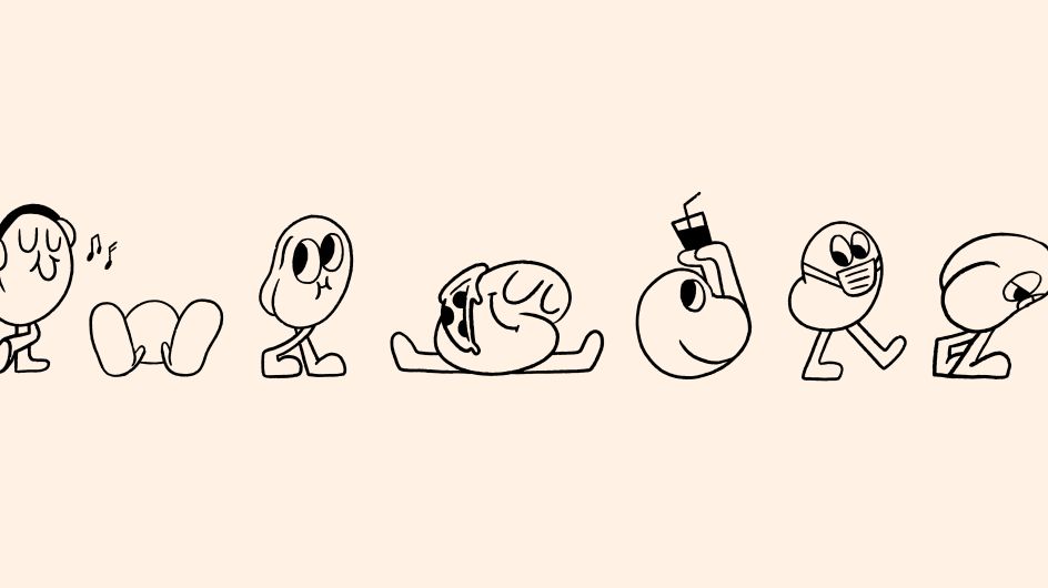
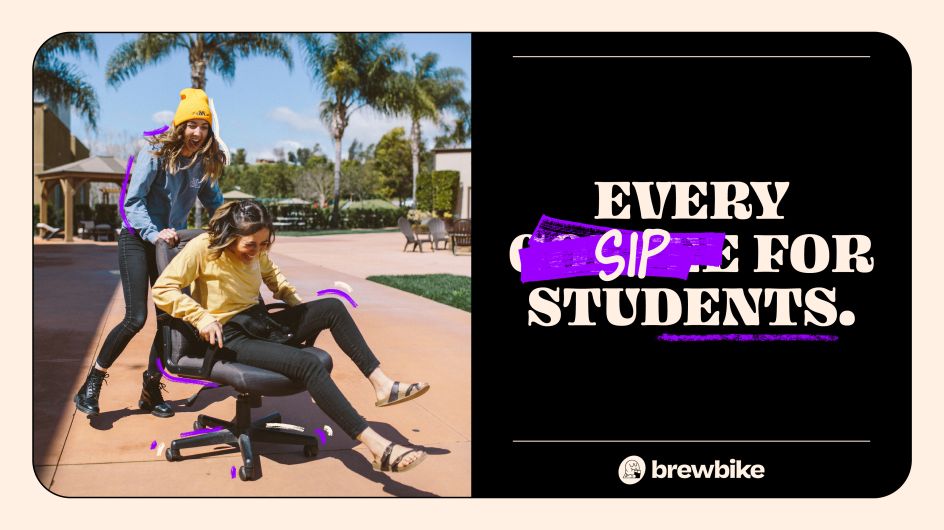
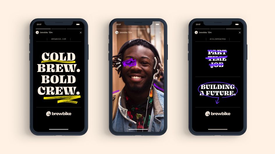
"It wouldn't be college without a mascot," says Dave. "From the get-go, it was evident we were building a brand with a mascot in mind. One that encompasses what Brewbike believes in, and stands for. A character that takes on many forms and guises, that ultimately becomes synonymous with the brand. This resulted in our little brew bean."
The number of Brewbike university locations is growing nationwide, so it was also important for Koto to consider how each school could make this brand its own, on-campus and online. "Our marker language was used to highlight and emphasise brand elements and is an expressive nod to studying hours on end, using colours specific to each university," says Dave.
In terms of typography, the Blazeface typeface, from Oh No Type Company, was chosen for its "fresh character and modern boldness". Pitch Sans from Klim Type Foundry, is used alongside the expressive headline typeface, grounding the brand's body copy. The supporting bespoke handwritten series comes from "Koto team scribbles".
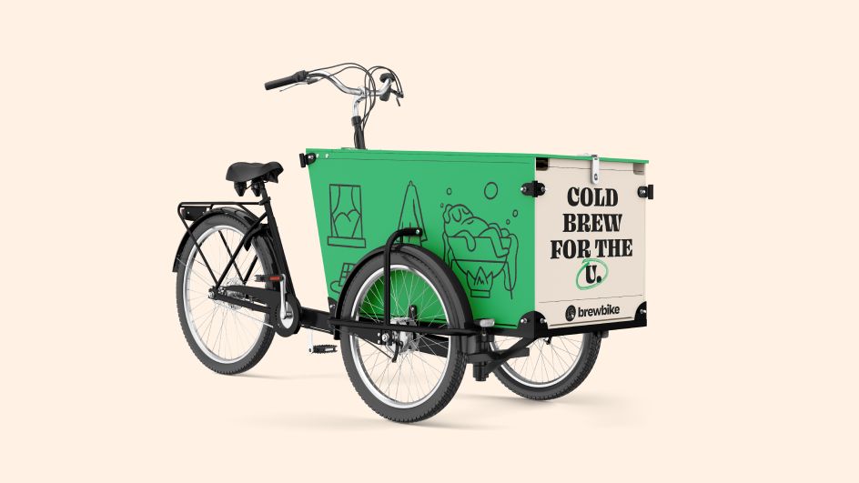
Alongside Koto's main Brew Bean mascot, it created a collection of beans that add a touch of playfulness to the brand. "We delivered over 50 beans that are expressive, university-themed, dressed for a day out, or just straight up chillin'," adds Dave. Each character plays a specific role across coffee packaging, coffee taps, social content, and everywhere in between.
The new website, which brings all these brand elements together, was designed by Love and Money.


 by Tüpokompanii](https://www.creativeboom.com/upload/articles/58/58684538770fb5b428dc1882f7a732f153500153_732.jpg)


 using <a href="https://www.ohnotype.co/fonts/obviously" target="_blank">Obviously</a> by Oh No Type Co., Art Director, Brand & Creative—Spotify](https://www.creativeboom.com/upload/articles/6e/6ed31eddc26fa563f213fc76d6993dab9231ffe4_732.jpg)


