Lauren Ly's obsession with mini markets spills out into Japanese ukiyo-e style illustrations
If you've ever read and enjoyed Convenience Store Woman by Japanese writer Sayaka Murata, then you'll know why London-based illustrator Lauren Ly shares a gentle curiosity for Asian mini markets. Here, we learn more about why she nods to the 711s in her latest work.
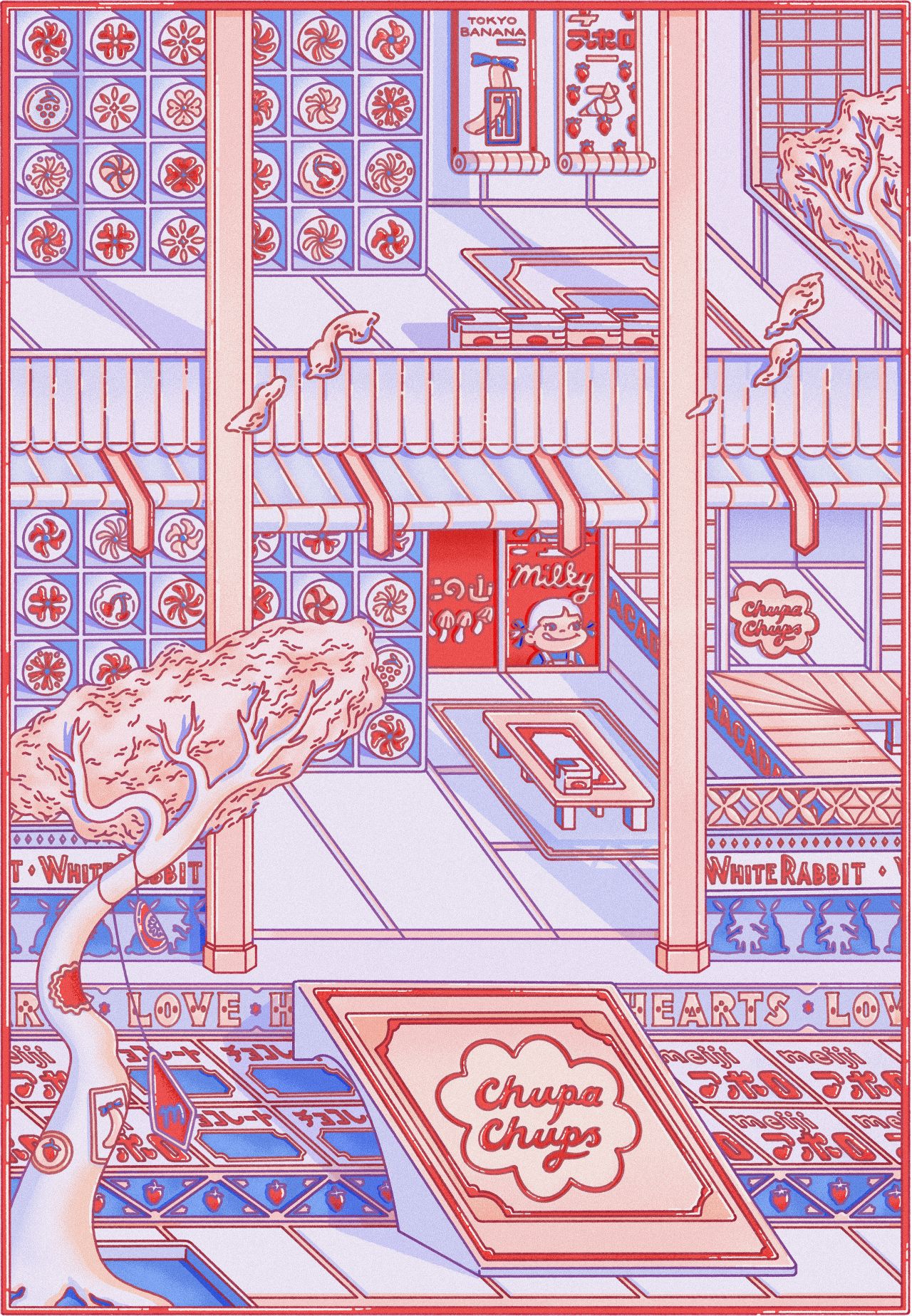
The Convenience Palace © Lauren Ly
Looking closely at Lauren Ly's highly detailed illustrations reminds us of those pictures we loved to draw as kids of fun factories, fantasy shops and conveyor belts, dreaming up colourful worlds from our wild imagination. Only, in the case of The Convenience Store, we see a cartoony shop in dreamy pinks and blues, with every considered line and interesting layer nodding to the artist's background in architecture. It was a subject she studied at the University of Applied Arts in Vienna under Japanese architect Kazuyo Sejima until she moved to London and opted to become an illustrator instead.
With architecture in mind, this particular drawing features a depiction of the classic Japanese garden – a feature that became popular during the Edo period – merged in a clash with more modern iconography that one might associate with simple sweets and drinks brands. "I'm obsessed with mini-markets," Lauren tells Creative Boom. "Especially the 711s in Hong Kong and Japan. Being of Chinese origin but born and brought up in the UK, visiting these stores is familiar and new at the same time. Being in these mini-markets, I'm surrounded by the flavours of my childhood; seaweed, matcha, salty fish sauce, and sickly sweet lychee drinks. They're a tiny world full of perfectly packaged and exactly aligned products."
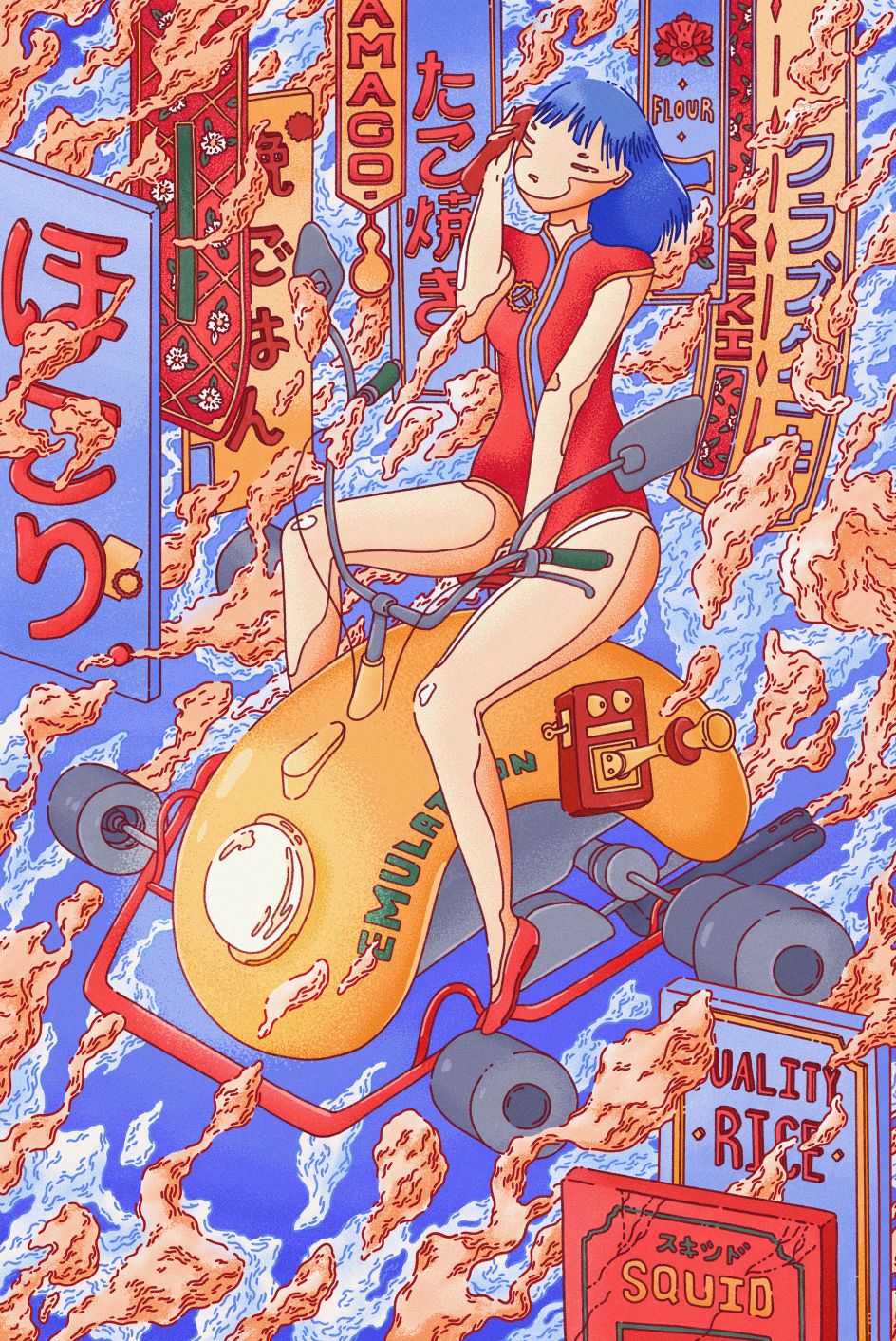
Steamy © Lauren Ly
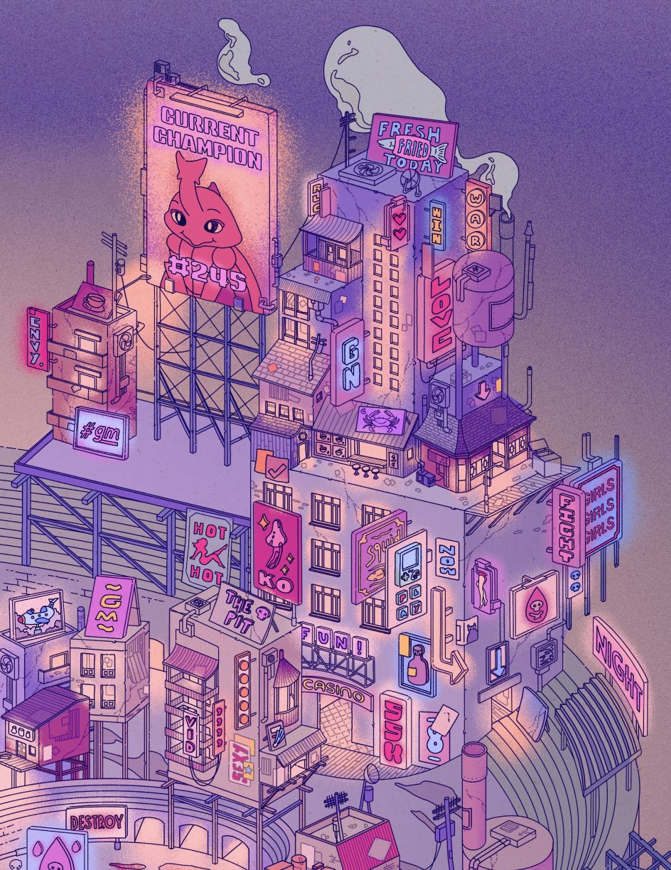
Pit City © Lauren Ly
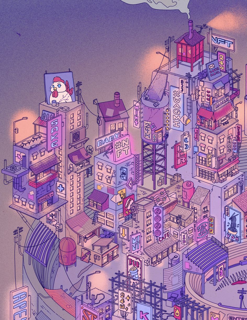
Pit City © Lauren Ly
Lauren believes there is a universal comfort derived from "buy-to-feel-good spending", which is only exemplified by Sayaka Murata's novel Convenience Store Woman. It's a story she tends to refer back to through her illustrations. "How amazing to have such convenience at your fingertips, but it's a bit sinister at the same time; thinking of the secret mechanisms that work to promote mindless consumerism and meaningless brand loyalty."
As well as drawing references from historical architecture to create her artworks, many enjoy a dash of satire on modern consumerism, capitalism and "pervasive product branding", as she puts it. Her illustrations use a garish colour palette, solid linework, and intricate details to mimic the modern poppy world of advertising and graphic design. But there's a hint of ukiyo-e, too – the genre of Japanese art that translates to 'pictures of the floating world'. This whimsical, dreamy approach makes Lauren's art so enticing.
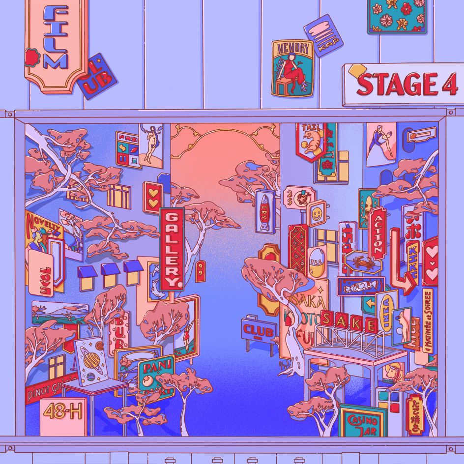
Forest of Consumables © Lauren Ly
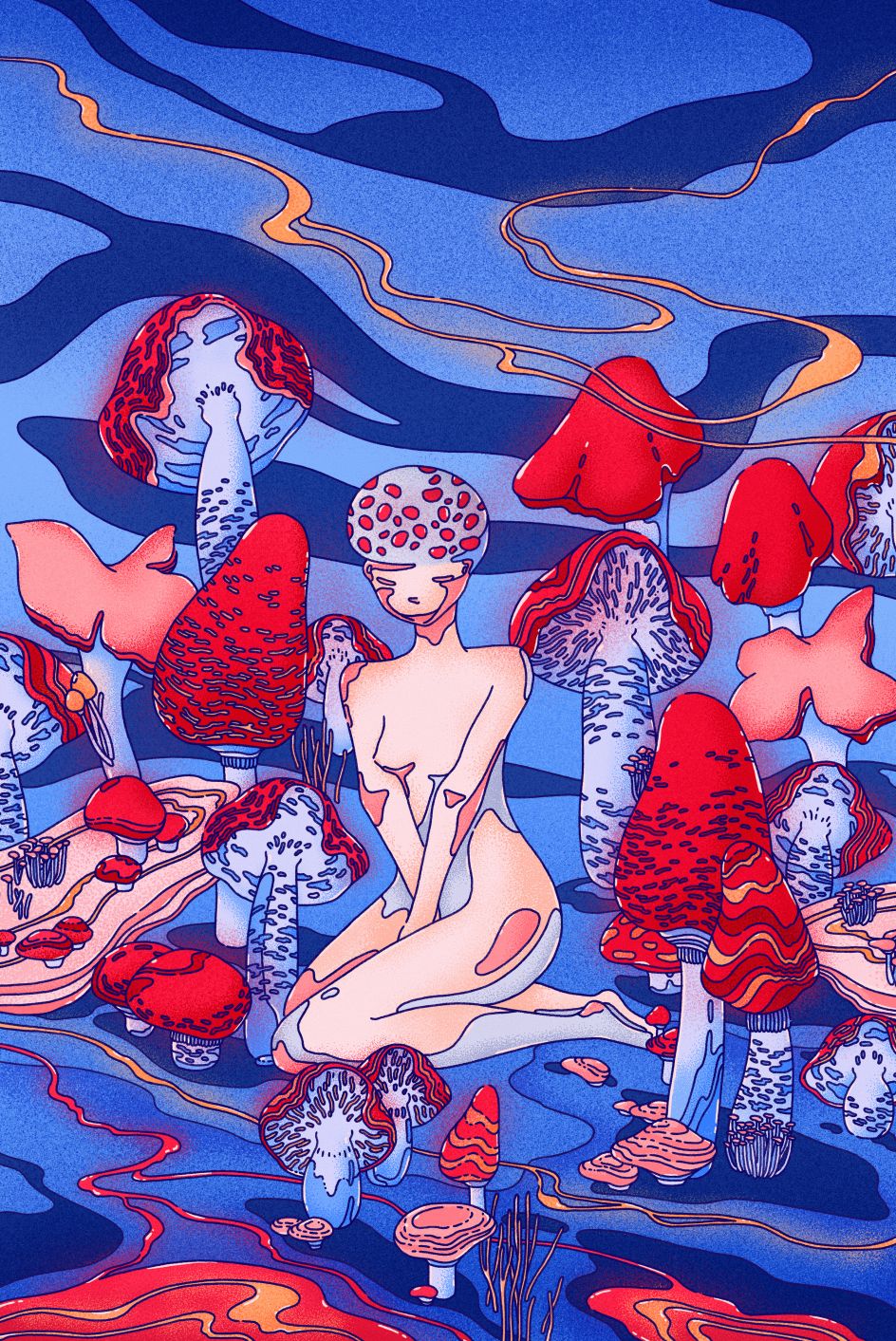
Toadette © Lauren Ly
In other work, Lauren brings us Steamy – a piece that sees an attractive woman riding on the back of some kind of invented vehicle, surrounded by fumes from a busy city and the bright signage nearby, promising all kinds of culinary delights. In another, titled Toadette, we see a more surreal side to her work with a mushroom-type character gazing directly at us, surrounded by a field of classic red and white spotted fungus. The Forest of Consumables, meanwhile, returns to her love of modern culture: "Boiled crab. Pay-by-hour hotels. Vintage film clubs. Painkillers and psychedelics. Happy hour cocktails. Virtual matinées. Fried cod. White Rabbit. Pani puri. Bubble tea. Cheap ramen. Love," reads the description.
Although her illustrations have an underlying cynicism, some are definitely darker than others. Take Pit City, for example. An imagined world sitting atop of a floating rock, its description reads: "The curse of kodoku ensnares the wretched souls of former humans and twists them into beastly forms. Cursed for an eternity, they fight for survival in the pit, a decaying world drifting through the endless void."
You might agree that Lauren's portfolio has a lot more at play. Take a look for yourself and enjoy peeling back the many layers at meowtide.com or follow her on Instagram.


 by Tüpokompanii](https://www.creativeboom.com/upload/articles/58/58684538770fb5b428dc1882f7a732f153500153_732.jpg)


 using <a href="https://www.ohnotype.co/fonts/obviously" target="_blank">Obviously</a> by Oh No Type Co., Art Director, Brand & Creative—Spotify](https://www.creativeboom.com/upload/articles/6e/6ed31eddc26fa563f213fc76d6993dab9231ffe4_732.jpg)


