Lithuanian studio Boy's bold, brilliant restaurant branding
We don’t often cover graphic design from Lithuania, and we’re chuffed to have discovered Boy Studio; an agency making some really stunning work and with a superb identity of its own.
We can’t get enough of the unusual interplay of typefaces on the Boy website, offset by a gorgeous paler-than-millennial pink, a murky green, and an overarching sense of play. The studio describes itself as “having a core purpose of doing the best creative work,” and refreshingly rails against “overused industry words” like “storytelling”.
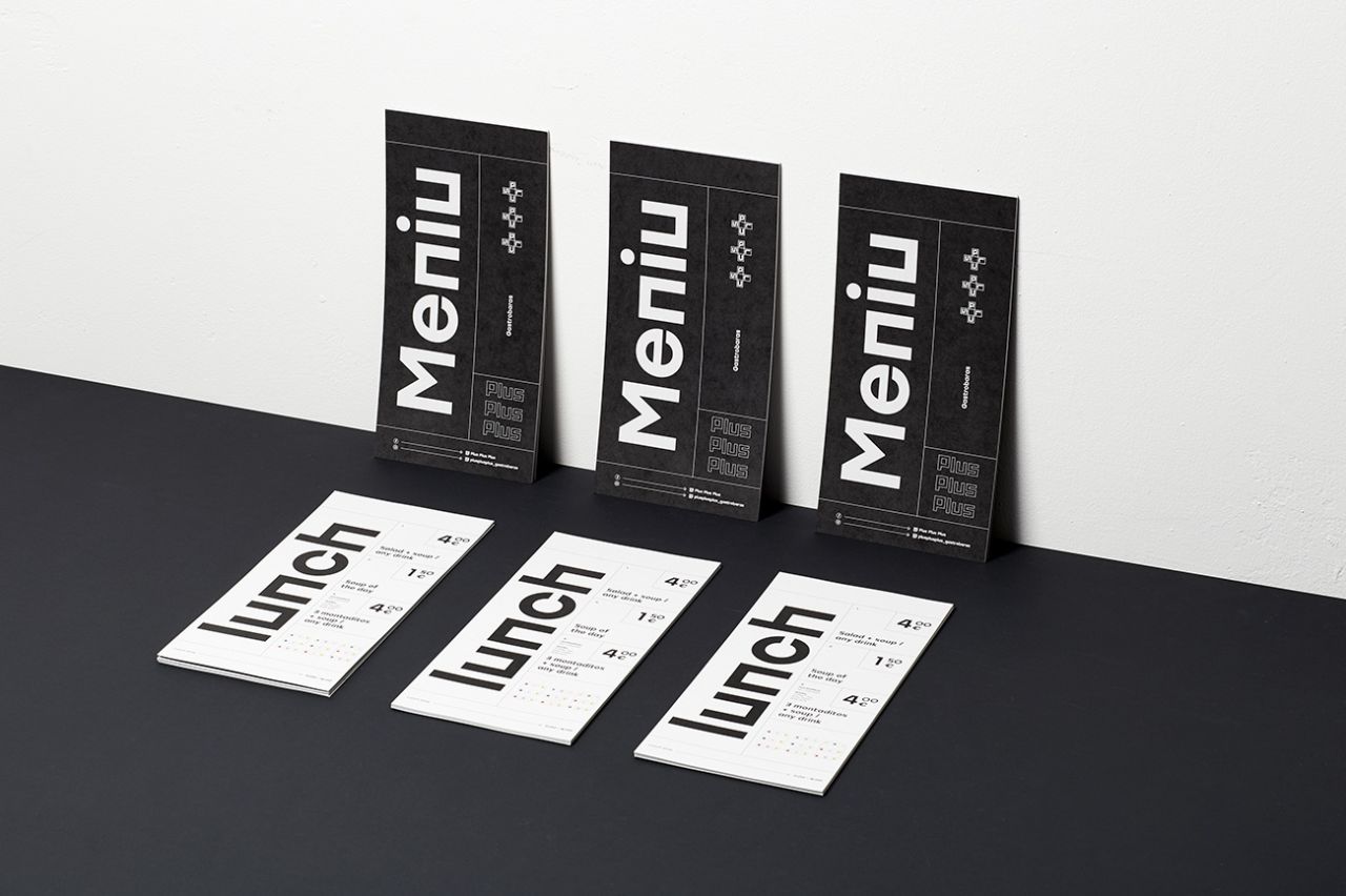
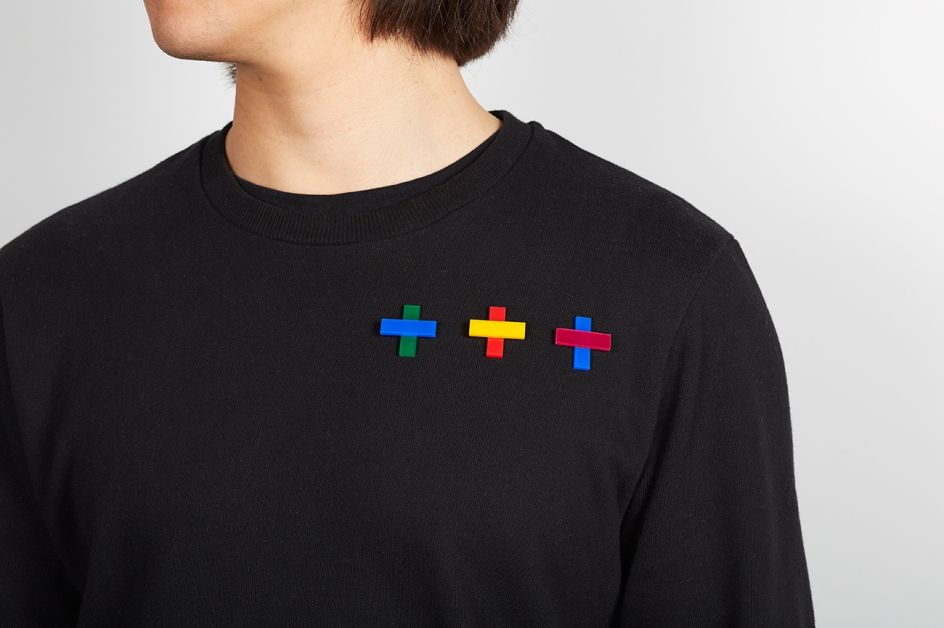
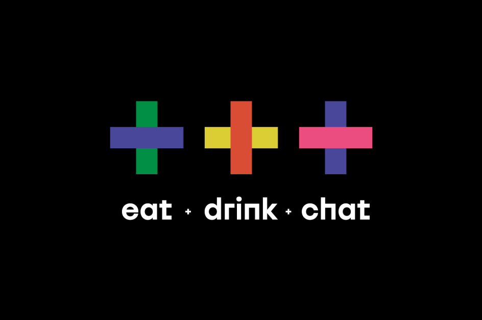
Instead, their M.O is fun, fresh graphic design and identity work that feels truly innovative and exciting. One recent project that exemplifies this is the branding for +++, or Plus Plus Plus, a new restaurant.
"We were more than excited when the new gastrobar in Vilnius chose our proposed Plus Plus Plus name," says Boy, "we were already imaging vast design possibilities playing around with those + + +."
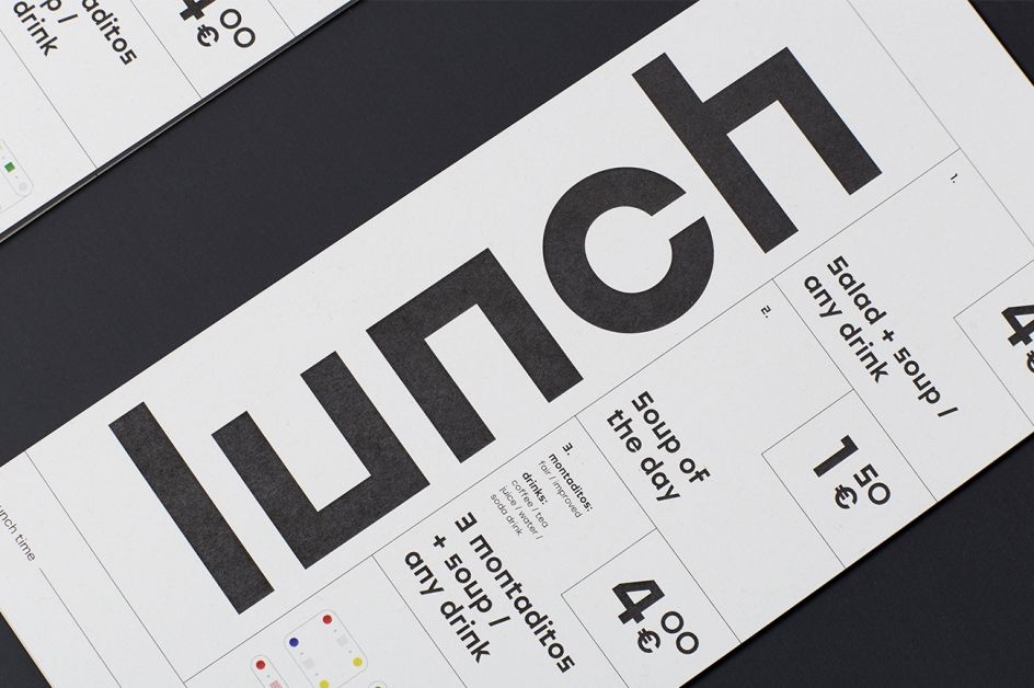
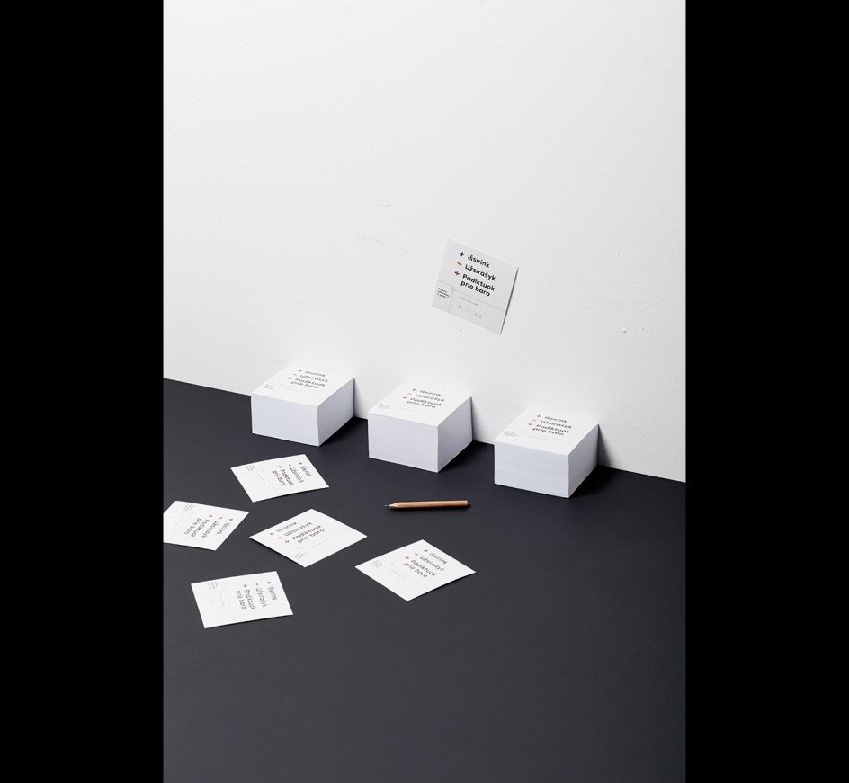
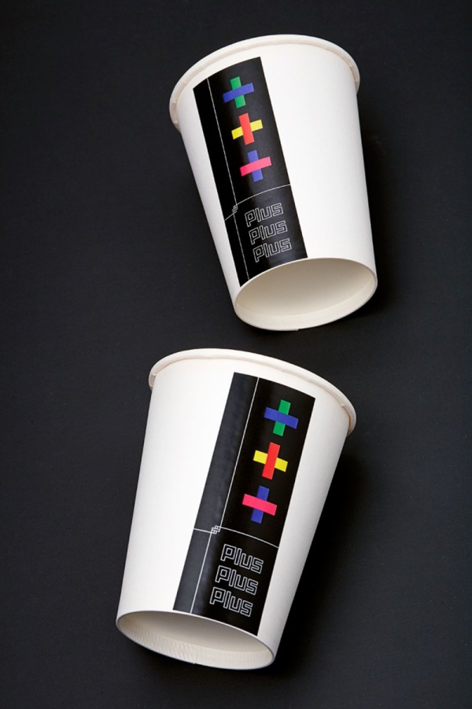
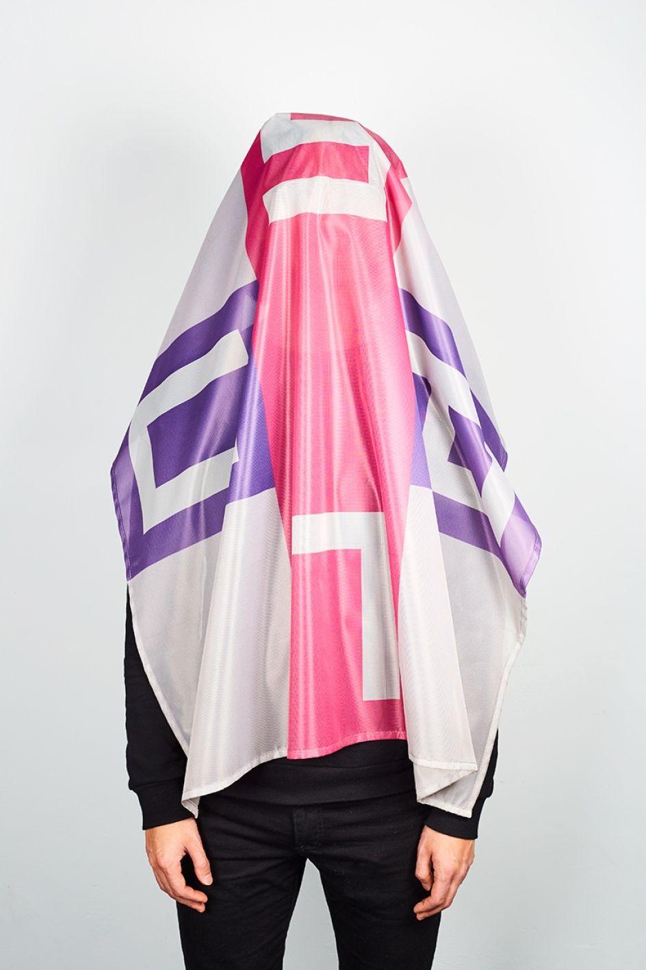
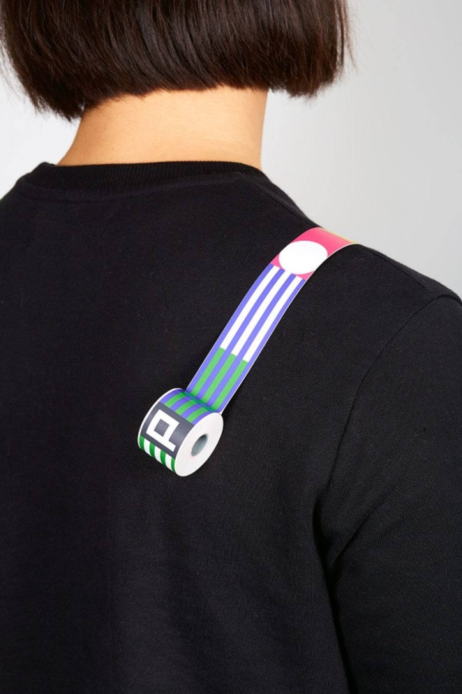
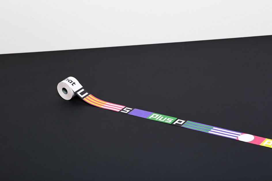
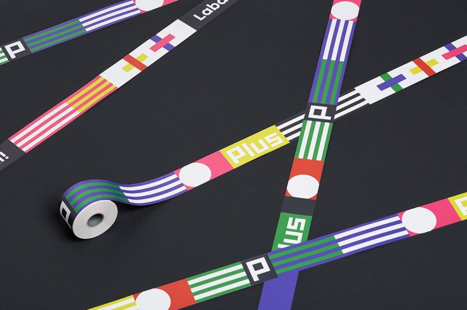
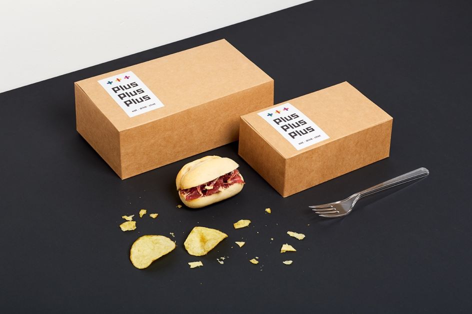
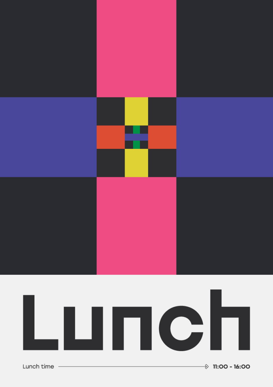
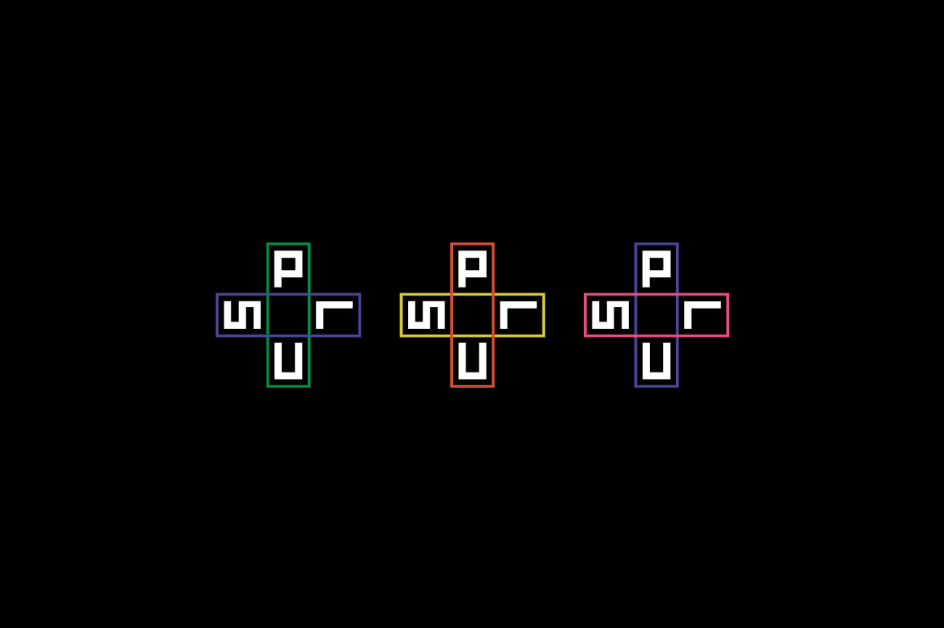
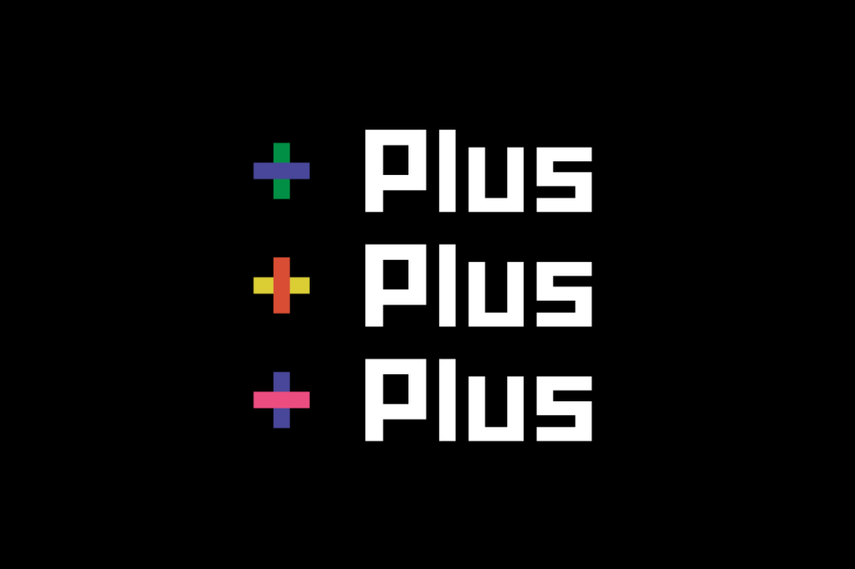
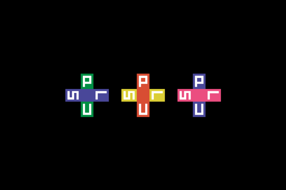
And play around they did, to beautiful effect. A blocky, digital-style typeface is used alongside the icons to give a bold sense of dynamism, with numerous possibilities for different colourways created by playing with the horizontal and vertical lines of the + symbol. What’s smart about the design is how that little icon suddenly feels so ownable for the brand, and can be used in numerous configurations across menus, packaging, signage, tote bags, caps, and even packing tape.


 by Tüpokompanii](https://www.creativeboom.com/upload/articles/58/58684538770fb5b428dc1882f7a732f153500153_732.jpg)


 using <a href="https://www.ohnotype.co/fonts/obviously" target="_blank">Obviously</a> by Oh No Type Co., Art Director, Brand & Creative—Spotify](https://www.creativeboom.com/upload/articles/6e/6ed31eddc26fa563f213fc76d6993dab9231ffe4_732.jpg)


