LMNOP whips up a fun and fresh new identity and website for Becca PR
You'd think PR is easy to explain. Technically, it is. But it's actually something that not many people understand. Becca is a PR firm based in New York City and LA that has not only managed to describe PR without the usual corporate slang; it's made it fun and interesting too. And that's also thanks to its new brand identity and website, courtesy of Brooklyn's LMNOP.
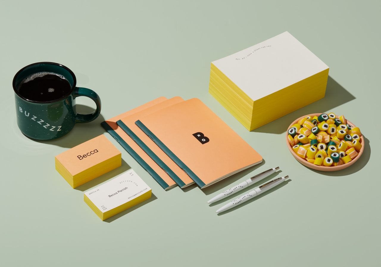
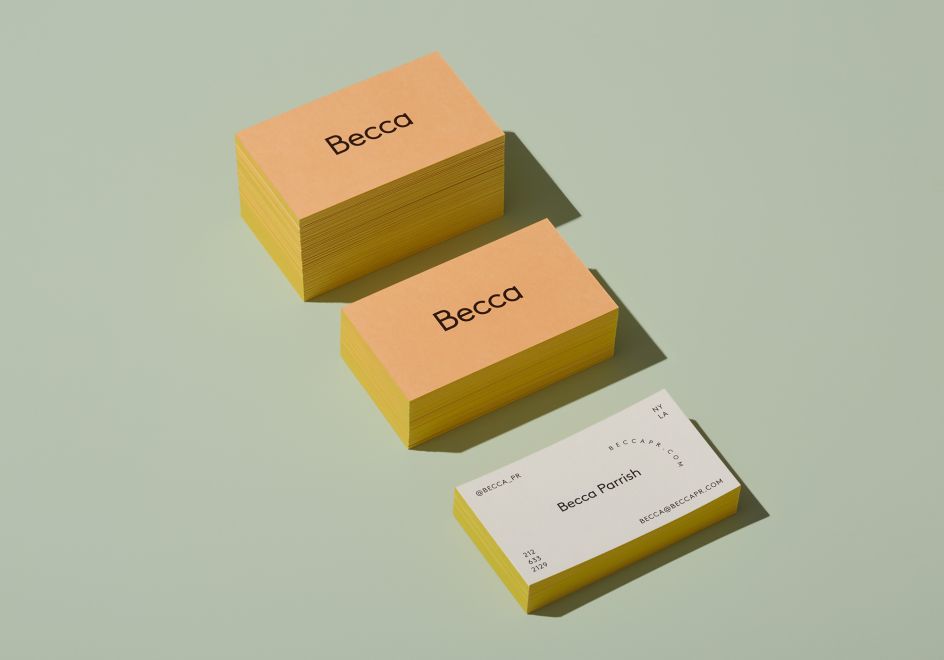
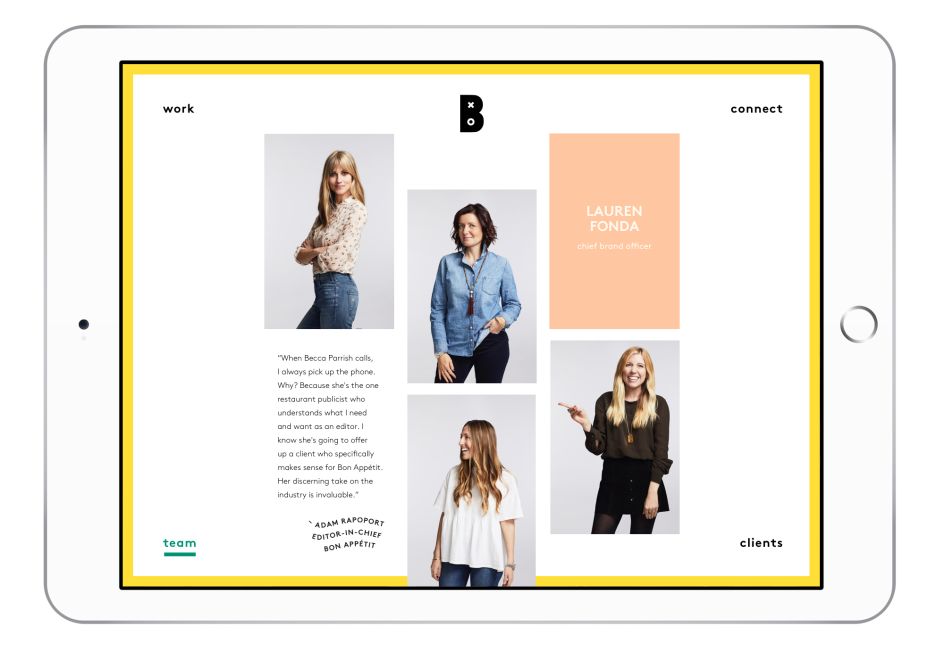
The design studio took inspiration from the sensibilities of the women behind the brand, crafting a clean, fresh look and feel, including punchy colours, understated but eye-catching graphics, and cheeky language.
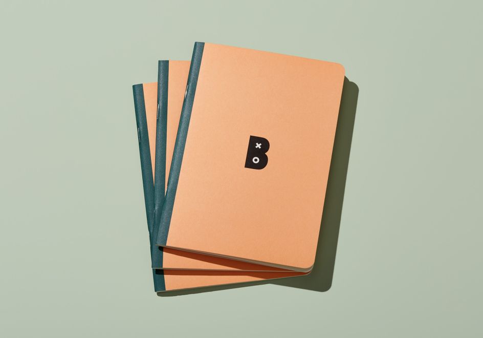
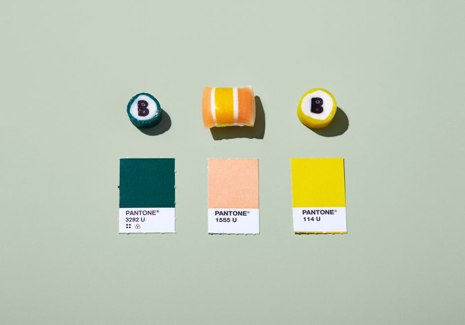
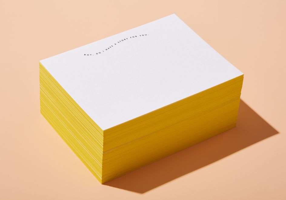
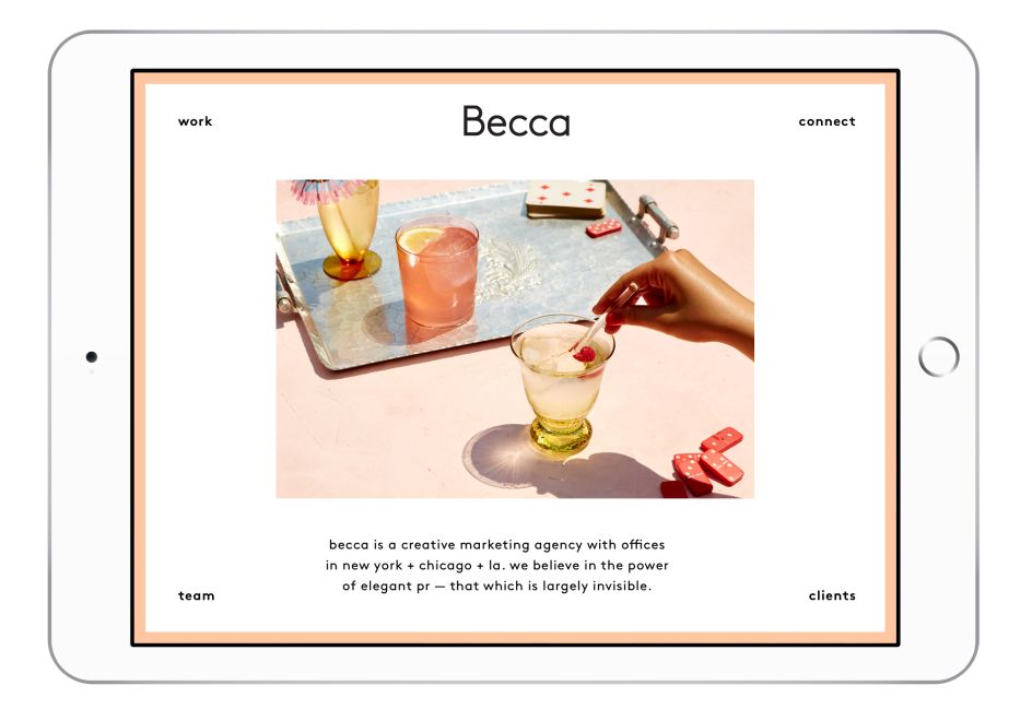
"We created a system layered with playful taglines and type treatments, a simple brand mark, logo, and pops of bright colours," explains Ashley Grayson, from LMNOP. "The system was rolled out onto notebooks, pens, stationery, a website, and our personal favourite, custom candies. A fully responsive website, layered with animation and a surprising layout give visitors a striking first interaction through which they can engage with the Becca team and learn about their impressive work."





 by Tüpokompanii](https://www.creativeboom.com/upload/articles/58/58684538770fb5b428dc1882f7a732f153500153_732.jpg)


 using <a href="https://www.ohnotype.co/fonts/obviously" target="_blank">Obviously</a> by Oh No Type Co., Art Director, Brand & Creative—Spotify](https://www.creativeboom.com/upload/articles/6e/6ed31eddc26fa563f213fc76d6993dab9231ffe4_732.jpg)


