Luis Mendo on leaving behind design for drawing – and not leaving the house
The pandemic has been a case of swings and roundabouts for Spanish illustrator Luis Mendo. Based in Tokyo, Luis has already made his mark on the city with artist residency Almost Perfect, a century-old rice shop he converted with his wife to house creatives from around the world.
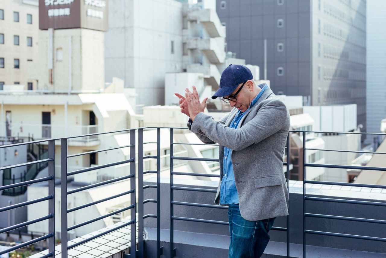
Image credit: Alex Abian
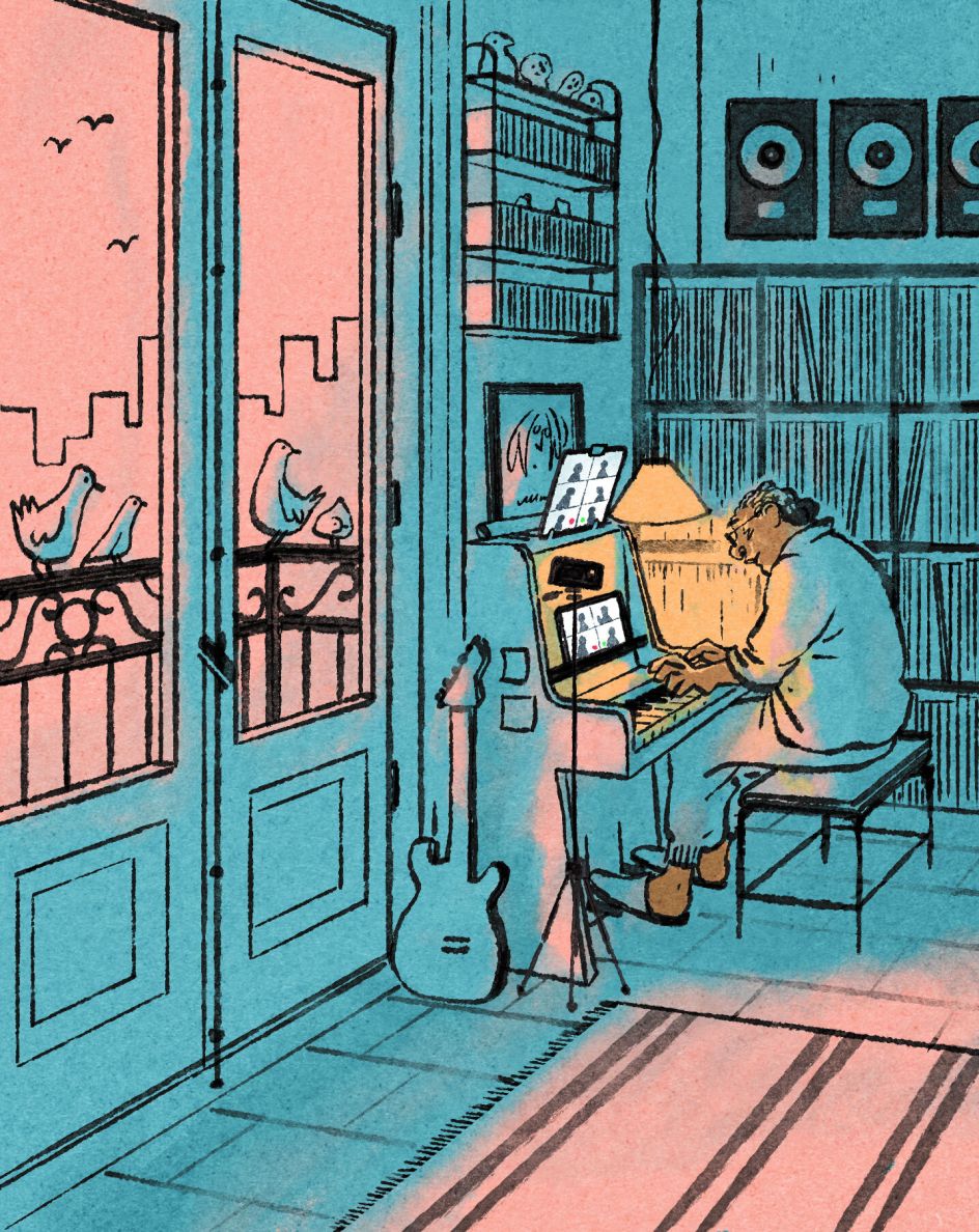
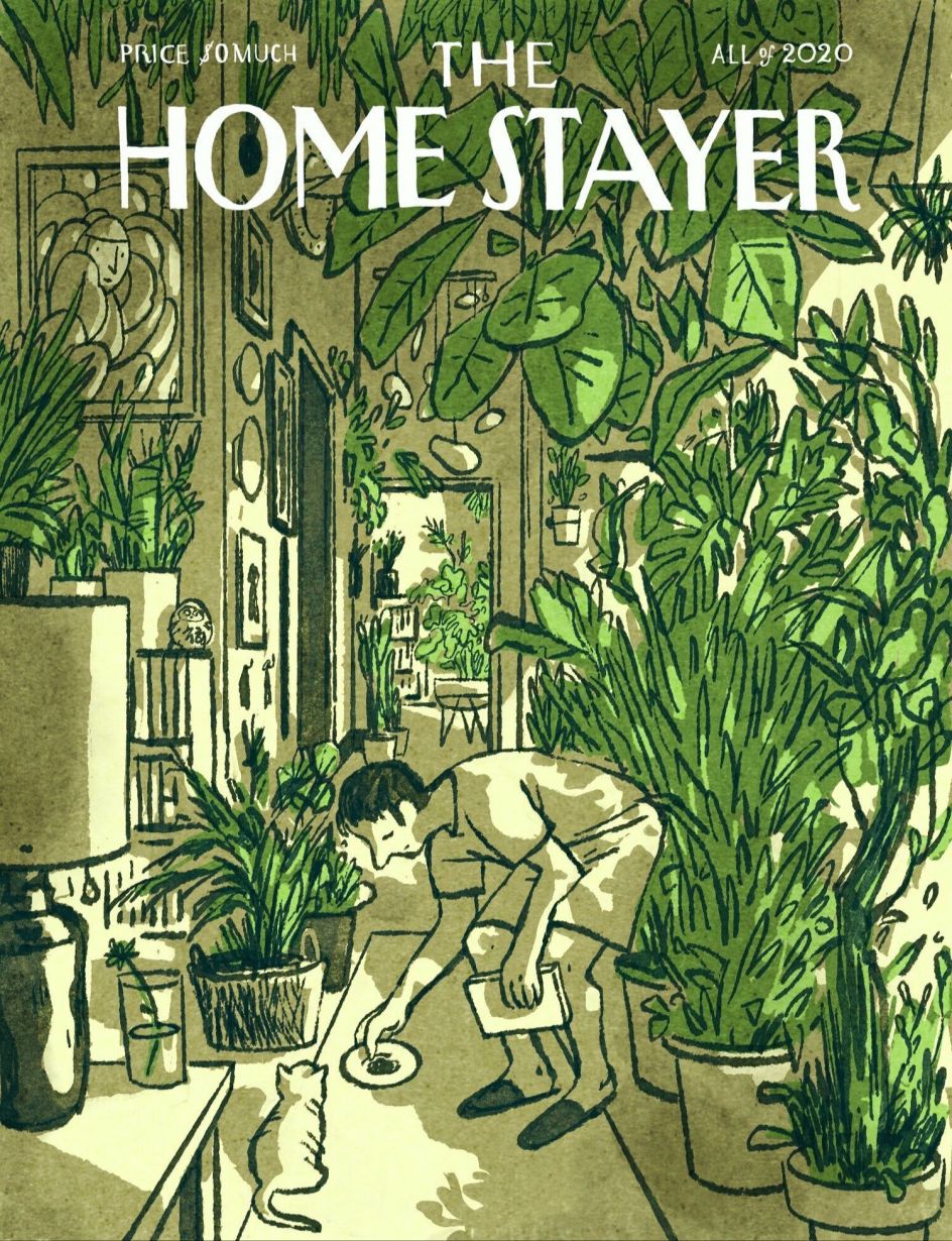
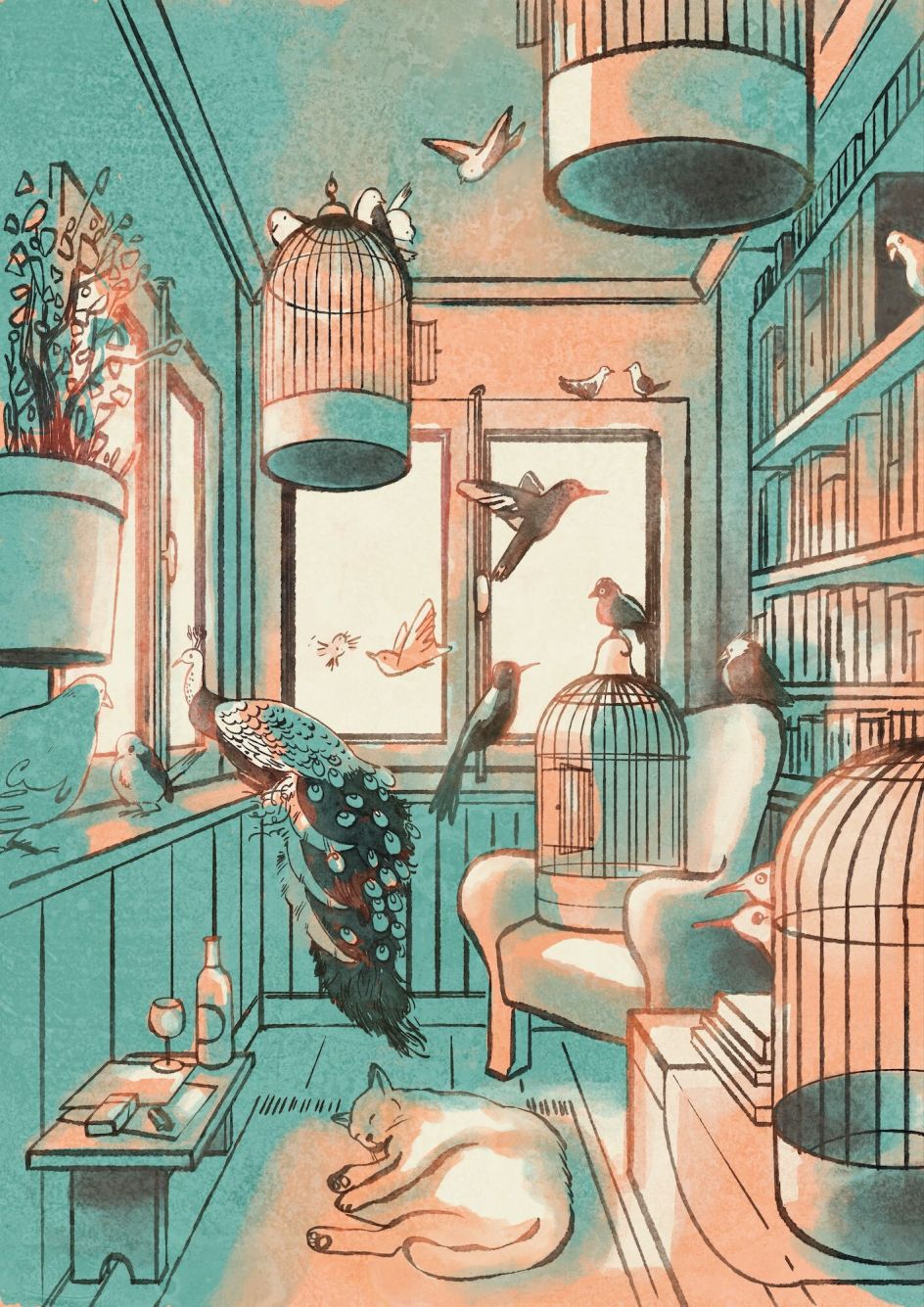
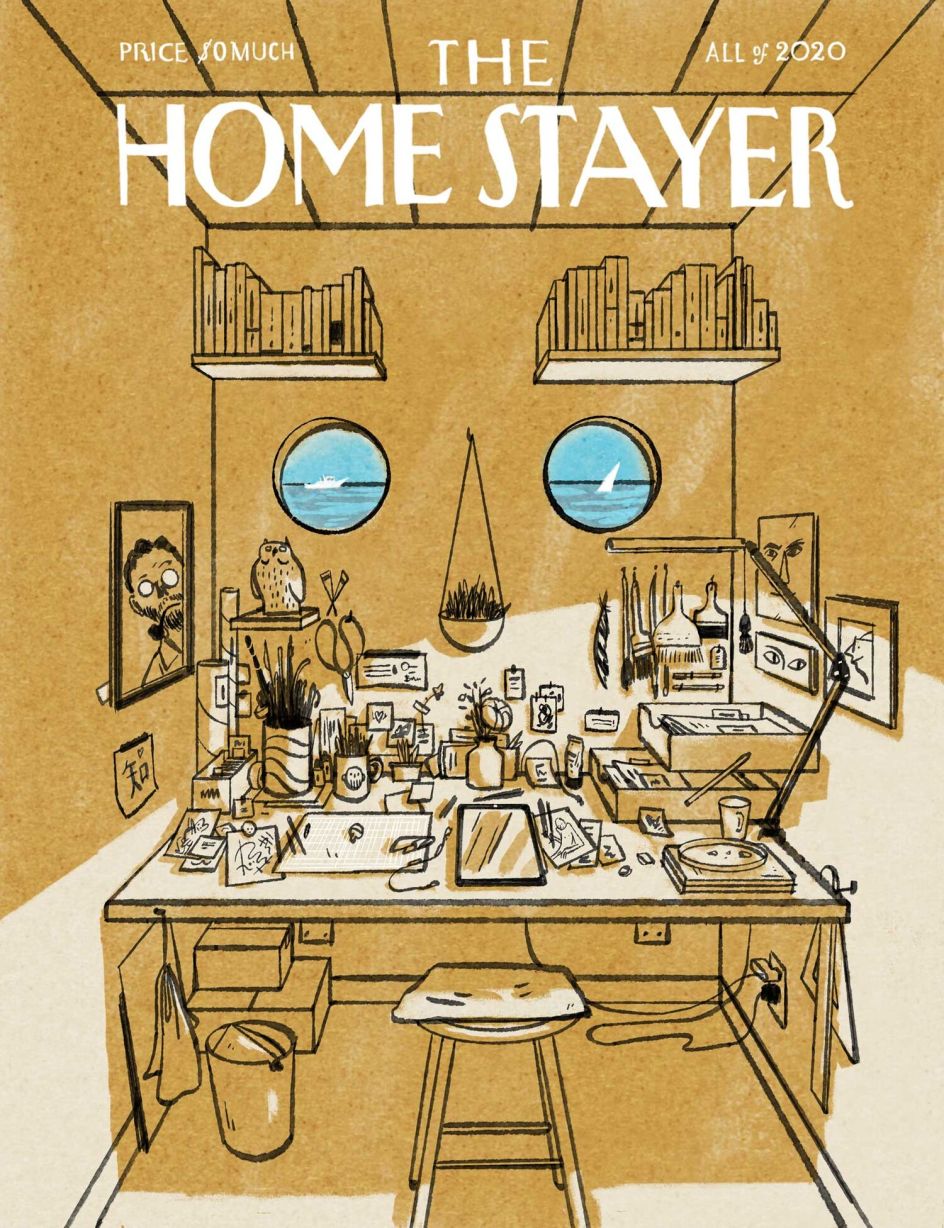
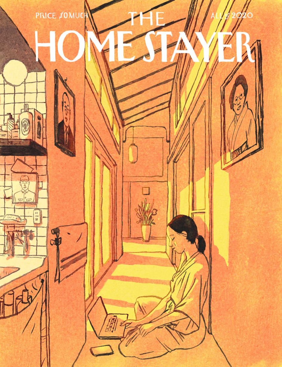
Whilst the pandemic has forced Almost Perfect's doors to shut, it's inspired one of Luis's most popular works yet in The Homestayer, a series of imaginary magazine covers modelled after The New Yorker and The Parisianer.
Where those magazines are designed as guides to the cultural life of big cities, The Homestayer instead honours the city we all now find ourselves of 'Home'. Celebrating all the small pleasures of having to stay in when everything is in lockdown, the personal project is also a nice nod by Luis to his 20 years as a magazine art director in Europe.
Having relocated to Japan, Luis is now signed to Handsome Frank, and his clients include magazines like The New York Times and Wired UK. Let's sit down with him for a virtual chat on the sofa about how Japan has changed his style, and why he prefers to be known as a 'drawer' rather than an illustrator.
How have you adapted from art direction to illustration?
I stopped doing my regular art direction and design work when I moved from Amsterdam to Tokyo seven years ago. It was obviously a huge reset at all levels, but work wise is maybe the biggest: I left behind me 20 years' worth of knowledge about type, layout, art direction and the editorial circus which had kept me fed over the years. I then took a few months to get rid of the burnout and think about what to do next. In those months, I started to draw more regularly, and I got very influenced by my new surroundings.
Yes, I was wondering: how has Japan influenced you since moving?
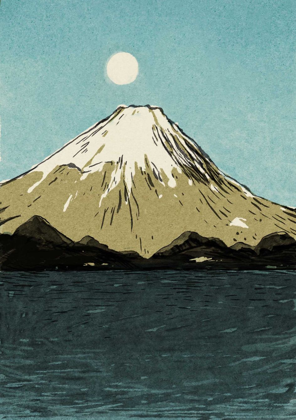
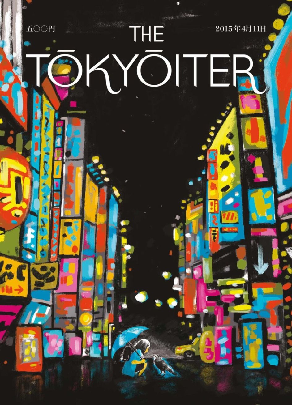
Japan is so rich in layers, abundant in imagery and references radically different to what I was used to from Europe. You learn to look at things differently, understand perspective in a different way, use different colour palettes and even the marks you make on paper get a different meaning.
To write Japanese, for example, you have to remember the shape of a kanji (Chinese character) not only by the shape but also by the direction of the strokes and the order in which you draw them. This too influenced the way I make marks on my drawings. But I think you can still see my Spanish origins in my work: a certain optimism, humour, warm colours, loose lines and friendliness, mixed with a more Japanese sense for colour and lack of symmetry.
On your blog, you mention not quite liking the word 'illustrator', preferring 'drawer.' Why so?
It comes because in Japanese they use the same word for both writing and drawing — 書 — while the verb 'illustrate' inherently means the pictures perform a submissive role to something bigger, something more important – the word. I much more prefer the Japanese egalitarian approach of both realms and the relation between them.
You love people watching (or 'people drawing'). What do you enjoy about sketching Tokyoites?
Oh, this is so hard. People in Tokyo are so different from each other, and you can never know what you're going to find. I have had conversations about macroeconomics with baristas, talked deeply with a stranger about her love for moss or with a kimono tailor about Spanish guitar music from the 1920s.
People in Japan tend to like something very deeply. When a subject catches their interest, they go really deep for it and know everything about it. This touches a soft spot for me. Their passion makes me so happy and inspires me to do my thing even deeper and makes me humbler. How can you not love something like that?
Throughout my life, I have had a very good relationship with change. It's also my only constant. So to me, this pandemic is a fantastic opportunity for all of us to finally escape the rat race and consider things seriously.
As someone who has lived around the world, I wonder if you've noticed a difference in how your fellow citizens treat life at home?
For us Tokyoites, the city is a continuation of our homes. The convenience and fantastic functioning of simply everything makes it so that we live mostly outside and go home only to sleep: people treat the konbinis (ubiquitous 24-hour supermarkets) as their fridge and pantry, the cafés as their living room/studio room/office, the perfectly safe trains are the places where you nap.
This makes homes mostly tiny (you don't need so much space to sleep anyway) and I can understand from a Western point of view the idea of lockdown here would have been hell. Still, things are not too bad here. People still go out and live a more or less normal life.
Image credit: Alex Abian
How have you been sharing your home 'city' with the family?
My wife and I had our baby girl in January, so now we mostly go for walks in our area with her. Also, of course, we've been staying inside much more, and since the borders are closed for most countries, we cannot have artists at Almost Perfect. But we have taken this as a nice break to enjoy the baby and see her grow.
Throughout my life, I have had a very good relationship with change. It's also my only constant. So to me, this pandemic is a fantastic opportunity for all of us to finally escape the rat race and consider things seriously: Is it really a good idea to keep chasing growth and money? Are we going to keep our way of life, fully knowing it’s killing our planet? If you really need to go out that badly, does it mean there's some emptiness in you that needs to be filled?
How has the reaction been to The Homestayer, which celebrates 'staying in' over going out?
How drawings, mere ink stains on a piece of paper pulp, can be a catalyst for real-life exchanges and experiences is something we often underestimate. You see, for the third issue, I found a photo on Pinterest of a house filled with plants and used it as a reference without giving it too much thought. As soon as I shared it on social, people told me that the house was very famous and belonged to an Instagram 'plant celebrity'.
I felt so bad; I had just let myself be inspired by the beauty and immediately apologised to the person and tagged him in the post. His reaction was so lovely, though; he appreciated my gesture and was so happy his home had served as inspiration for my drawing. We exchanged some more emails, and I made a version on the cover with his face on it.
Was it a magazine or particular magazine cover which inspired you to take up design for studies?
When I was at art school, I spent many hours in the library admiring copies of Graphis from the '50s and '60s. They were so strong and beautiful. Later on, came Emigré, which was, of course, a big influence on my thinking as a designer. I learned a lot about making striking page design from Wired and typography from New York Magazine.
How about the style of magazines in Japan?
The most interesting thing about Japanese media is that it seems to lack the prejudices we hold in the West; you can see all kinds of imagery and graphic approaches within the same magazine, and that's something refreshing.
Having worked in a North European country for so long makes you think in a very rigid way of how things must look on a page. In Japan, you can see calm, chaos, explanatory infographics and product photography all in the same double spread.
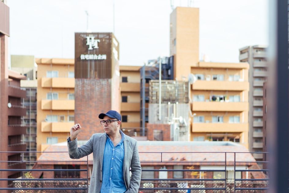
Image credit: Alex Abian
Do you illustrate for any?
I'd love to work more for Japanese magazines, although the budgets are lower than in, say, the US or Europe. Not surprisingly, they have many more images in an issue than any magazine I worked on while in the Netherlands. If they paid the same, magazines would probably be too expensive to produce.
What is surprising is that here you don't get briefed by the AD but by the editors instead. It's as if they were too important to be talking to freelancers. I keep imaging the art directors being elegant divas in a hidden luxury back room, drinking martinis in crystal glasses, stroking a Persian cat's head while saying "Yes… no… yes…" to things that are presented to them on a huge screen!


 by Tüpokompanii](https://www.creativeboom.com/upload/articles/58/58684538770fb5b428dc1882f7a732f153500153_732.jpg)

 using <a href="https://www.ohnotype.co/fonts/obviously" target="_blank">Obviously</a> by Oh No Type Co., Art Director, Brand & Creative—Spotify](https://www.creativeboom.com/upload/articles/6e/6ed31eddc26fa563f213fc76d6993dab9231ffe4_732.jpg)


