Landor & Fitch join the dots, to promote health-data initiative
There's no point in health professionals gathering data, if it just sits in a box and isn't used to improve the quality of outcomes. And so Lumos is an initiative in New South Wales, Australia, aiming to integrate health data across the general practice sector and the public health system, to enable better care for patients.

It was important to showcase this initiative effectively, so that health professionals would get to know about it and start engaging with it. And so Landor & Fitch was asked to create a unified brand strategy, name and identity for the pioneering project.
The power of data was at the heart of this brand. So the team asked themselves: What if we created a brand that could not exist without data? This was the thought that evolved from the brand idea of 'illumination': an identity that could singly represent data, and collectively reveal outcomes.
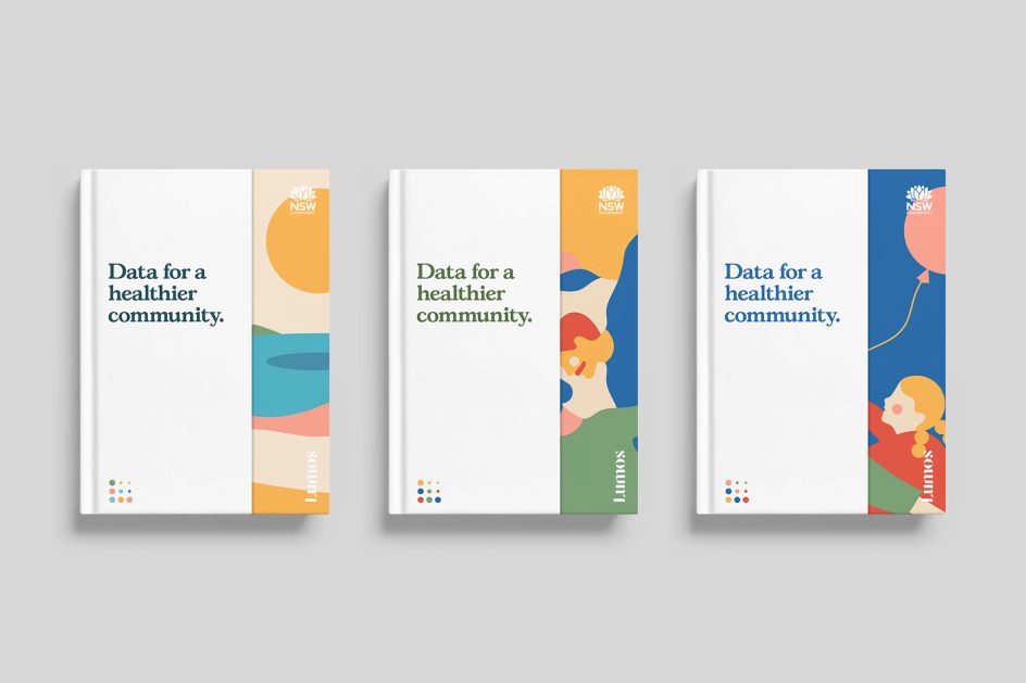
Using the simplicity of dots and a limited colour palette to represent data, Landor & Fitch created a joyful visual identity to showcase the positive impact the project seeks to have on patient outcomes.
Illustrations by Cecilia Castelli were also composed in simple and minimal forms, and represent the diversity of the people, communities and landscape of Australia. The typefaces used were Gascogne Serial and Greycliff.


 by Tüpokompanii](https://www.creativeboom.com/upload/articles/58/58684538770fb5b428dc1882f7a732f153500153_732.jpg)


 using <a href="https://www.ohnotype.co/fonts/obviously" target="_blank">Obviously</a> by Oh No Type Co., Art Director, Brand & Creative—Spotify](https://www.creativeboom.com/upload/articles/6e/6ed31eddc26fa563f213fc76d6993dab9231ffe4_732.jpg)


