Magpie Studio's identity for a new plant-based haircare range with roots in Egypt
London's Magpie Studio has created the brand identity, packaging and various marketing collateral for a plant-based haircare range called Khali Min, which launched earlier this month in Selfridges.
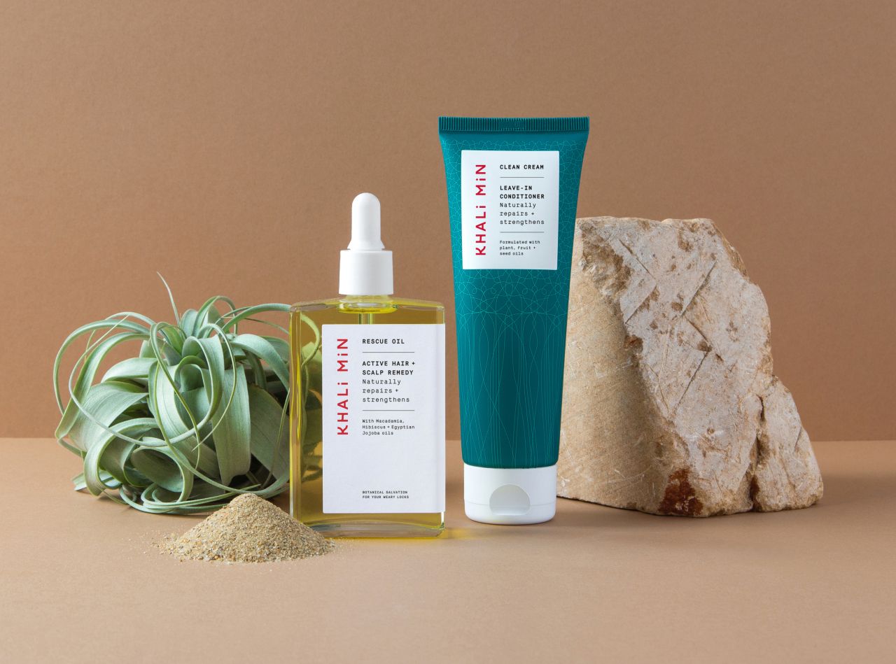
Meaning 'Free from' in Arabic, Khali Min is a clean and conscious brand that creates sustainable products formulated in the UK but with roots in Egypt. It has an emphasis on high performance, fair-trade, transparent sourcing and non-toxic ingredients, so the brief to Magpie was to develop an identity that would "balance its Egyptian heritage with a clean and modern aesthetic to appeal to a conscious audience". But because it's a startup, the launch needed to be budget-friendly.
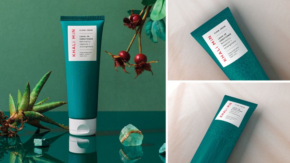
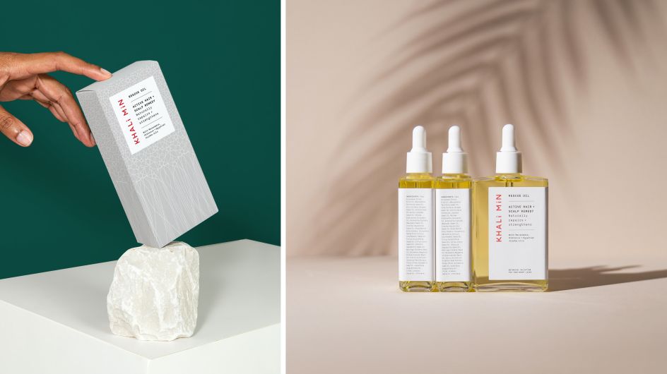
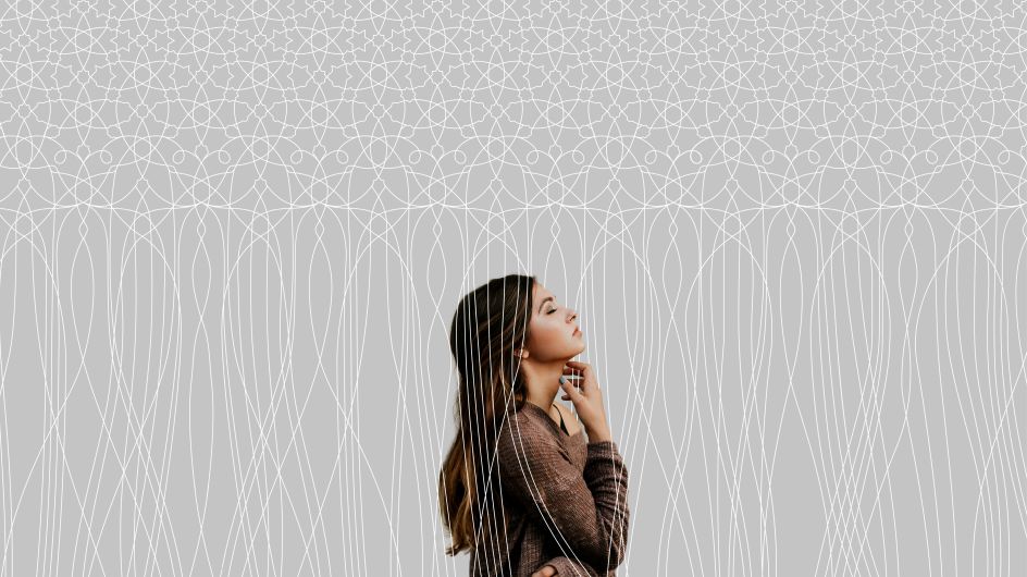
Taking a heap of inspiration from its Egyptian roots, Magpie created an Arabic pattern that transforms into free-flowing lines, "representing unruly hair that's been tamed," as the studio puts it. The logo draws reference from Arabic calligraphy and Magpie used playful language to further build the narrative with lines like 'raised in the warm desert winds of Egypt, we know a thing or two about haircare' and 'freedom for your spirit, not just your hair'.
Product photography, meanwhile, evokes warmth and gives a sun-drenched feeling, styled using raw natural ingredients.
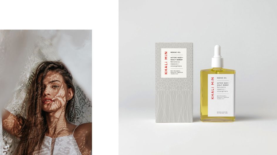
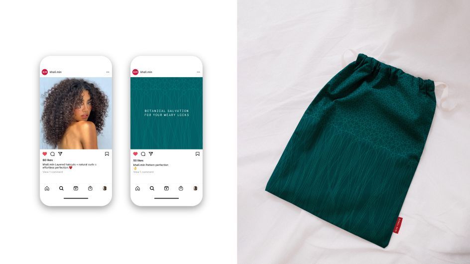
Khali Min's founder Vanessa Kahlo said: "We asked Magpie to draw from a storied, structured cultural tradition that is instantly recognisable. Their genius was to create an Arabic-influenced typographical logo and an arabesque interpretation that pays tribute to this heritage. They gave us something familiar but new."
Since its launch, Khali Min has been recognised in the Beauty Shortlist's Wellbeing Awards and it is now stocked in Selfridges, with its spring collection making its debut this month.


 by Tüpokompanii](https://www.creativeboom.com/upload/articles/58/58684538770fb5b428dc1882f7a732f153500153_732.jpg)


 using <a href="https://www.ohnotype.co/fonts/obviously" target="_blank">Obviously</a> by Oh No Type Co., Art Director, Brand & Creative—Spotify](https://www.creativeboom.com/upload/articles/6e/6ed31eddc26fa563f213fc76d6993dab9231ffe4_732.jpg)


