Manchester's latest workspace breaks away from typical office CGIs with a quirky new identity
To help the local creative community get excited about a new workspace in Manchester opening next year, a playful identity has been unveiled, featuring gorgeous illustrations by German illustrator Klaus Krammerz that draw on the "weirdness and the wonderfulness" of the people you work with.
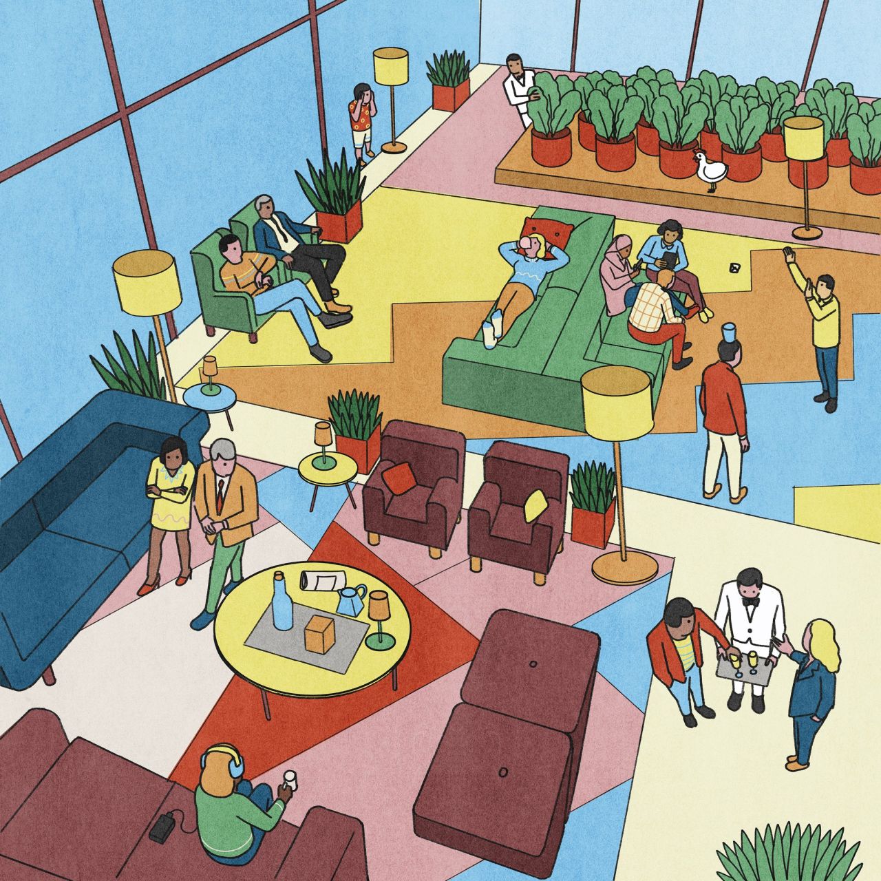
Developer HBD is set to launch Island in 2024, a large net zero-carbon workspace offering private offices and an entire ground floor dedicated to informal working, eating, meeting and events. It's an innovative new building for Manchester, set in a historic neighbourhood right in the heart of the city, and even comes with its own rooftop terrace and wellness hub.
With a thriving local creative community, it's only natural that HBD wants to appeal to the people it hopes to attract. It's why it collaborated with Manchester-based studio Modern Designers to craft a playful and surreal identity, one that's brought to life with quirky illustrations by Klaus Krammerz.
His artworks are bold, colourful, and peppered with unexpected features – from giraffes and pandas to quirky characters participating in unusual activities that break the norm from your usual commercial property CGIs or awful stock photography. Each scene is set out in his usual style, inspired by American comic art of the 1960s with a dose of storytelling that's fresh, unseen and cool. "Every detail matters," says Klaus. "It is like the set design of a play – each element reinforces the message in the scene. It's more than telling a story; I try to suggest a story, using clues to make the viewer complete it using their own imagination."
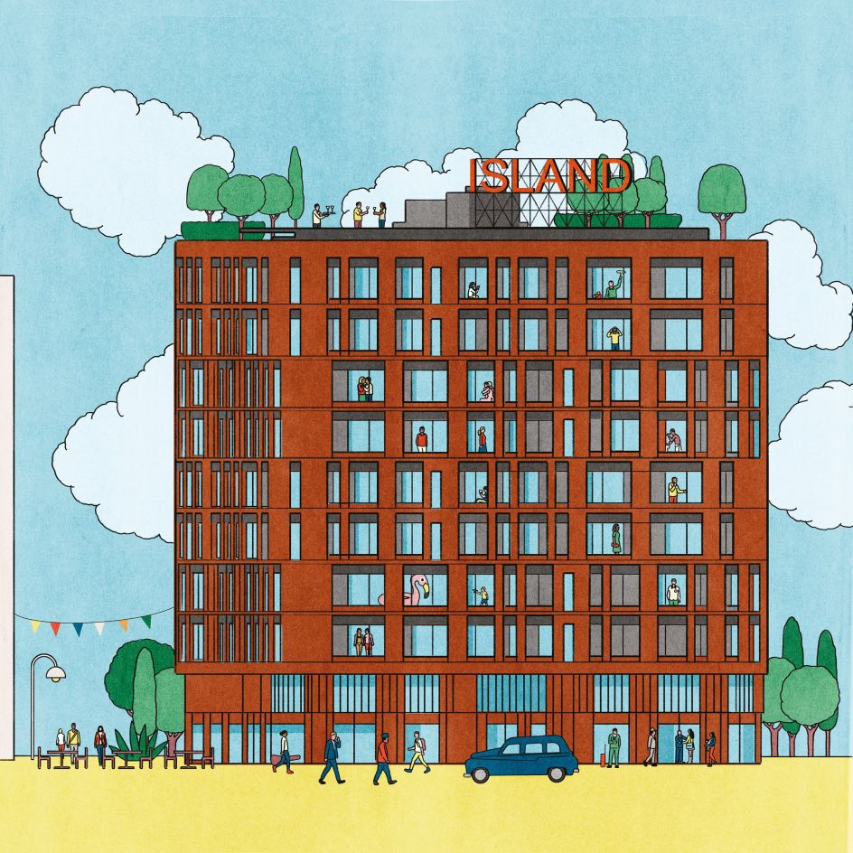
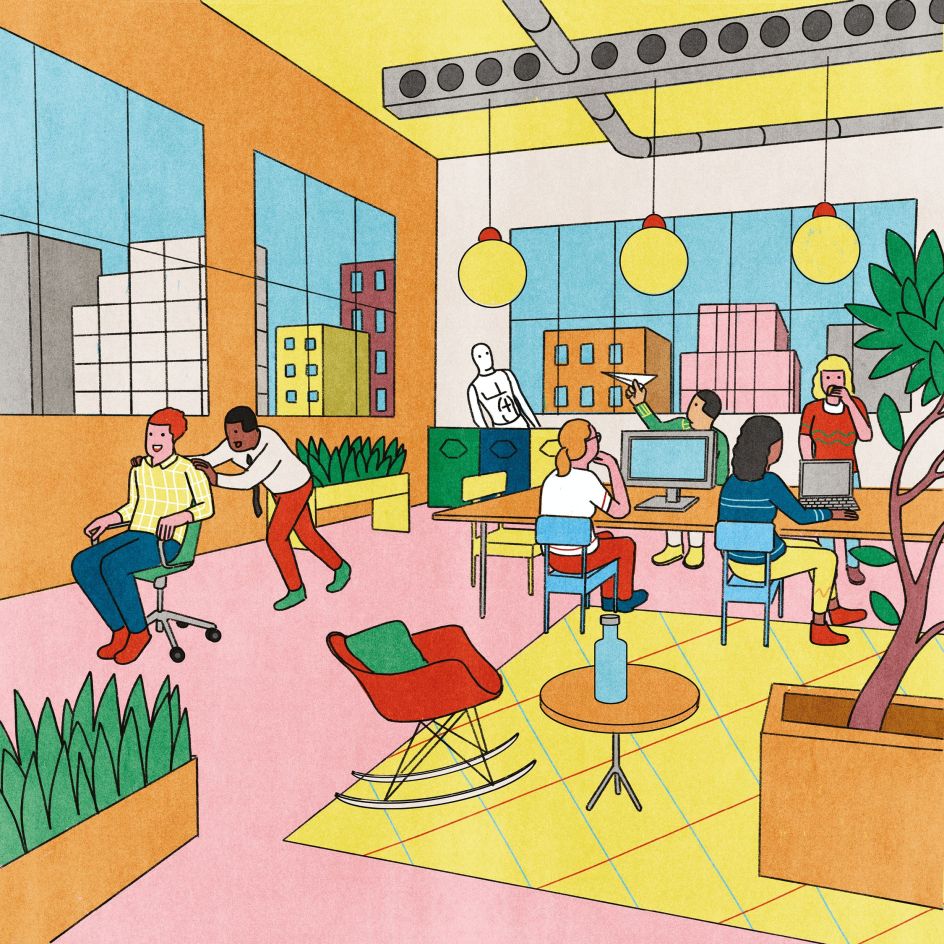
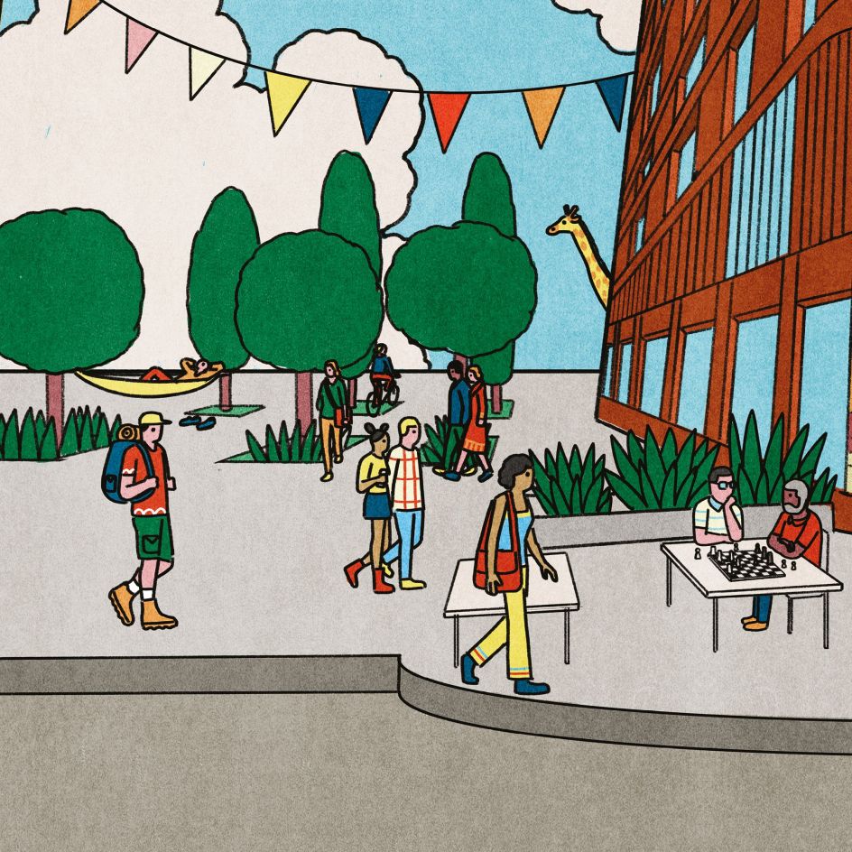
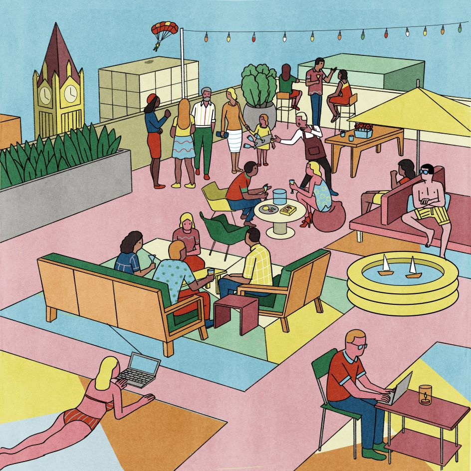
But it doesn't stop there. The wider identity and website design by Modern Designers succeed in articulating what will be a premium yet fun new workspace for Manchester. One that doesn't take itself too seriously and understands the office doesn't have to be stuffy or dull – without forgetting the important stuff like sustainability and innovation.
In typical Modern Designers' fashion, the identity is clean and bold, with typography leading the way. The logo, headlines, and body copy all feature in Monotype's Neue Haas Unica, a revival of a sans-serif typeface by Team '77, released to great acclaim in 1980. It's almost a hybrid of Helvetica, Univers and Akzidenz Grotesk, so it naturally offers a minimalist, understated and elegant tone to the branding, hitting that sweet spot between professional and playful.
The accompanying colour palette is fresh and vibrant in appealing pinks, greens, blues, reds and yellows. The tone of voice continues the simple approach: 'Use less, do more', reads one message and another simply claims: 'Designed for happy humans'.
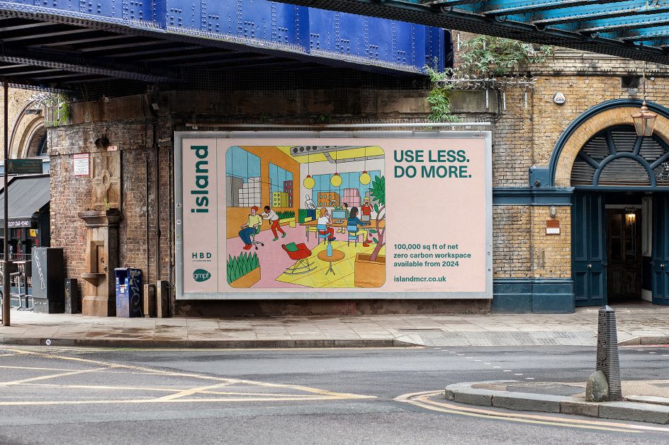
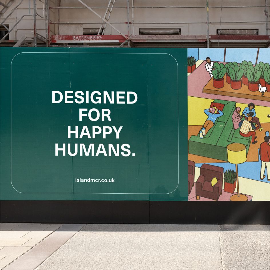
This palette extends to the illustrations by Krammerz, which help to address HBD's original brief for the project. "One of the biggest challenges for businesses is how to get teams back into the office," explains Susie Stubbs of Modern Designers, "and successful workspaces now flex to meet the needs of each individual worker. It's this idea that Klaus' illustrations draw on the weirdness and the wonderfulness of the people you work with."
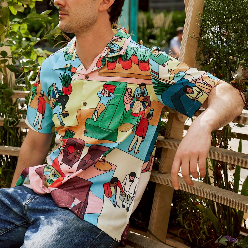
The work has been rolled out to a new website for Island, designed by Modern Designers, that includes interactive features to explain how the building will operate and benefit the city. Of course, the illustrations by Krammerz lead the way, as they do in a wider campaign seen around Manchester on billboards and the building itself. There's even a shirt – yes, a shirt. How we get our hands on it, we're not yet sure. But you'll be the first to know once Krammerz confirms where it's available.
Island on John Dalton Street is located in the heart of Manchester's Central Business District, and HBD will complete the development in 2024. Find out more about the building and see the work in action over at islandmcr.co.uk.


 by Tüpokompanii](https://www.creativeboom.com/upload/articles/58/58684538770fb5b428dc1882f7a732f153500153_732.jpg)

 using <a href="https://www.ohnotype.co/fonts/obviously" target="_blank">Obviously</a> by Oh No Type Co., Art Director, Brand & Creative—Spotify](https://www.creativeboom.com/upload/articles/6e/6ed31eddc26fa563f213fc76d6993dab9231ffe4_732.jpg)


