Martin Reznik brings a touch of film noir suspense to furniture design illustrations
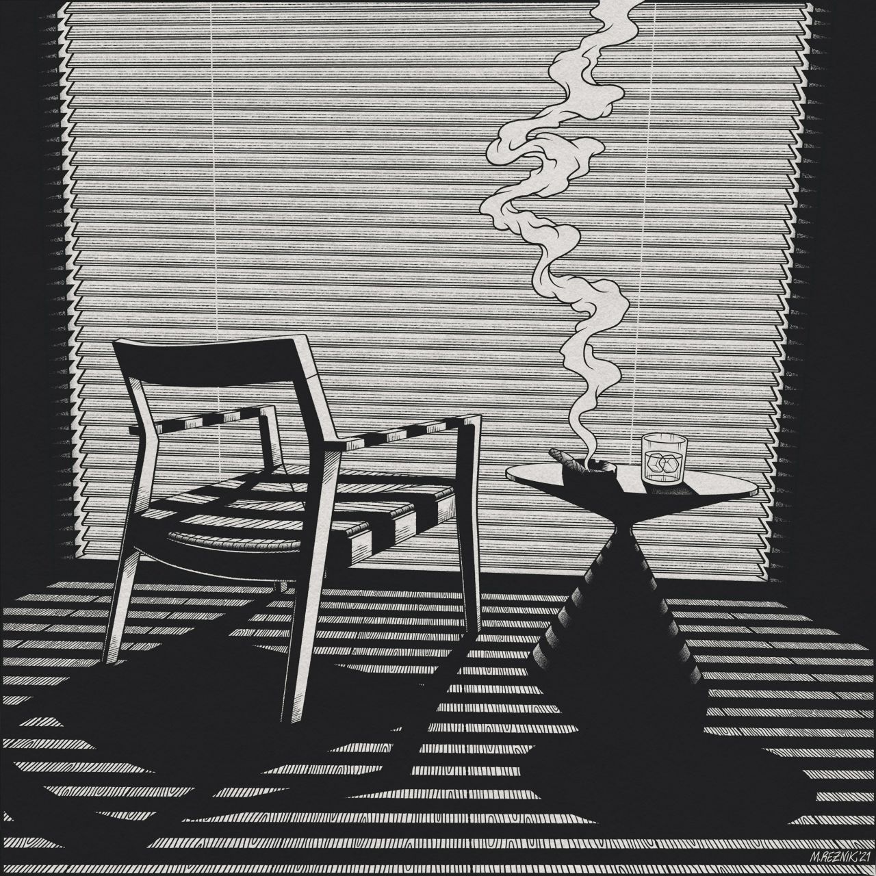
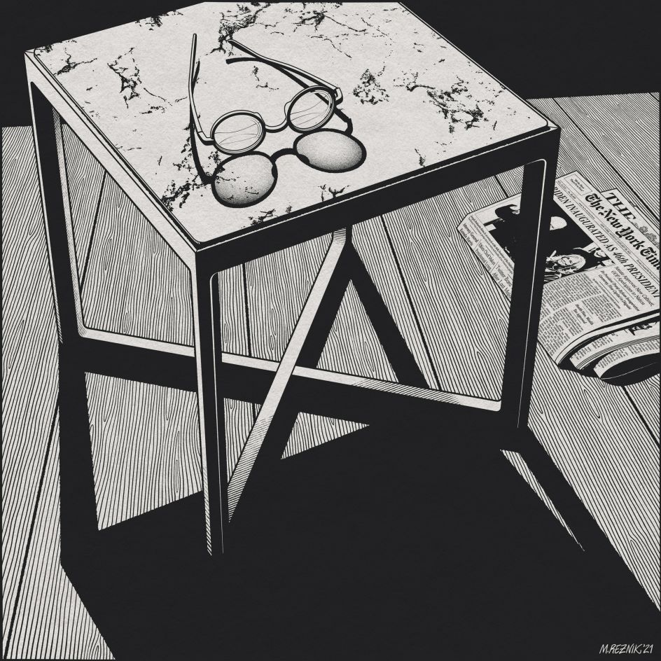
Polish illustrator Martin Reznik has turned the conventions of furniture design illustration on their head by depicting the creations of Marc Krusin as the stars of a moody, black and white film noir. With powerful lighting and suspenseful composition, the project draws the viewer into a smoke-filled world of mystery.
A 2013 illustration and printmaking graduate from the University of East London, Martin has already put his skills to good use by designing packaging, logos and merchandise for various clients, as well as branching out into editorial illustration.
But it's with these moody and atmospheric promotional illustrations for Knoll and Desalto that he's struck gold, with the project recently winning Gold Award and People's Choice Award in the Creativepool Annual 2021 Illustration Category. On top of that, the opening image of a chair cast in blind shadows was also longlisted for the AOI World Illustration Awards 2021 in the Design Product & Packaging category.
"The series consists of four highly detailed black and white digital illustrations and a comic/poster uniting them together," Martin tells Creative Boom. "The first image was crucial in setting the tone for the whole series. Placing the viewer behind the furniture and the addition of some everyday objects brings a pinch of narrative and mystery to the scene."
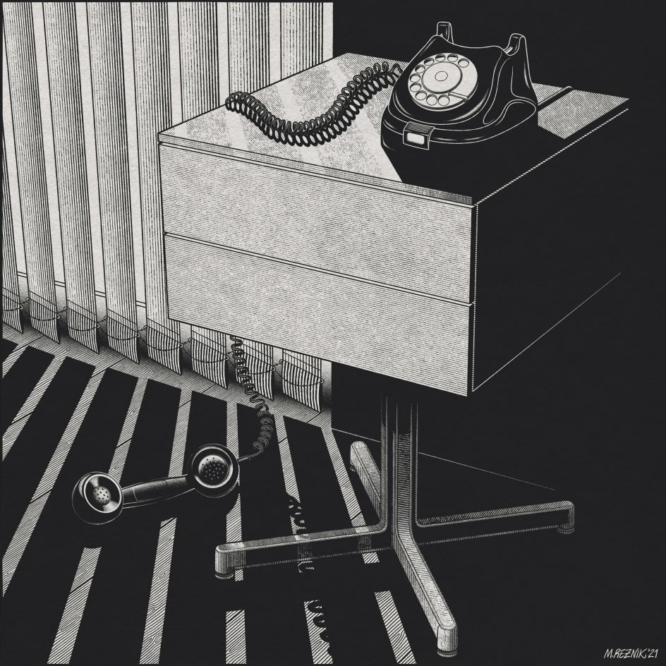
Another key element to the illustrations is the lack of a human presence. We can see the traces of a person via the swirling cigarette smoke, but where are they? This was a deliberate decision on Martin's part to add a further 'whodunnit' element to the series. Successive images which feature seemingly abandoned objects like a newspaper and a phone receiver lying on the floor help to deepen the viewer's curiosity and suggest that they are looking at a crime scene.
"The perspective in the images implies someone (the viewer) wandering around and surveying the apartment," Martin adds." I used Adobe Illustrator to construct the furniture and interiors accurately and then Photoshop to apply textures, light and draw other elements using Wacom Cintiq tablet."
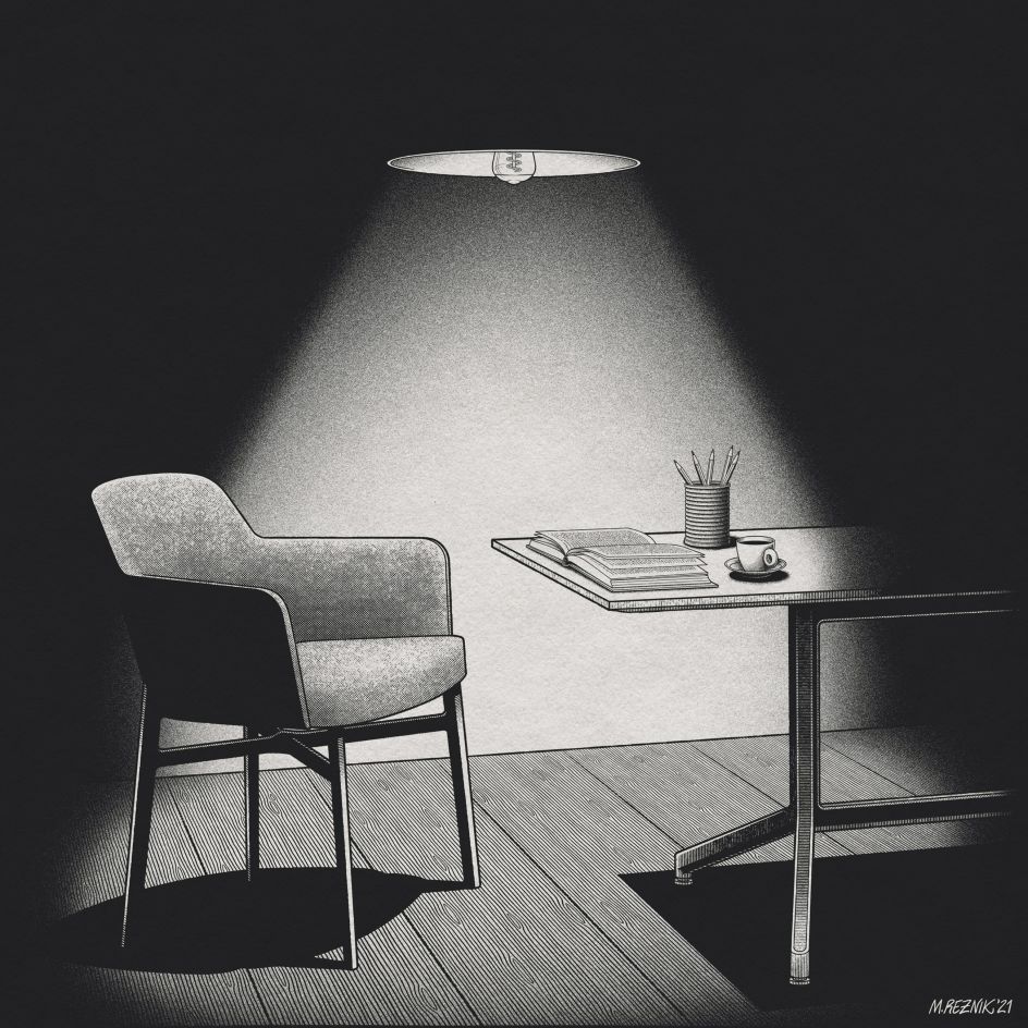
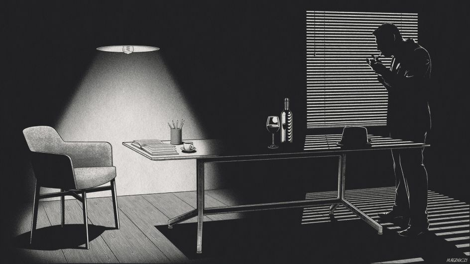
Every crime thriller needs a resolution, though, and this project is no exception. Despite initially resisting the idea to include a figure, Martin couldn't help but wonder about the smoker missing from the first image. "I wanted him to reappear in the last image closing the series, but Marc was strongly against any human figures in the scenes. I had to find a way to convince him."
To win Marc over, Martin extended the fourth illustration and included a barely visible silhouette of the smoker against the window. Crucially, this part of the image only appears as a scroll option on an Instagram post. "Marc really liked this solution and thought it added an element of surprise and closure to the story."
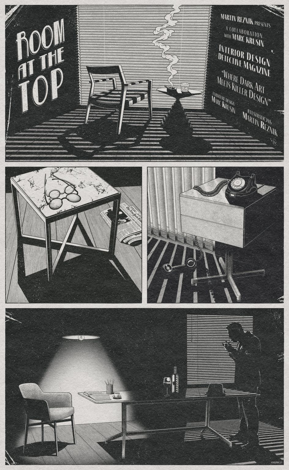
Finishing off the project is a film noir comic-cum-poster that wasn't originally part of the commission. "I've decided to include it as an extra," explains Martin. "I thought it brings all the illustrations nicely together, and it is an obvious culmination of the style chosen for this project. "


 by Tüpokompanii](https://www.creativeboom.com/upload/articles/58/58684538770fb5b428dc1882f7a732f153500153_732.jpg)

 using <a href="https://www.ohnotype.co/fonts/obviously" target="_blank">Obviously</a> by Oh No Type Co., Art Director, Brand & Creative—Spotify](https://www.creativeboom.com/upload/articles/6e/6ed31eddc26fa563f213fc76d6993dab9231ffe4_732.jpg)


