Masquespacio design firm reveals its new brand identity and colourful studio
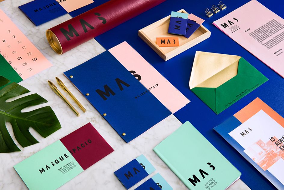
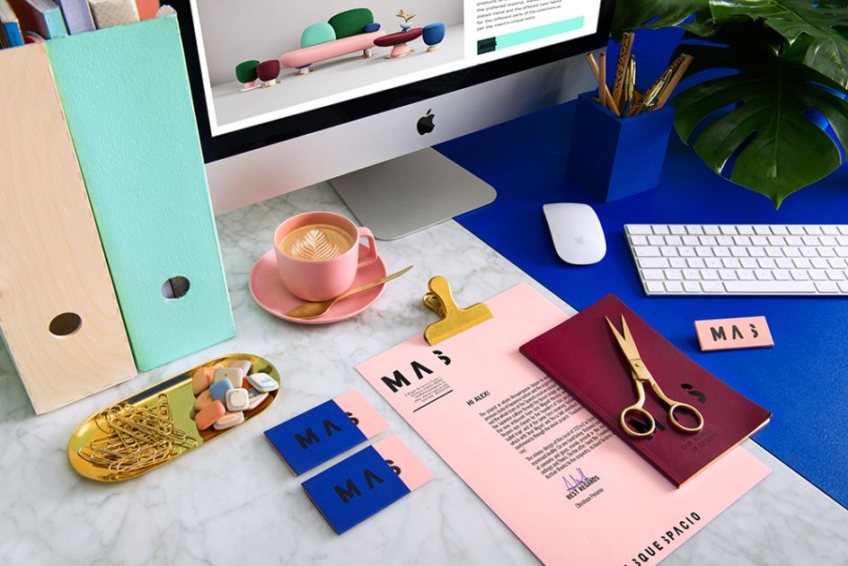
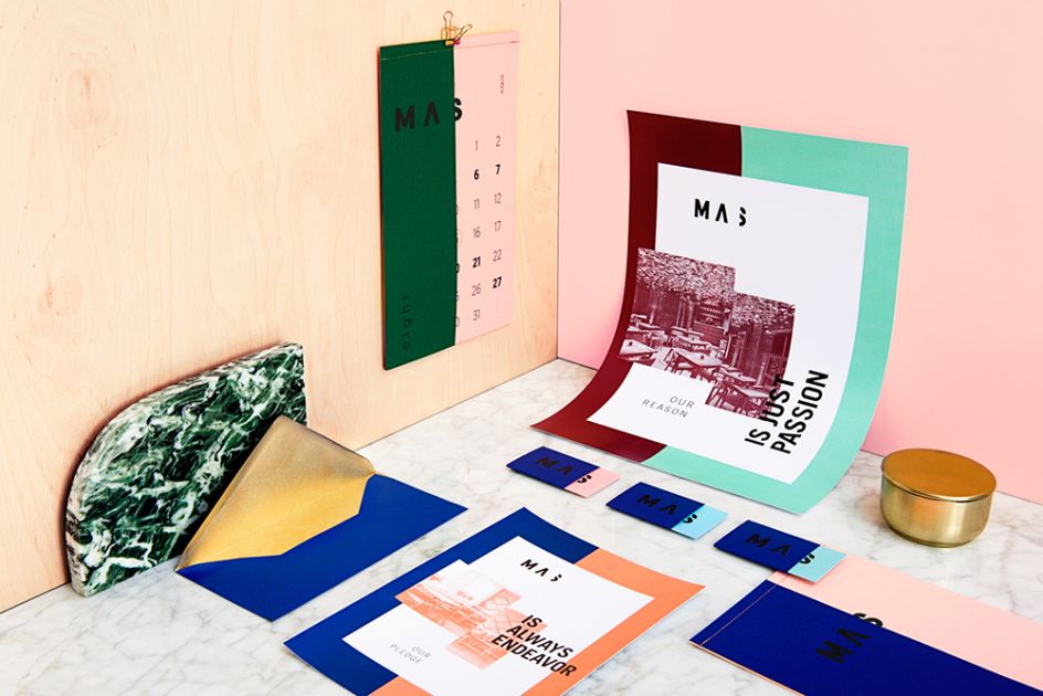
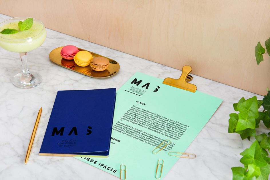
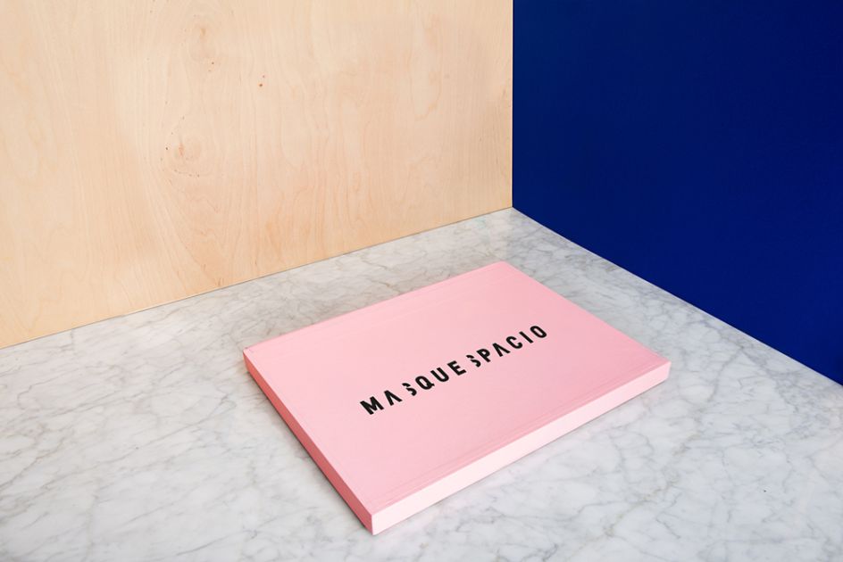
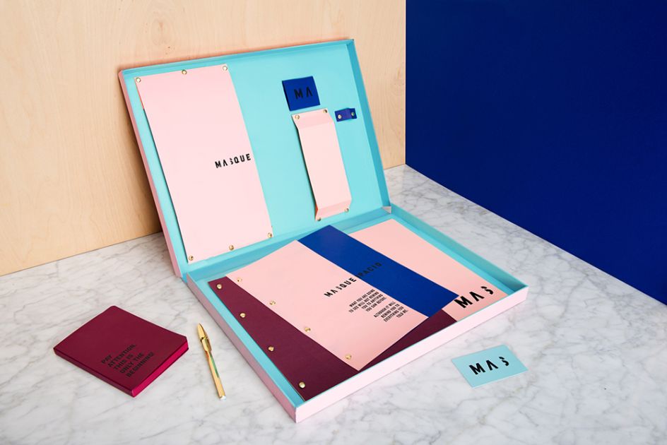
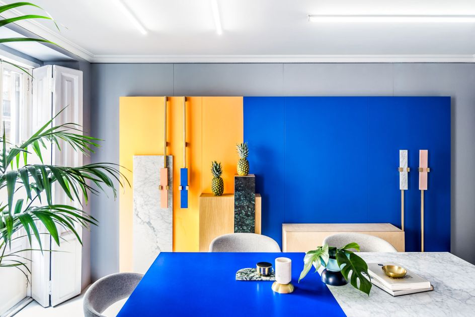
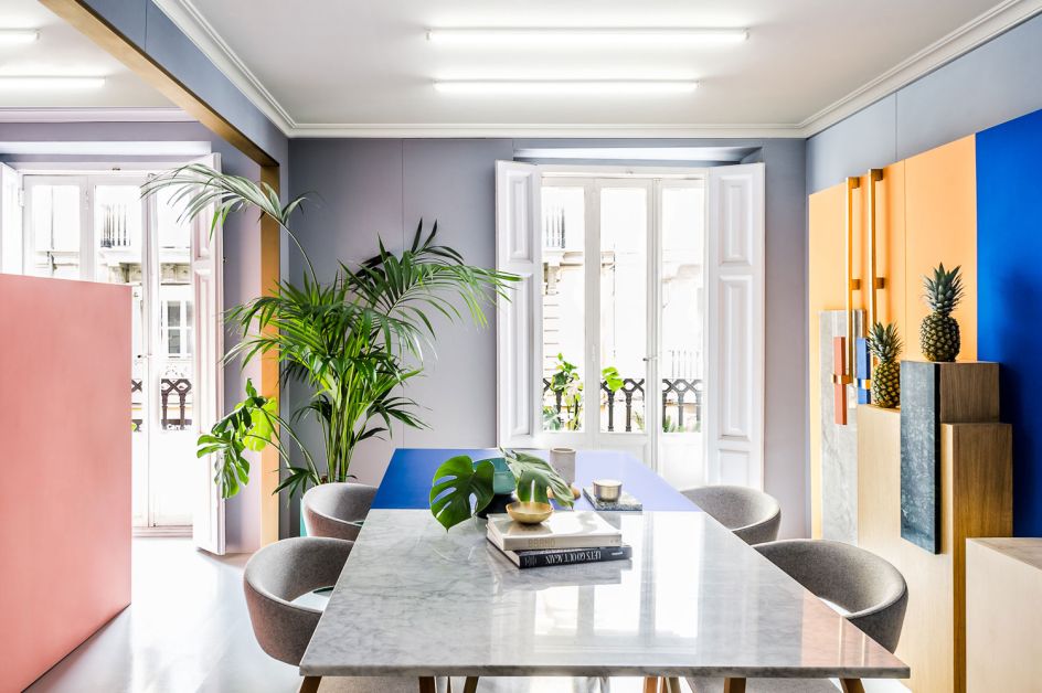
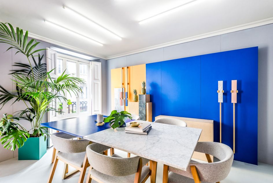
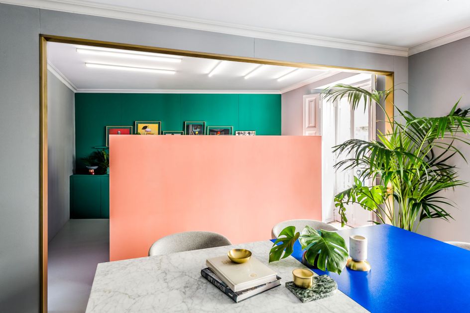
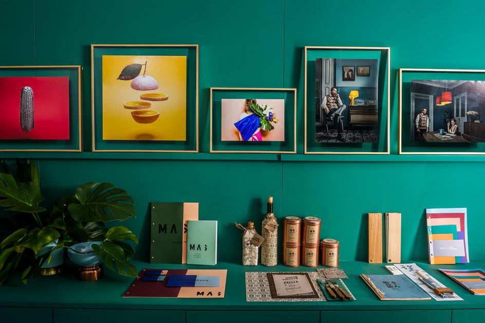
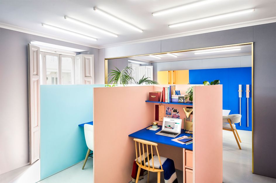
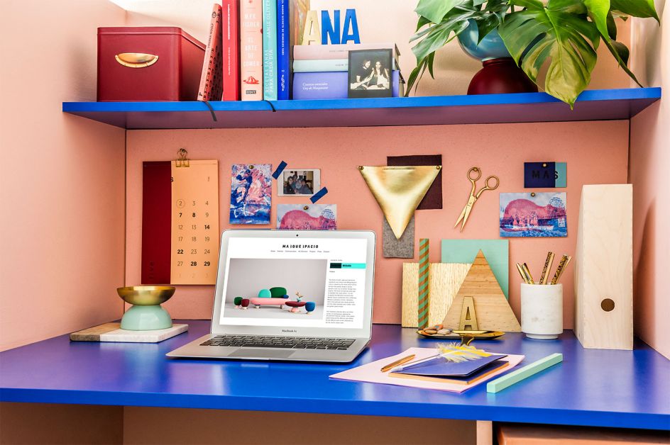
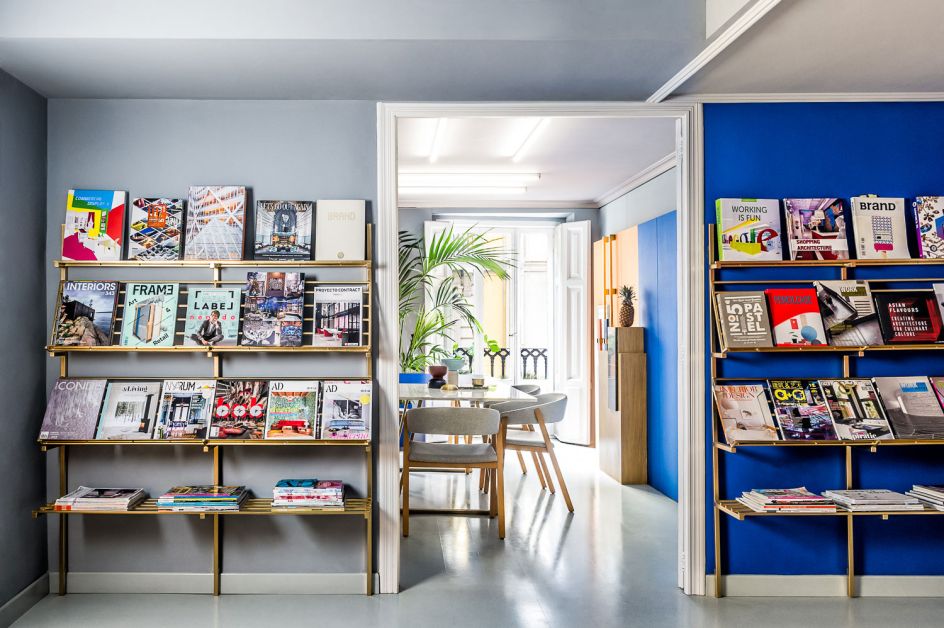
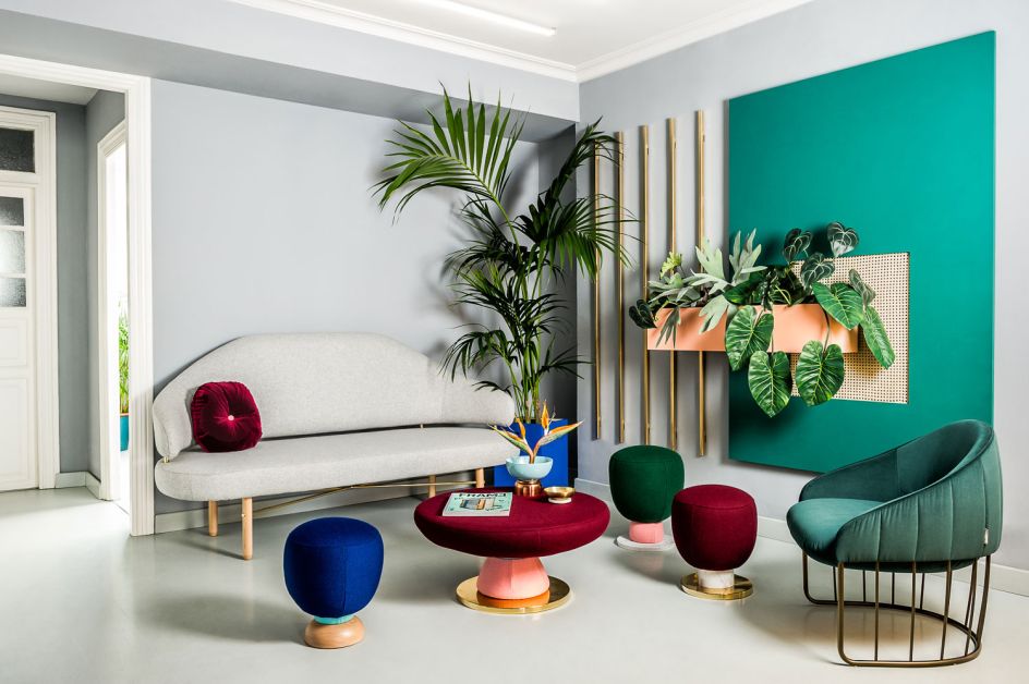
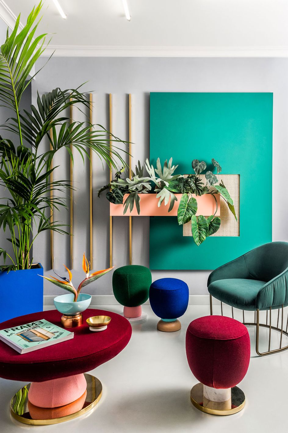
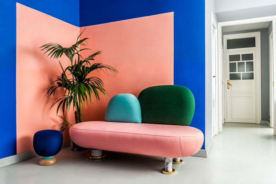
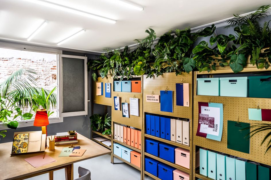
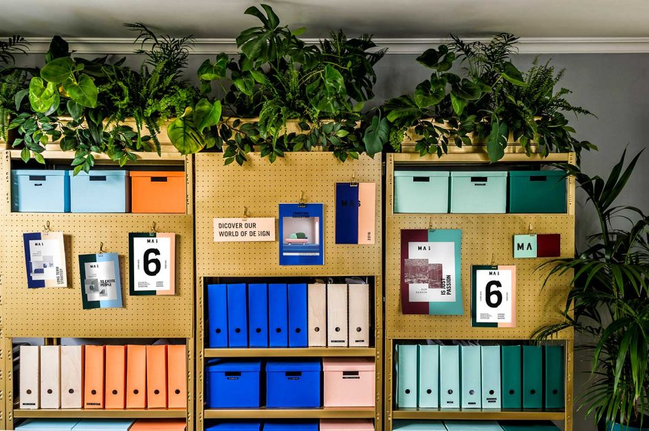
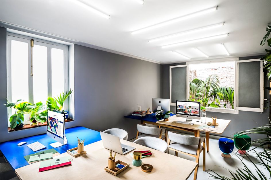
When Spanish creative agency Masquespacio decided to create a new brand identity for itself to celebrate its fifth anniversary, it also pulled out all the stops to redesign its entire studio in Valencia. Taking inspiration from its signature style of bright colours, geometric shapes and contrasting materials, the branding flows seamlessly from business cards and letterheads to office furniture and décor.
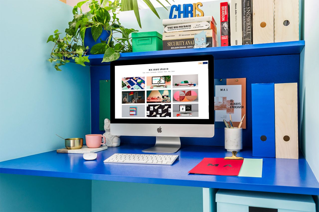
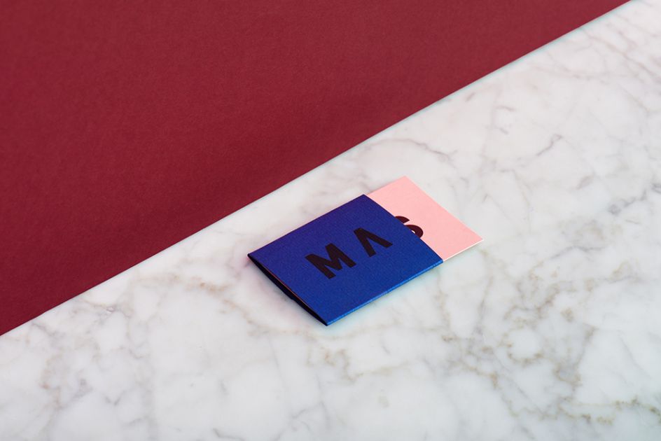
The new logo is based on the consultancy's name - 'Mas' meaning 'More' in English, with the letter 's' divided into two parts to symbolise the added value offered by Masquespacio in each of its projects. Meanwhile, the brand consists of seven different colours that can change depending on what's on-trend at any given moment. In fact, using a palette of these on-trend hues, the studio's interior colours will also be changed annually to keep up with the latest fashions.
Ana Milena Hernández Palacios, Creative Director of Masquespacio said: “Although our studio is technically a workspace, we wanted to incorporate decorative elements, alongside vivid colours and upholstered furniture with the aim to create a warm atmosphere that felt like home.”
Masquespacio is an award-winning creative consultancy launched in 2010 by Ana Milena Hernández Palacios and Christophe Penasse. Combining the two disciplines of their founders, interior design and marketing, the Spanish agency creates branding and interior projects for clients internationally. Find out more at www.masquespacio.com.
Photography of the studio by Bruno Almela and of the branding by Luis Beltran


 by Tüpokompanii](https://www.creativeboom.com/upload/articles/58/58684538770fb5b428dc1882f7a732f153500153_732.jpg)


 using <a href="https://www.ohnotype.co/fonts/obviously" target="_blank">Obviously</a> by Oh No Type Co., Art Director, Brand & Creative—Spotify](https://www.creativeboom.com/upload/articles/6e/6ed31eddc26fa563f213fc76d6993dab9231ffe4_732.jpg)


