Michelle Wagenaar's joyful posters capture the sad and fun aspects of life
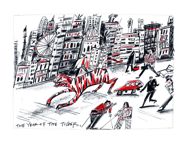
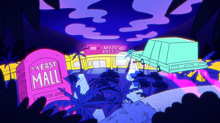
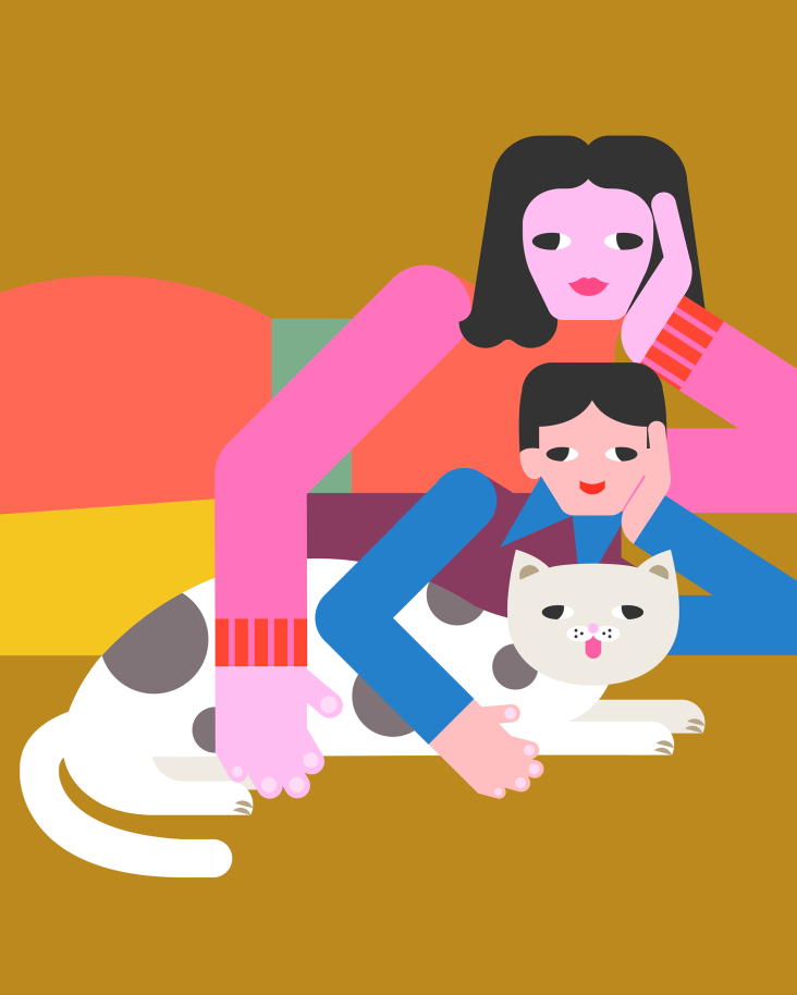
Netherlands-based freelance illustrator Michelle Wagenaar taps into social media-induced angst to create bright, playful posters that acknowledge the sad sides of life. But far from being all doom and gloom, they are a fun and honest reaction to struggles that everybody in the online world deals with.
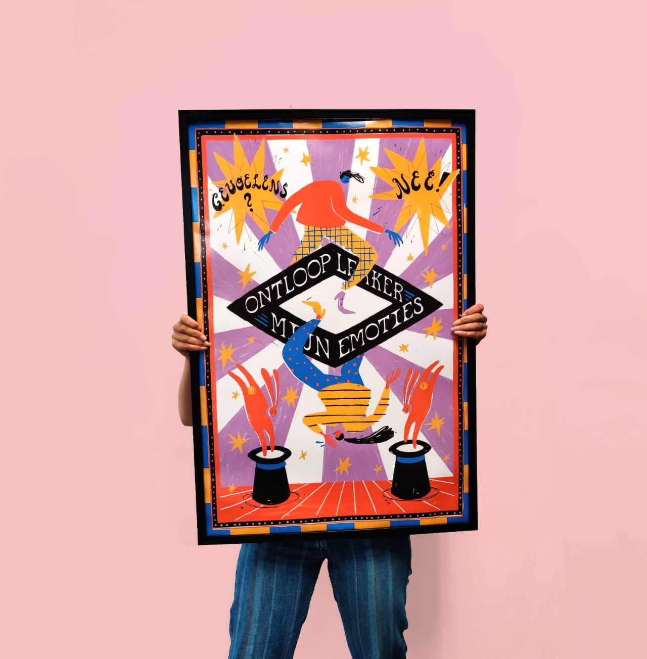
It's all too easy to feel overwhelmed when scrolling through social media. If you're not looking at photos of an exciting holiday, you're likely getting bombarded with other exciting life updates from friends and family. The endless stream of content can get a bit too much, especially when it only concentrates on upbeat stories.
For Artez Academy graduate Michelle Wagenaar, this side of social media is a typical part of millennial culture and has influenced her artwork. But rather than getting bogged down by it, she takes a more optimistic approach. " In this world, the sad side of life is often avoided, whereas everyone knows life consists of both a fun and sad side," she tells Creative Boom.
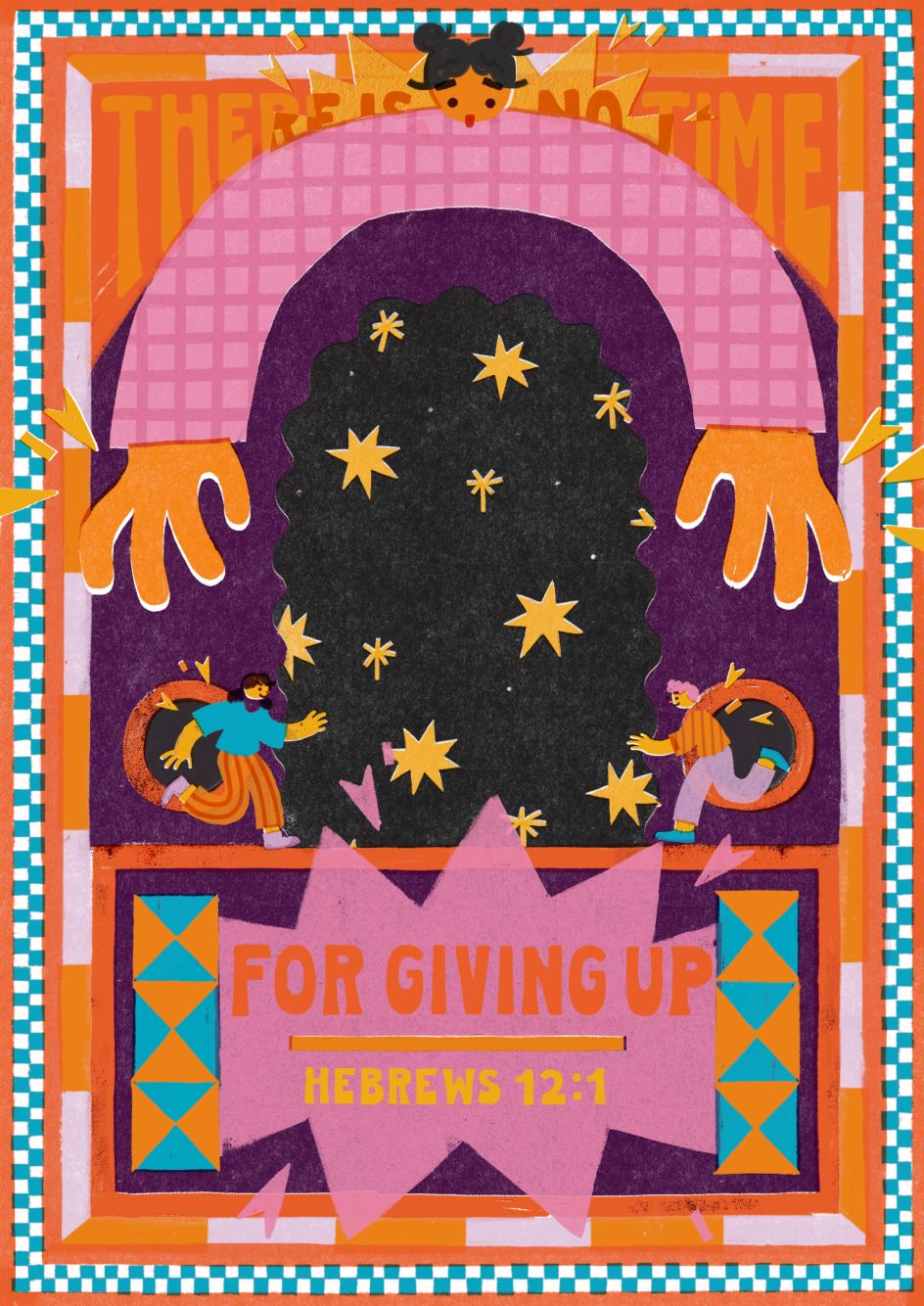
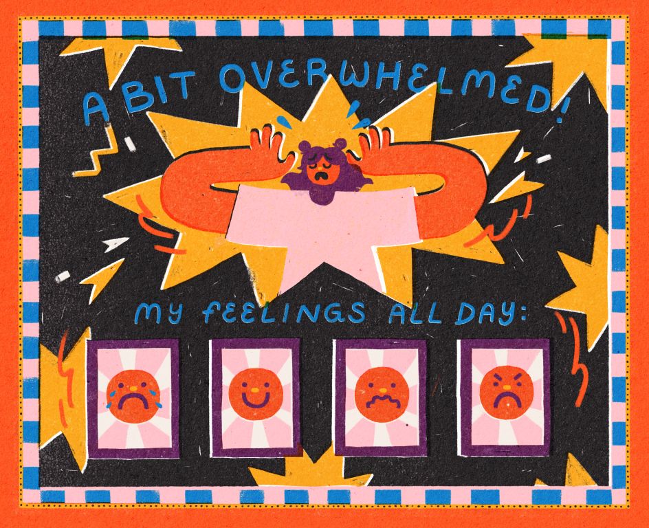
This observation gave Michelle the urge to be honest about life by expressing both sides of it through her illustrations. "I didn't want to dwell on those feelings, so I came up with the idea to depict my subjects in a playful and humorous way," she says. "This turned out to work really well for me, so I explored this concept further and came up with my current style: joyful, playful, and humorous illustrations about the fun and sad side of life!"
Outside of social media, Michelle also draws inspiration from music. The band AJR was the first influence, which gave her the idea of taking life's sadder aspects and turning them into something more positive. And it wasn't long until she noticed a similar recurring theme in the Bible.
"People like Joseph, Esther, but also Jesus Himself, had to go through trials to achieve something greater for others," she explains. "This concept, but also the Bible as a whole, is also a big inspiration of mine as it's all about life and the meaning of it. It's a theme that my work centres around."
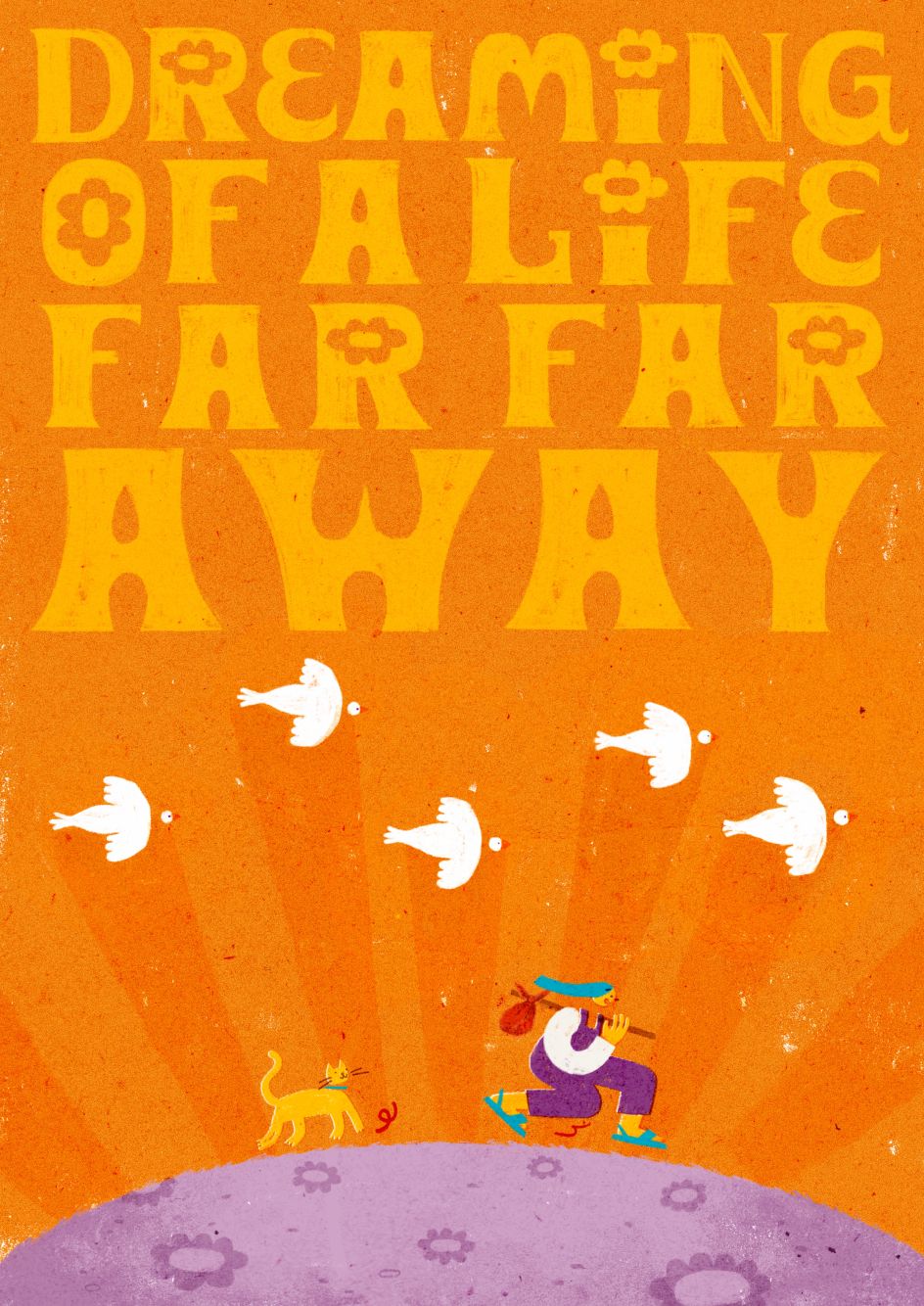
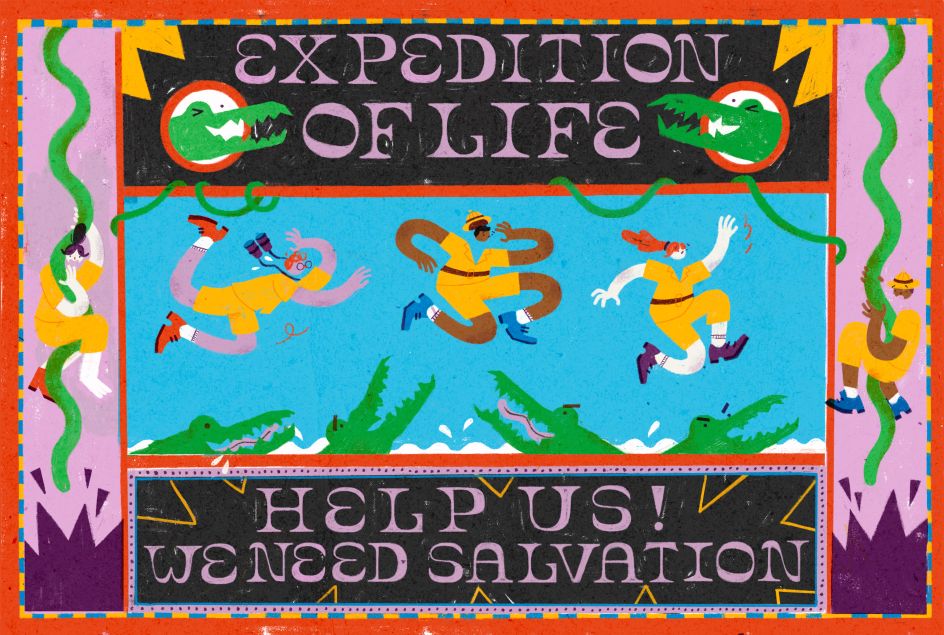
As for visual inspiration, Michelle is fascinated by packaging as it ties together everything from typography to creative illustrations and marketing. "As a package needs to be functional, it pushes the designer's ability to problem solve," she adds. "I love to imagine how the designer does this whenever I look at a package, as in illustration, you also encounter visual problems. It can be a real pain but also spark my creativity!"
All of these factors come together in Michelle's poster series. What started out as a side project where she would experiment with depicting sad thoughts in a playful manner has grown into a joyful collection that pushes her creativity.
"I used bold colours, typography and humour to avoid dwelling on sad thoughts," she reveals. "It turned out to work really well for me and the viewer. I noticed that by depicting something sad in a playful way, I made it more accessible and nuanced.
"I believe it's important to do something with your thoughts and emotions instead of dwelling on them, so I was really happy that my work could contribute to this! Eventually, the poster project grew and became an ongoing series where I make joyful posters about the sad and fun aspects of life."
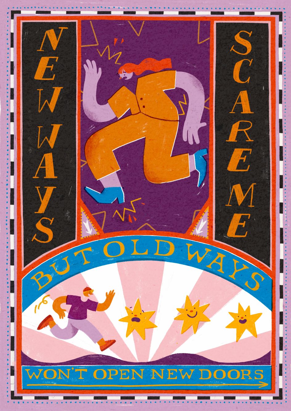
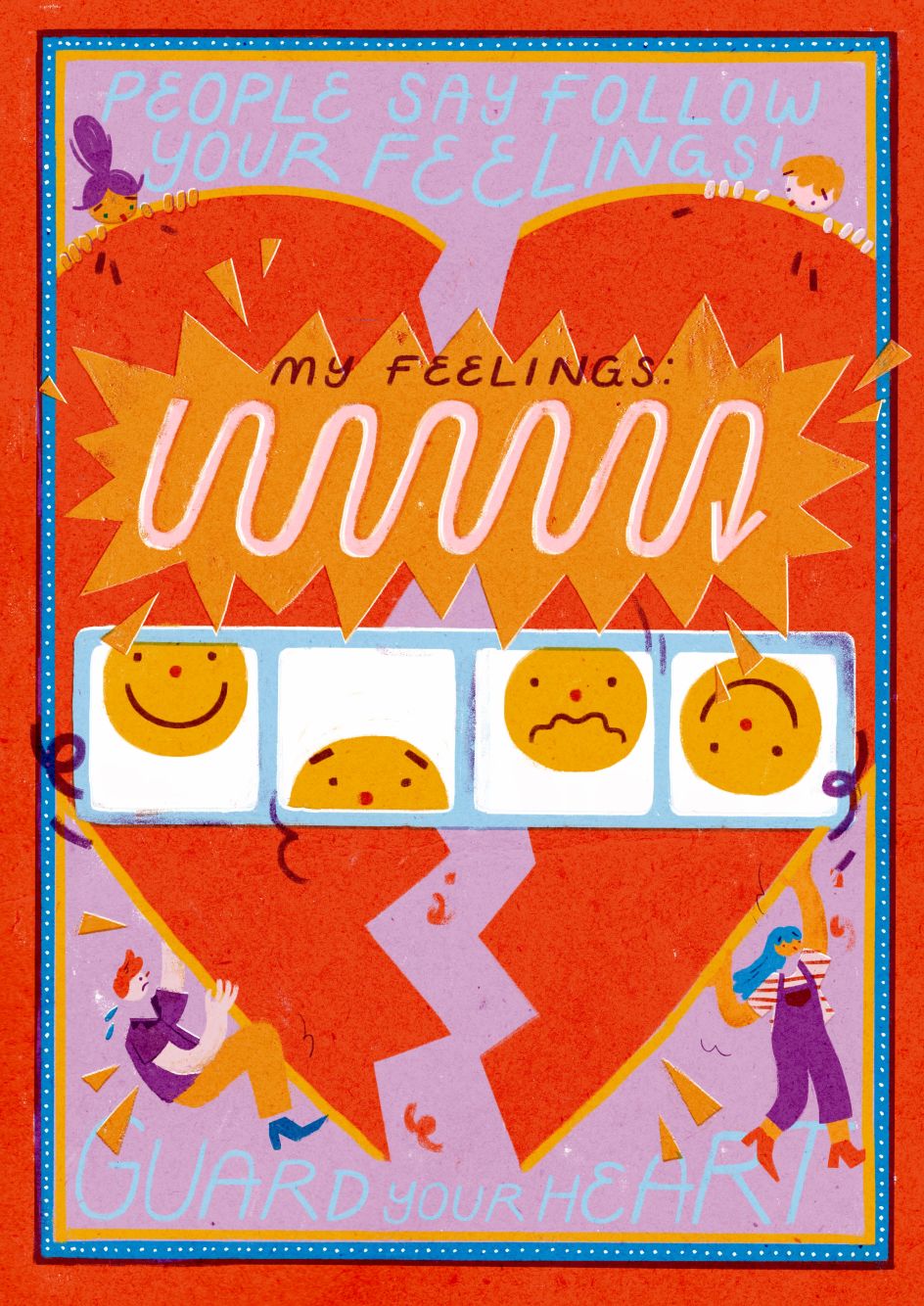
As well as communicating a serious message, these posters allow Michelle to fly her creative muscles. "For each poster, I use the same dimensions to challenge myself, just like packages do," she concludes. "I only have a set space to tell my story, but instead of letting that limit me, I literally embrace it by decorating the borders and dividing the canvas into smaller pieces.
"In this way, the canvas becomes a puzzle I must solve. Which piece of the story fits where? Sometimes it works, sometimes it doesn't; either way, I love this approach as it pushes my creativity."


 by Tüpokompanii](https://www.creativeboom.com/upload/articles/58/58684538770fb5b428dc1882f7a732f153500153_732.jpg)


 using <a href="https://www.ohnotype.co/fonts/obviously" target="_blank">Obviously</a> by Oh No Type Co., Art Director, Brand & Creative—Spotify](https://www.creativeboom.com/upload/articles/6e/6ed31eddc26fa563f213fc76d6993dab9231ffe4_732.jpg)


