Mikhail Lychkovskiy on channelling Swiss design elements with experimental forms and flair
Combining traditional Swiss design with his own artistic flair, the graphic designer's work spans digital interfaces and posters.
© Mikhail Lychkovskiy
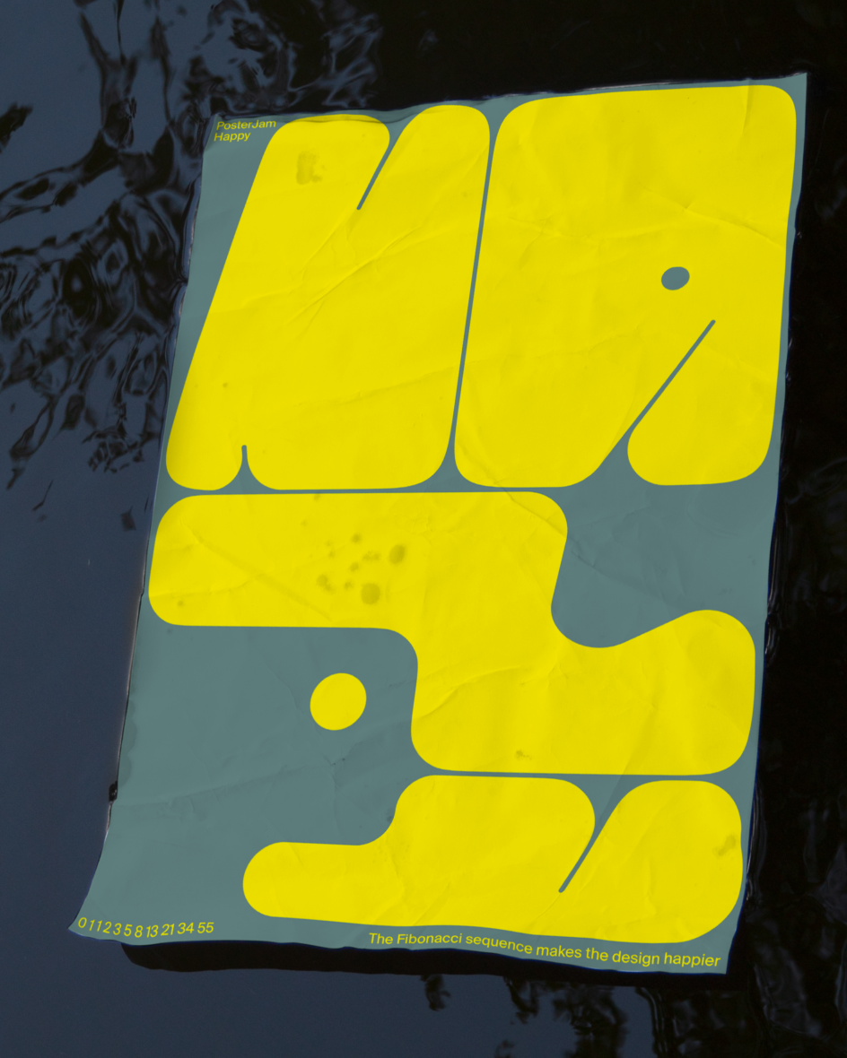
By looking at the work of Mikhail Lychkovskiy, you'd be unsurprised to learn that his key inspirations are derived from Swiss design masters such as Josef Muller-Brockmann, Emil Ruder, Armin Hofmann and Karl Gerstner. Functional and clean, Mikhail's work is an offshoot of this era in a way that places typographic and grid systems at the centre of everything he does: it's experimentally clean.
Born and raised in Minsk, Belarus, Mikhail's first love was heavy music. He started practising the guitar and played in a band, which came to an end once he left school and had to think about his future. Resultantly, he ended up studying computer science at university. "It seemed that I would be doing IT to earn money for music rehearsals, a cool guitar, music equipment, amplifiers and so on," he tells us. "However, as soon as I started working, the music faded into the background."
His next love was a girl who lived in Moscow, but sadly she didn't want to move to Minsk. He landed a job as a system analyst. They dated for a few more months, and then he was "left alone" in the city. Then, as things turned out, Mikhail became fascinated by user interface design; he decided to apply to various courses in the field at Bauman University, University of California San Diego, Bureau Gorbunov and the British Higher School of Art & Design, respectively. "I couldn't be an analyst anymore. I became a designer."
© Mikhail Lychkovskiy
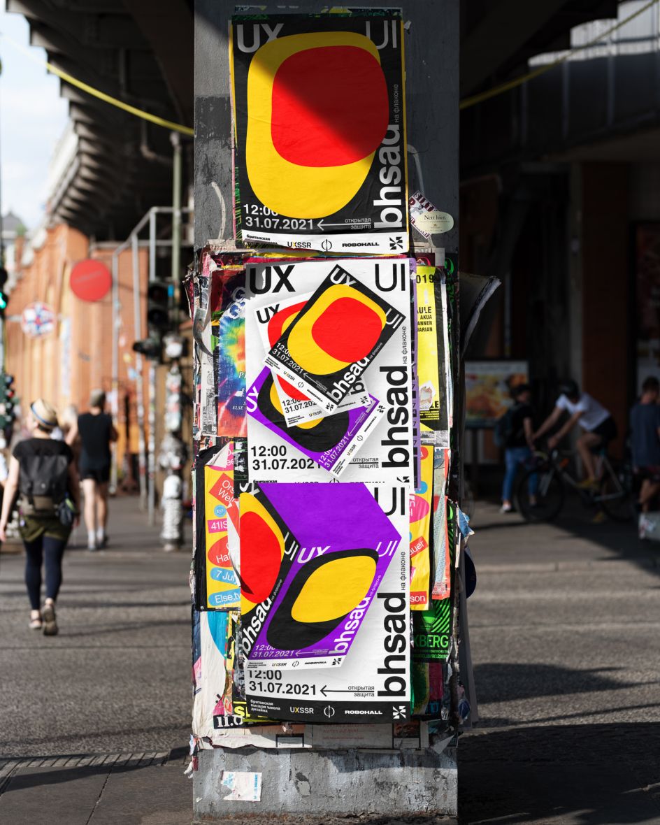
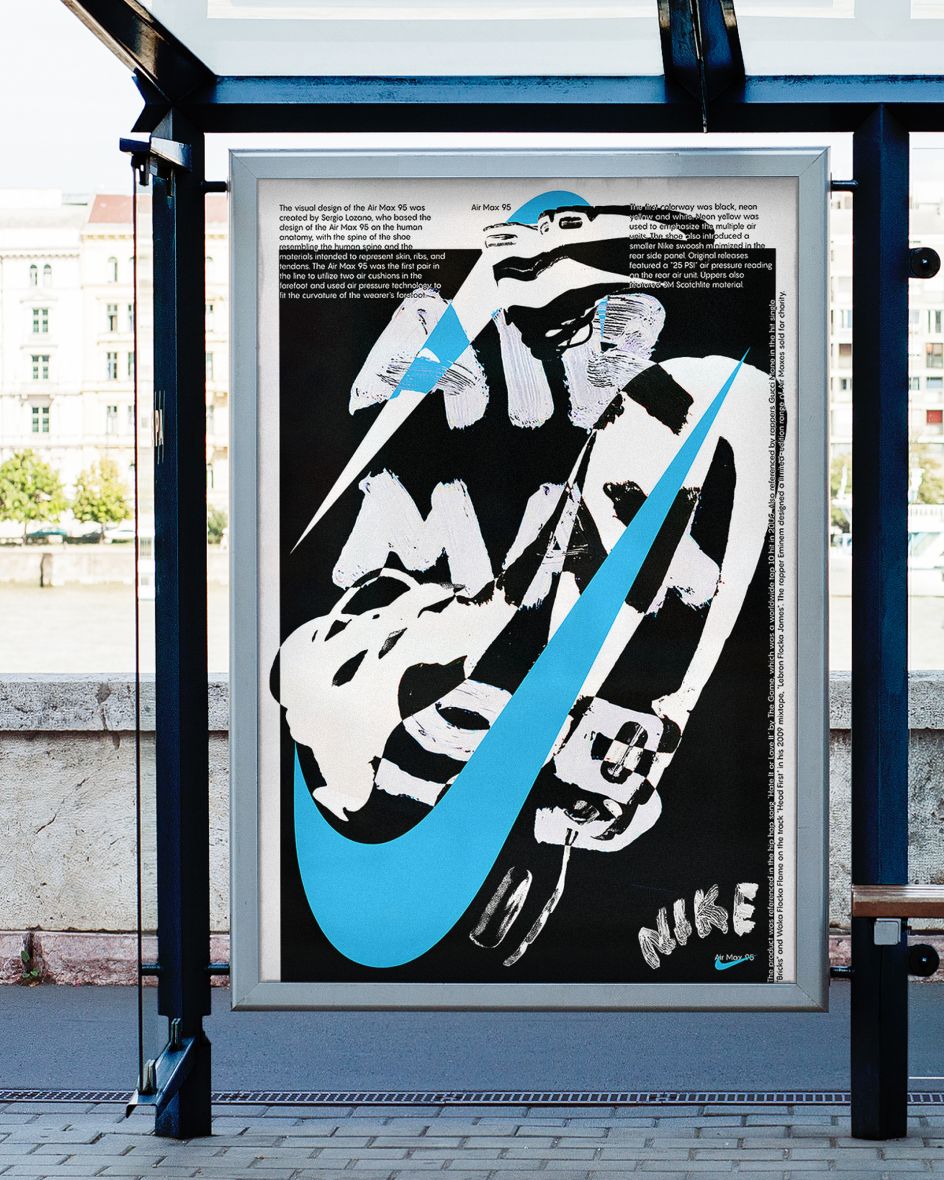
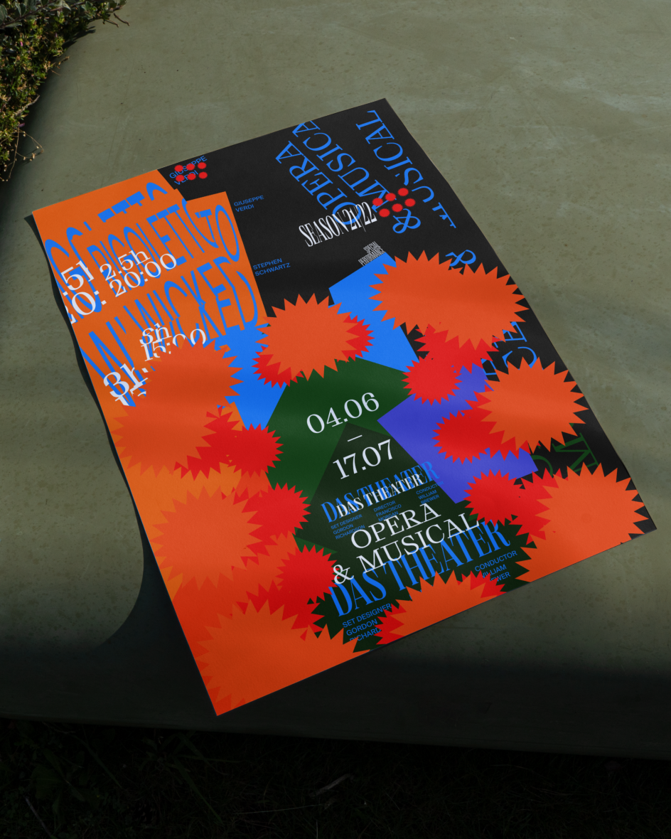
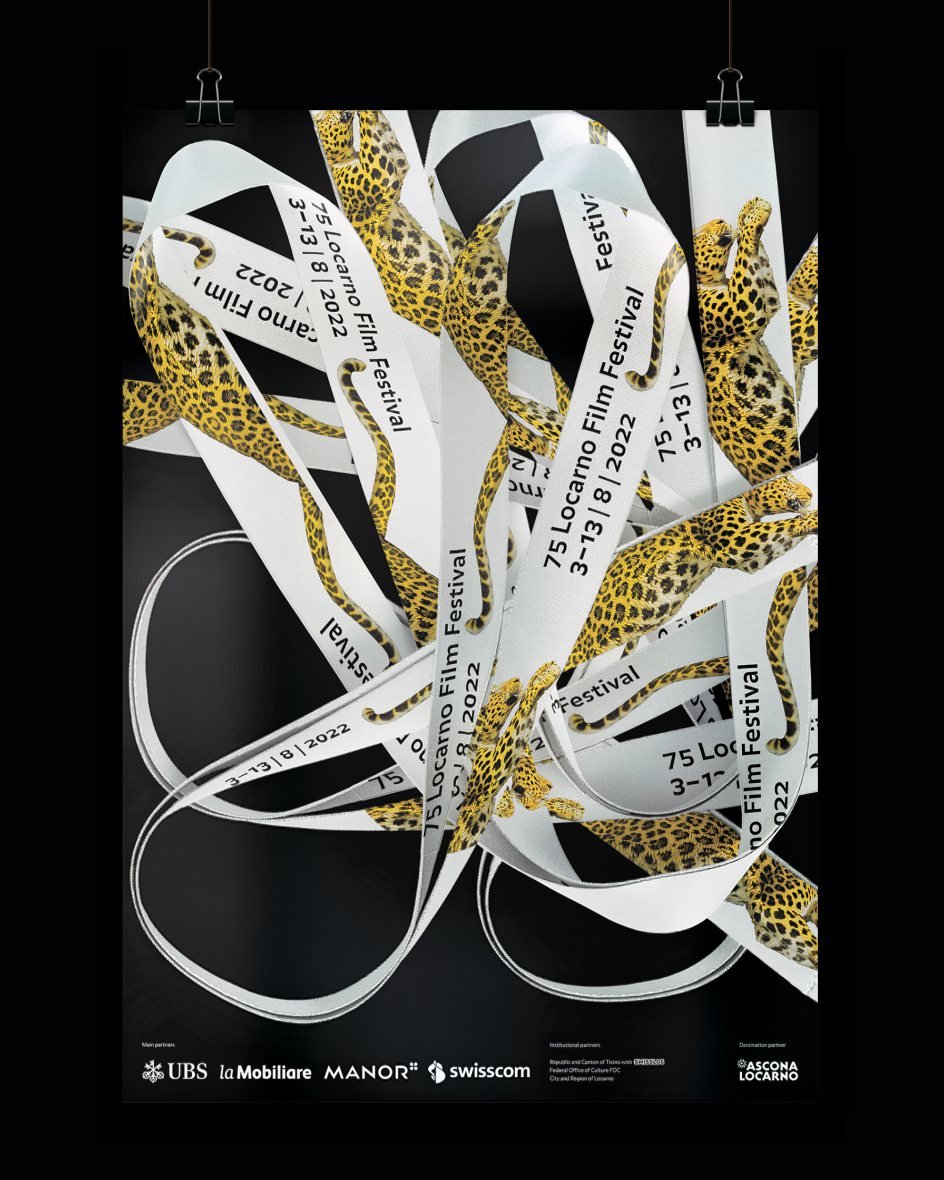
Nowadays, you'll find Mikhail designing interfaces for the largest bank in Russia by day and creating posters and typographic experiments by night. A harmonious balance of commissioned and personal work, Mikhail successfully manages to merge the two worlds – besides, he's a big fan of posters. He cites Emil Ruder's Die Gute Form as his main point of reference, which "became both an icon of the poster and a slogan in the creation of my works". Otherwise, he loves the work from Lucerne Theatre by Studio Feixen, the posters designed by Jiri Oplatek for Basel Theatre, the animated posters for Rias Kammerchor by Fons Hickmann, Malakoff Scene by Brest Brest Brest and French authors who have recently been creating "unimaginable things", he says.
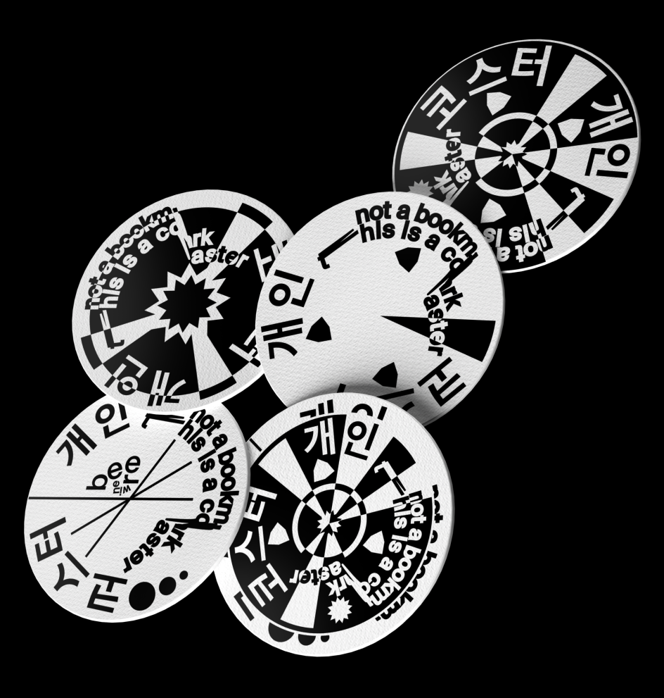
Meanwhile, the final influence is alcohol. "I have a dream in which I'm lying drunk in Basel or Lausanne under a poster board with my poster on it," he says, giggling. "In fact, there are amazing examples of how real art objects are obtained from beer cans. I've sketched out a couple of coasters for myself. Now it's time to design a label for beer."
© Mikhail Lychkovskiy
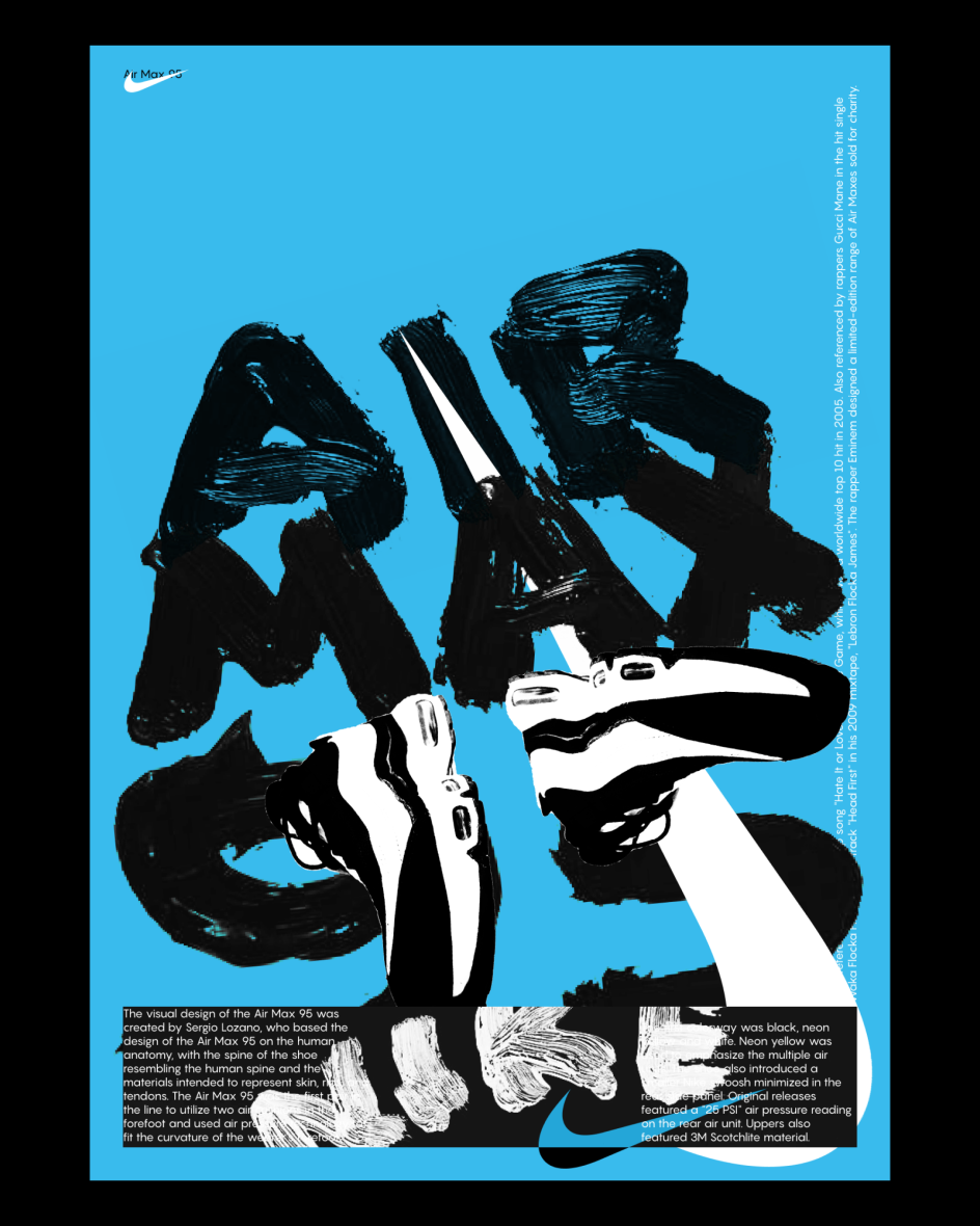
© Mikhail Lychkovskiy
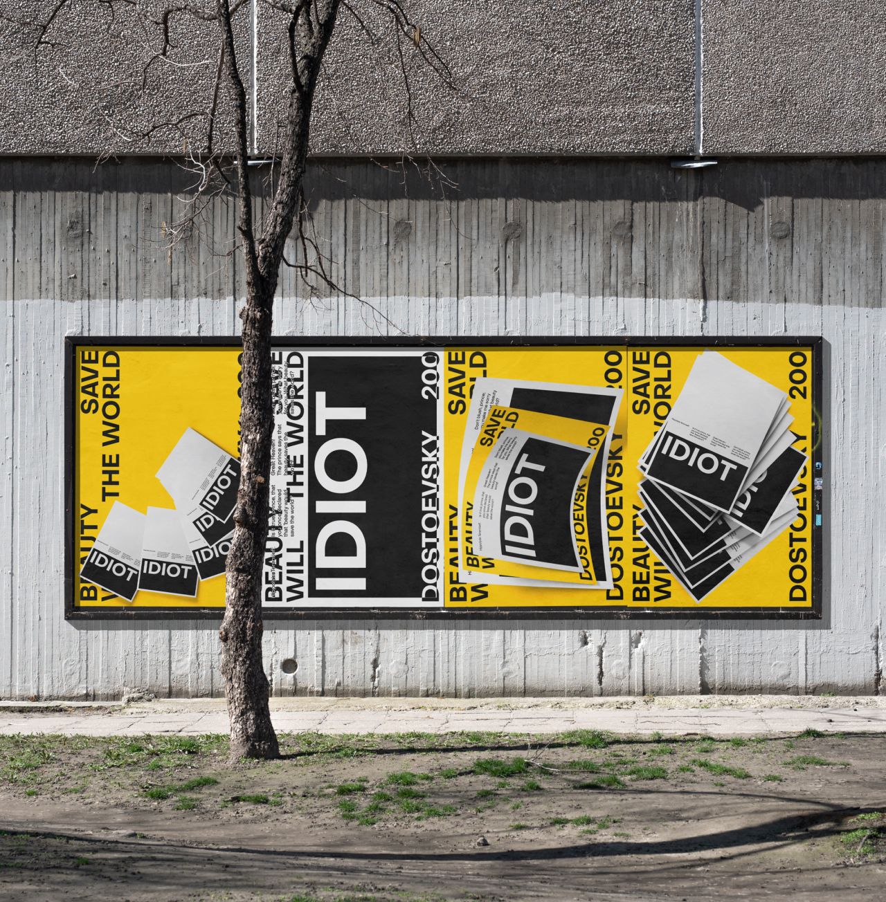
In November last year, Mikhail made a note of the bicentenary of the birth of Fyodor Dostoevsky. He, as part of the poster school of Typomania under the supervision of Ekaterina Terekhova, designed posters in honour. Conceived in a vibrant palette of yellow and black, the outcome presents a legible bold typeface and a kind of paper inception in the middle. "I love this work because it contains a study of a particular Dostoevsky novel, the conditions in which it was written (in Switzerland), and it contains references to posters of my favourite authors," says Mikhail. Just like the rest of his creations, the poster design encompasses the traditional elements of Swiss design, all the while incorporating his own artistic flair.
In the future, Mikhail hopes that he'll earn the freedom to design "nothing but typography and posters" and help others in the field. "I think that as soon as I finish forming my own library, I will need to take care of how to transfer my experience and knowledge to new designers," he says, "those who are delighted with the books and posters and are just approaching the solution of graphic problems."
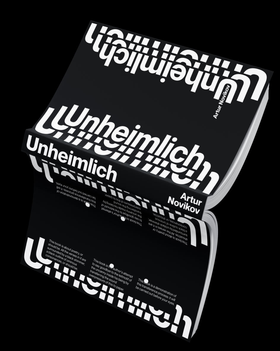
© Mikhail Lychkovskiy
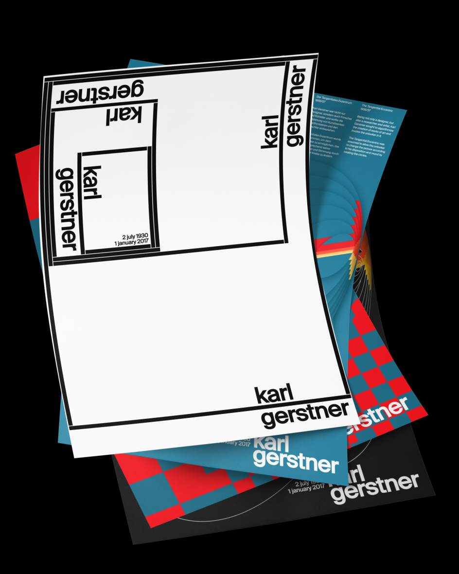
© Mikhail Lychkovskiy
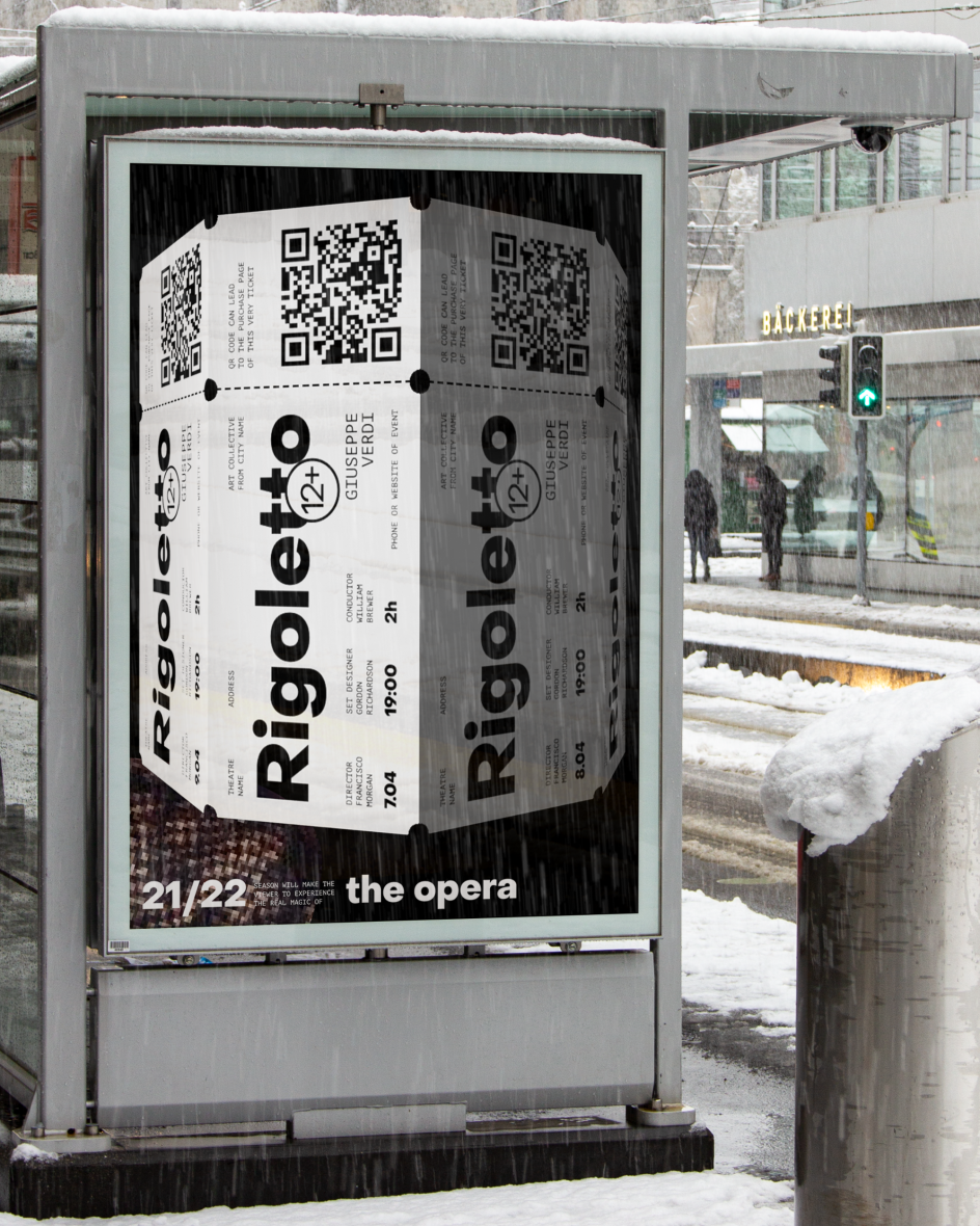
© Mikhail Lychkovskiy
© Mikhail Lychkovskiy
© Mikhail Lychkovskiy
© Mikhail Lychkovskiy
© Mikhail Lychkovskiy


 by Tüpokompanii](https://www.creativeboom.com/upload/articles/58/58684538770fb5b428dc1882f7a732f153500153_732.jpg)


 using <a href="https://www.ohnotype.co/fonts/obviously" target="_blank">Obviously</a> by Oh No Type Co., Art Director, Brand & Creative—Spotify](https://www.creativeboom.com/upload/articles/6e/6ed31eddc26fa563f213fc76d6993dab9231ffe4_732.jpg)


