Fiasco Design and Moshi bring mindfulness to the next generation with redesigned site and app
Bristol-based studio Fiasco Design has collaborated with Moshi, a sleep and mindfulness app for children, to make mental health magical to the younger generation. With new branding and a website, Moshi hopes to reverse the unprecedented mental health crisis currently affecting children.
The topic of mental health has, thankfully, become increasingly mainstream over recent years. Whereas before, it was unusual and sometimes taboo to discuss mental health publicly, these days, whole industries are built around looking after and improving our mental well-being. However, during this national conversation, children have not been considered as much as adults.
That's where Moshi comes in. A relative newcomer to the mental health scene, Moshi has quickly become a world-leading sleep and mindfulness app for kids. Its mission is to improve the health and happiness of the next generation by teaching them the fundamentals of mindfulness from an early age.
Moshi couldn't come at a better time either. The UK is currently in the grips of an unprecedented mental health crisis, with one in six children suffering from anxiety, eating disorders, attention deficit or hyperactivity disorders, as well as other emotional well-being issues.
To make mindfulness appeal to a younger audience, Moshi uses guided meditations, mesmerising stories and soothing sounds. "Emotional well-being for the next generation requires us to be there not just at bedtime but also across the day and in environments like classrooms," says Moshi COO Ed Barton. "Our goal is that proactive development of EQ becomes as important as IQ. To reflect this, we have evolved from Moshi: Sleep and Mindfulness to Moshi."
Seeing as Moshi has grown from a sleep-only tool into a round the clock mindfulness aid, they approached Fiasco Design to encapsulate this change via a new digital home. Taking six months to complete, Fiasco was briefed to give Moshi's platform a visual overhaul and manifest its pledge to use creativity to inspire change.
"As a parent to a young child, I've had first-hand experience of how transformative the Moshi app can be to family life," says Fiasco Design's Creative Director Ben Steers. "It was a pleasure, therefore, to get the chance to work with the team at Moshi to help realise their vision for the brand."
Ed adds: "We initially appointed Fiasco to rebuild our website. The project quickly became something much more and led to us sharpening our brand across platforms with the website at the centre."
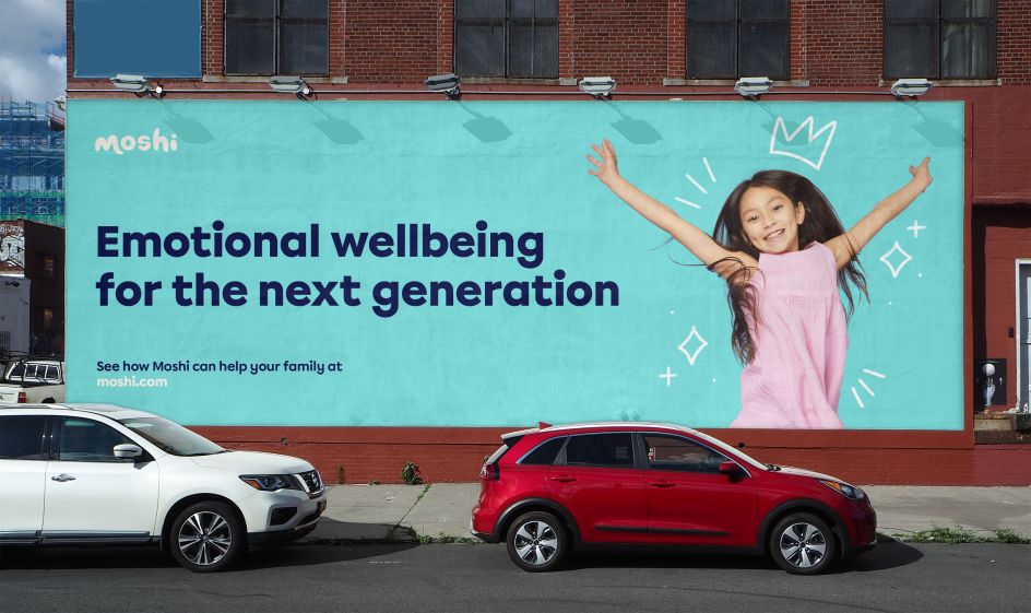
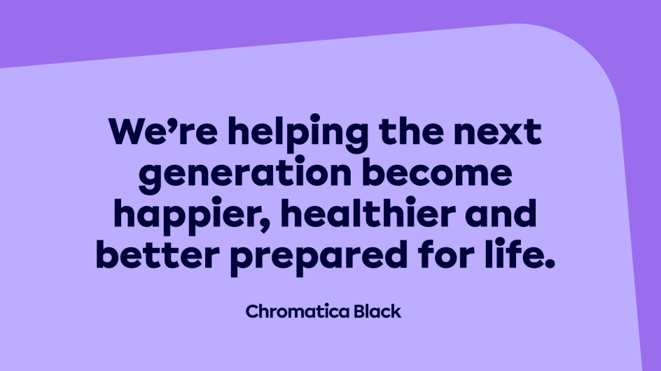
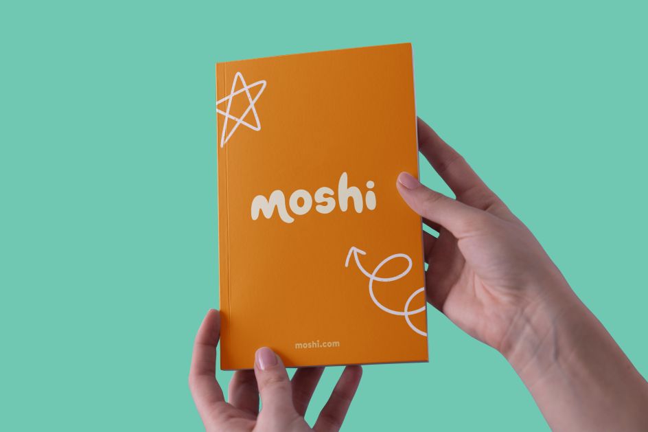
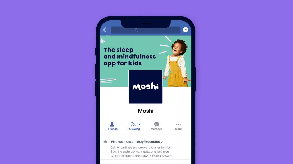
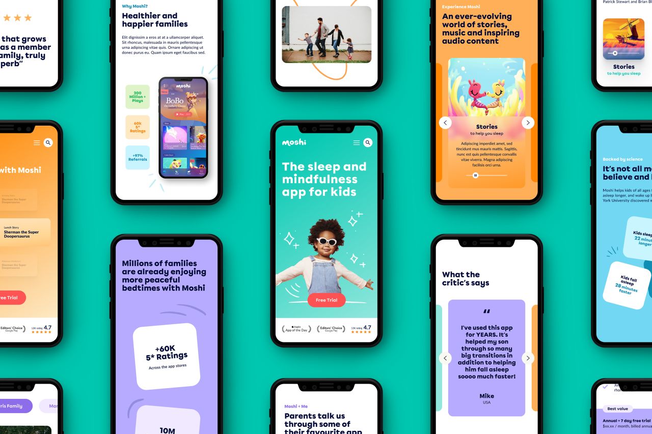
This sharpening includes an updated brand colour palette with brighter hues that have accessibility in mind—meanwhile, Moshi's main brand font, Calibri, has been replaced by Chromatica from the independent Glasgow-based foundry Polytype. This versatile, sans serif typeface was chosen for its warm and personable tone, making it the perfect fit for a mindfulness tool.
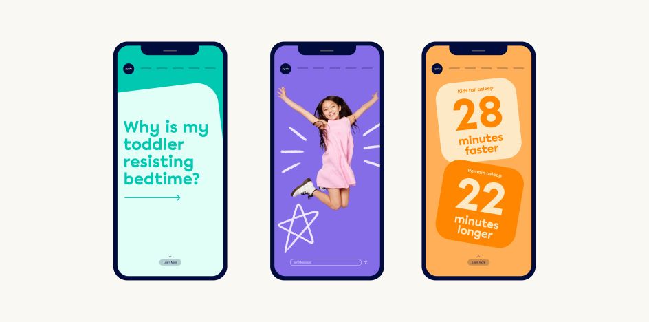
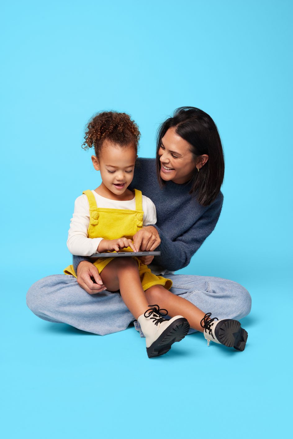
Fiasco also helped to set the tone with its new photography. Gone are the shots of stock imagery, and in their place, you can now find mood-lifting and vibrant studio photographs. Accompanying them are hand-drawn annotations that add a sense of personal expression as unique as every child.
As for the new website, it manages to balance functionality with visual appeal perfectly. Subscriptions are driven on a platform that captures the magic of mindfulness that Moshi is going for, and the platform's personality has been dialled up through playful UI design and motion. The result is a site that echoes the spirited nature of the app and ultimately champions the child.



 by Tüpokompanii](https://www.creativeboom.com/upload/articles/58/58684538770fb5b428dc1882f7a732f153500153_732.jpg)


 using <a href="https://www.ohnotype.co/fonts/obviously" target="_blank">Obviously</a> by Oh No Type Co., Art Director, Brand & Creative—Spotify](https://www.creativeboom.com/upload/articles/6e/6ed31eddc26fa563f213fc76d6993dab9231ffe4_732.jpg)





, featuring some of his own top picks](https://www.creativeboom.com/upload/articles/fb/fb68ac17f1e5572502d7ebf1c53fb086d5cbd4cd_732.jpg)

