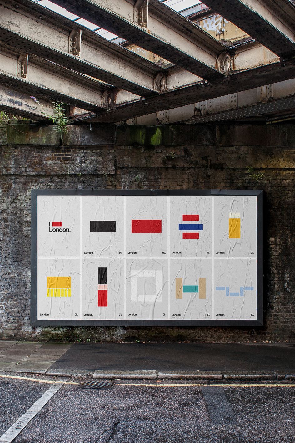
Minimal graphic art that represents London's biggest icons using only rectangles
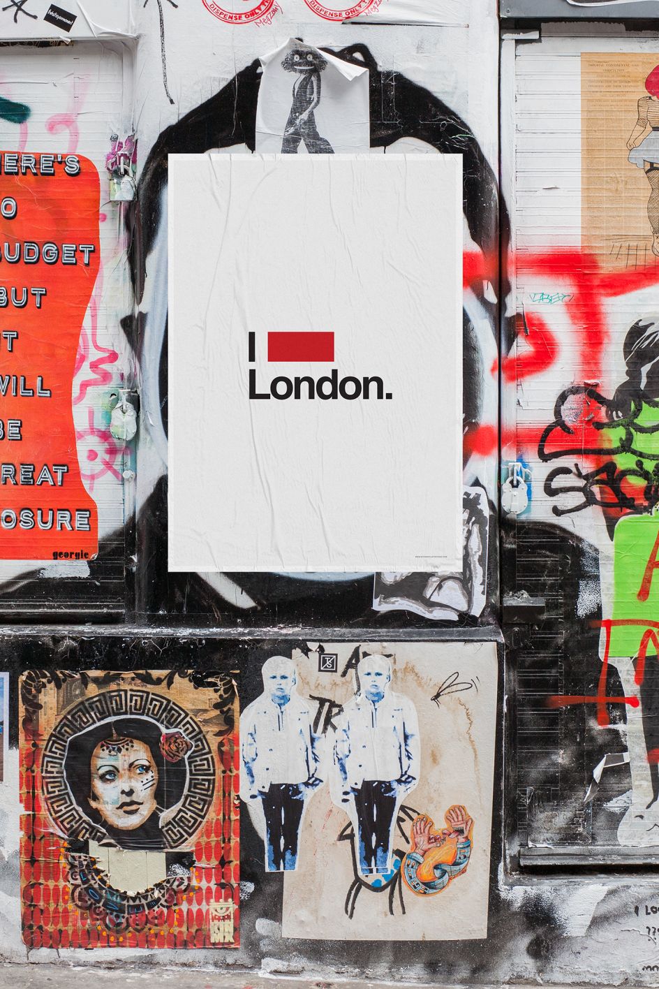
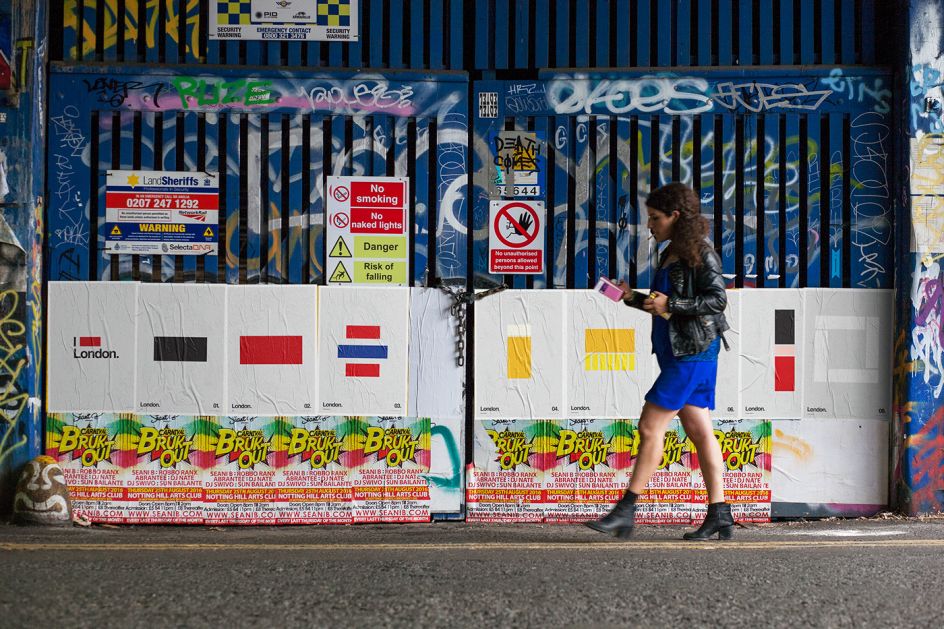
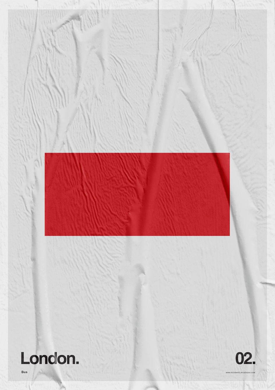
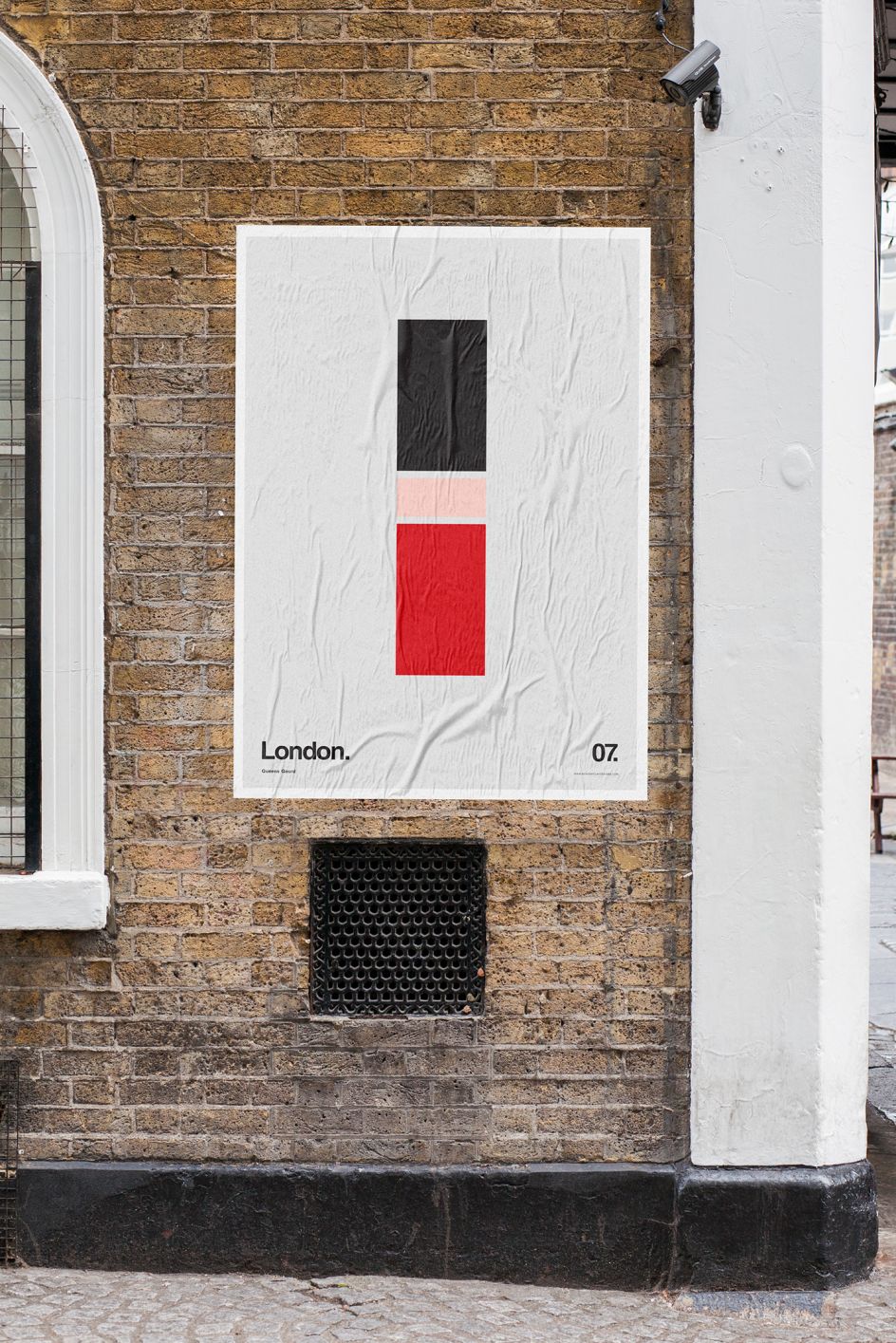
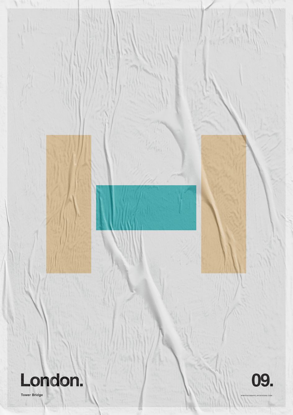
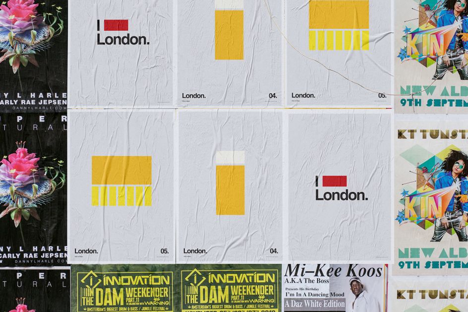
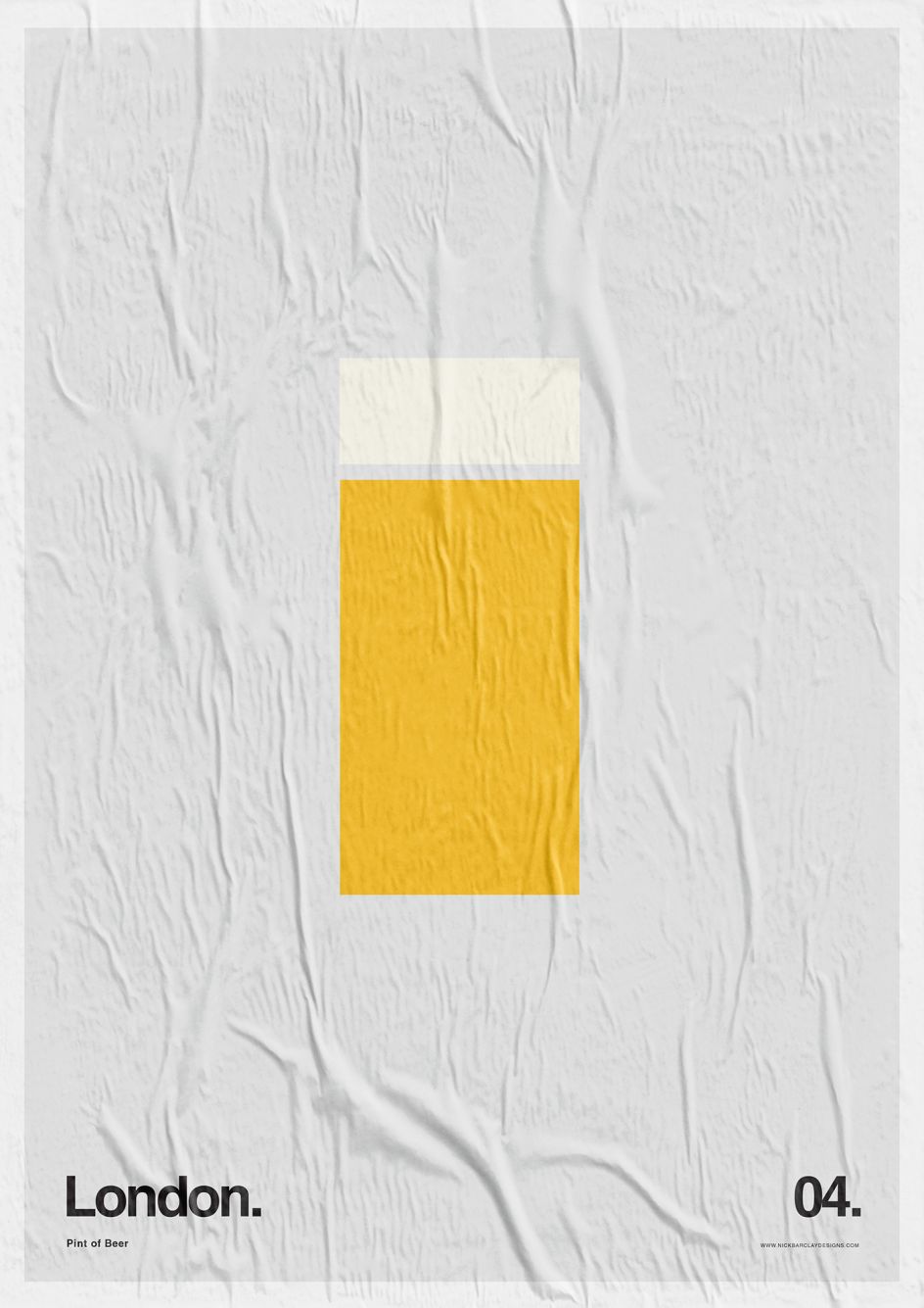
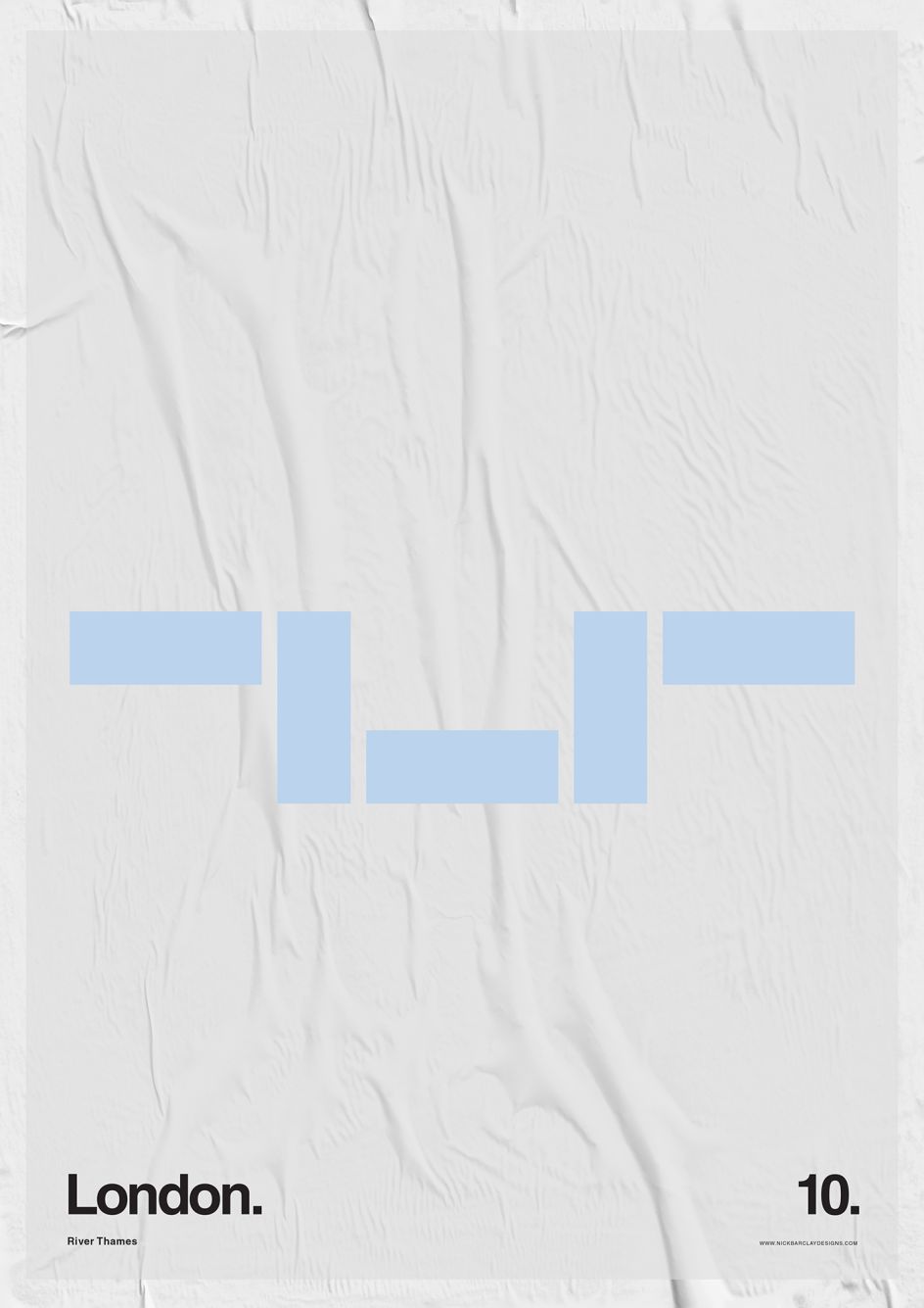
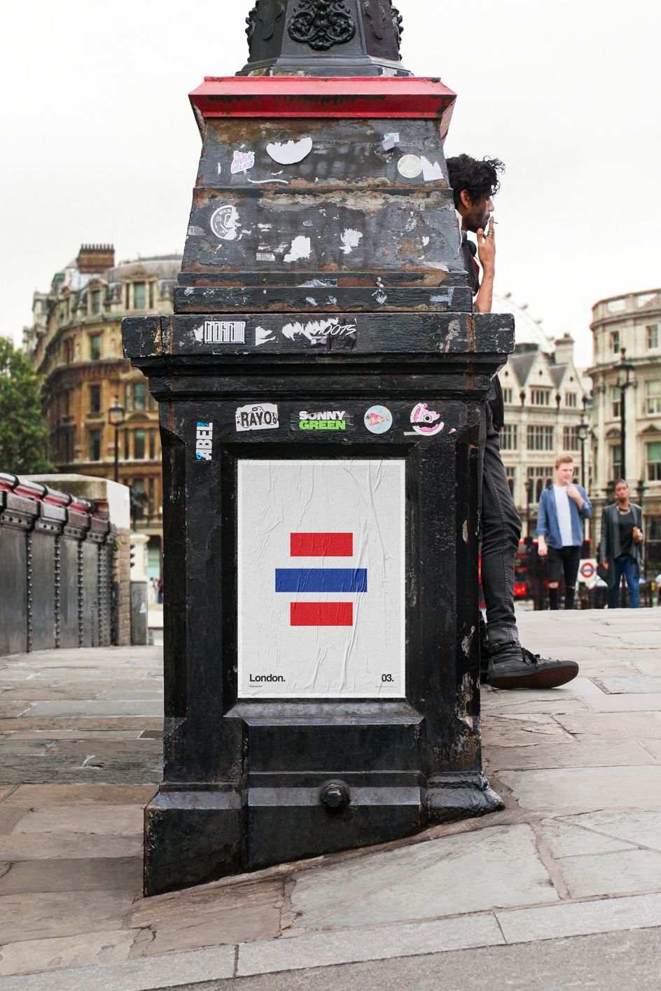
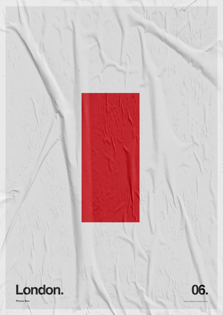
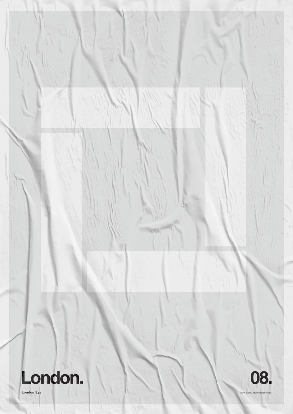
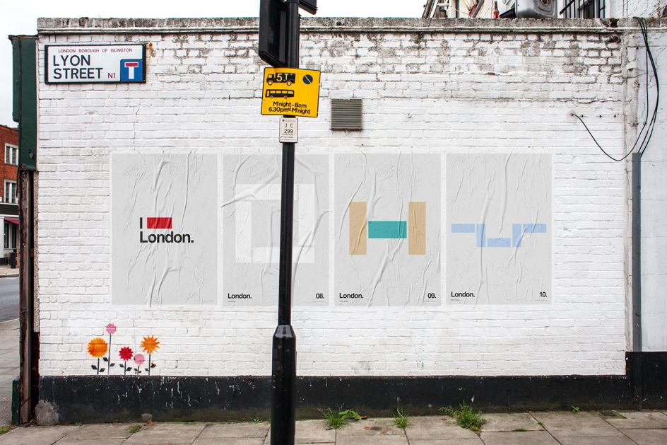
"Representing a city with iconic things made only from rectangles," explains the reasoning behind Nick Barclay's latest project, I Love London. His signature minimalist style has once again left us guessing what each of his graphic artworks represents – this time focusing on the capital's recognisable structures and landmarks.
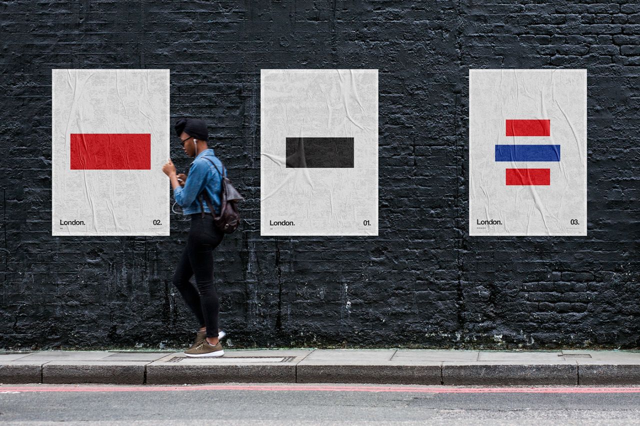
The art director from Sydney, Australia, has made quite a name for himself with his poster projects, either paying tribute to the Tour de France, taking a closer look at depression or summing up our favourite cocktails. Although the subject may vary, the theme is consistent – how can one represent something significant by only using a few simple graphical elements?
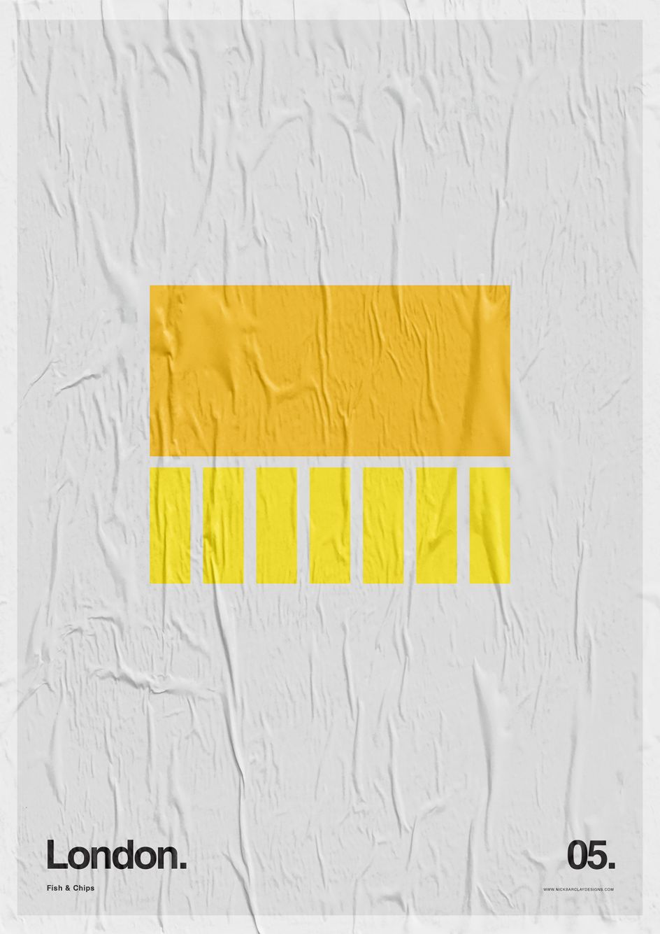
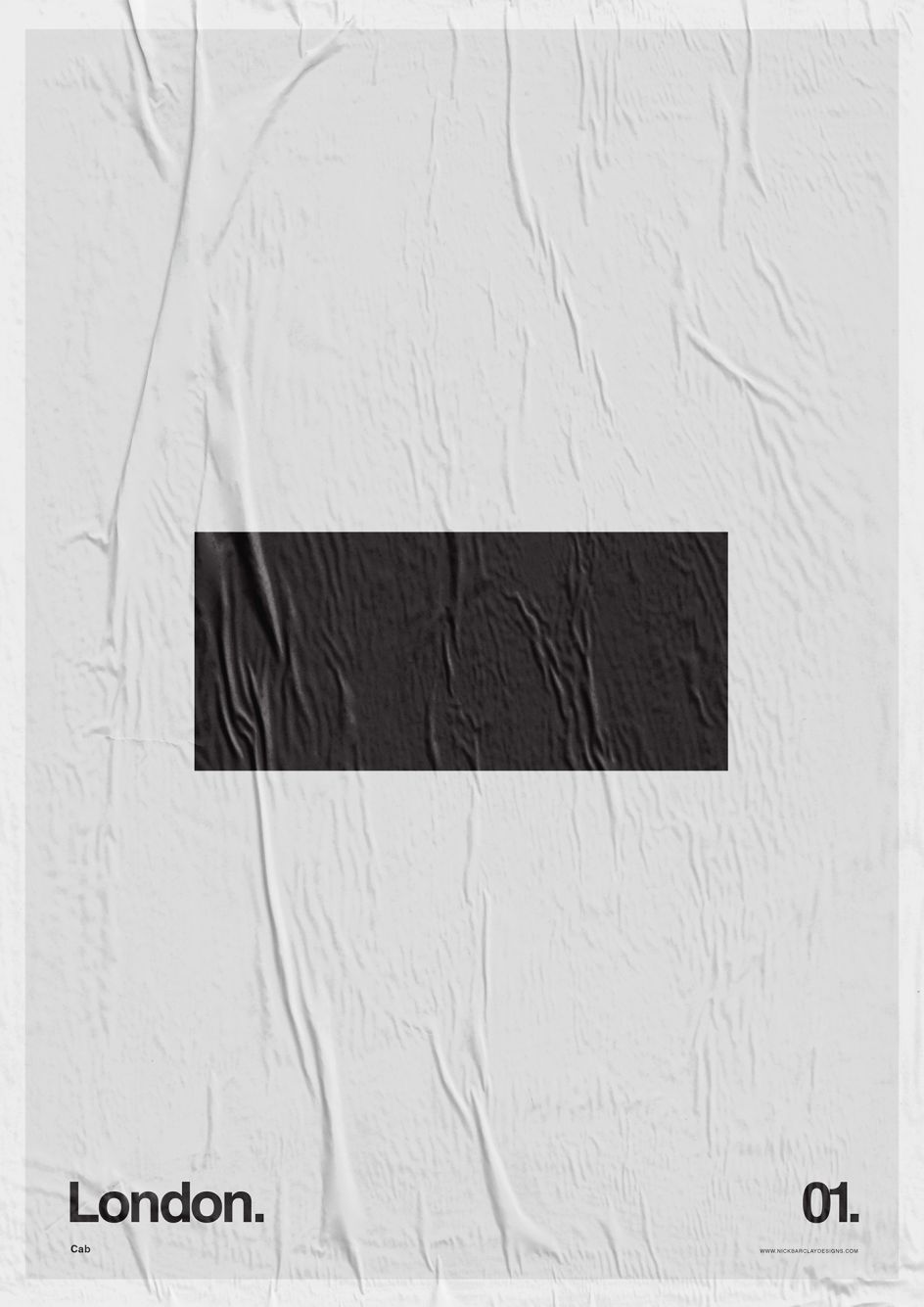
In this case, Nick celebrates London using only rectangles to represent something that he believes you would instantly associate with the Big Smoke. "The idea is that these objects are so iconic I could present a simple shape in a certain colour with the name London and their brain would do the rest to turn each rectangle into a bus a taxi, Tower Bridge or Fish & Chips," explains Nick.
"In that way, for that split moment in time, their brain will transport them to London or bring up a memory or feeling from being there."
You can discover more of Nick's latest work at nickbarclaydesigns.com.
All images courtesy of Nick Barclay



 by Tüpokompanii](https://www.creativeboom.com/upload/articles/58/58684538770fb5b428dc1882f7a732f153500153_732.jpg)


 using <a href="https://www.ohnotype.co/fonts/obviously" target="_blank">Obviously</a> by Oh No Type Co., Art Director, Brand & Creative—Spotify](https://www.creativeboom.com/upload/articles/6e/6ed31eddc26fa563f213fc76d6993dab9231ffe4_732.jpg)


