Moby Digg creates new identity and typefaces for blockchain-based learning platform Indorse
The brilliantly named Munch studio Moby Digg has long made graphic design work that’s smart, bold and succinctly fit for purpose, and this latest project is no exception.
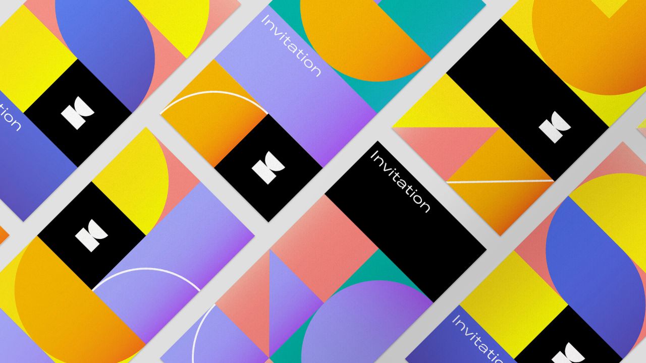
The studio describes it as the “biggest and most intensive” branding project it’s ever worked on. So what is it you ask? Well, it’s 2019: naturally, it’s for a blockchain platform.
Moby Digg, which realized the project in cooperation with Serviceplan Innovation, was taken with creating the visual identity for Indorse, a blockchain platform from Singapore. The platform is based on secure, non-biased and free-to-use blockchain technology, with the aim to “empower people to learn and give access to sharing both professional and social skill sets.” To keep data secure, the platform uses a new model dubbed “tokenization,” using a network in which users have full control over their data, Indorse claims.
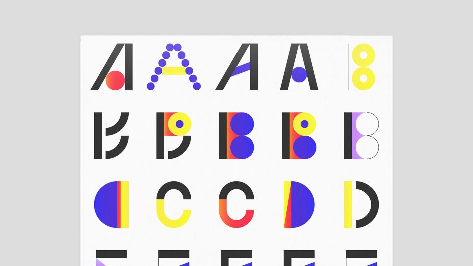
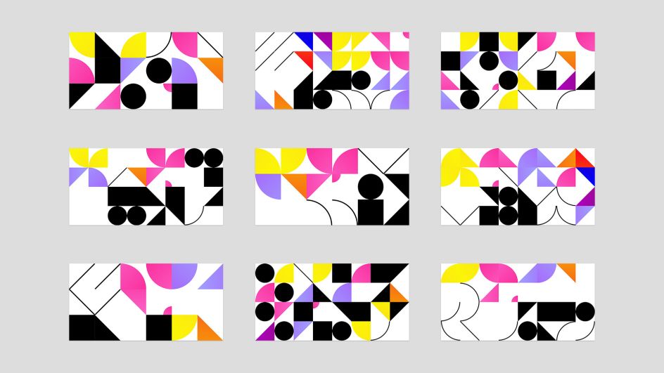
“The blockchain cosmos almost only saw really techy designs in the past, this is a move in a new era (we hope),” says Moby Digg.
“By continuing the idea of personal growth and combining it with the will to embrace individuality, we have created a branding system constructed from basic shapes, which not only visualizes an abstraction of the abbreviated IND, but also states that ‘each of us is unique, colourful and different’ in a unique way.”
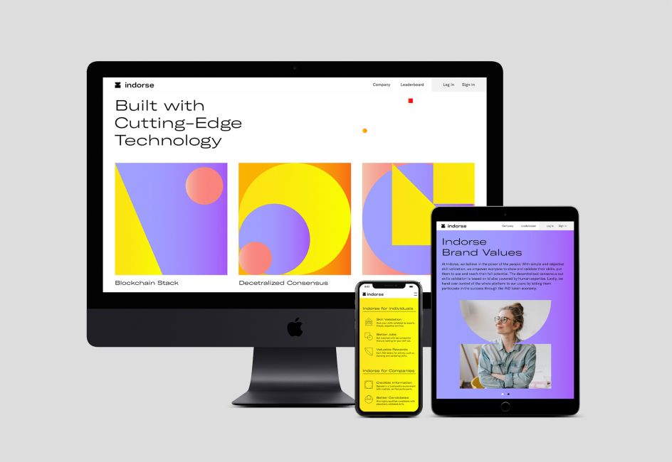
At the heart of the designs are two new custom typefaces. which will later be released for free for all us mere mortals to use, should we wish to? The logo design is trophy-shaped to “show the importance of skill validation,” says the studio. “It also makes up the Indorse “I” and underlines the balance that is essential to the skill mastery process.”
The new designs are used across promotional materials, in which visual elements and disjointed shapes from the branding system form “masks” over photos of people. “This approach connects geometric patterns with human elements and brings people into focus,” says Moby Digg. “By doing so we underline, that behind each skill stands a real person and Indorse is a platform for various individuals, where skills are their online representation.”
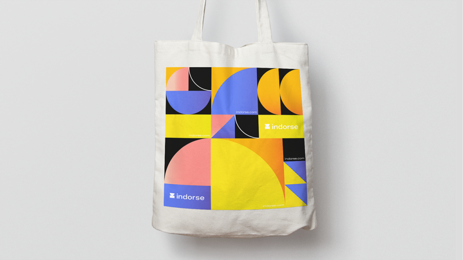
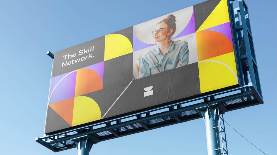
Moby Digg adds: “The visual system is designed to display user data. By keeping the visuals abstract, we gave the brand a distinctive look, while particular graphics can be used to illustrate more complex data. By using the custom developed generative tool, users can access individual patterns that reflect the skills they have. As users add more skills and validate them, their patterns transform.”


 by Tüpokompanii](https://www.creativeboom.com/upload/articles/58/58684538770fb5b428dc1882f7a732f153500153_732.jpg)


 using <a href="https://www.ohnotype.co/fonts/obviously" target="_blank">Obviously</a> by Oh No Type Co., Art Director, Brand & Creative—Spotify](https://www.creativeboom.com/upload/articles/6e/6ed31eddc26fa563f213fc76d6993dab9231ffe4_732.jpg)


