Monochrome poster series deconstructs key elements of graphic design
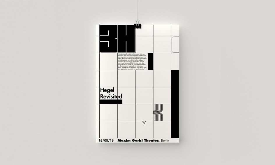
Berlin-based art director and designer, Devran Dogaroglu, created this monochrome poster series for 3H Seminars.
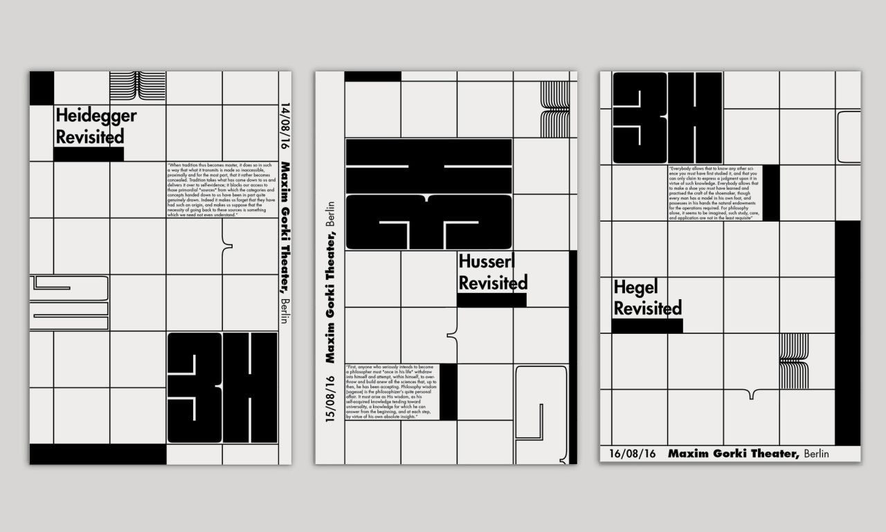
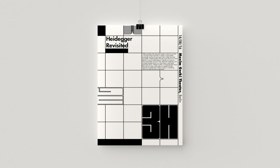
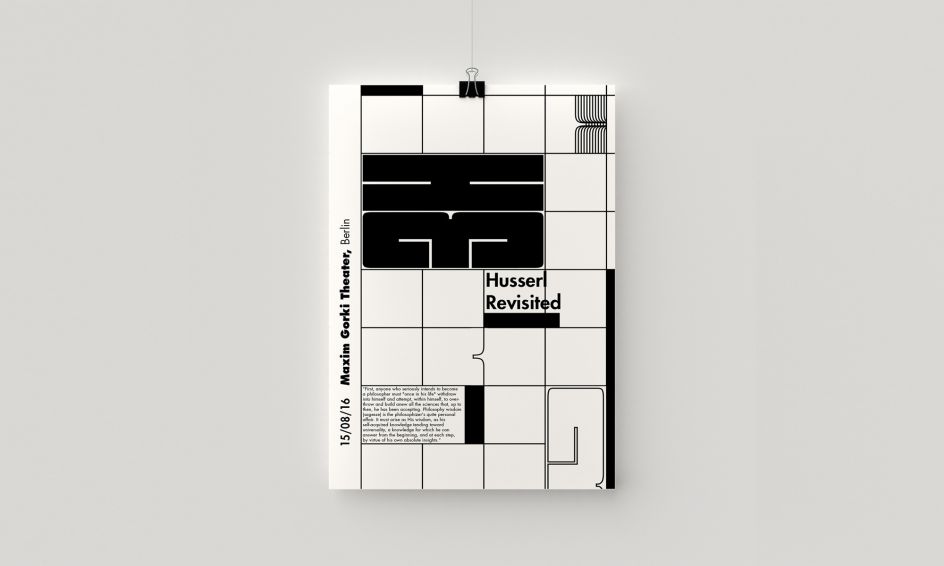
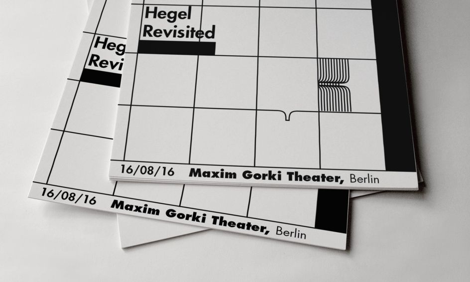
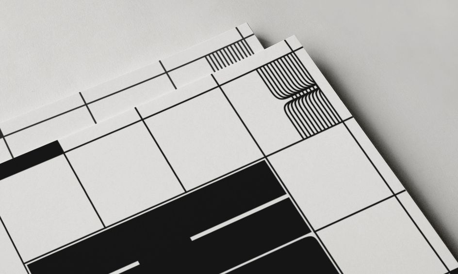
He explains: "Realisation of the posters was initiated with the decision to make visible the underlying grid framework which usually gives shape to the forms and spaces that we call design.
"This, I believe, is very much in line with the attempts of the philosophers of phenomenology, who try to make apparent the structures that lie behind the consciousness. “3H” expands and shrinks with the strict geometry of the grid while other typographic elements overflow its authority with their organic forms.
"The language on the whole is a reflection on what it is that structures our experience in design and which elements might be in excess of that container."
Dogaroglu's bold style has been applied to a number of client projects in the capacities of illustration, publishing and visual communications.
To see more, visit devrandogaroglu.com.
Via direct submission | All images courtesy of Devran Dogaroglu


 by Tüpokompanii](https://www.creativeboom.com/upload/articles/58/58684538770fb5b428dc1882f7a732f153500153_732.jpg)


 using <a href="https://www.ohnotype.co/fonts/obviously" target="_blank">Obviously</a> by Oh No Type Co., Art Director, Brand & Creative—Spotify](https://www.creativeboom.com/upload/articles/6e/6ed31eddc26fa563f213fc76d6993dab9231ffe4_732.jpg)


 | All images © Arthur Evans for the Tang Museum except where indicated in the caption](https://www.creativeboom.com/upload/articles/0a/0ad910b28d8324f04003d64aaea36be9ff428c07_732.jpg)


