Motto creates 'first of a kind' aluminium-bottled wine packaging
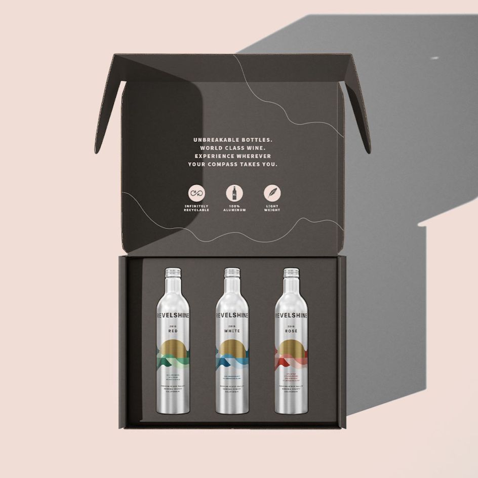
Dallas- and New York-based branding agency Motto has created the branding and packaging for Revelshine, billed as a "first-of-its-kind line of sustainable wine bottled in unbreakable, infinitely recyclable aluminium vessels".
Sunny Bonnell and Ashleigh Hansberger, Motto co-founders, first of all worked with the brand on what it terms "an extensive workshop process" to delve into and define the ethos of the company, honing in on its love of nature.
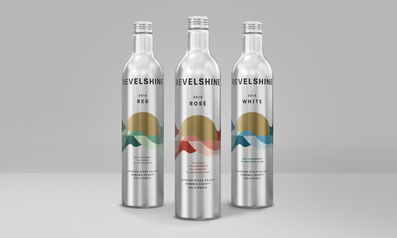
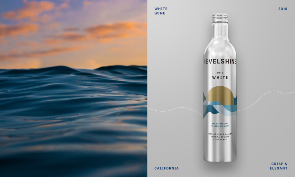
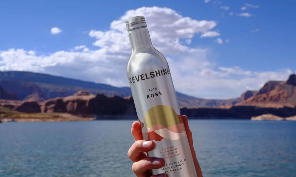
At a basic level, the brief for the project was about creating a high-quality feel to match the nature of the groundbreaking new wine bottle format. The silver aluminium material was deliberately left visible to "reinforce the brand's ethos".
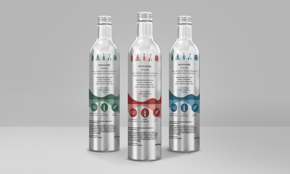
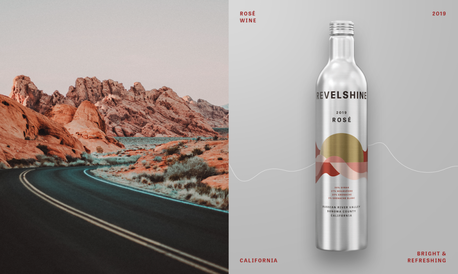
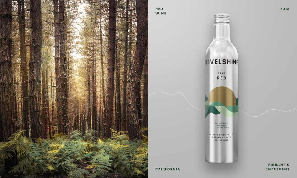
The front label artwork shows nature-based images such as a golden sun and "simple, flowing" landscape depictions that look to be both "suggestive" and "subtle". The back label, meanwhile, features a series of icons featuring outdoor activities such as a simplified surfboard, campfire, guitar, oar and a backpack. These icons were "styled to remind consumers to enjoy Revelshine with all of their outdoor adventures," according to Motto.
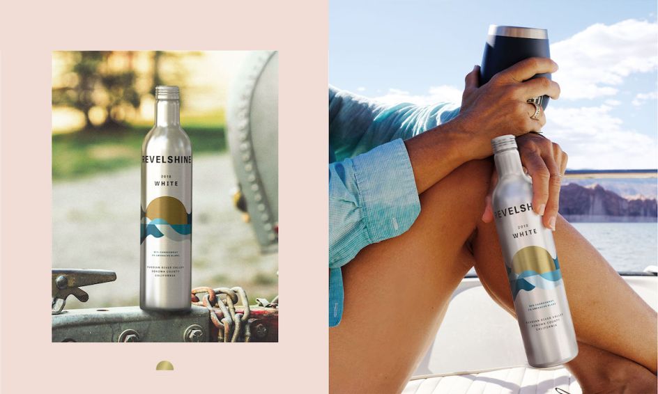
The colour palettes were similarly nature-oriented: Revelshine Red uses green inspired by forests; Revelshine White's rich blues were inspired by the ocean; and Revelshine Rose's red hues draw from the tones found in desert canyons.
Motto adds that the logo is "intentionally simple and down to earth," styled in black uppercase sans serif lettering to prioritise clarity and functionality.


 by Tüpokompanii](https://www.creativeboom.com/upload/articles/58/58684538770fb5b428dc1882f7a732f153500153_732.jpg)


 using <a href="https://www.ohnotype.co/fonts/obviously" target="_blank">Obviously</a> by Oh No Type Co., Art Director, Brand & Creative—Spotify](https://www.creativeboom.com/upload/articles/6e/6ed31eddc26fa563f213fc76d6993dab9231ffe4_732.jpg)


