Mucca designs Chora brand to stand out in a sea of 'not-so-great' podcast designs
Everyone and their dog seems to have released a podcast: it felt like that before lockdown, and they feel even more ubiquitous now. Yet, as many design commentators have remarked, the thumbnail images that advertise them are usually pretty "not great".
Looking to break that norm of average-at-best podcast design is branding studio Mucca, which recently worked on designs and branding for podcasting media company Chora.
The studio was tasked with creating a design system to unify the disparate voices of Chora's Italian hosts "while also standing out from the crowd", opting for a strong, colourful aesthetic.
Chora was created by former editor-in-chief of Italian newspapers la Repubblica and La Stampa, author and journalist Mario Calabresi. His newsletter, Altre/Storie, had been a success, and he opted to created Chora as "a company that strives to give voice to a wide range of authentic narratives, through an unconventional range of formats," according to Mucca. Its hosts range from TV, literary and journalistic celebrities to influencers and vloggers.
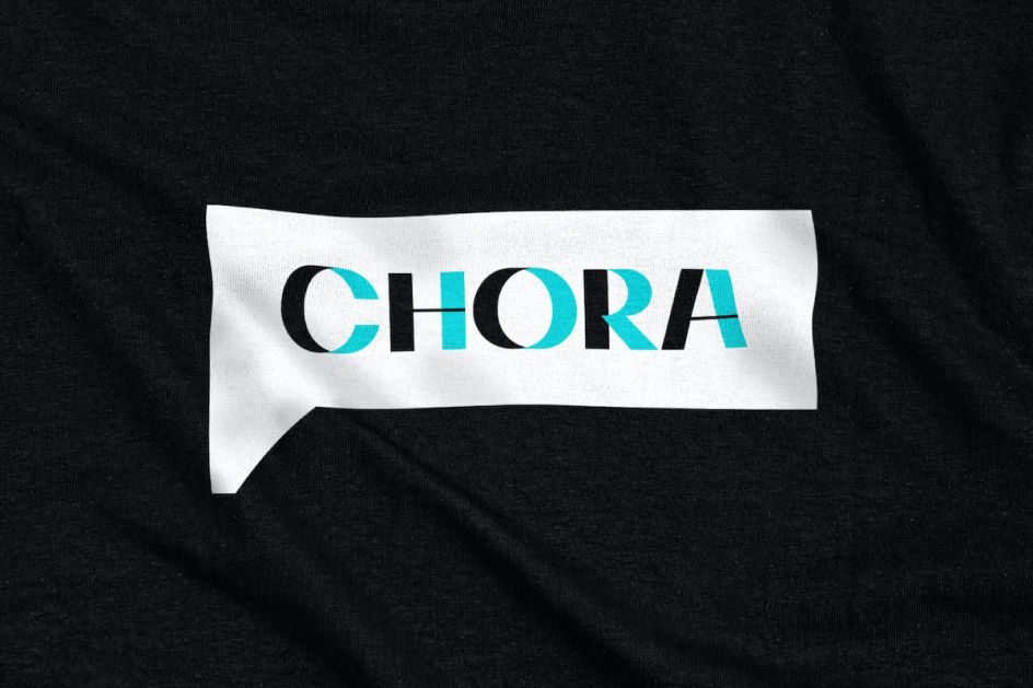
Creating the brand alongside Calabresi, Mucca orchestrated a strategic workshop to "unearth the core aspects of the brand's promise, personality and values". The strategy focused on Chora's "authenticity, unconventional approach and championing of new perspectives," according to Mucca, and helped the agency envision how the company would exist and behave in the world.
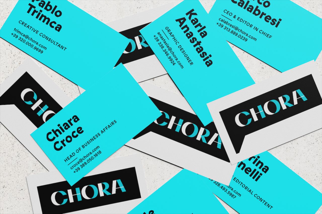
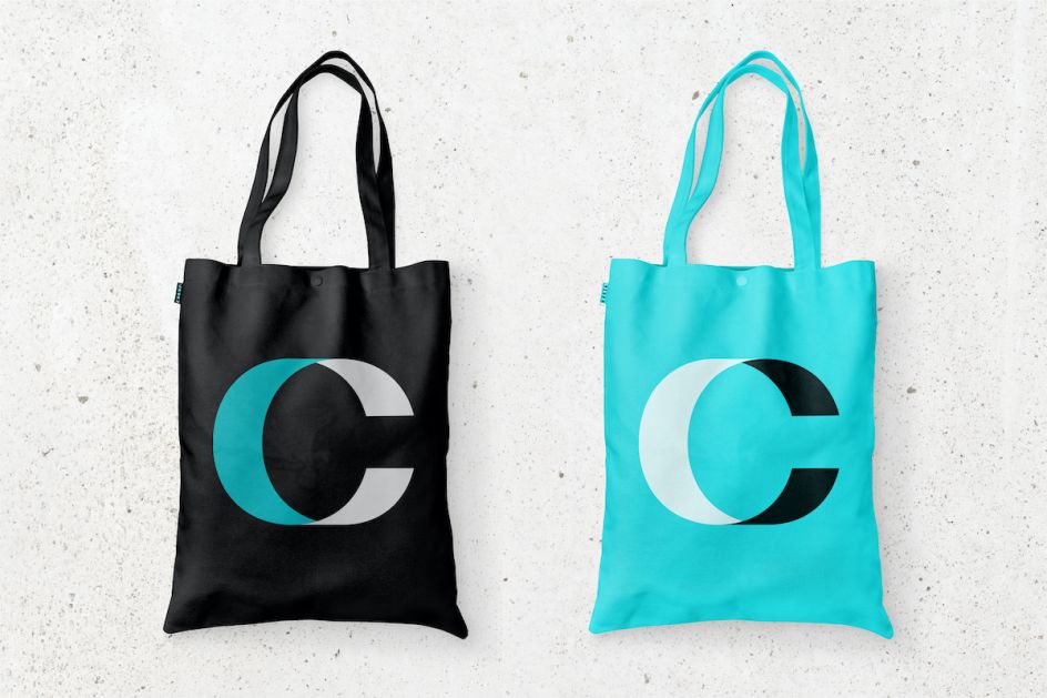
The idea behind the look and feel of the brand was to create something that would stand out and be impactful in a quickly growing podcasting market. The characters of the logo were inspired by the idea of Chora bringing a new perspective to a story, and so the letterforms were created to be seen from multiple angles.
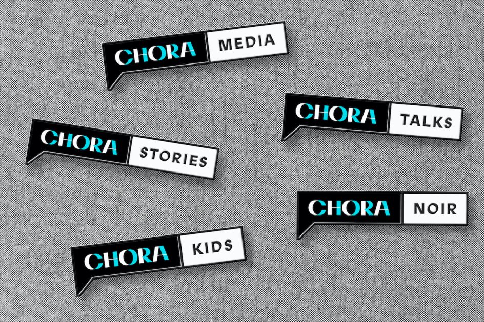
Chora's ability to bring a new perspective to a story results in letterforms that can seemingly be seen from multiple angles. Mucca also chose a speech bubble container to denote the idea of Chora as a platform that amplifies voices.
"We wanted the logo to reflect the power and importance of every person's personal narrative, not just of the podcast hosts, but of the subjects of each podcast episode," says Mucca founder and creative director Matteo Bologna.
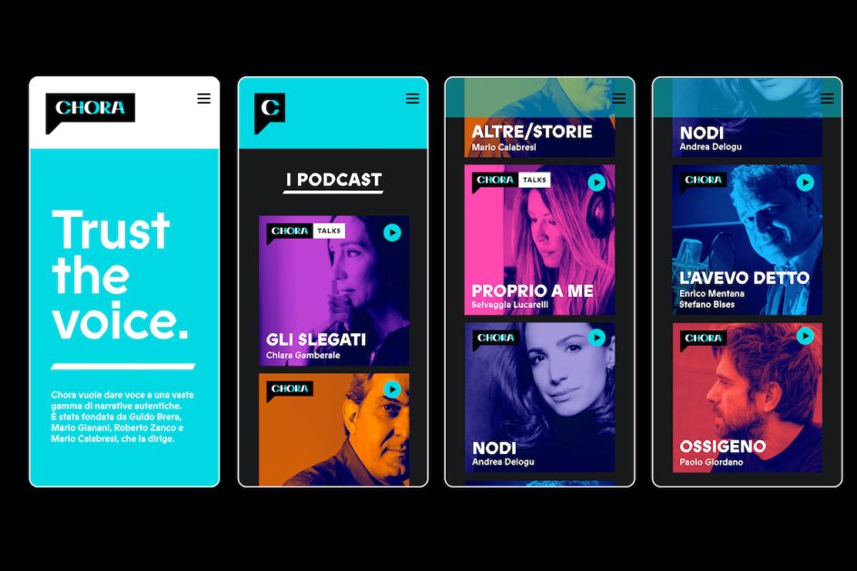
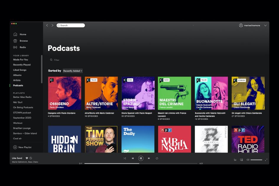
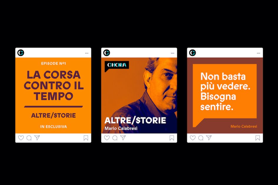
Chora has plans to launch nearly 40 podcasts by the end of this year, so it was vital to unify the different podcasts under the same strong parent media company brand while also giving each podcast its own voice. To achieve that, Mucca created a design system that's easy to use and gave flexibility within a consistent identity framework.
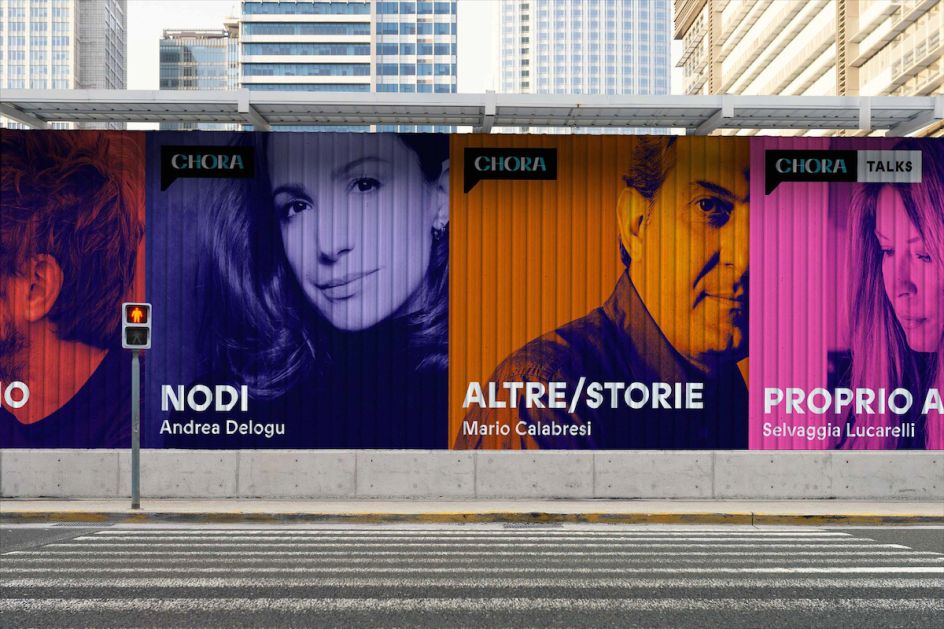
"We decided that every podcast cover would be represented with a photograph of the host of the podcast or a relevant thematic image," says Mucca senior designer and brand strategist María Silva Mora. "The idea was to tint each image, juxtaposing a strong colour and a dark blue—with colour options specific to the particular podcast. That way, their team could create podcast images and covers that never look the same between each host."
Bologna adds: "The podcasting market is saturated, and it was important to create something that felt unique and a step above the others. These are perspectives that deserve to be heard and stories that need to be told. It's been very rewarding to help Chora find its voice and bring Mario's dream to reality."


 by Tüpokompanii](https://www.creativeboom.com/upload/articles/58/58684538770fb5b428dc1882f7a732f153500153_732.jpg)


 using <a href="https://www.ohnotype.co/fonts/obviously" target="_blank">Obviously</a> by Oh No Type Co., Art Director, Brand & Creative—Spotify](https://www.creativeboom.com/upload/articles/6e/6ed31eddc26fa563f213fc76d6993dab9231ffe4_732.jpg)


