Munich-based agency Moby Digg's bold yet pared back corporate identity for RGE consulting
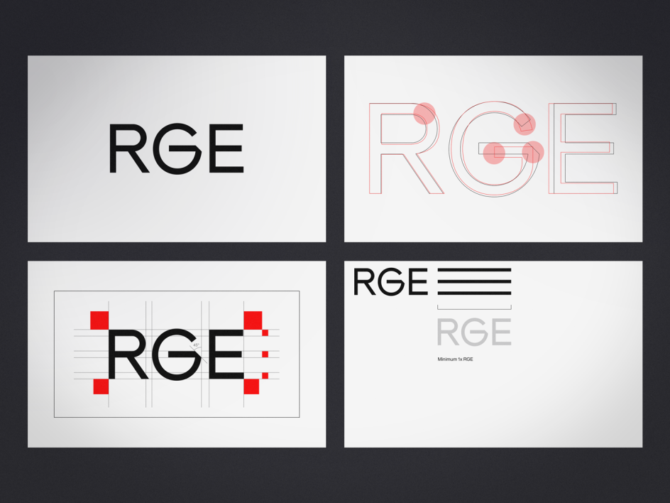
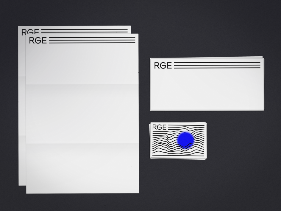
It takes real skill to be able to create a corporate identity for a big name client and make it feel as dynamic and bold as a personal project, and that’s just what Munich-based agency Moby Digg has achieved in its branding for RGE consulting.
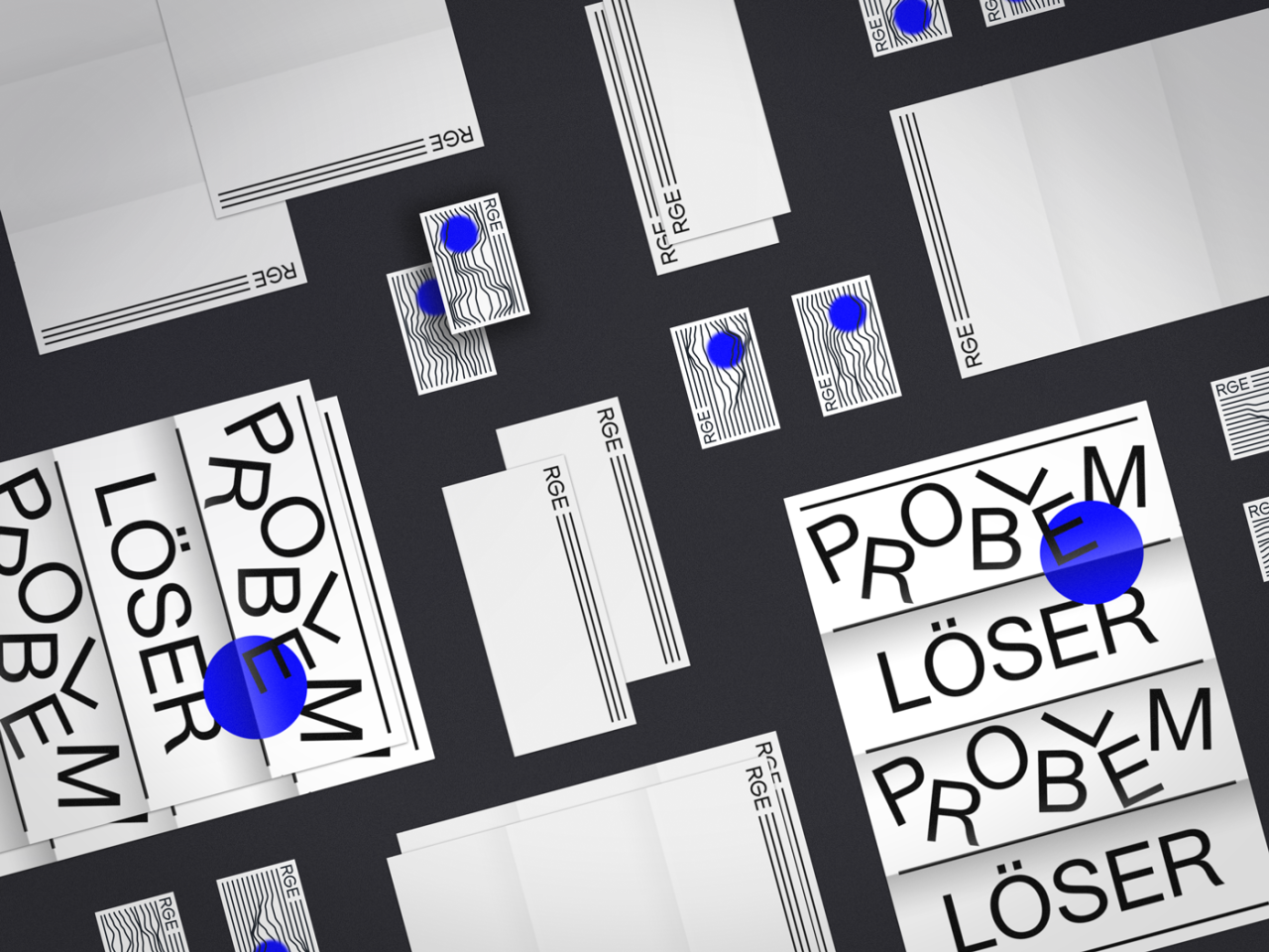
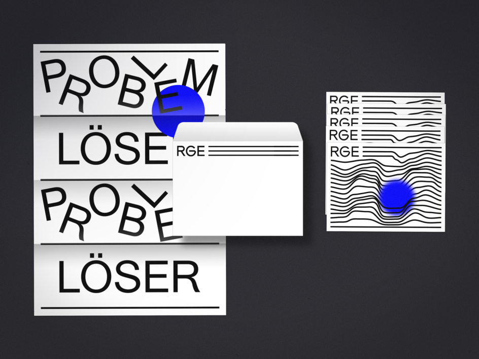
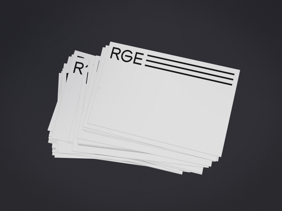
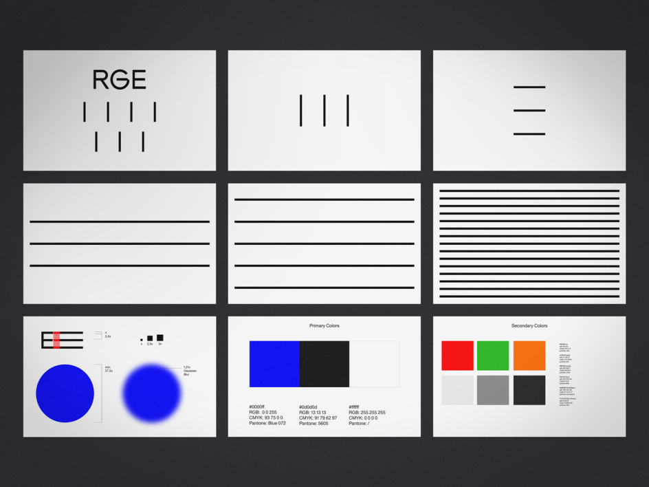
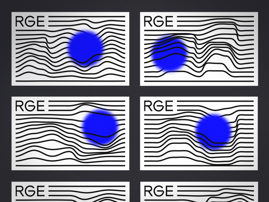
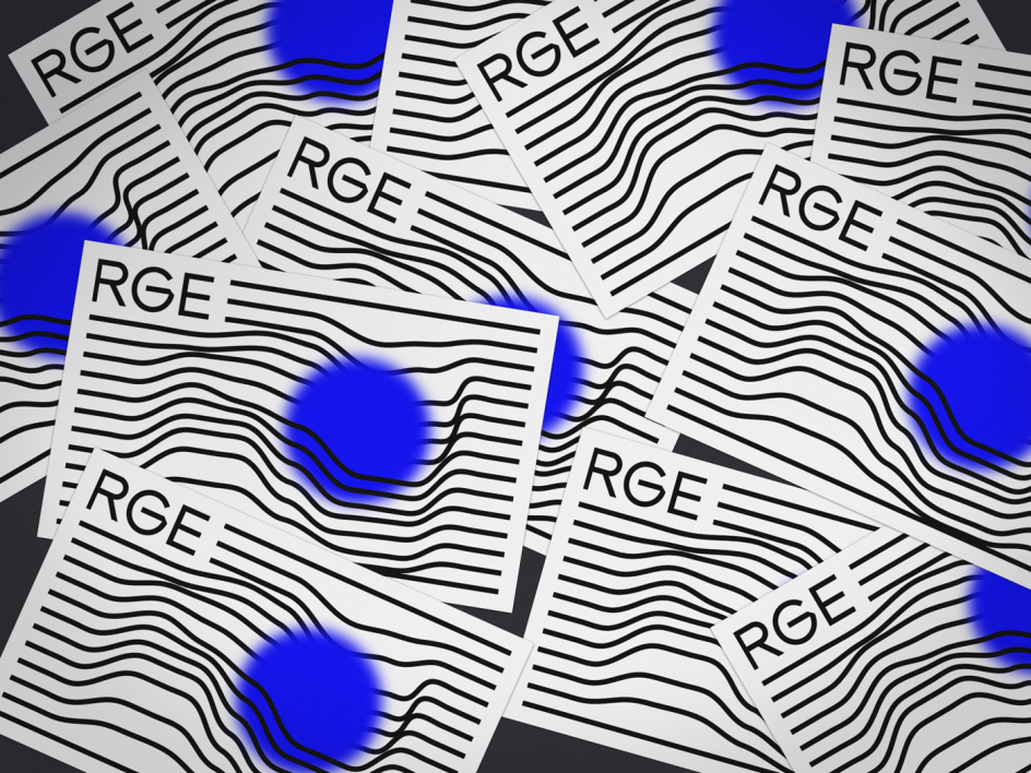
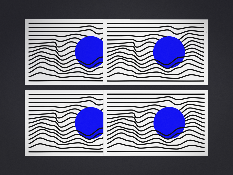
Creating designs across everything from the company’s website to stationery and signage, Moby Digg created a design based around its triumvirate background. "The minimalistic corporate identity was based on the three founding partners, represented by three lines," explains Moby Digg founder Maximilian Heitsch.
The numerous other lines shown on the identity represent the employees that joined the company later on, and the blue circle "stands for the passion and emotion the company puts in every project," he says. "The lines do not only connect a starting point and an ending, but also symbolise the path until a project is done. We searched for a simple graphic system and a decisive colour combination, which builds a recognisable brand."


 by Tüpokompanii](https://www.creativeboom.com/upload/articles/58/58684538770fb5b428dc1882f7a732f153500153_732.jpg)


 using <a href="https://www.ohnotype.co/fonts/obviously" target="_blank">Obviously</a> by Oh No Type Co., Art Director, Brand & Creative—Spotify](https://www.creativeboom.com/upload/articles/6e/6ed31eddc26fa563f213fc76d6993dab9231ffe4_732.jpg)


