Navarra's minimalist yet bold studio identity based on an intricate grid system
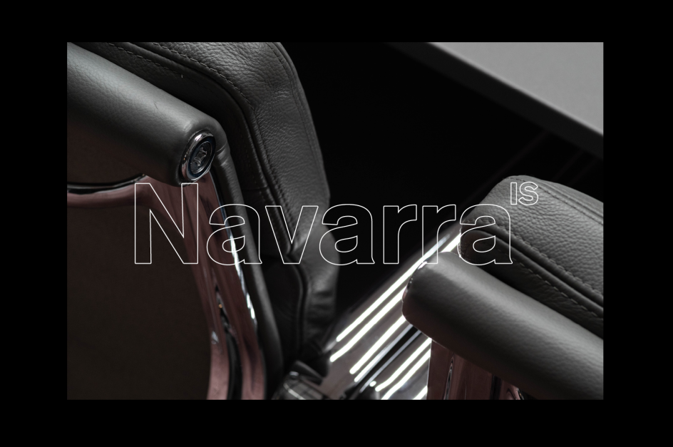
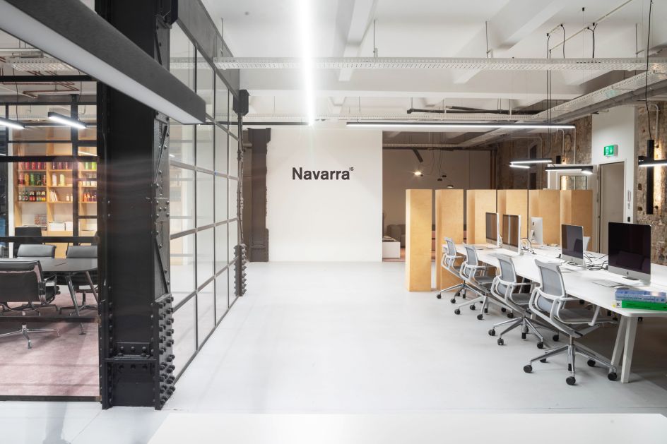
We’re big fans of German design here at Creative Boom, and on our radar right now is Navarra, a Berlin-based visual communications studio with a classically German, minimalist approach to graphic design.
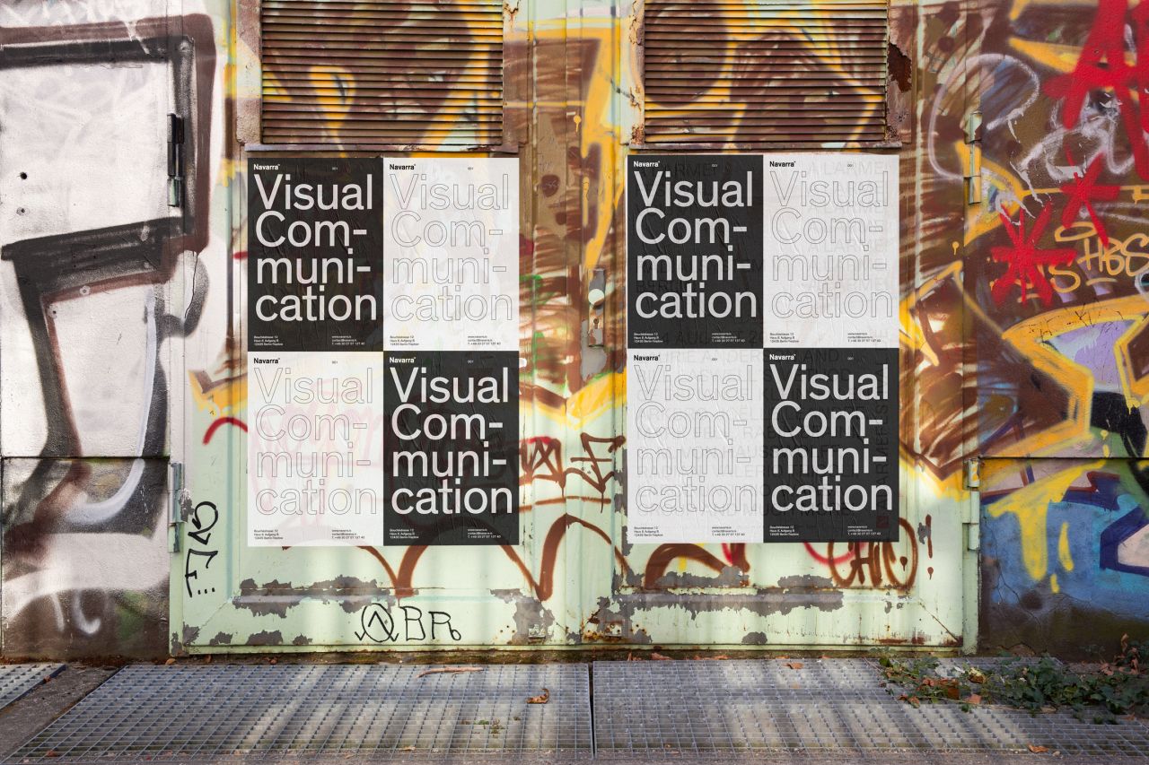
Working with the likes of ASOS, Wrangler and Zalando, the studio takes a systematic approach, with the aim of recontextualising modernist principles in a contemporary context.
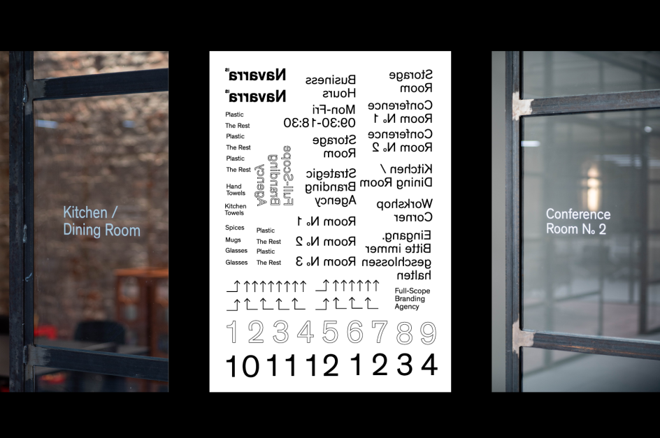
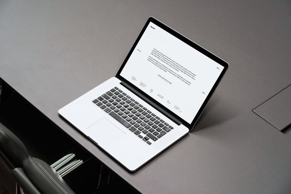
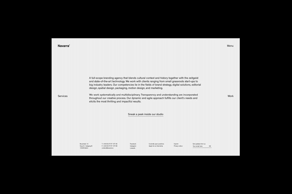
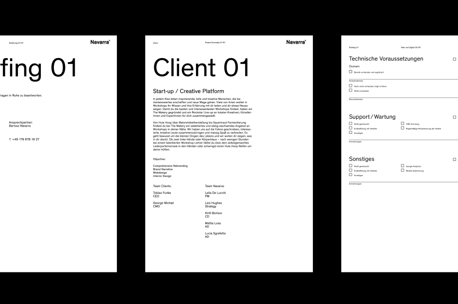
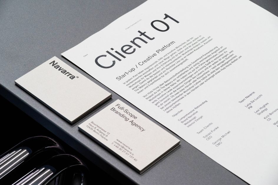
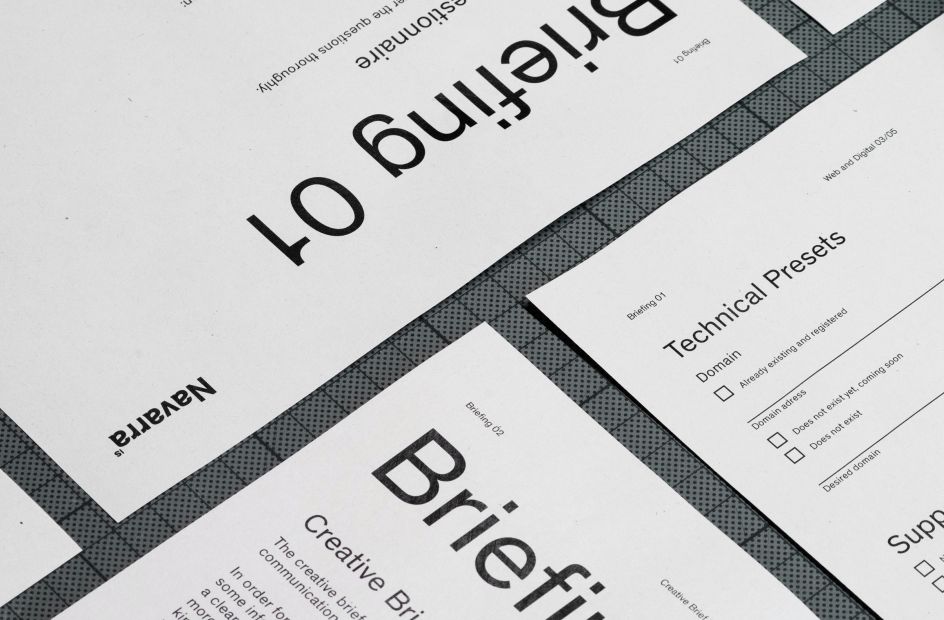
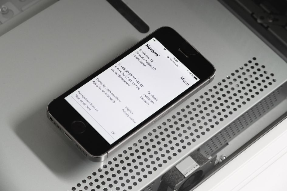
Their own visual identity is a case in point. Based on an intricate grid system, it’s clean and simple yet considered and impactful, using only black and white and letting the content speak for itself.
Their Theindhardt typeface is a nice homage to influential German typographer Ferdinand Theinhardt, whose foundry was located in the Alt-Treptow district of Berlin, the same neighbourhood as Navarra’s offices. Unusually, they’ve only used one weight (regular) – typographical hierarchy is usually achieved solely through a font-size variation.
You can see more of Navarra’s work over at their website.


 by Tüpokompanii](https://www.creativeboom.com/upload/articles/58/58684538770fb5b428dc1882f7a732f153500153_732.jpg)


 using <a href="https://www.ohnotype.co/fonts/obviously" target="_blank">Obviously</a> by Oh No Type Co., Art Director, Brand & Creative—Spotify](https://www.creativeboom.com/upload/articles/6e/6ed31eddc26fa563f213fc76d6993dab9231ffe4_732.jpg)


