New York City FC debuts new identity by Gretel
Football club rebrands are always super tricky, but Gretel has taken a 'refresh' approach to the project, polishing some fan favourites and putting the brand at the top of its game.
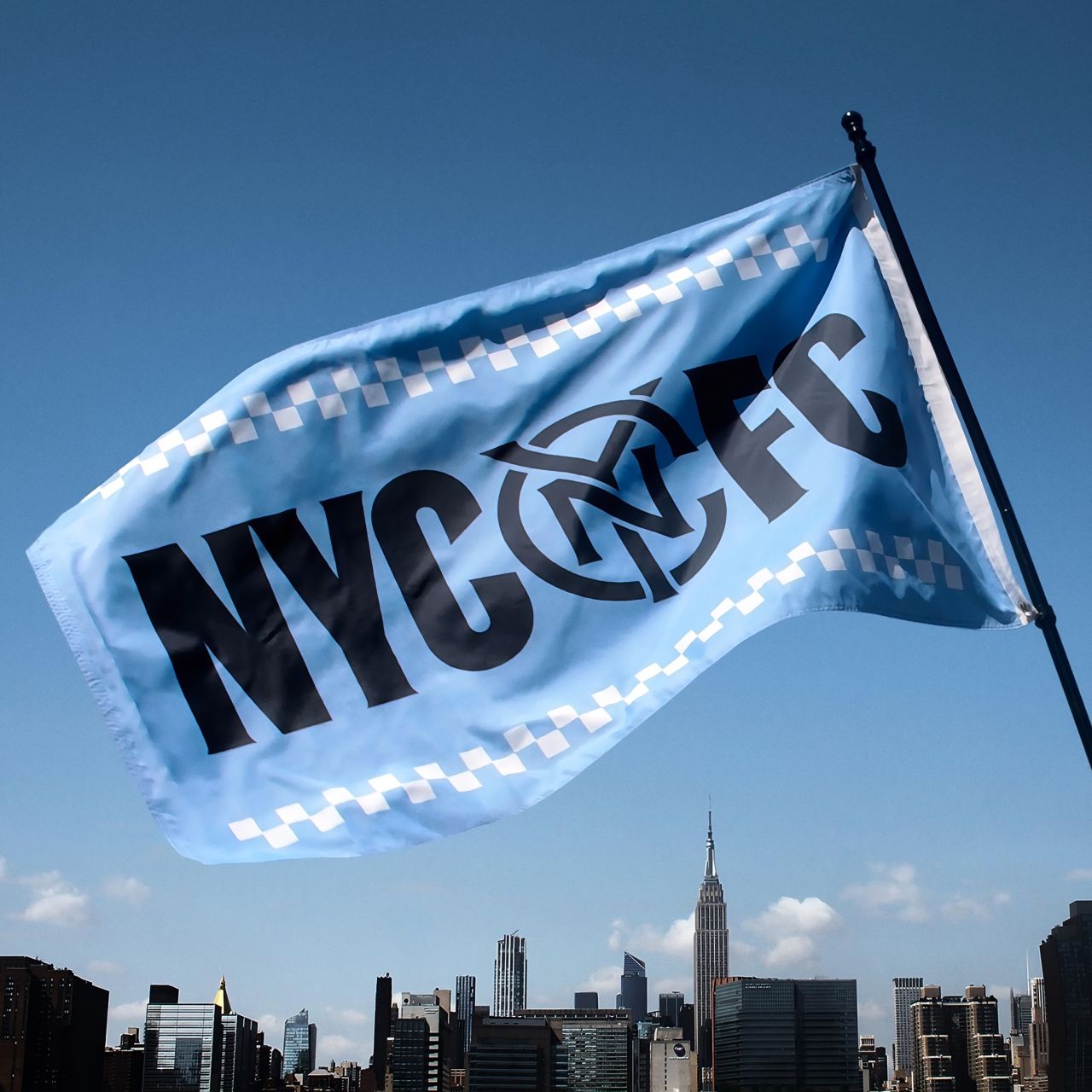
New York is recognised worldwide for its colossal character. Even the city's boroughs each have their own eclectic personalities that intertwine to create a city of subcultures like no other.
What you might not know is that New York City has the most major league sports franchises in the United States, from baseball and basketball teams to football, hockey, and soccer teams. So, Brooklyn-based studio Gretel had no easy task when redesigning the identity of New York City FC.
Despite the challenge, Gretel saw the collaboration as an opportunity to celebrate two things they're passionate about: the beautiful game played at the highest level and their home city, which, according to creative director Justin Au, is also the greatest city in the world.
He says, "We were immediately drawn to how New York City FC embodies the spirit of the city. From the beginning of the project, it was clear we were working with a uniquely passionate team of people dedicated to their players, fans, and the city.
"With such a rich foundation, revitalising the club's creative platform and visual identity felt exciting."
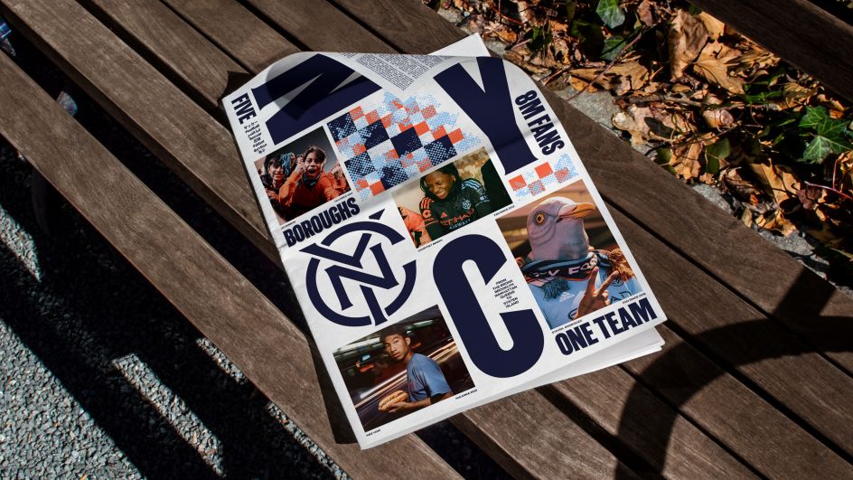
It had been ten years since New York City FC was founded when the club started to consider a rebrand, asking itself what it would take to compete with the top-tier Major League Soccer clubs and New York City teams. Other elements of this ambitious plan included New York City's first-ever soccer-specific stadium in Queens and significant investment in player development.
But, says Au, "to continue building a devoted base of hardcore fans while inspiring new ones to join would mean reframing what the club stood for beyond the game".
Gretel associate strategy director Ian Beckman Reagon adds: "Any team that seeks to stake its claim to NYC needs to live up to the city's colossal character". In light of this, the studio's approach was to develop a visual and verbal identity that embodied the city's relentless hustle and eclectic spirit.
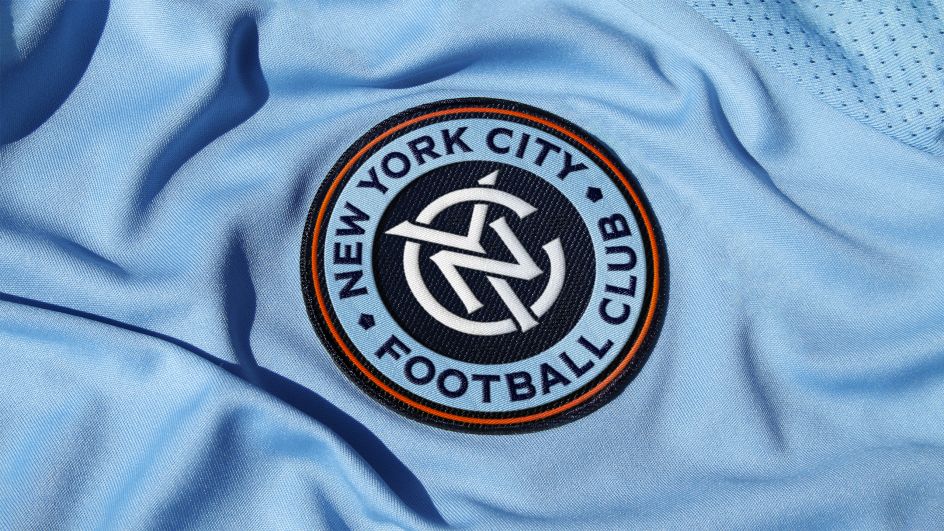
A sure way to make a football club brand flop is to not consult with the fans. Gretel recognised this, and Reagon notes, "New Yorkers instinctively know if something feels inauthentic".
Involving the community across all five boroughs was the key to making this work. "In addition to market research, several focus groups were held with NYCFC super-fans to discuss what matters to them and what about the club identity they hold near and dear," says Reagon.
This helped Gretel evolve the brand while preserving its original spirit.
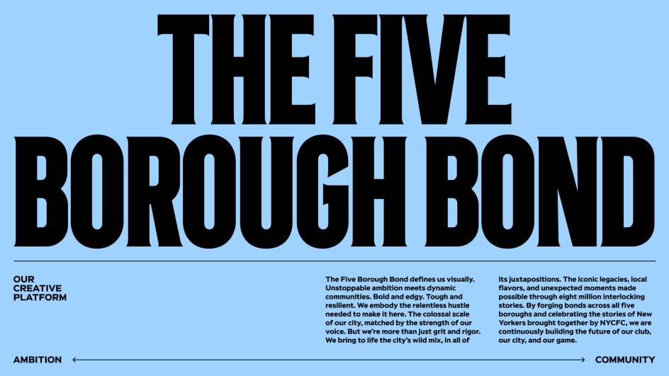
To capture the spirit of New York's club and city, Gretel developed The Five Borough Bond, a creative platform that serves as the team's core ethos and guiding metaphor. Reagan says: "The Five Borough Bond embraces contrast and juxtaposition, a wild mix of ever-changing local flavours and iconic legacies.
"The relentless hustle and colossal scale of the city—edgy, tough and resilient— enriched by the pulsing rhythm and poetic beauty of everyday life, interwoven with unexpected moments made possible through eight million interlocking stories."
Forging bonds across all five boroughs and celebrating the stories of New Yorkers brought together by NYC soccer was a way of solidifying the future of the club, the city, and the game.
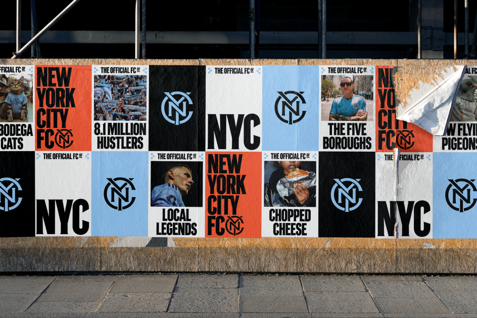
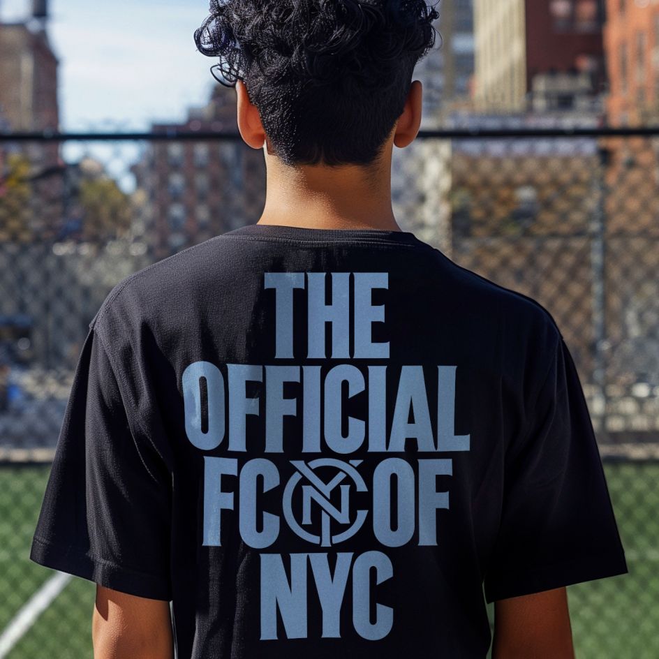
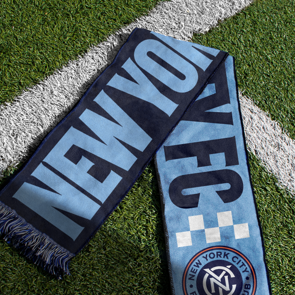
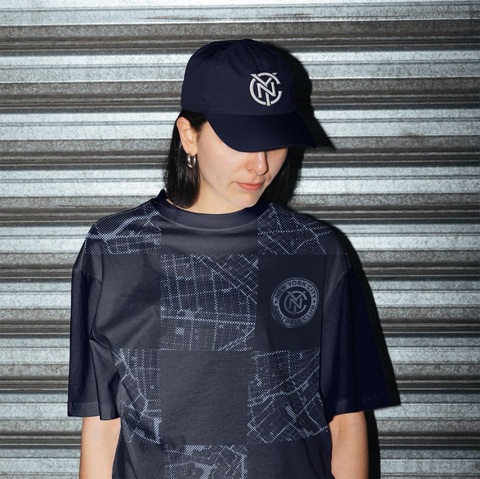
The club's old badge was inspired by a subway token-inspired, and the new badge builds on this but has been updated with enhanced balance. It also features a refined monogram, with proportions that Au says "evoke a strength and pride that matches the bold spirit of the city".
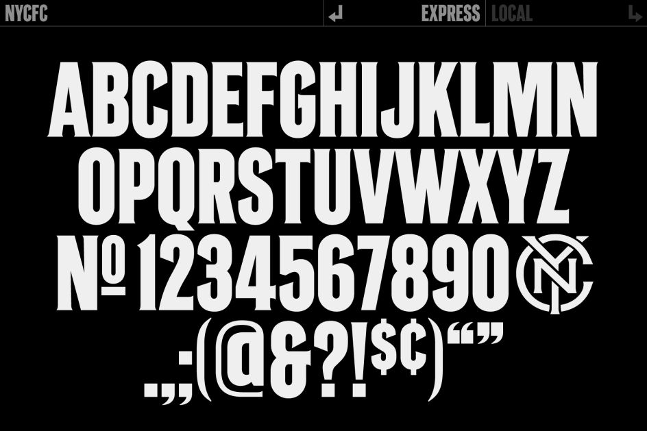
A custom typeface, 'NYCFC', developed in-house and drawn by Frere-Jones Type, sits front and centre on the badge. Again, this is inspired by the New York City subway, which has connected the city's five boroughs since its construction in 1932. Drawn in two styles—'Local' and 'Express'—the typeface combines the iconic details of historical pre-unification subway signage with a modern construction and bold attitude.
"Changes to a club's badge inevitably attract scrutiny, and we certainly heard mixed opinions upon its announcement," says Au. "We have confidence that our rigorous and collaborative process between club, group, and fans has resulted in a timeless icon — one that reflects the club's legacy and embodies its vision for the future."
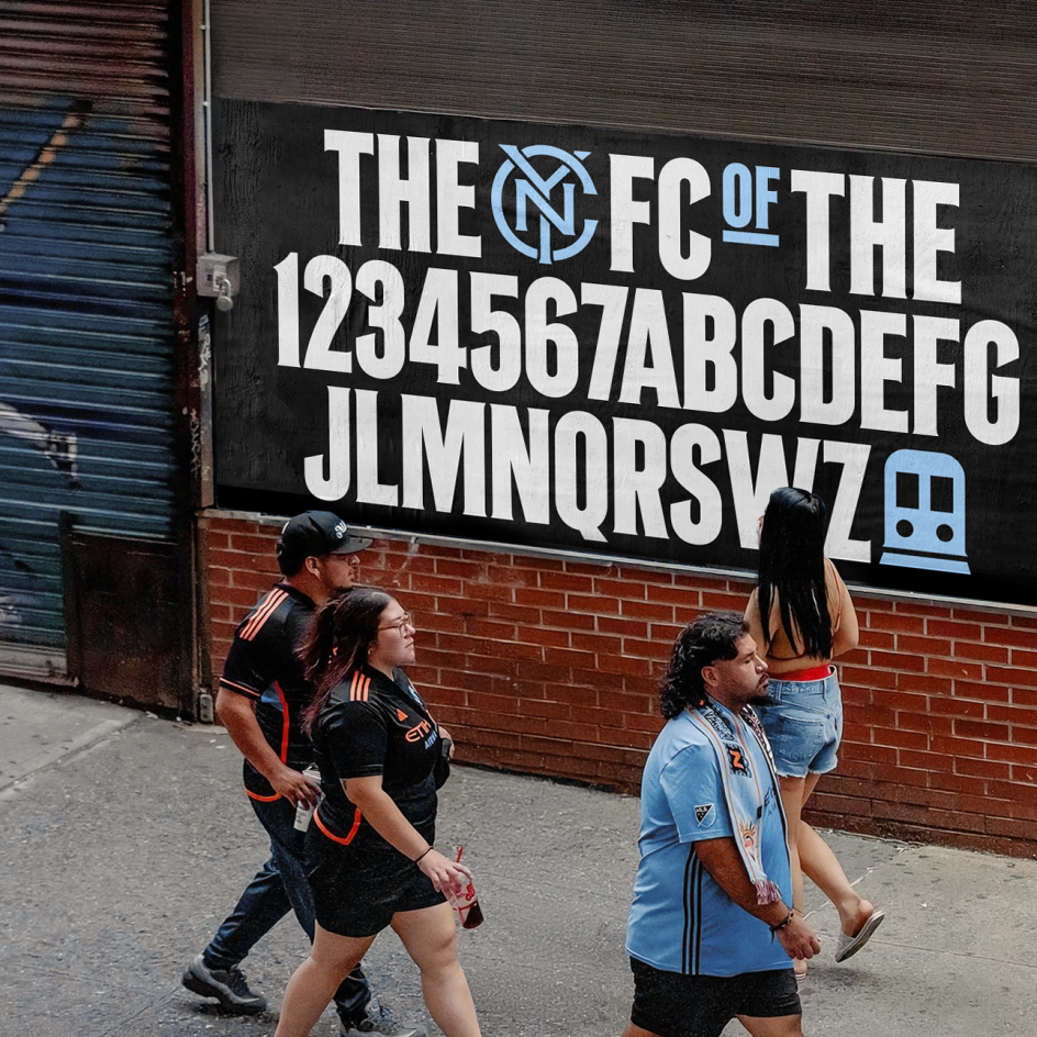
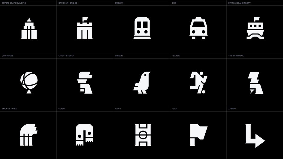
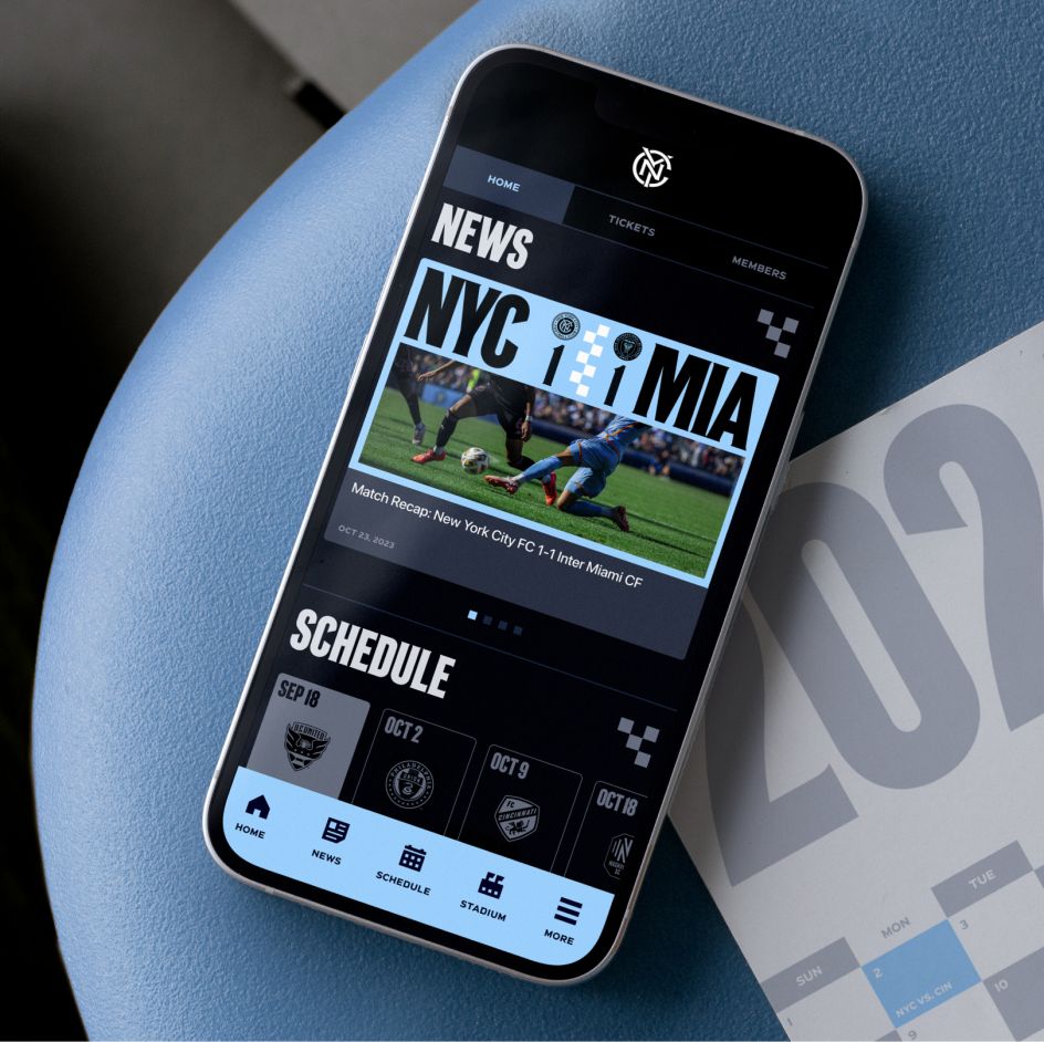
An electric colour palette, a pictogram library of iconic NYC elements, and authentic photography that spotlights players and the city's eclectic characters are some other key elements of the identity. While the iconic sky blue and navy colourway was enhanced with greater contrast, they're still unmistakable NYCFC.
The club's new mosaic graphic system, built from the topography of the city, is also a great addition. "The new identity weaves together the countless stories that unite the club and the city, creating an iconic brand that amplifies the confidence, diversity, passion, and irreverence of all New Yorkers," Au explains.
He adds that fan-created references have been essential to the club's culture, so Gretel brought them into the core of the brand, from pigeons to chopped cheese and even chicken buckets ("If you know, you know," says Au).
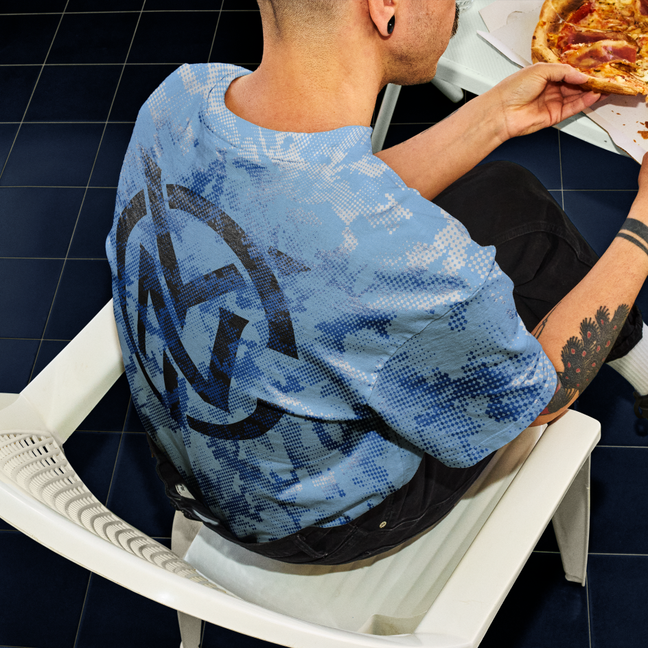
According to Reagon, several things became immediately clear when Gretel started to work on the club's verbal identity. "We needed to capture the spirit and pride of our city without dipping into clichés; the passion, energy, and love for the game had to be genuine without being over-the-top; and we wanted to bring even more fans in, embracing a sense of humour without limiting who feels welcome in the club," he says.
As with any brand, the tone of voice needed to adapt to different contexts and audiences while retaining consistency, so Gretel landed on four key traits: confidence, inclusivity, passion, and irreverence. Reagan says: "What's more New York than someone who speaks with unapologetic self-assuredness and quick-witted humour while embracing the passion and dynamism that makes our city absolutely unlike anywhere else, with all its beautiful juxtapositions?"


 by Tüpokompanii](https://www.creativeboom.com/upload/articles/58/58684538770fb5b428dc1882f7a732f153500153_732.jpg)

 using <a href="https://www.ohnotype.co/fonts/obviously" target="_blank">Obviously</a> by Oh No Type Co., Art Director, Brand & Creative—Spotify](https://www.creativeboom.com/upload/articles/6e/6ed31eddc26fa563f213fc76d6993dab9231ffe4_732.jpg)


