Nick Barclay's minimalist series explores RGB and shows us the world in its true colours
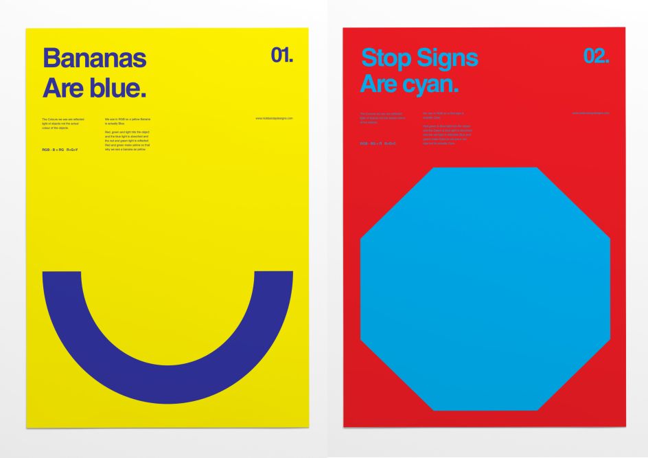
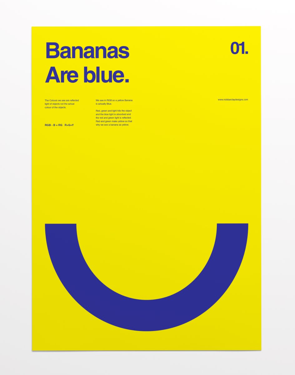
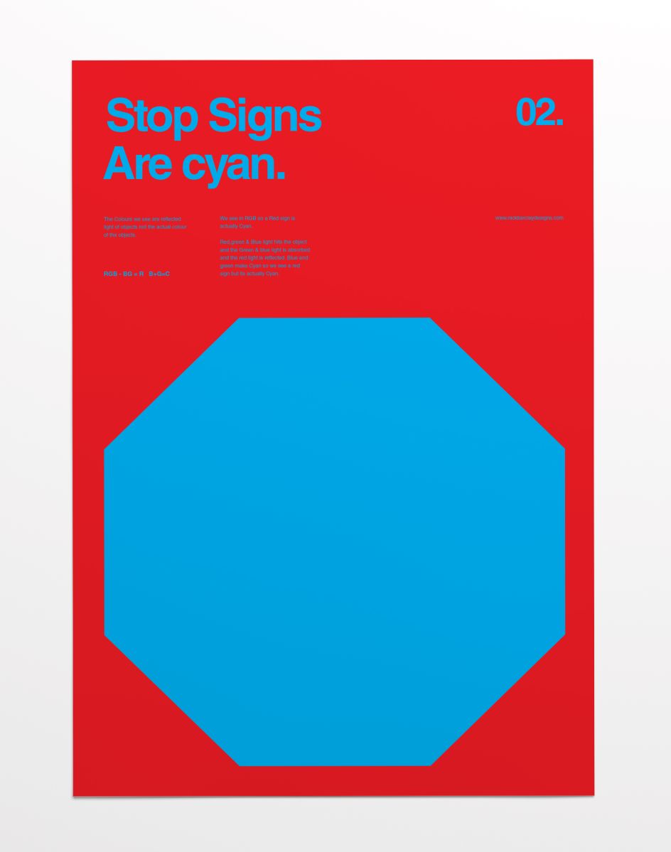
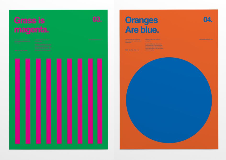
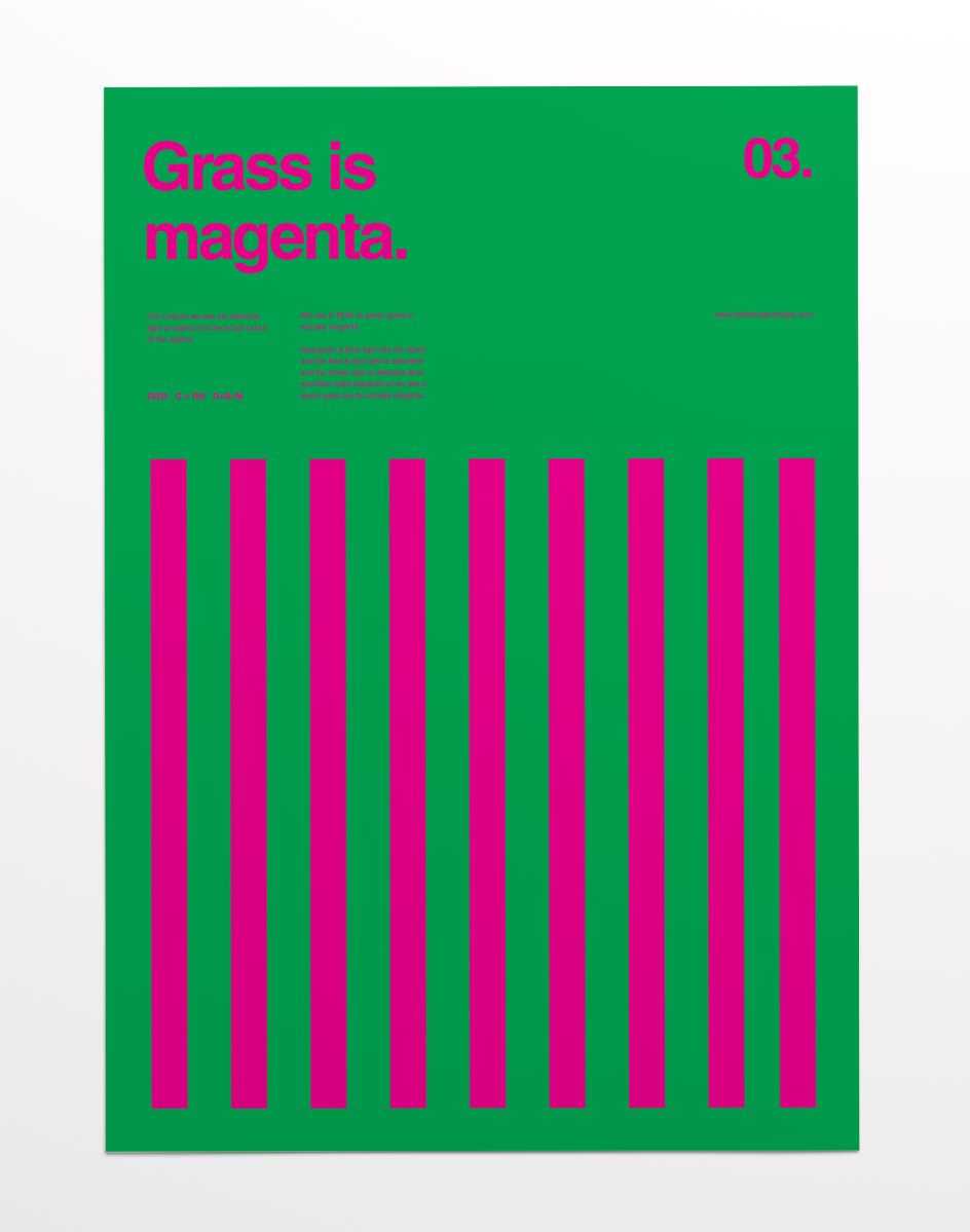
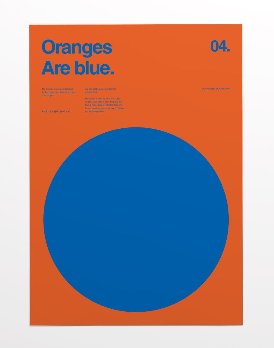
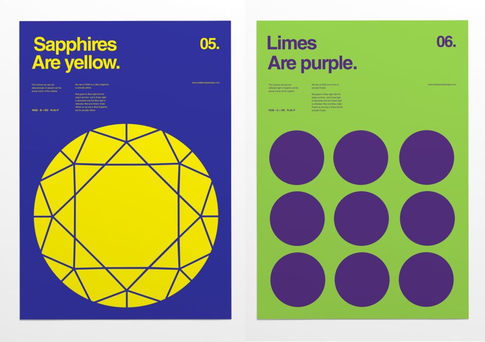
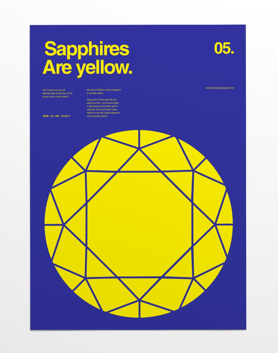
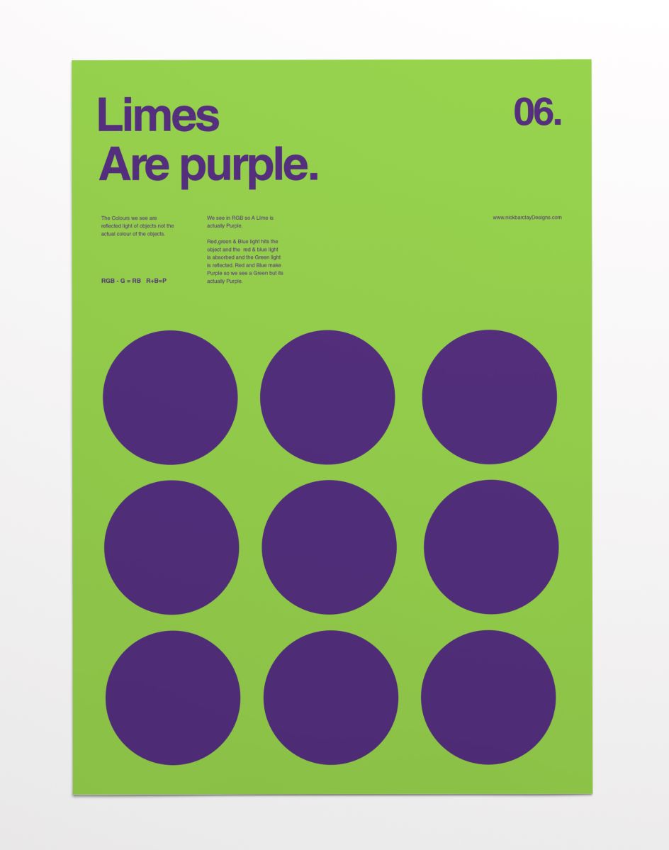
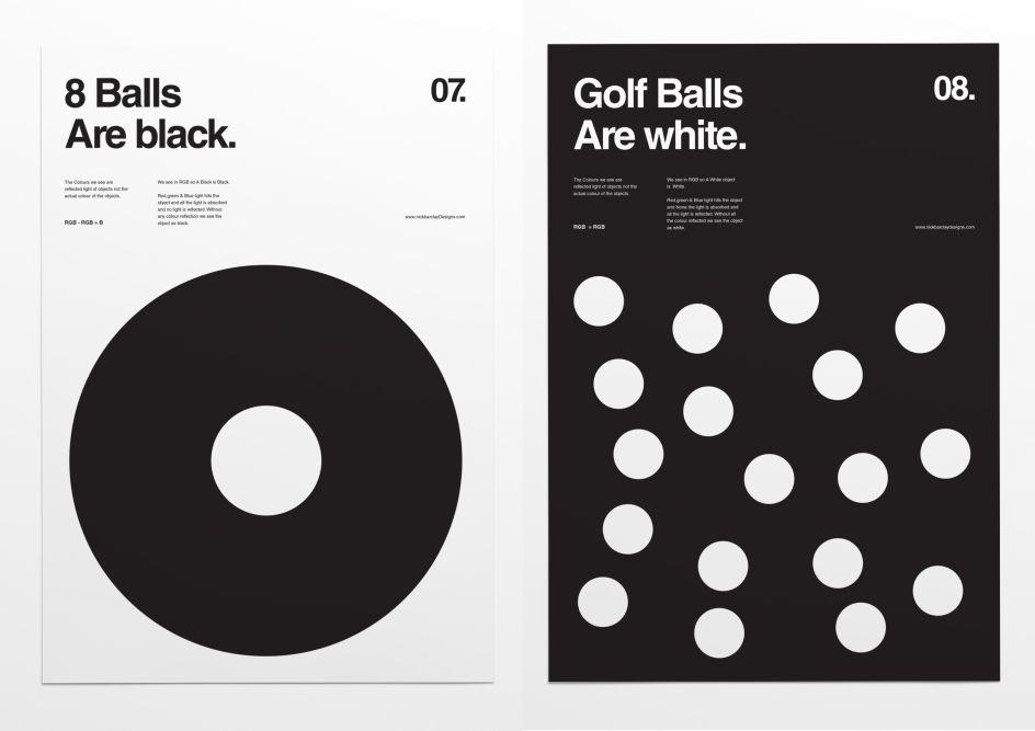
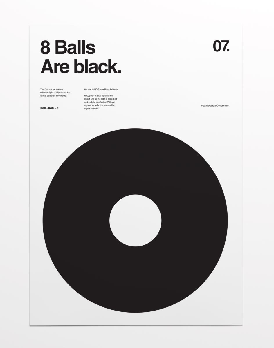
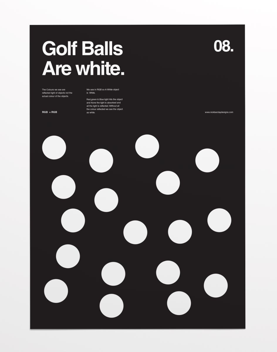
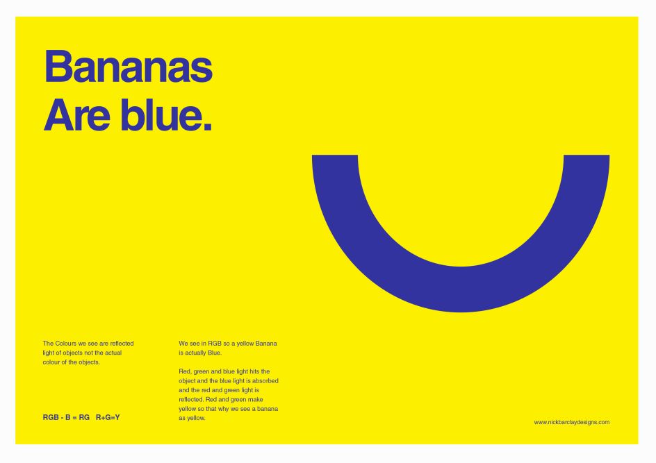
"The colours we see are the reflected light of objects not the actual colour of the objects. We see in RGB so a yellow banana is actually blue," explains Sydney-based designer Nick Barclay.
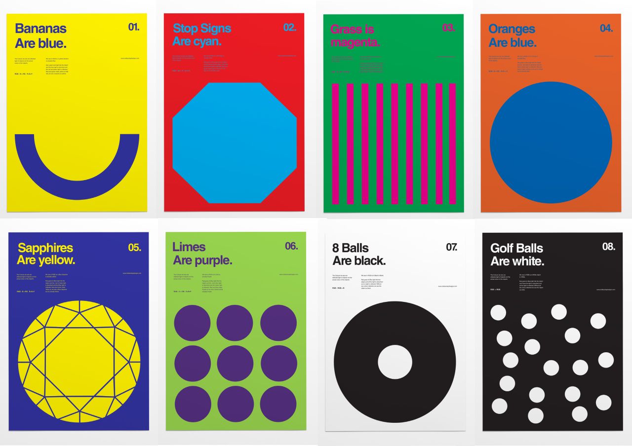
In his latest series, following his usual trademark minimalist style, he considers how we perceive colour and translates his findings into simple graphical posters.
He adds: "Red, blue and green light hits the object and the blue light is absorbed and the red and green light is reflected. Red and green make yellow so that why we see a banana as yellow when it is actually blue
"It's a little hard to get your head around at first but I have simplified it so that people can understand and I have used objects that everyone can associate with a colour."
If you love this style of work, check out Nick's earlier works including a minimal movie poster series, and a simple take on classic album covers. Find out more about Nick at nickbarclaydesigns.com.


 by Tüpokompanii](https://www.creativeboom.com/upload/articles/58/58684538770fb5b428dc1882f7a732f153500153_732.jpg)


 using <a href="https://www.ohnotype.co/fonts/obviously" target="_blank">Obviously</a> by Oh No Type Co., Art Director, Brand & Creative—Spotify](https://www.creativeboom.com/upload/articles/6e/6ed31eddc26fa563f213fc76d6993dab9231ffe4_732.jpg)


