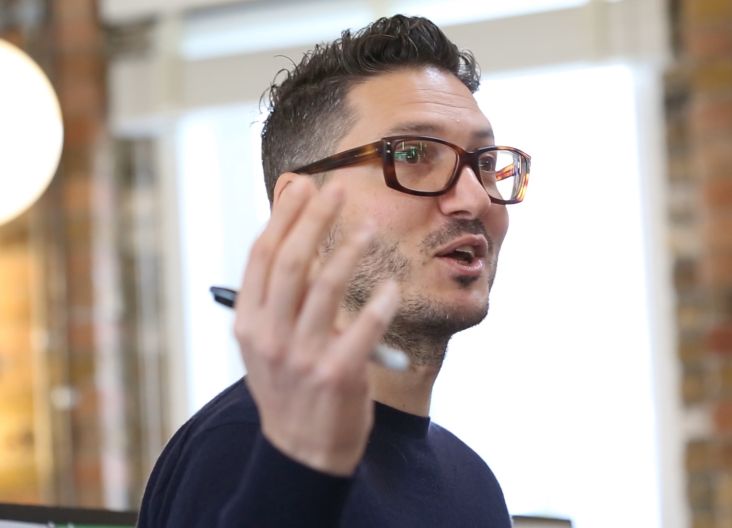
Nicole Phillips a.k.a the TypographHer on her creative journey, printmaking and finding balance as a creative
Nicole Phillips a.k.a the TypographHer is someone who has mesmerised us with her typographic and letterpress work, her thoughts on Human vs. Designer and tips for finding balance as a creative.
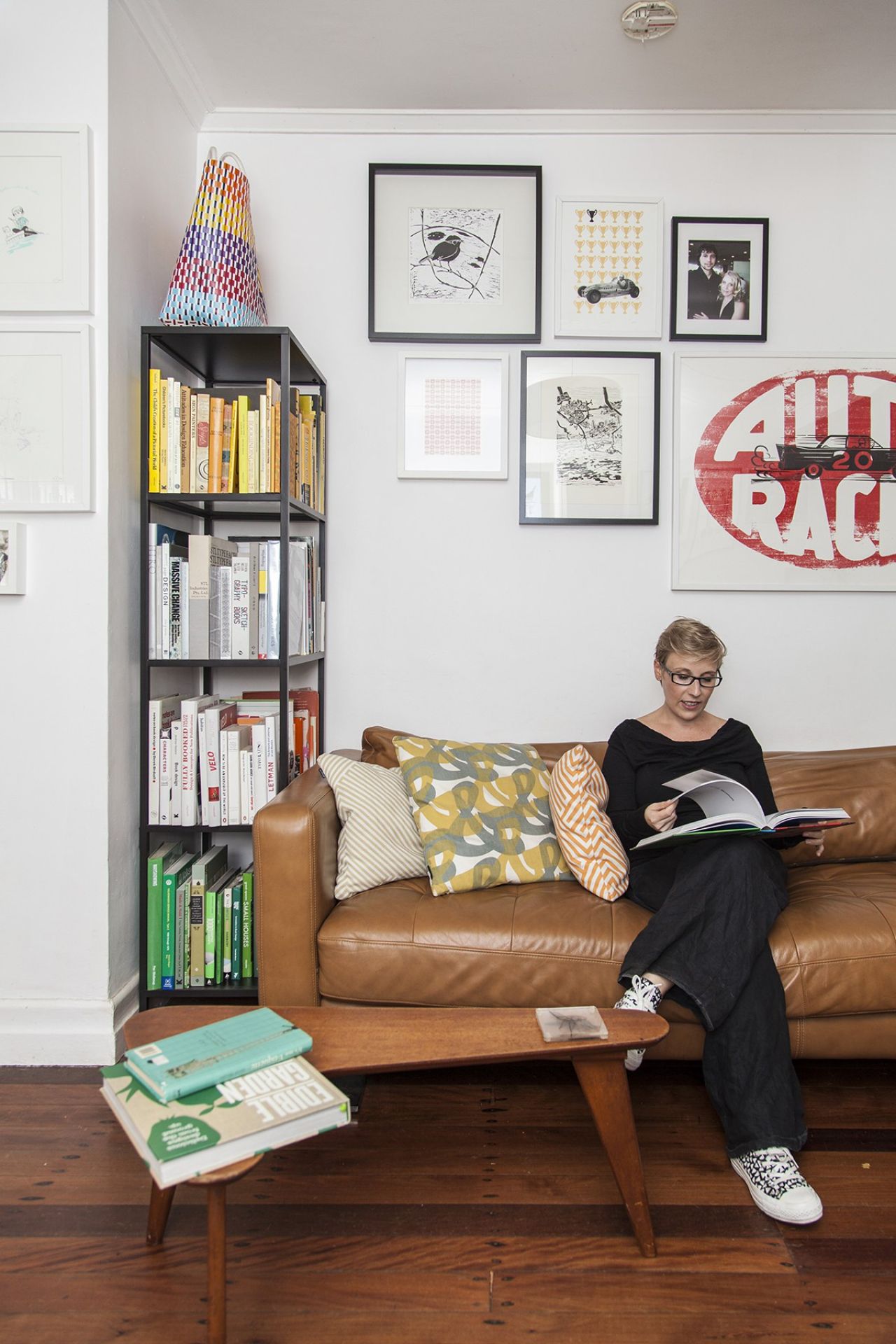
During a guest lecture at Shillington, we loved how honest and relatable she was – and our students said she was a serious inspiration to keep pushing through design struggles.
For Creative Boom, we share our interview with Nicole about her creative journey, process and printmaking techniques, the evolution TypographJournal, collaboration in the Brisbane community and what’s on the horizon.
Tell us about your creative journey. What stepping stones led you to where you are now?
I feel like I always need to credit newspapers. When I was growing up my Dad worked for the New Zealand Herald, and so the seeds of my career were planted early when I became fascinated with print media as a child.
My professional journey with design has been cross-disciplinary. I paid my way through university working in the fashion industry but was desperate to break into book design. I got my first breaks into publication design and typesetting in my final years at university, and that is really where my heart has been since.
Although, after working with books for a few years I felt as though I was stagnating, and I wasn’t getting the same creative challenges I had early in my career, so I changed discipline again and made the leap into the built environment where, alongside my document design, I was able to work with type at large-scale and in multiple dimensions (in the form of signage and public art).
This was a valuable move for me as urban designers are a lot less insular (and more collaborative) than traditional graphic design and publishing business models. I was learning loads and enjoying the work, but I was too emotionally invested in my design outcomes and ended up burnt out (and broken).
In 2009, I started buying printing presses and type to digitally detox and reconnect with the elements that got me into design in the first place. I began printing one day a week (usually Saturdays) and quickly wanted more press time (and less time on the Mac!), so my current business model enables me to spend half my time focused on earning – collaborating and solving problems for clients (mostly in publishing and the built environment).
And half my time learning where I ask self-initiated research questions to deepen my understanding of design, build my creative confidence and experiment with type, lettering and print.
What’s your studio set-up like? What’s important for you to create your best work?
Ah! Total transparency here. Currently, it is pure chaos (not the usual creative mess kind, but I am between spaces right now, so it is all a bit of a shambles!) I work from home and have two workspaces set up.
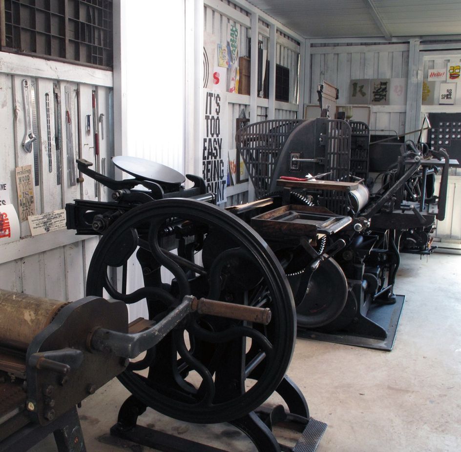
My studio space has my books and Macs, this is where I do client work. I also have a print pavilion where I experiment, play and make a mess in the backyard with my menagerie of letterpress and screen printing equipment.
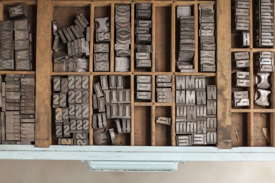
But we are in the process of getting our house ready for sale (which given I have nine printing presses and literally tonnes of type cabinets requires a lot of logistics, forklifts and a crane!) so I have slowly been disassembling, cleaning packing equipment and it all has me discombobulated at the moment.
The process has taught me how important my creative spaces are to me because I do feel off-kilter and like I am not doing my best work at the moment while everything is in flux!
Why do you love exploring printmaking techniques like letterpress and woodcut?
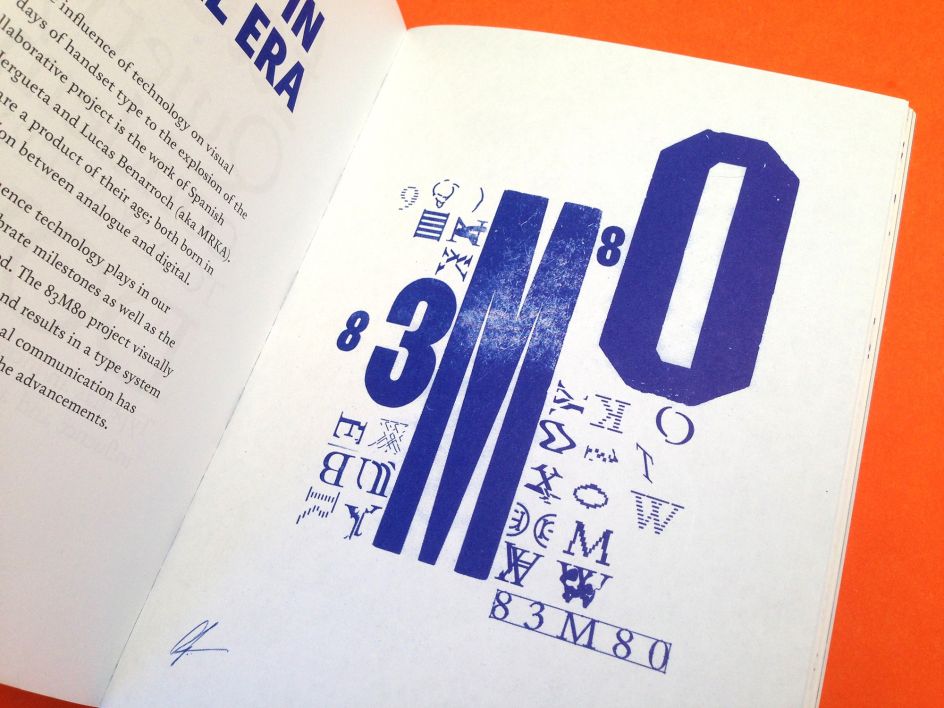
No command Z to undo! There is a real freedom in working analogue – you can’t strive for perfection. Instead, working slowly with these old-school mediums you’re getting hands-on and just trying to learn and be better.
I find that liberating and often my mistakes end up being my most valued learning opportunities or favourite outcomes.
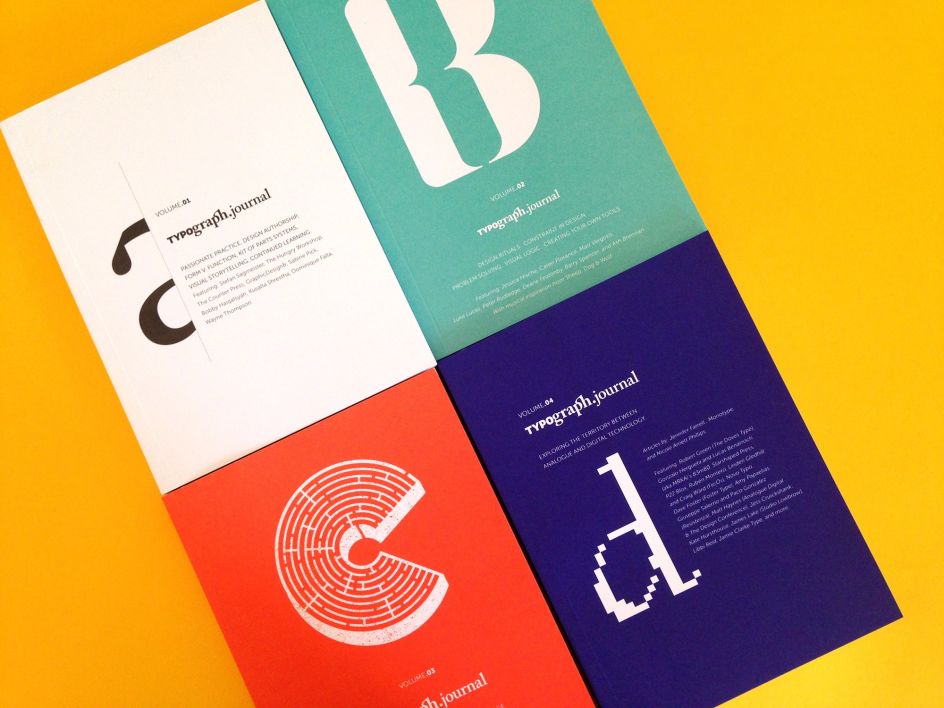
TypographJournal is such an accomplishment. Tell us why you were drawn to publishing and some favourite milestones from the past four volumes.
I had been producing small-run artist books that were a vehicle for my learning and play with print – and as much as I enjoy making work like that I couldn’t easily share it with others – so I felt like they were insular/selfish pursuits.
The journal was born from a desire to connect, converse, and collaborate with our community. Publishing the first volume was nerve-wracking, not knowing how it would be received by the community was terrifying. I was well outside my comfort zone and felt vulnerable and uncertain, so overcoming that anxiety to invest thousands of dollars in print production and a launch was a huge milestone (not just in the journal, but in life)!
In your bio, you explain that you’re “all about process”. Tell us about a time when your process led you to an unexpected outcome.
The way I see it, the design process is essentially three phases – to see, to shape and to build.
As designers, I believe it is the approach (or action we take) that defines the value and meaning of our service. Clients are paying for an outcome and quality, efficiency, cost-effectiveness is the criteria that are often important to them.
But when designers prioritise the same ideals, it is easy to skip ahead and start to design a solution without the creative play and discovery that happens in the earlier phases of the design process.
I try to spend as much time as possible in the early stages of the design process; I try to take risks here as I believe that is where innovation and advancement come from. At this point, I am trying to have fewer expectations of my work so (particularly in my self-initiated print work) they are all unexpected outcomes!
We love the key design principles outlined on your website. Have these evolved throughout your career?
In 2002, I did a set of (very ordinary) screen prints that said; "if you stand for nothing you’ll fall for anything". It was a direct quote lifted from an edition of Dazed & Confused magazine, and it resonated with me.
At the time I was only just starting to get a feeling for how powerful design could be. Through our treatment of content, we manipulate meaning, so I realised it was important that a designer had a point of view or position on the things they were designing and people/products they were designed for.
This translates into my personal work too. Using design as a mechanism to voice a point of view on social, environmental and political issues is becoming increasingly important to me.
Since that first screen print, I have written myself a bunch of design manifestoes and guiding principles/philosophies (some more resolved and or public than others).
But I find publishing your beliefs on design (or the world) is valuable in helping you to attract clients and collaborators with similar values.
The way I see it, the design process is essentially three phases – to see, to shape and to build.
As a champion of collaboration, could you tell us about a time that collaboration made your work better?
Each and every time! One of my favourite recent collaborations is an ongoing series of work I am building with Craig Black. He is a tremendous letterer and has so much passion and energy for his work it’s super cool to be working with him, we jump on Skype and tease out ideas I doubt either of us would have dreamt up on our own. But with any collaboration, the delight comes from having another perspective, voice or skill set enrich your work.
In your guest lecture at Shillington Brisbane, we were fascinated by your take on Human vs. Designer. Can you talk about your scheduling, how you switch off, and why that’s important?
I have two unhealthy design habits – the first is because I love what I do I don’t always view it as work and so I "work" around the clock and this leads to burnout and bad health.
The second is also a fast track to the psychologists' office – and that is defining your worth by the quality of your work. When you become a designer, and "design" starts to inform your identity when something in your work doesn’t turn out as well as you’d hoped, or you don’t win a project, or get recognition for your contribution to something it is really easy to start thinking you’re not good enough, and that dents your creative confidence which will either make you give up, or (in my case work harder) – see bad habit number one.
In that scenario, it’s like a feedback loop from hell, and you’re spending so much time working and trying to do perfect work that it becomes all-consuming. I got to the point where I became a successful professional designer and a very amateur human.
I love design, but life is about more than my work – so although I work six days a week I have a design-free date day with my husband where I recalibrate. I also try to limit my work hours now. I still do long days (often 12 hours, six days per week) but I make time for exercise in the middle of the day and by 7pm I am typically in the kitchen with the music up loud dancing while I'm cooking!
Do you love the Brisbane creative scene? Why?
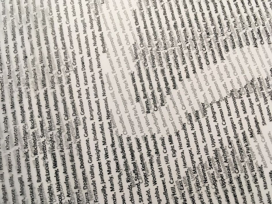
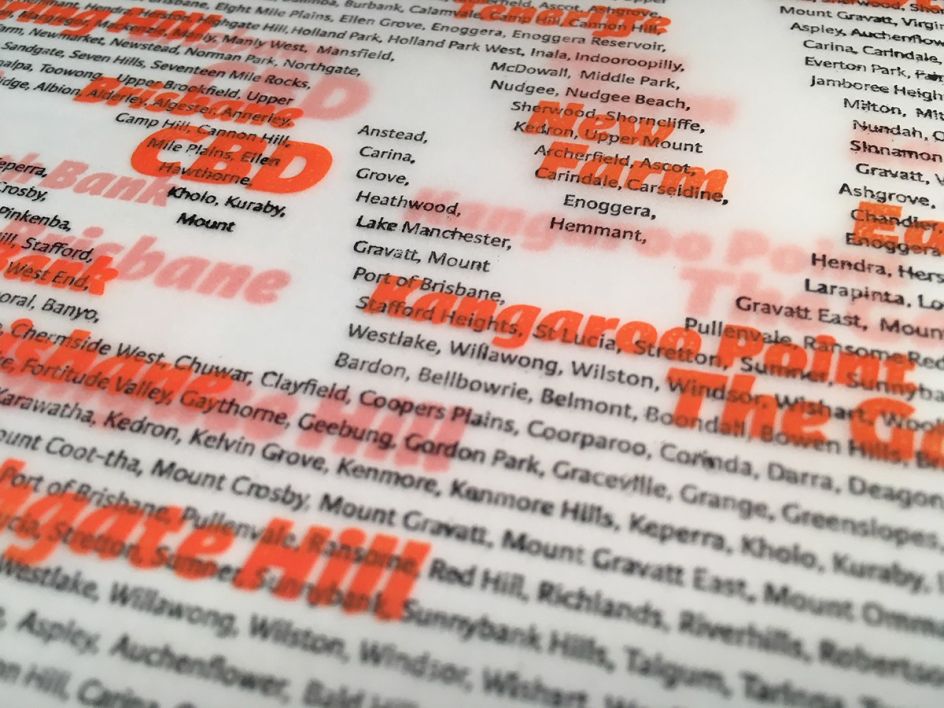
Sure do. My latest print series is a love letter to Brisbane. This is a glorious city and I feel privileged to have lived here for the last 14 years. I especially admire all the people in our local community working to promote creativity and collaboration in the city and generously share their knowledge and time with us.
There's Jacinta Conza for Creative Mornings, Kevin Finn with Open Manifesto, Dominique Falla with Typism, the entire team at APDL, Megan and Jeff at The Brisbane Collective, Matt & Zak for the Design Conference, Grace Dewar and Chris Ahern for AGDA.
I could go on and on as this city/region is full of creative legends who make it their business to help make us all better designers.
Which other designers, artists or creative people are you inspired by at the moment?
I have an unhealthy crush on David and Elizabeth from The Counter Press – everything they produce makes my heart sing. Also in the UK, I think Sarah Hyndman is an absolute champion of contemporary type culture.
Sam Winston’s work is a constant source of delight. Kate Hursthouse's calligraphy and lettering is exceptional. I am also incredibly inspired by Daniel McQueen’s talent, tenacity and business savvy with the Designers Foundry. Locally David Sargent’s research into diversity, body image and type/lettering is fascinating. I checked out some of his letterpress outcomes last week, and can’t get the form and colour out of my head!
What’s on the horizon for you?
I am splitting my time between Australia and New Zealand at the moment, and life is busy! But my future career goals are about continuing to scaffold my client work with more creative analogue and self-initiated opportunities to learn.
Hopefully, some more teaching down the track as that is something I enjoy. And balancing being a designer/researcher/printmaker with some human time at the beach too!


 by Tüpokompanii](https://www.creativeboom.com/upload/articles/58/58684538770fb5b428dc1882f7a732f153500153_732.jpg)


 using <a href="https://www.ohnotype.co/fonts/obviously" target="_blank">Obviously</a> by Oh No Type Co., Art Director, Brand & Creative—Spotify](https://www.creativeboom.com/upload/articles/6e/6ed31eddc26fa563f213fc76d6993dab9231ffe4_732.jpg)


