North celebrates 'collective power' in a brand identity for insurance group Howden
Howden has unveiled a new identity that champions the "collective power" of its global broking operations under one name. Designed in collaboration with North, the fresh brand is inspired by a murmuration of birds or a shoal of fish with letterforms of the Howden name brought together to reflect this unified sentiment.
Working closely with the in-house Howden brand and marketing team, North was commissioned to create an identity for both the corporate and consumer sides of the Howden Group, bringing together its entire global business through one single brand. The move marks an exciting new chapter for the company as it celebrates its 30th year. In the UK, Howden is introducing its brand to a consumer retail audience, with insurance brokers offering consultancy on the high street.
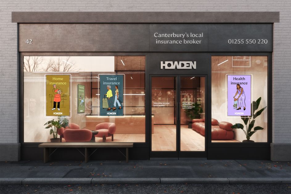
North was responsible for the creative concepts and direction of the 120-branch network, both the exteriors and interiors. "Howden is not what you expect, and it's a culture that's hard to capture," says Sean Perkins of North. "This is a 'People First' business, which celebrates and respects expertise and individuality wherever it may appear in the 15,000 people organisation. One team. No borders. A global network of individual experts, moving as one, harnessing the group's collective power. The new brand reflects this collective spirit."
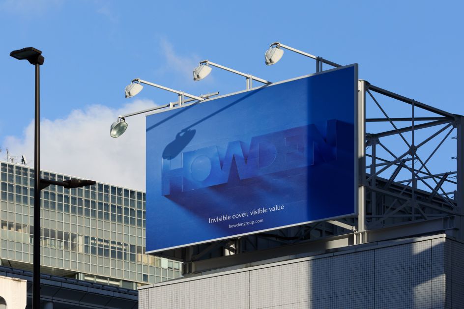
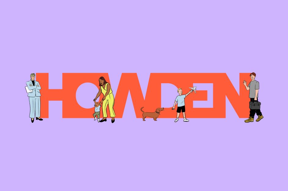
For the logotype, North helps tell the company's story and shares its approach – particularly focused on one of Howden's core brand truths, 'Collective Power'. As such, the symbol and wordmark look like a single, unified emblem, perhaps mimicking a murmuration of birds or a shoal of fish, just like its own network of experts.
"Designed to stand out and be unique in the sector, there was a need for a distinct and mannered logotype solution. Not only as a clear signal of bringing together its global broking operations under one name but also to differentiate from other 'Howden' named businesses in other sectors," explains North.
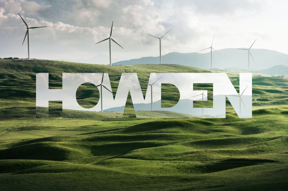
In another clever twist, North considered the idea of insurance, which is essential and always present but invisible. To highlight this, the Howden logotype can be expressed as a transparent lens, sat on top of various relevant areas like cyber security or perhaps wind farms in the North Sea – all seemingly protected through insurance security.
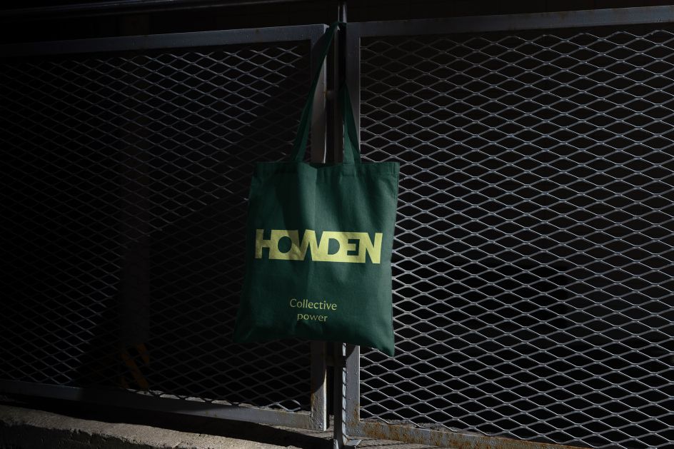
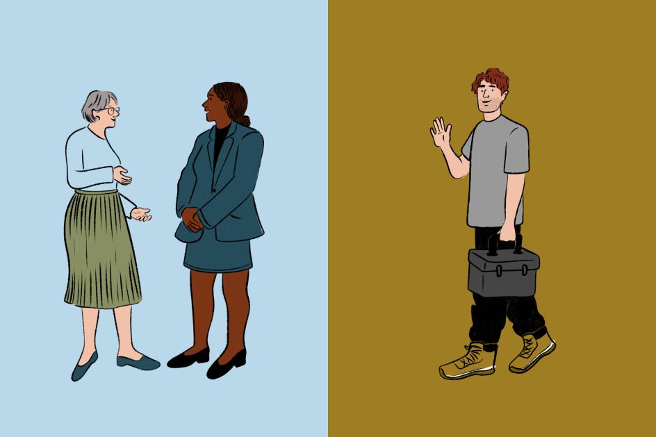
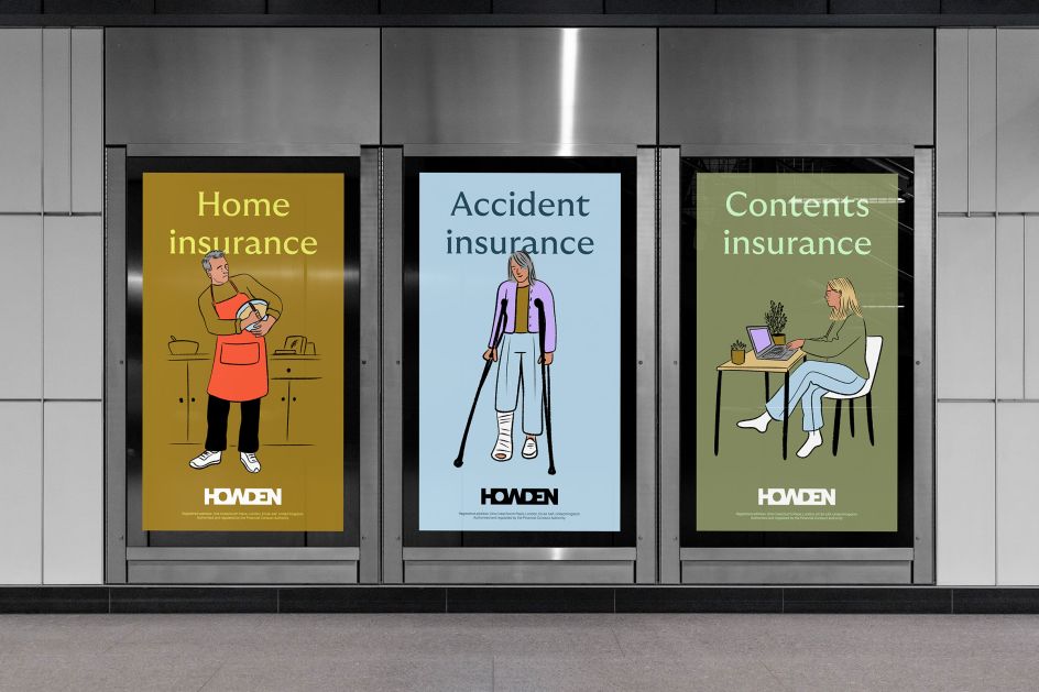
For the colour palette, North felt the brand needed to sit comfortably between consumer and corporate spaces. It, therefore, avoided any sombre colours – tones it felt quite common in the insurance sector – and instead opted for a "warm and human" palette. These colours have been applied using a system of “complementary, neighbouring and unexpected pairings”, helping it to stand out from Howden's competitors.
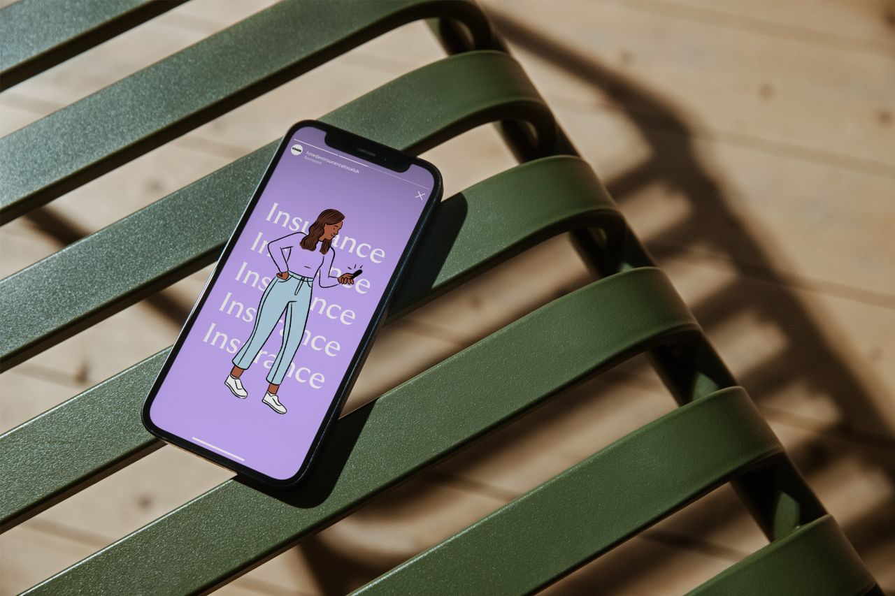
The identity is further brought to life with friendly and approachable illustrations by Haley Tippmann, depicting various scenes to suit health, travel and home insurance. The typography adds to the warm approach, as Swiss foundry Grilli Type's GT Ultra reflects the spirit and personality of the business, "a combination of classical serif type with the dynamism of a modern sans".


 by Tüpokompanii](https://www.creativeboom.com/upload/articles/58/58684538770fb5b428dc1882f7a732f153500153_732.jpg)


 using <a href="https://www.ohnotype.co/fonts/obviously" target="_blank">Obviously</a> by Oh No Type Co., Art Director, Brand & Creative—Spotify](https://www.creativeboom.com/upload/articles/6e/6ed31eddc26fa563f213fc76d6993dab9231ffe4_732.jpg)


