Pentagram's identity for gaming brand Nuverse reflects 'excitement and escapism'
Pentagram partners Jody Hudson-Powell and Luke Powell have designed the identity for game development and publishing company Nuverse, working with Yuri Suziki on the sound design and aiming to reflect gaming's "excitement and escapism".
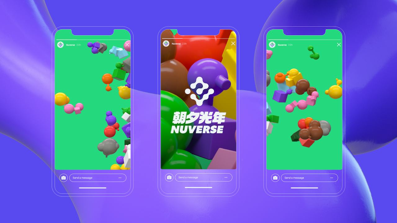
One of the most important aspects of the design was to make Nuverse stand out among existing games labels and for gamers to instantly understand the brand's values—"to create a sense of joy and companionship for individuals coming together through gaming," according to Pentagram.
After extensive research – Hudson-Powell, Powell and their team decided to create a platform for the Nuverse community that looks to extend the experience of playing the brand's game. It acts as the foundation for the new identity.
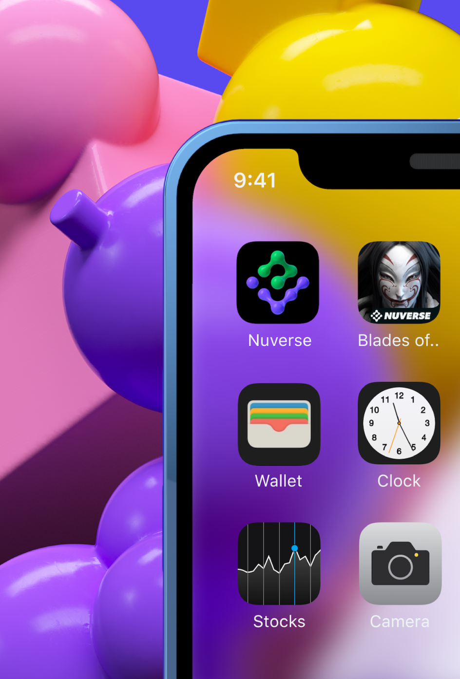
The identity looks to centre Nuverse's users, and so Pentagram created 50 colourful "player figures"—abstracted 3D shapes—that are used throughout the brand's touchpoints in both static and animated forms.
These are colour-coded according to the type of game being played (Sports, SciFi/FPS, Adventure or Family/Social). Each genre has its own colour palette, giving rise to over 500 combinations of player icons.
"These can range from a single player on a heroic quest to several players forming part of a winning team or hundreds and thousands coming together to create a distant, thriving MMO world," the agency explains. "Nuverse represents a virtual, fantasy world where players can connect through their shared love of gaming."

The Nuverse logotype is formed of a chain of connected sphere-like forms, representing two players gaming together. These "player" shapes join to form the letters 'n' and 'v'. The logo is used alongside the bold, angled '90s-inspired Nuverse wordmark, which appears in English and Chinese.
The colour palette is mostly electric blue and a bright green shade that pops all the more next to the other brand colours, black and white. The typography looks to convey a sense of "joy": Pentagram chose to use FK Grotesk by Florian Karsten for the Latin alphabet uses alongside the Bold and Black versions of Rui Abreu's Azo Sans, the secondary typeface. For the non-Latin uses, an extended width sans-serif Chinese type family was selected.
A series of animations used on digital ads and at events show a "swirling 'Player Story'" that represent all of the players connecting at any one time to underscore the idea of connectivity and shared experience. Snapshots that draw from these animations are used as assets throughout the branding in various crops and angles to give a sense of depth and movement.
Since Nuverse's branding will be used across multiple platforms and applications, the identity had to work across all sizes and across analogue and digital – from icons to giant HD event screens, business cards, exterior and interior signage and collectable Nuverse merchandise.
Suzuki's sound design team aimed to sonically replicate the fantasy world created in the visual identity and further enhance the central tenets of the brand, "excitement and joy," through the use of "warm synthesiser tones and pleasing vocals," says the studio.
"The sonic identity needed to sound bold, exciting and clear, no matter what the playback device," says Pentagram. "The team created a modular construction, allowing them to extend, contract or simplify the sound design for a given event or touchpoint."
The team used a granular synthesis technique, meaning that tiny elements of the sounds can be reordered and reworked in numerous configurations: essentially turning sound into tiny grains that can then be reordered, reworked and brought together.
As a nod to video game history and to reinforce the brand name, a key element of the sound is two voices that say "Nuverse" in several different intonations.


 by Tüpokompanii](https://www.creativeboom.com/upload/articles/58/58684538770fb5b428dc1882f7a732f153500153_732.jpg)


 using <a href="https://www.ohnotype.co/fonts/obviously" target="_blank">Obviously</a> by Oh No Type Co., Art Director, Brand & Creative—Spotify](https://www.creativeboom.com/upload/articles/6e/6ed31eddc26fa563f213fc76d6993dab9231ffe4_732.jpg)


