'Opening the way' for walkers with a brand refresh for Britain's walking charity
The Ramblers has unveiled a new identity to bring its 86 year old brand up to date and encourage more people to try putting one foot in front of the other in the great outdoors. Created by BrandOpus, it comes at a pivotal moment for the British walking charity.

The global pandemic made a lot of us realise how important our countryside and green spaces are, and it meant many discovered the joys of hiking for the first time. In 2020, in England alone, there was an increase of 9% in walking "for leisure" compared to the previous year. It's why The Ramblers felt it was the right time to rethink its identity.
It appointed global branding agency BrandOpus to inject new life into the 86-year-old walking charity with a vibrant new identity system that would "guide more individuals towards the pleasures of walking". The complete refresh hopes to drive a more meaningful and positive narrative for the organisation and has launched this month across a new website and key communication platforms.
If you've not yet heard of The Ramblers, its mission has always been to expand and protect the places people love to walk and to promote walking for pleasure. Today, this mission includes not only removing physical and legal barriers to walking but also tackling social barriers – such as green equality – as well.
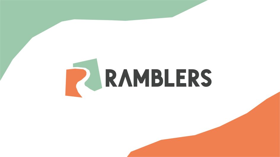
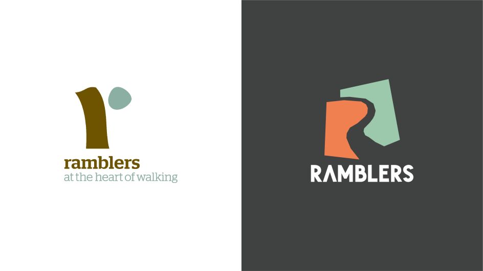
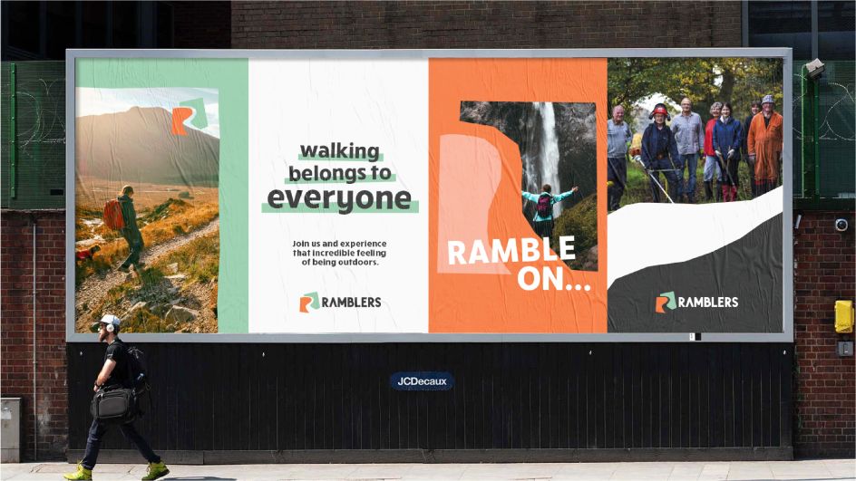
Hence, the identity is rooted in the idea of "opening the way", with a papercut that crafts an open 'R' path, symbolising that anyone can create their own way through the landscape. There's also a refreshed colour palette of upbeat earthy tones that hopes to instil a sense of warmth – names of hues include 'Sunset' and 'Mint Cake'. While a bold, rounded typeface titled 'RuckSack' brings a contemporary feel with its clean rounded shapes.
Accompanying photography is natural and open and highlights the Ramblers experience, showing a diverse mix of walkers, enjoying trails across all terrains. Overall, it feels like BrandOpus has struck the right balance between aiming to appeal to a wider new audience of recreational walkers, whilst still maintaining existing loyal memberships – a challenge in itself.
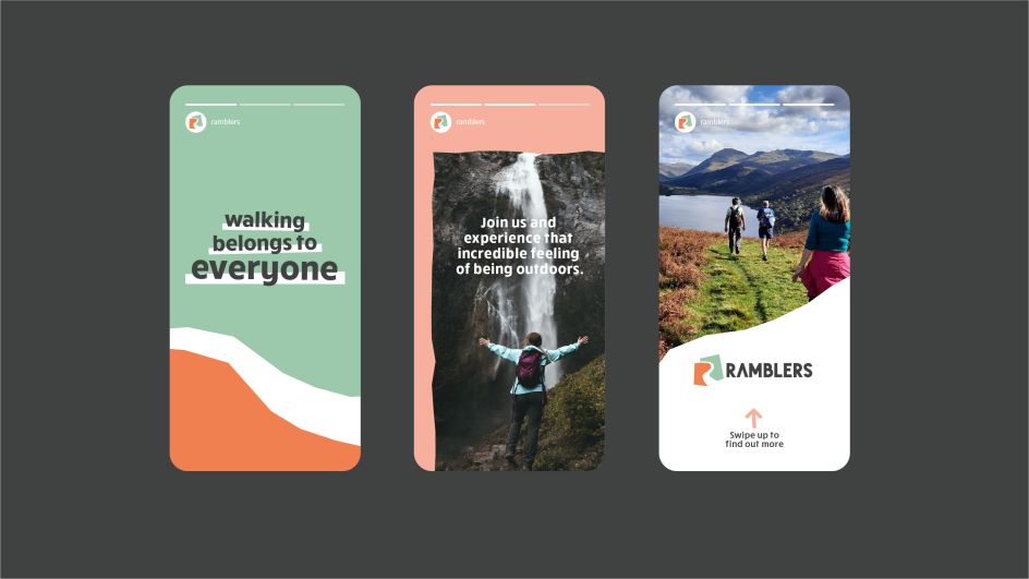
The other big challenge was that The Ramblers has hundreds of local groups, so the new brand also needed to sit under one clear and compelling visual expression that could flex across all touchpoints from digital to comms. As well as uniting The Ramblers' brand both locally and nationally, BrandOpus has also refreshed the 'Walking for Health' initiative as 'Wellbeing Walks' to feel part of the Ramblers family.
"We set out to open up the Ramblers to a wider audience by bringing an open path into the identity," says Ellen Munro, creative director at BrandOpus. "The refreshingly bold identity system not only champions all the wonderful campaigning work that the Ramblers does but also provides a welcoming and open way for others to join. The papercut style extends to the layouts, typographic treatment and iconography, and when set in the naturally vibrant colour palette, creates an open and energetic Ramblers."


 by Tüpokompanii](https://www.creativeboom.com/upload/articles/58/58684538770fb5b428dc1882f7a732f153500153_732.jpg)


 using <a href="https://www.ohnotype.co/fonts/obviously" target="_blank">Obviously</a> by Oh No Type Co., Art Director, Brand & Creative—Spotify](https://www.creativeboom.com/upload/articles/6e/6ed31eddc26fa563f213fc76d6993dab9231ffe4_732.jpg)



, featuring some of his own top picks](https://www.creativeboom.com/upload/articles/fb/fb68ac17f1e5572502d7ebf1c53fb086d5cbd4cd_732.jpg)

