Freytag Anderson and Studio Chong create identity for Gerry's, a drink that 'sacks off the drama'
If you're looking for good times, guaranteed, and you want to say goodbye to any unnecessary drama in your life, then a new low-calorie hard seltzer, Gerry's, might do the trick – if only to enjoy admiring its new identity by Freytag Anderson and Studio Chong.
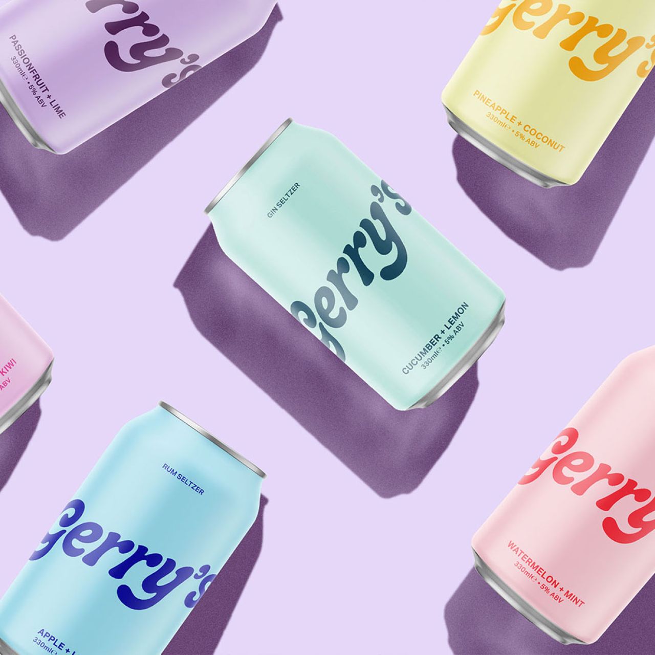
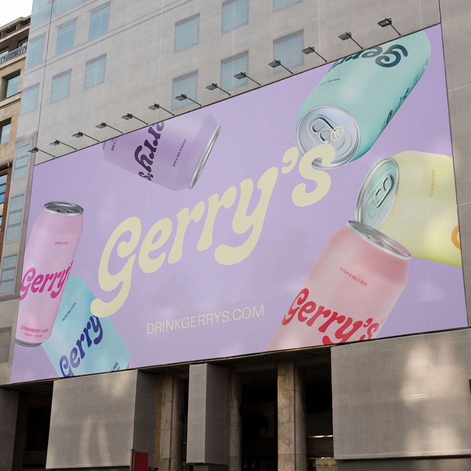
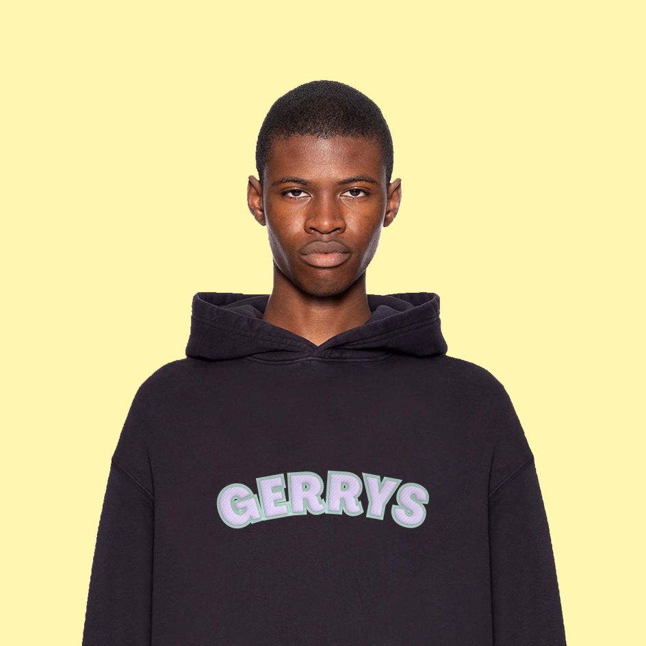
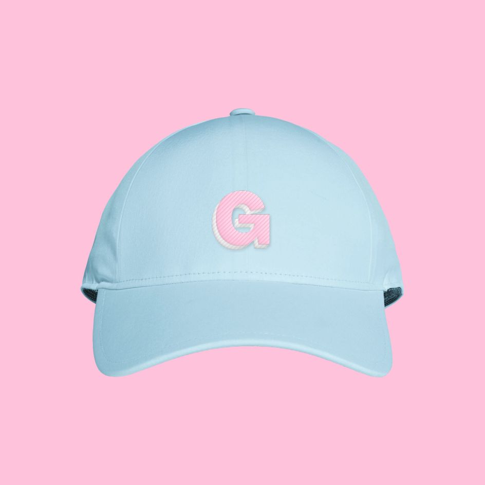
Full of bubblegum pink and delicious ice cream pastel tones, the fresh and fun brand also has a youthful voice that's all about "good times". The accompanying packaging identity continues the happy theme with a minimalist, stripped-back design that understands that "less is more". And the campaign photography shows young people living life to the full with backdrops of sunshine-soaked cities and breezy beaches.
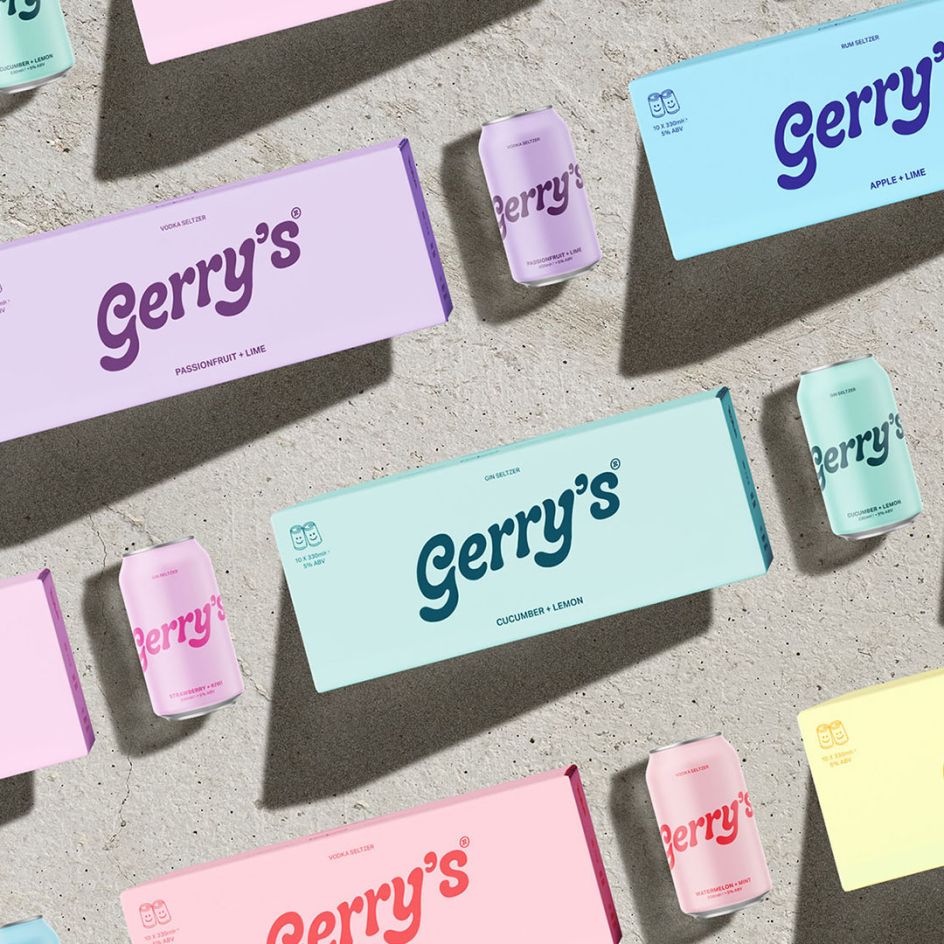
The Glasgow-based studio, headed up by German / Scottish duo Daniel Freytag and Greig Anderson, collaborated with Ade Chong of Studio Chong to then develop the Gerry's website and handle some additional positioning and social media.
Chong is a strategic design director who grew up in Singapore where she kicked off her career in branding and design before moving to London to join creative agency Impero, where she worked for eight years as their design director.
Chong's collaboration with Freytag Anderson for Gerry's is one of her most recent projects and follows identities for Havana Club, Nature Valley and LOLA – even her own sustainable 'low alcohol' gin brand, Mary. "I've always been passionate about food and drink," Chong tells Creative Boom. "It's an exciting and ever-evolving space to be in. I love digging away at the consumer and looking for nuggets and insights to bring out a product that actually adds value to them."





 by Tüpokompanii](https://www.creativeboom.com/upload/articles/58/58684538770fb5b428dc1882f7a732f153500153_732.jpg)


 using <a href="https://www.ohnotype.co/fonts/obviously" target="_blank">Obviously</a> by Oh No Type Co., Art Director, Brand & Creative—Spotify](https://www.creativeboom.com/upload/articles/6e/6ed31eddc26fa563f213fc76d6993dab9231ffe4_732.jpg)


