ORCA creates colourful gifs, assets and new mascot for Hop Union Brewery
ORCA, the purpose-driven, challenger brand agency based in Bristol, has conceived and produced a series of graphic assets for Hop Union Brewery (HUB), formerly known as Great Western Brewery.
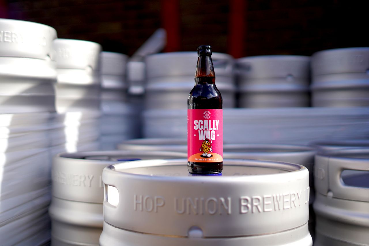
The brewery brought the team on to transition its brand identity from an established family-run business into a modern D2C brand encapsulating its history.
The brand was set up in 2006 as a traditional cask beer brewery with open-top fermenters, but since its rebranding, it's been more focused on sustainability and stocking a range of craft beers.
Part of the brand identity upheaval was to include this pivoted focus into the new visuals and expand its target audience to appeal to a younger demographic specifically aimed at craft beer enthusiasts – without alienating existing customers.
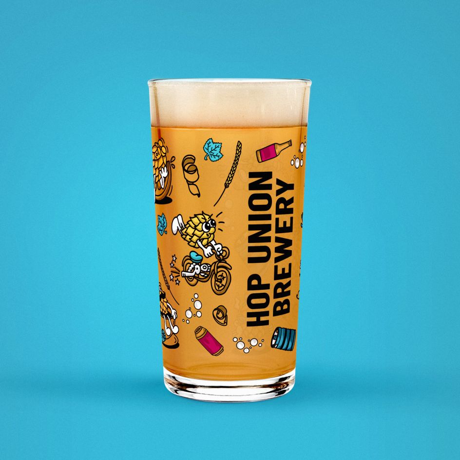
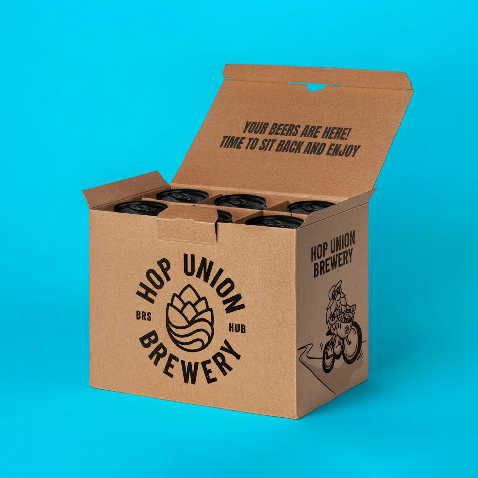
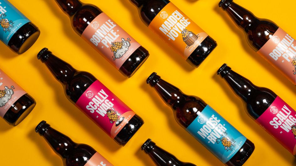
The creative team birthed the HUP HOP mascot with guidance from the client, and the result is a cute and quirky illustrated hop that can be seen going on adventures across the brand's canned, bottled and casked products.
The process of creating this new brand identity involved the creatives working closely with HUB's founder and stakeholders to redefine the brand's renewed values and refined services. With updated packaging design that features bold colouring and striking typography, the new brand identity draws the eye whether products feature on supermarket shelves or behind the bar.
HUB rolled out a series of new designs across its packaging, digital, e-commerce and merchandise offerings, as well as within the newly-refurbished branded Tap Room.
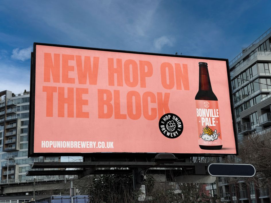
Meanwhile, the mascot will continue to live on and be implemented across nationwide market strategies. HUB's staple IPA, Bloody Nora, is the first new product to launch with the incorporated updated brand – and since going live, it's sold four times more units across Wetherspoon pubs in the South West of the UK, proving that the new design and mascot is very much a hit with the public.


 by Tüpokompanii](https://www.creativeboom.com/upload/articles/58/58684538770fb5b428dc1882f7a732f153500153_732.jpg)


 using <a href="https://www.ohnotype.co/fonts/obviously" target="_blank">Obviously</a> by Oh No Type Co., Art Director, Brand & Creative—Spotify](https://www.creativeboom.com/upload/articles/6e/6ed31eddc26fa563f213fc76d6993dab9231ffe4_732.jpg)


](https://www.creativeboom.com/upload/articles/a2/a2e7e26b0c2de5b87ce93ecd3be0c40ff157b2bd_732.jpg)
](https://www.creativeboom.com/upload/articles/32/32af5de1f983d22dde4b1bf985ec7672962993c4_732.jpg)
