Lark designs new visual identity for Ordnance Survey's employees
The Warwickshire agency has crafted a new identity for mapping agency Ordnance Survey, but there's a twist in the tale. Rather than outward facing, this one's actually for the employees.
In the rush to communicate with clients and stakeholders, internal communications and intranets are very much an afterthought in many large organisations. One exception is Ordnance Survey, the national mapping agency for Great Britain.
Collaborating with Lark, a brand and design studio based in Leamington Spa, the department recently created a new visual identity specifically for its employees.
The brief
Recognising the importance of engaging its workforce and showcasing its values and culture, the OS Learning and Development team wanted to build upon the existing Ordnance Survey brand.
While the previous materials were well-designed and consistent, they lacked a personal touch for internal audiences, often blending with external messaging and going unnoticed by employees. (Let's be fair, for anyone who's worked for a large organisation will know that's not exactly unheard of.)
The team wanted to convey their purpose, services, and values more effectively to foster a stronger connection with the people at OS. The challenge was to create designs that would stand out on the intranet and engage employees within internal communications.
Protecting the heritage
The key to the rebrand was repurposing existing assets into something new. Lark worked with the internal design team to remain true to the brand's heritage and its core components, including the colour palette and typography.
For instance, the typeface OS Gill has been used on Ordnance Survey maps for almost 100 years – so it obviously wasn't going anywhere. For Learning and Development, Lark used two weights: Regular and Light.
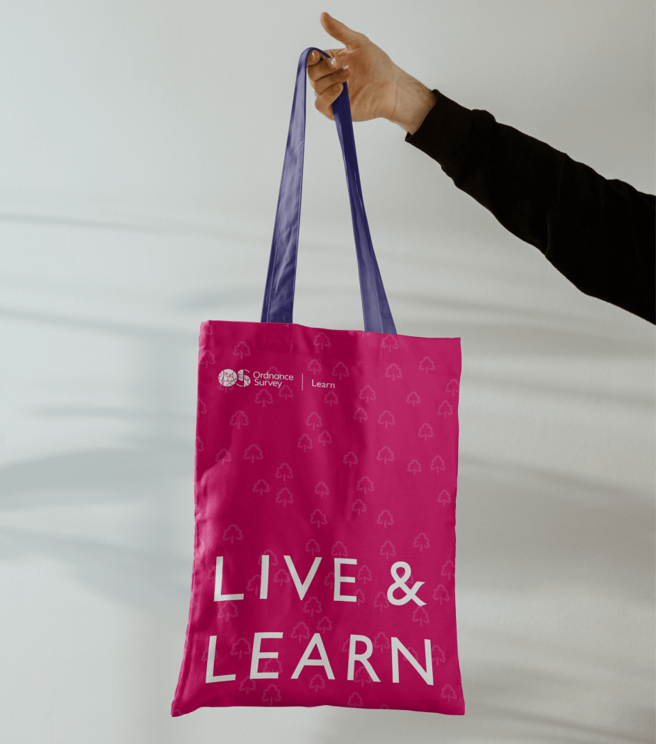
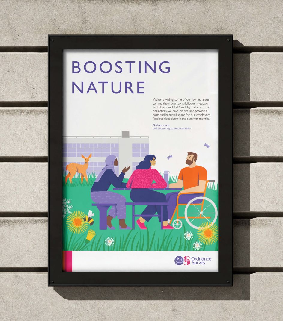
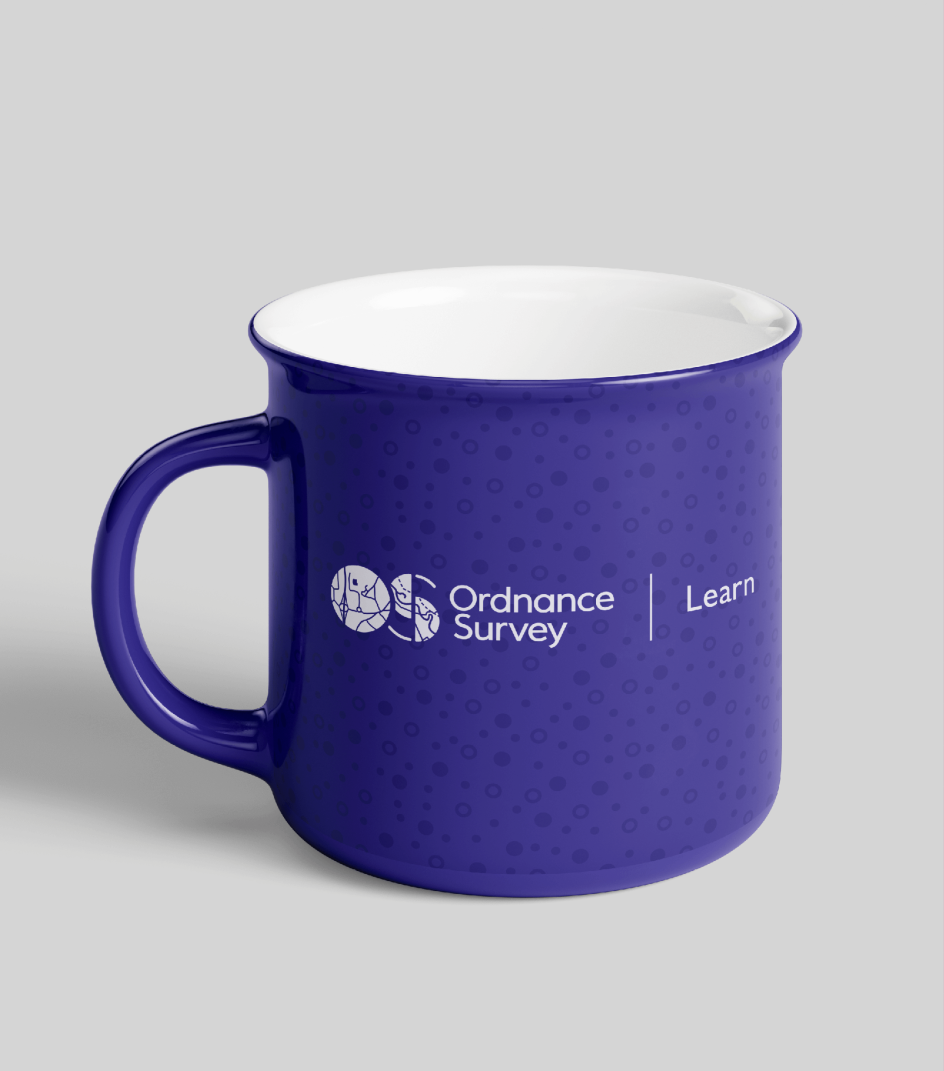
To give the department something they could own, Lark created bespoke patterns inspired by OS map keys. Contour lines, forests, marshlands, and loose rocks became distinctive new assets that can be used at multiple scales and in a range of bright, poppy colours. These new patterns add interest to a whole range of applications.
Where previously the department might have used a plain sweep of colour, they can now introduce subtle branding – everywhere from mugs and tote bags to web banners and backgrounds.
Illustrations and icons
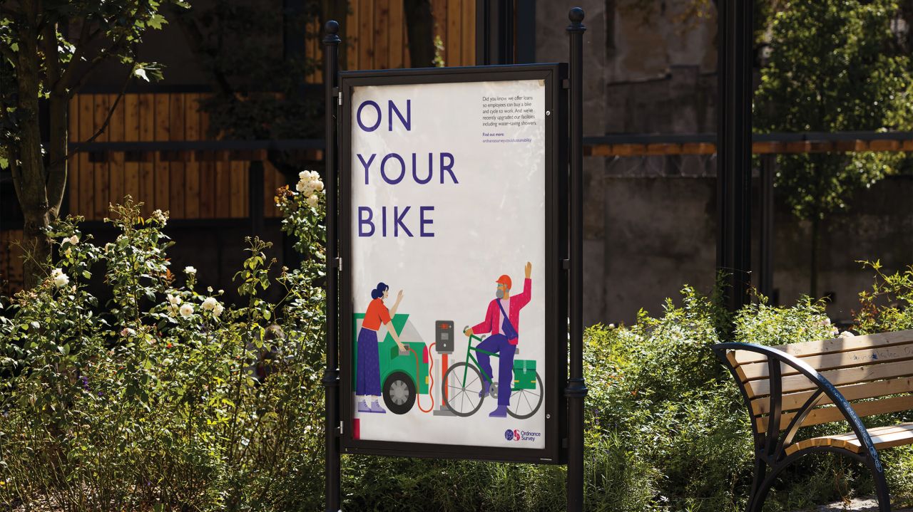
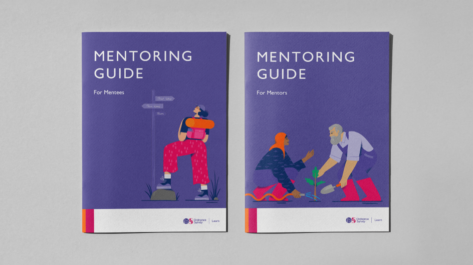
The patterns show up in illustrations, too. Lark commissioned illustrator Nicola Robson to create a series of bespoke illustrations centred around people and representing the services offered by the Learning and Development team.
The illustrations cleverly blend outdoor metaphors with the development journey, featuring individuals climbing, searching, and exploring. They also depict people working, conversing, and learning, all maintaining heart and plenty of character.
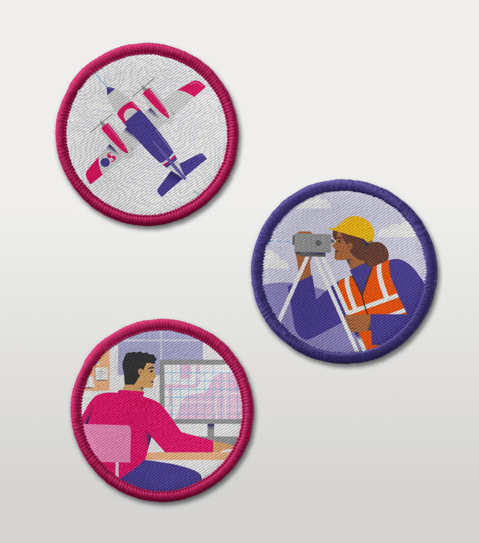
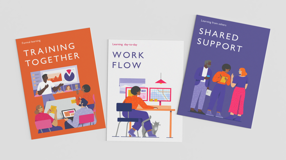
Completing the department's unique assets, Lark developed a set of customised icons that seamlessly integrate with the wider OS brand's existing icon suite. These icons specifically cater to Learning and Development concepts, enabling the team to communicate their services more effectively.
Brand guidelines
Finally, to point the team in the right direction, Lark compiled a set of guidelines and designed mentoring guides, documents, presentations and templates. And the brand extension has already been a hit – so much so that the HR department has since commissioned Lark for illustrations promoting their sustainability initiatives.
"We initially reached out to Lark for support with an internal Learning & Development brand identity," recalls Emma Hopkins, a learning specialist at Ordnance Survey. "What they have achieved is above and beyond our initial brief.
"They incorporated our company brand guidelines and delivered eye-catching illustrations, simple icons, easy-to-read tools and recourses as well as considered what people know OS for – maps and the outdoors – and with this, taken map icons to create bespoke patterns we can use for banners or backgrounds on documents. We love what has been delivered and wouldn't hesitate to work with Lark again in future."


 by Tüpokompanii](https://www.creativeboom.com/upload/articles/58/58684538770fb5b428dc1882f7a732f153500153_732.jpg)

 using <a href="https://www.ohnotype.co/fonts/obviously" target="_blank">Obviously</a> by Oh No Type Co., Art Director, Brand & Creative—Spotify](https://www.creativeboom.com/upload/articles/6e/6ed31eddc26fa563f213fc76d6993dab9231ffe4_732.jpg)


