Outside rebrands micro-philanthropy app Gen E
In a bid to avoid being just another environment brand, Outside focused on creating a brand that quashes climate anxiety and inspires people to make small changes to have a big impact.
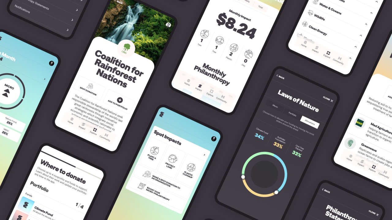
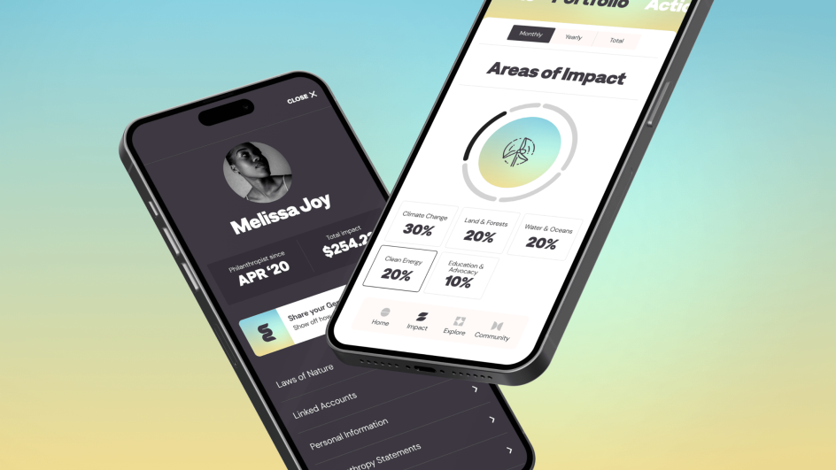
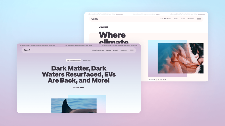
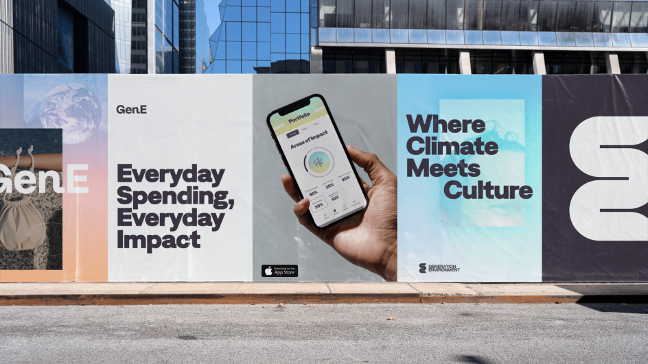
Impact-driven design and technology studio Outside has rebranded environmental micro-philanthropy app Gen E, through which users can donate a percentage of their everyday spending to vetted environmental nonprofits and stay informed about climate news.
It's been five years since Outside began working with Gen E and its founder and climate entrepreneur, Kristen Kammerer. They were first introduced in 2019 when another agency responsible for creating the app's initial brand guidelines brought in Outside to design the original app and website.
As Gen E prepares to transform from an app to a lifestyle brand and redefine environmentalism, a new identity is needed to help it reach that next level. This type of ambition is exactly what Outside is drawn to, as its own ethos centres around supporting companies and organisations that are trying to build a more equitable world.
Outside creative director Rich Stangroom says: "We're a tech company, but we're interested in tech that improves the lives of humans and the planet we share; we're not interested in tech for the sake of tech.
"We have always liked that Gen E uses tech to connect what we do on a daily basis with the world we want to see."
Avoiding using gloom as a motivating tactic was very important for this project. Outside also didn't want to play into existing environmental "brands", which can be quite limiting. Instead, they sought to broaden the scope of what an environmentalist looks like by ditching old tropes and overused imagery and visuals.
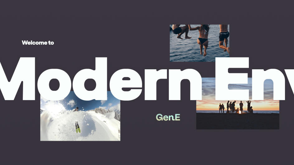
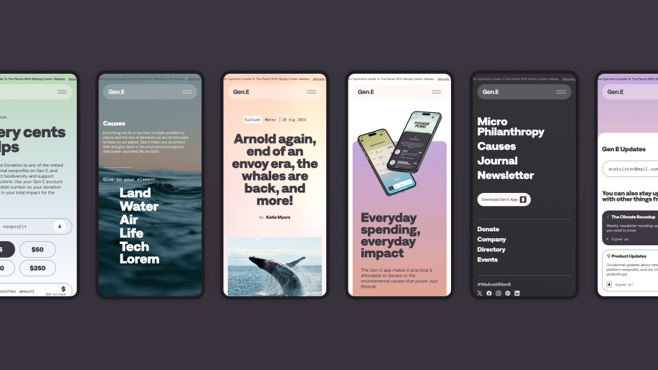
Green fatigue and climate anxiety are all too real in our society but Gen E's new colour palette was carefully selected to combat this. Inspired by skies and sunsets - two of the most beautiful things in nature - the bright yet calming palette is made up of soft pink, yellow, and blue hues that flow together in modern gradients.

"Part of the overall strategy is demonstrating how our lifestyle choices are supported by the natural world, even in the city environments where many members of Gen E's audience live," says Stangroom. He adds that this is where "climate meets culture".
Visuals that depict more typical outdoor enthusiast activities, like skiing and hiking, have been combined with more urban pastimes, like lounging in the park or eating at a restaurant, including a much wider audience in the brand. On Gen E's 'Air' page, you might see an image of someone skateboarding with mountains in the backdrop, while on the "Biodiversity" page, you might see a group of friends having a picnic in a city park.
Gen E's new squiggly logo was designed to mirror "the fluid serenity of a meandering river" and was intended to be a modernised version of a timeless concept. Stangroom explains how this represents the idea that "environmentalism doesn't have to look a certain way" because you can be a "techy or a modernist" and still want to move towards having a healthier planet.
For the main typeface, Gen E will use Denim Ink, which Stangroom describes as "an impactful complement to the more calming elements of the design, reminding us of the importance of the message". It is also applied in dark and light contrasting colours, adding to the balance of calm and impactful.
Since a lot of climate-related and environmental branding focuses on the beauty of nature, Outside took a different approach, showing how nature is present as a backdrop in most things that we do. As a result, the imagery is driven by four guiding principles.
The first is the environment, which is then merged with community, innovation and texture. The community aspect shows people living and playing within the environment, while innovation demonstrates the role of tech in the future of our planet, according to Stangroom. The texture aspect includes up-close, tangible aspects of nature and life, such as bark on a tree or droplets of water on the underside of a leaf.
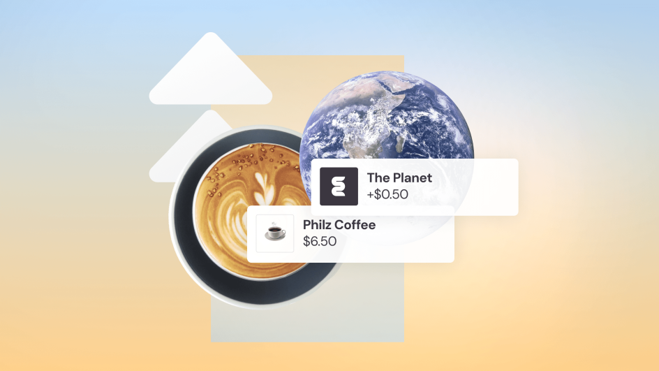
While Outside didn't provide final copywriting for the project, they did provide brand messaging and tone of voice guidelines and came up with taglines, including "Everyday spending, everyday impact".
"Gen E's messaging has always been culturally relevant and inspirational, and that remains, but we did advise on making it more approachable in the age of climate anxiety, which often means slowing down and zooming in," says Stangroom.
He notes that one of Gen E's target audiences is the "early adopters", meaning people who are aware and want to take action to help the environment but don't quite know how or feel defeated. "Micro-philanthropy is like a baby step into the movement," he explains, adding that "it can fit into your daily life."
The metaphor of a conduit was used to communicate the messaging strategy and get across that micro-philanthropy starts small with a single person or, in this case, a single purchase. "If the feeling the brand inspires is: 'I'm ready to become an environmentalist,' then the first question the language should be answering is: 'Where do I start?'", says Stangroom.
Kammerer feels that new branding is "more modern and focused" and that it better supports Gen E's positioning of Modern Environmentalism. "We want to shine a light on how simple, joyful, and intuitive it can be for anyone to embody their inner environmentalist and give back to the planet that gives us so much," she says.
Editor's Picks


 by Tüpokompanii](https://www.creativeboom.com/upload/articles/58/58684538770fb5b428dc1882f7a732f153500153_732.jpg)

Trending
 using <a href="https://www.ohnotype.co/fonts/obviously" target="_blank">Obviously</a> by Oh No Type Co., Art Director, Brand & Creative—Spotify](https://www.creativeboom.com/upload/articles/6e/6ed31eddc26fa563f213fc76d6993dab9231ffe4_732.jpg)


Podcasts


Editor's Picks
Further Reading


