Pentagram's new identity for illustrated book publisher Thames & Hudson
Pentagram has designed a new brand identity for Thames & Hudson, the publisher founded in 1949 by Walter and Eva Neurath, to make the world of art accessible to everyone.
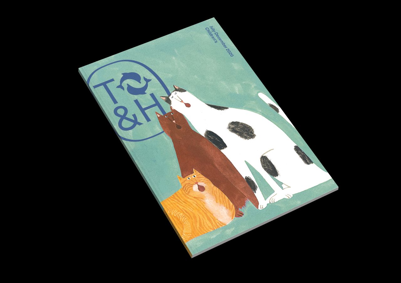
© Thames & Hudson Autumn 2020 Children’s Sales Catalogue
Believe it or not, the company is still family-owned to this day with over 2,000 books in print, featuring everything from high-end art and fashion titles to children's books. Its hugely successful pocket-sized World of Art series was launched in 1958 and now spans over 300 titles and will be relaunched to coincide with the new identity.
The publisher's name reflects the international nature of its business and comes from the primary rivers in London (the Thames) and New York (the Hudson). But despite this rich history, there was a need for the new identity to be modernised and work across a wide range of applications in print and digital, and at a broad range of sizes, from book spines to banners.
Pentagram researched previous incarnations of the publisher's logo and looked at how it was applied. A new wordmark has been created, as well as a new cartouche, which is a reworking of the original Thames & Hudson version. The new cartouche contains a T&H monogram built from the team's bespoke logotype typography, locked up with the publisher's existing dolphins symbol.
"As the most complete visual shorthand of the brand, the cartouche can be used alone or in place of the logotype and symbol – it appears on sales and marketing materials, on the website masthead, on the title pages of books and embossed on hardcover binding cases," explains Pentagram.
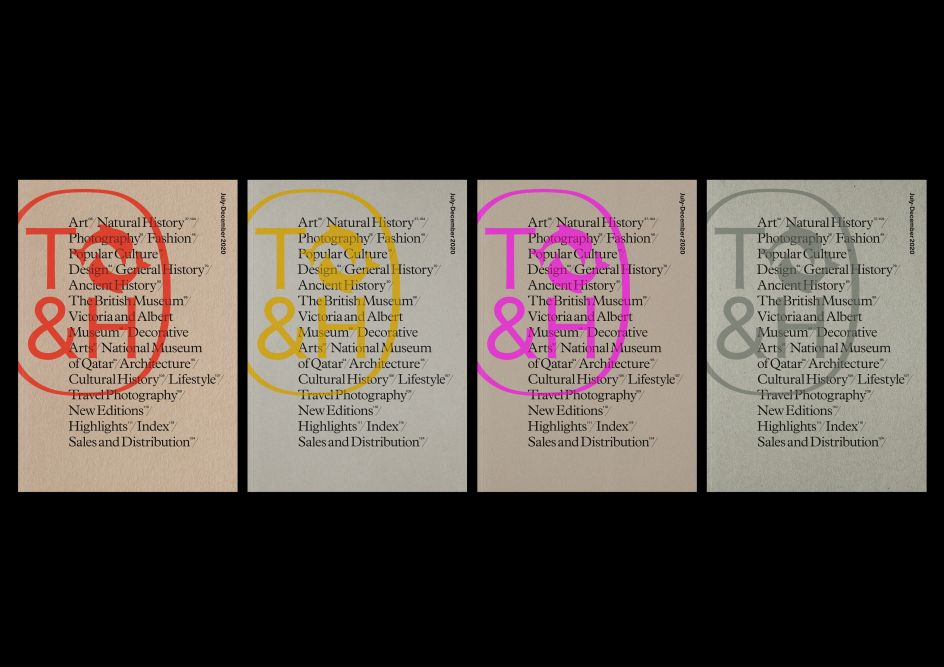
The new cartouche also appears on banners and carrier bags, as well as the cover of the publisher's biannual catalogue which the team also redesigned. Chosen for its bookish qualities, Plantain is used for the catalogue's body copy, with Neue Haas Unica as a supplementary information typeface.
Inspired by an original mosaic which can be found at the publisher's London office, the neutral yet sophisticated colour palette of cool and warm greys acts as a foil to the colourful book covers.
"This new identity is part modernisation and part restoration of the brand," says Harry Pearce, partner at Pentagram. "The original inspiration for the Thames & Hudson visual identity was two dolphins swimming east to west respectively and the initial letters of the two rivers referenced in the name. We recreated the cartouche to allow these elements to appear together in a single mark once more. The new modernist sans wordmark has a suggestion of the artisanal nature of bookmaking through the subtle detailing of its letterforms."

© Thames & Hudson New wordmark, designed by Pentagram
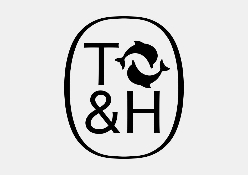
© Thames & Hudson New cartouche, designed by Pentagram
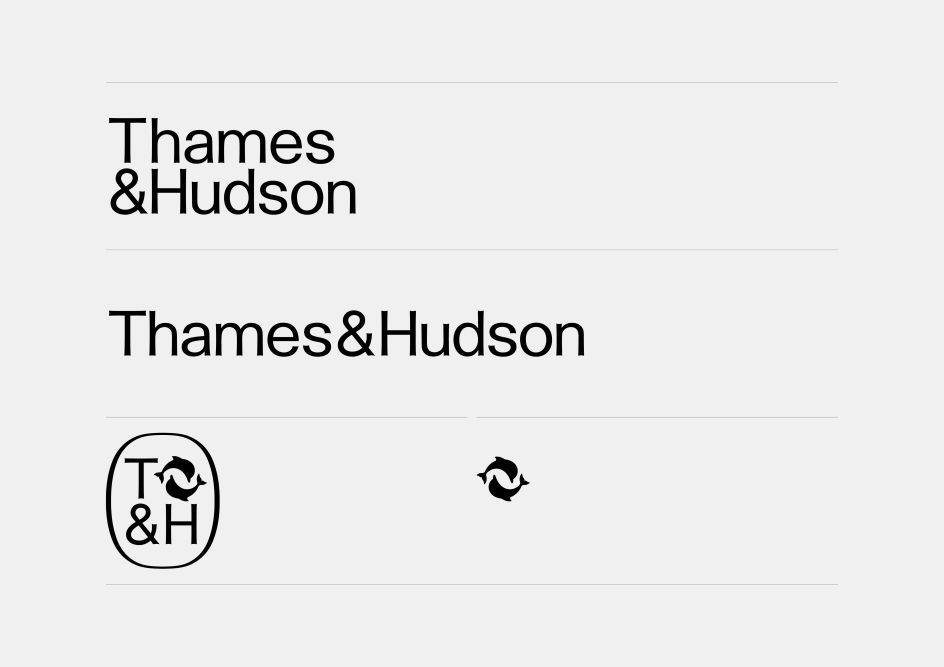
© Thames & Hudson All logos, designed by Pentagram
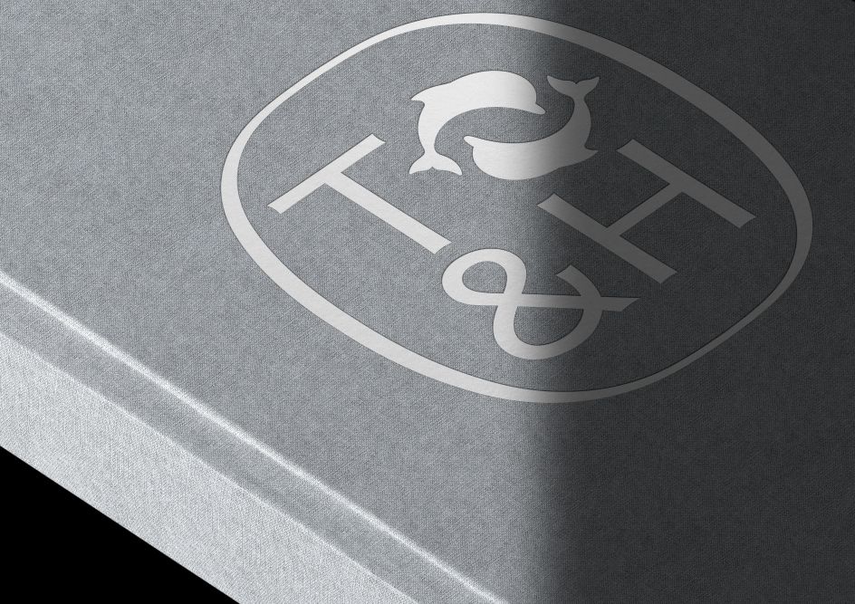
© Thames & Hudson Book case blocking, designed by Pentagram
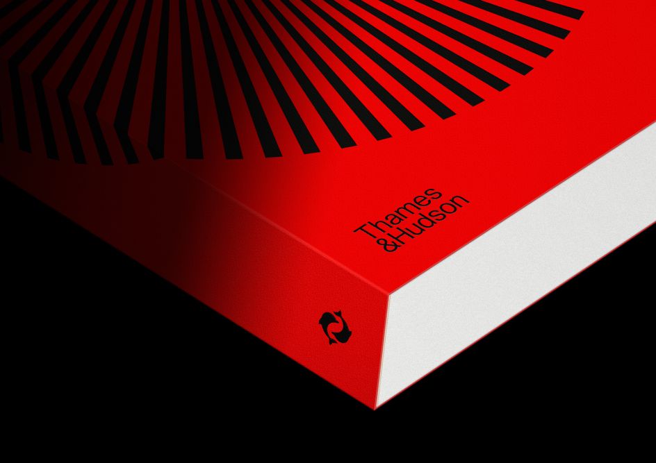
© Thames & Hudson Spine and front cover
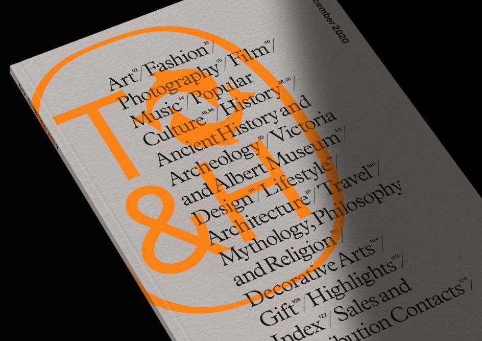
© Thames & Hudson Autumn 2020 Sales Catalogue
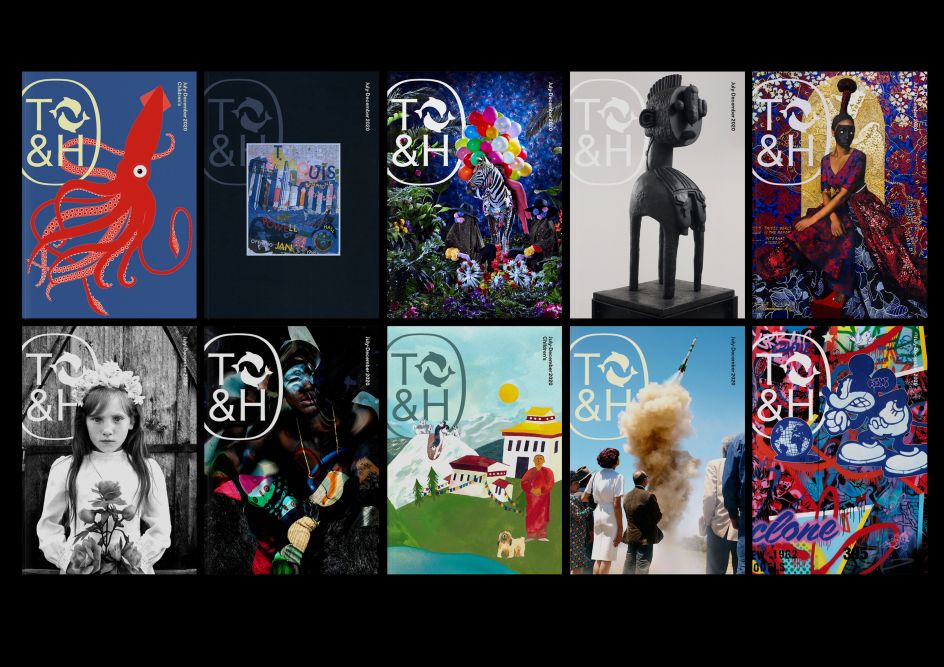
© Thames & Hudson Sales catalogue cover examples
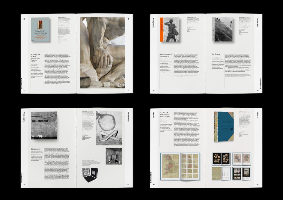
© Thames & Hudson Autumn 2020 Sales Catalogue, inside pages
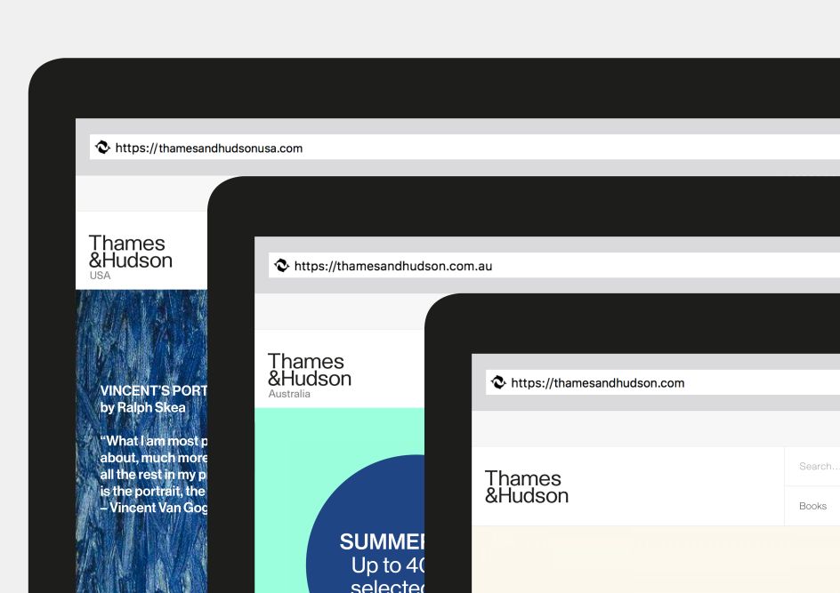
© Thames & Hudson Website mastheads
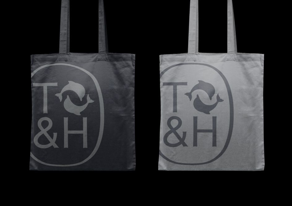
© Thames & Hudson Tote bags

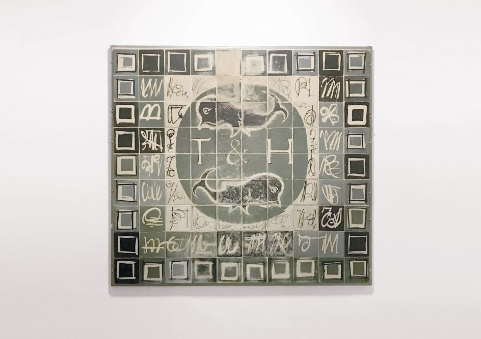
© Thames & Hudson Original mosaic floor at Thames & Hudson’s Bloomsbury Street office
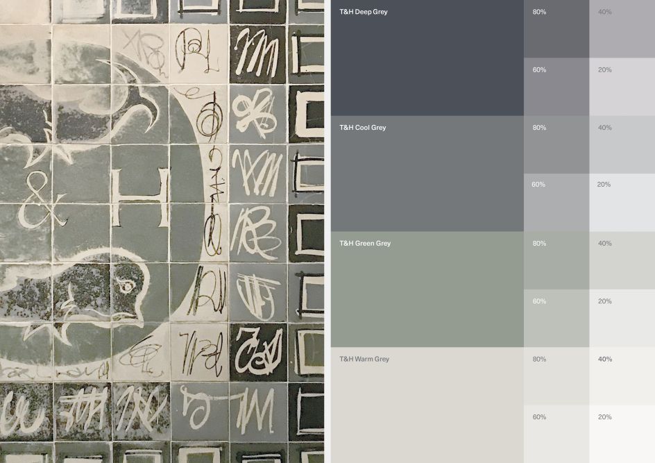
© Thames & Hudson New brand colour palette, devised by Pentagram


 by Tüpokompanii](https://www.creativeboom.com/upload/articles/58/58684538770fb5b428dc1882f7a732f153500153_732.jpg)


 using <a href="https://www.ohnotype.co/fonts/obviously" target="_blank">Obviously</a> by Oh No Type Co., Art Director, Brand & Creative—Spotify](https://www.creativeboom.com/upload/articles/6e/6ed31eddc26fa563f213fc76d6993dab9231ffe4_732.jpg)


