Pentagram’s new identity for saucy novels publisher Mills & Boon 'allows readers to project their own fantasies'
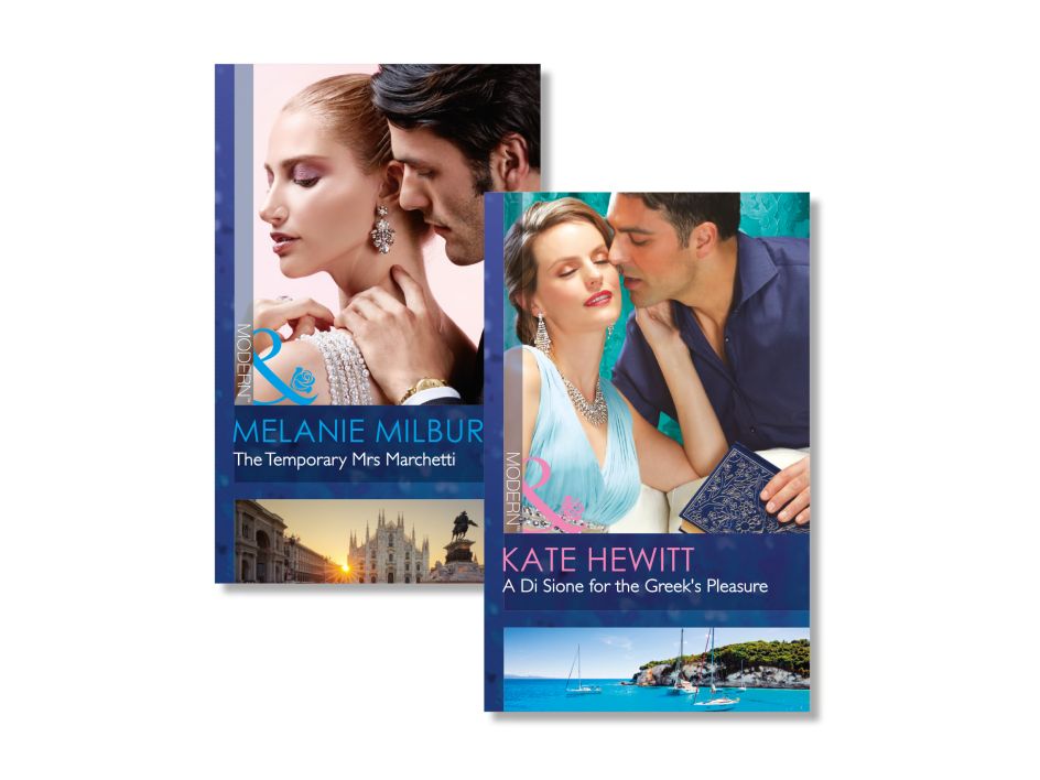
Pentagram partner Angus Hyland has created new designs famously racy romance novel publisher Mills & Boon. The prolific fiction house publishes 120 new titles each month, and Pentagram’s new graphic system has brought about a new way for the publisher to deliver artwork across this high turnover, which relies on stock imagery for its covers.

Mills & Boon was founded by Gerald Rusgrove Mills and Charles Boon in 1908, and has gone on to publish a wide range of theme-led series that are comprised of manuscripts from multiple authors, These are sold through traditional retailers, as well as a long-running subscription service. “While the subscription arm of the business is extremely profitable for Mills & Boon, its consumer base is shrinking—making it imperative for the publisher to reach romance readers who regularly buy similar titles from bookshops, supermarkets and retailers,” says Pentagram. A consumer insight survey showed that “potential customers viewed its content favourably and capable of satisfying their romance reading needs; but the general branding, cover design, finish and series model was a significant barrier for potential consumers. The Mills & Boon proposition was considered disorientating and too far removed from people’s regular book-buying experience—with the sheer quantity of series, titles and categories coming across as alienating.”
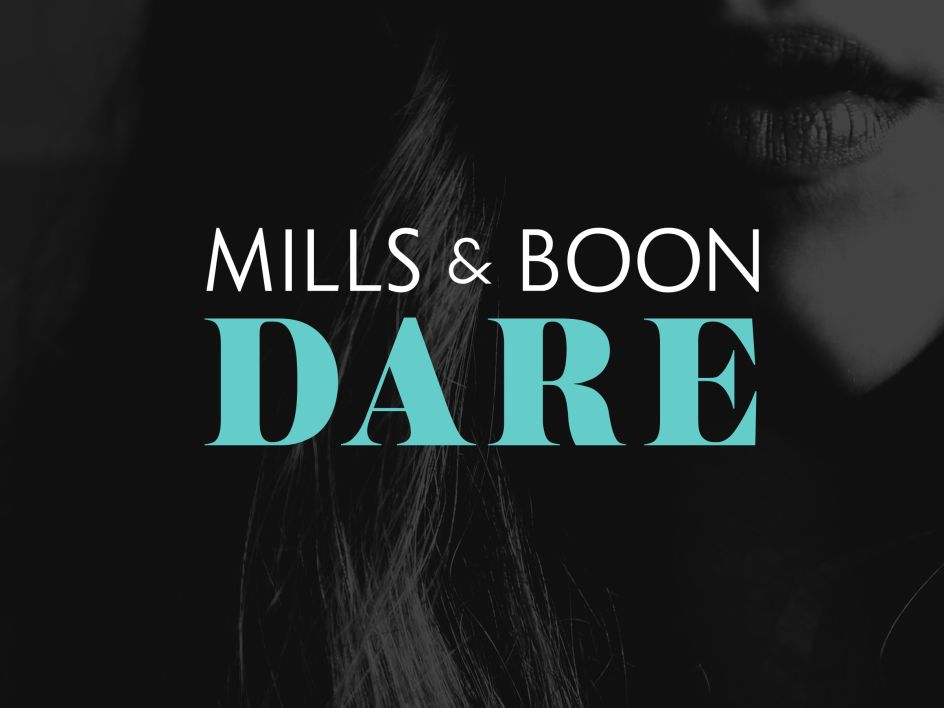
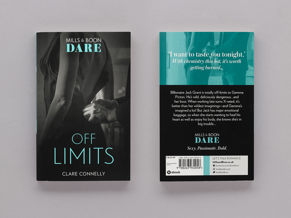
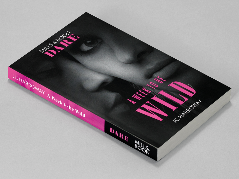
Hyland and his team developed this system and style guide to use “a combination of tight crops and filters for the imagery, alongside considered typography and flexible colour palettes,” says Pentagram. “This removes unnecessary and trite elements from the composition, focusing instead on the characters. The resulting covers allow readers to project their own fantasies onto the Mills & Boon promise, and are more appealing in a today’s retail environment.”
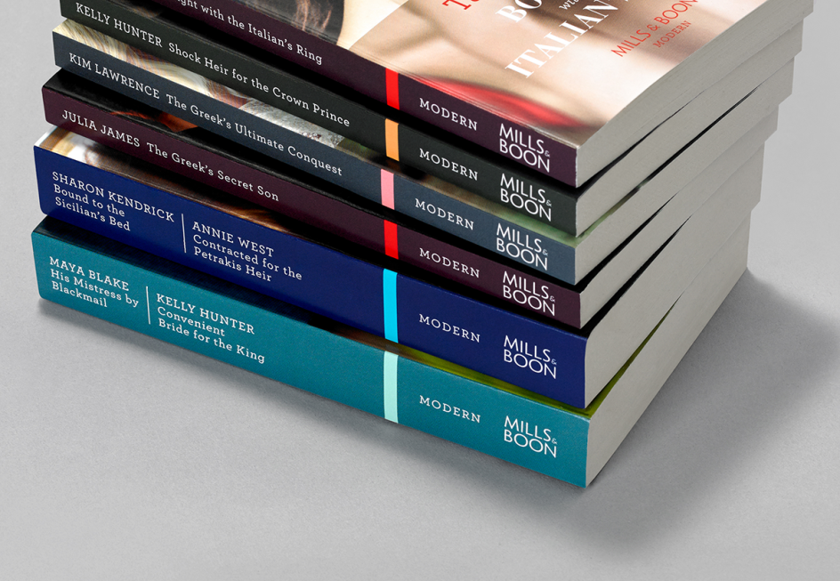
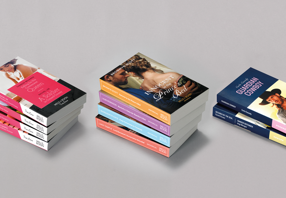
It adds: “A key focus while developing the identity was to create a system that could flex and scale based on the series and its subject matter. The overarching brand can live on its own strongly when required, but can also work in tandem with Mills & Boon’s diverse range of series.”
The new look also shifts the emphasis away from the previously prominent “supersized ampersand” and towards the whole Mills & Boon name. “The ampersand’s rose has been replaced with subtle heart-shaped geometry, a more universal signifier of romance that places the brand idea at the centre of the new mark,” Pentagram explains.
The agency developed the core proposition of ‘instant romantic indulgence’ alongside the brand idea of ‘the heart of romance’ to inform the refresh.



 by Tüpokompanii](https://www.creativeboom.com/upload/articles/58/58684538770fb5b428dc1882f7a732f153500153_732.jpg)


 using <a href="https://www.ohnotype.co/fonts/obviously" target="_blank">Obviously</a> by Oh No Type Co., Art Director, Brand & Creative—Spotify](https://www.creativeboom.com/upload/articles/6e/6ed31eddc26fa563f213fc76d6993dab9231ffe4_732.jpg)


](https://www.creativeboom.com/upload/articles/3c/3c830209aa6d1a282a67946101aba2df5d1d459f_732.jpg)

