Pets eat as well as their owners in this clever and colourful rebrand for PetChoy
Vietnamese design studio M — N Associates has worked closely with font foundry TypeType to create a bold, modern and industry-leading rebrand for pet food company PetChoy.
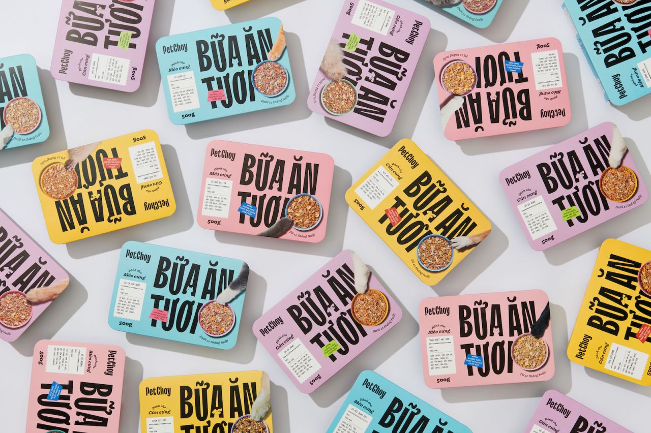
Based on the idea that pets should be served and their owners when it comes to mealtimes, the new look prioritises the nutrition, health and happiness of our four-legged friends.
Catering to the needs of cats and dogs in Saigon, Vietnam, PetChoy's founders are big believers in the idea that domestic animals should eat as well as their owners. With an aim to educate and empower the pet-loving community through its accurate and comprehensive understanding of their dietary needs, PetChoy has quickly established itself as a major player on supermarket shelves. And its outstanding rebrand is no small part of that success.
Led by Duy Nguyễn and Lan Mai, the rebrand from M — N Associates is a complete transformation and departure in terms of design compared to other local pet food brands.
With its eye-popping colour and genius lettering that incorporates tails, ears and paw prints, PetChoy wants to target an international and Gen Z-based audience.
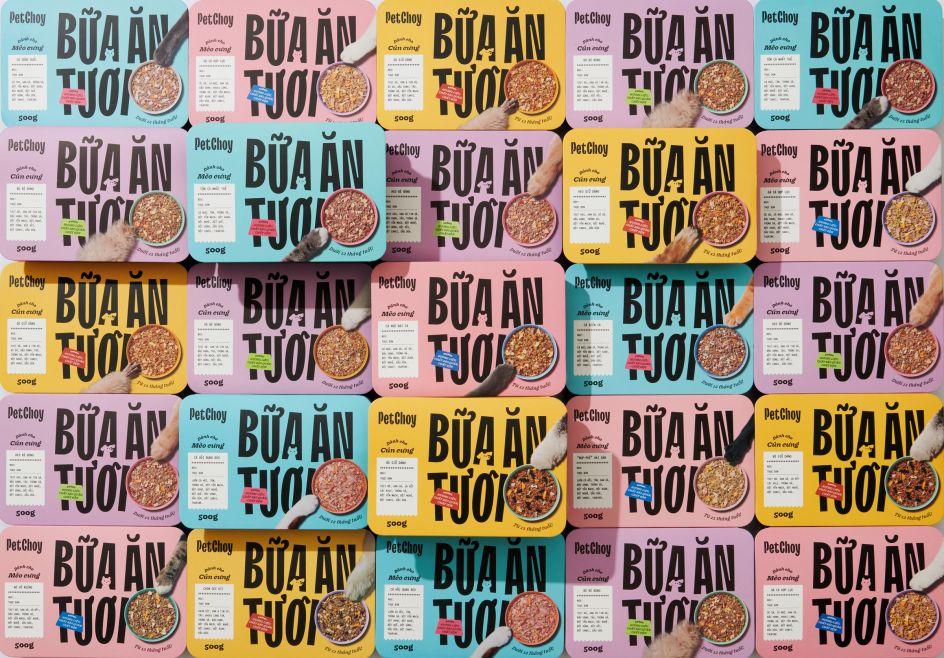
Signature elements that are bound to draw attention include a purely typographic logo from TypeType, which has motifs and characteristics inspired by that universal sign of pet approval: happy wagging tails. A colour palette of soothing hues built around the core flavours, namely seafood, meat, chickens, and vegetables, helps make the packaging appealing and instantly understandable to owners.
Anyone who's ever raised a cat or a dog, though, will know that they don't always appreciate being given food that's not tailored specifically to them. Fortunately, M — N Associates are aware of this too and have taken it into consideration.
"To define from the cat and dog product line, we designed cat and dog characters minimally and brought them subtly into letter A's negative space," they reveal. "Also, the icon set was designed to be solid and recognisable to easily differentiate between products."
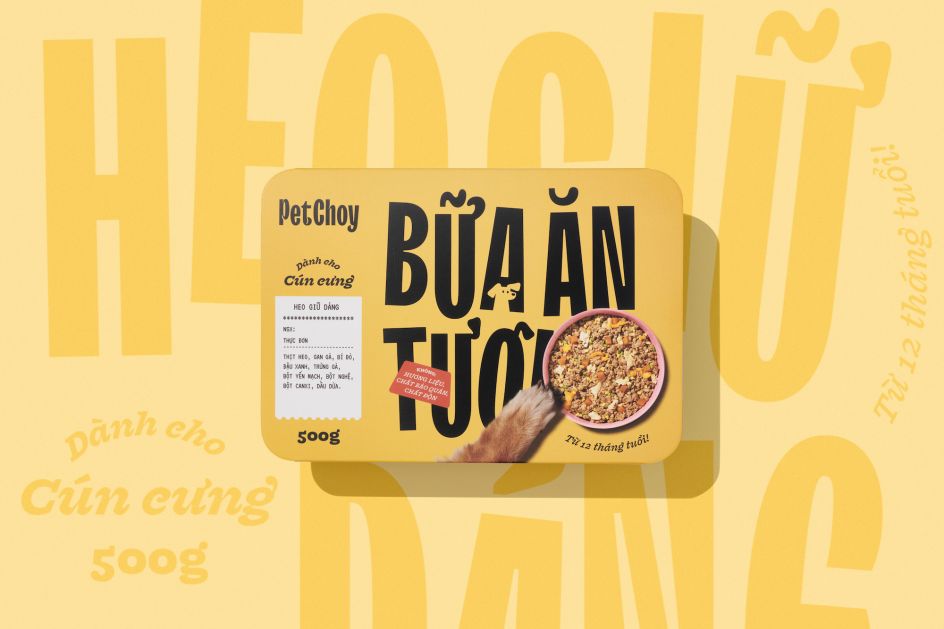
Topping off the rebrand is a specially designed restaurant ticket for each flavour. This menu receipt is cleverly decorated with paw prints to suggest that the pet wanted the delicious food. "This represents the meaning of high-quality, nutritious, well-prepared meals which are ready for every beloved pet."
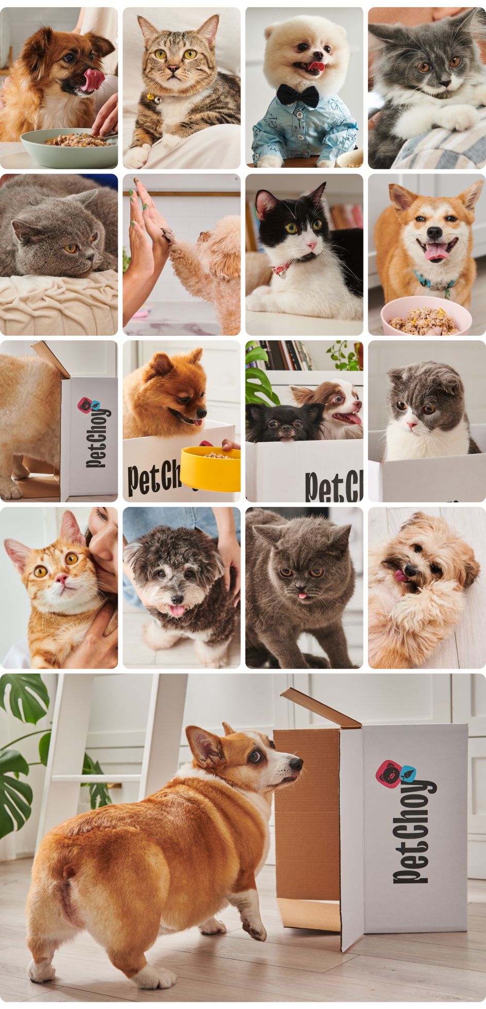
To complete the brand vibe, the design firm worked with food and lifestyle photographer Wing Chan to snap photos of the raw ingredients and shots of pets enjoying what they're eating.
Accompanied by a website built around a completely custom template, the PetChoy rebrand not only made buying food fun for pet owners but also made it easier during those difficult lockdown months.


 by Tüpokompanii](https://www.creativeboom.com/upload/articles/58/58684538770fb5b428dc1882f7a732f153500153_732.jpg)


 using <a href="https://www.ohnotype.co/fonts/obviously" target="_blank">Obviously</a> by Oh No Type Co., Art Director, Brand & Creative—Spotify](https://www.creativeboom.com/upload/articles/6e/6ed31eddc26fa563f213fc76d6993dab9231ffe4_732.jpg)


